Building a Design System for Growing Startup
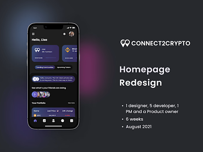
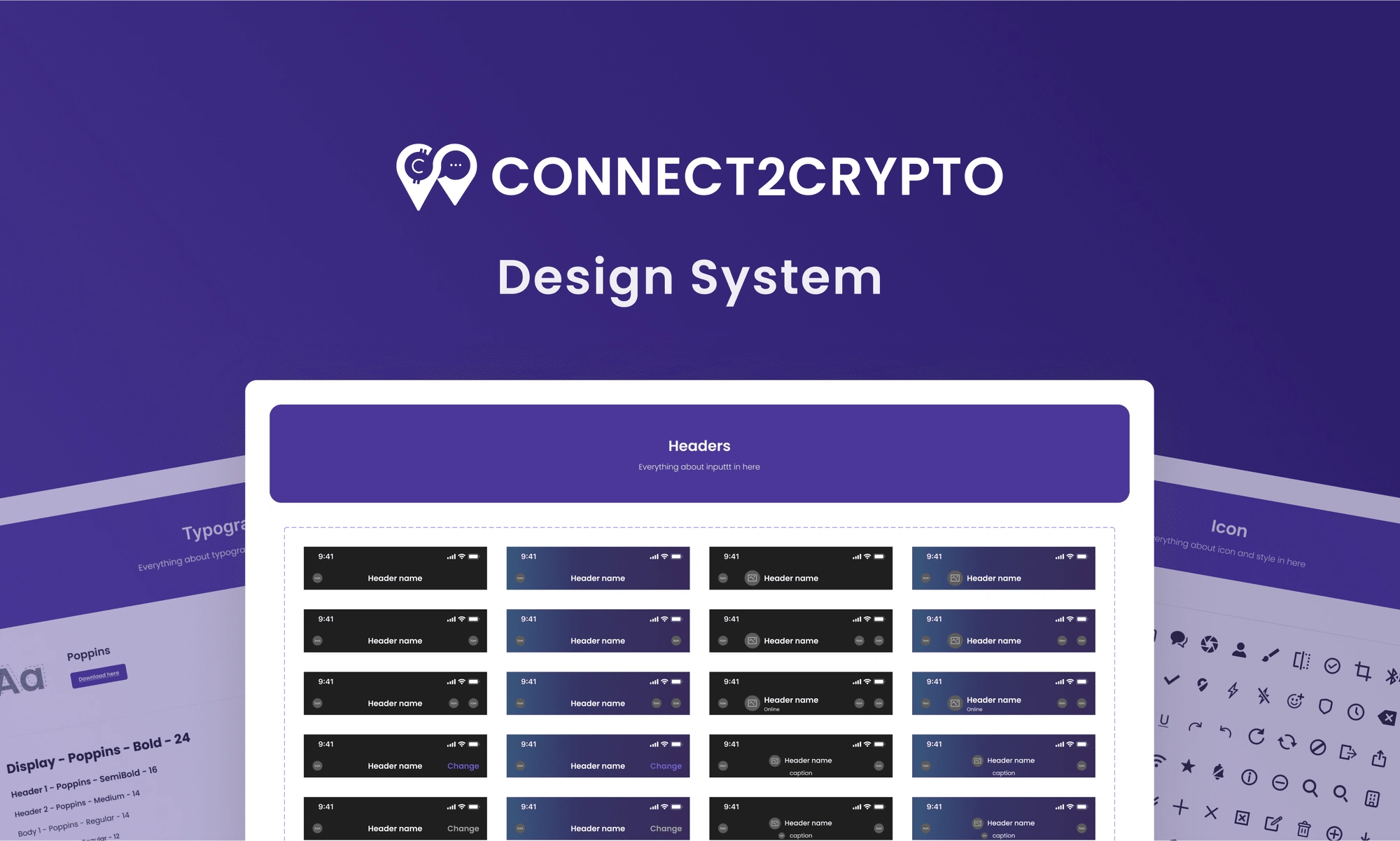
CONNECT2CRYPTO Design System
On March 2022, I had the privilege of leading a project to develop a design system at CONNECT2CRYPTO. I worked collaboratively with another talented UX designer/researcher, a project manager, and developers to accomplish this task. We completed this project in just four weeks.
About Project
Our design team was growing, as was the library of components in our Figma file, which was leading to inconsistencies in our design. We recognized the need for a design system to address our design debt and ensure consistency.
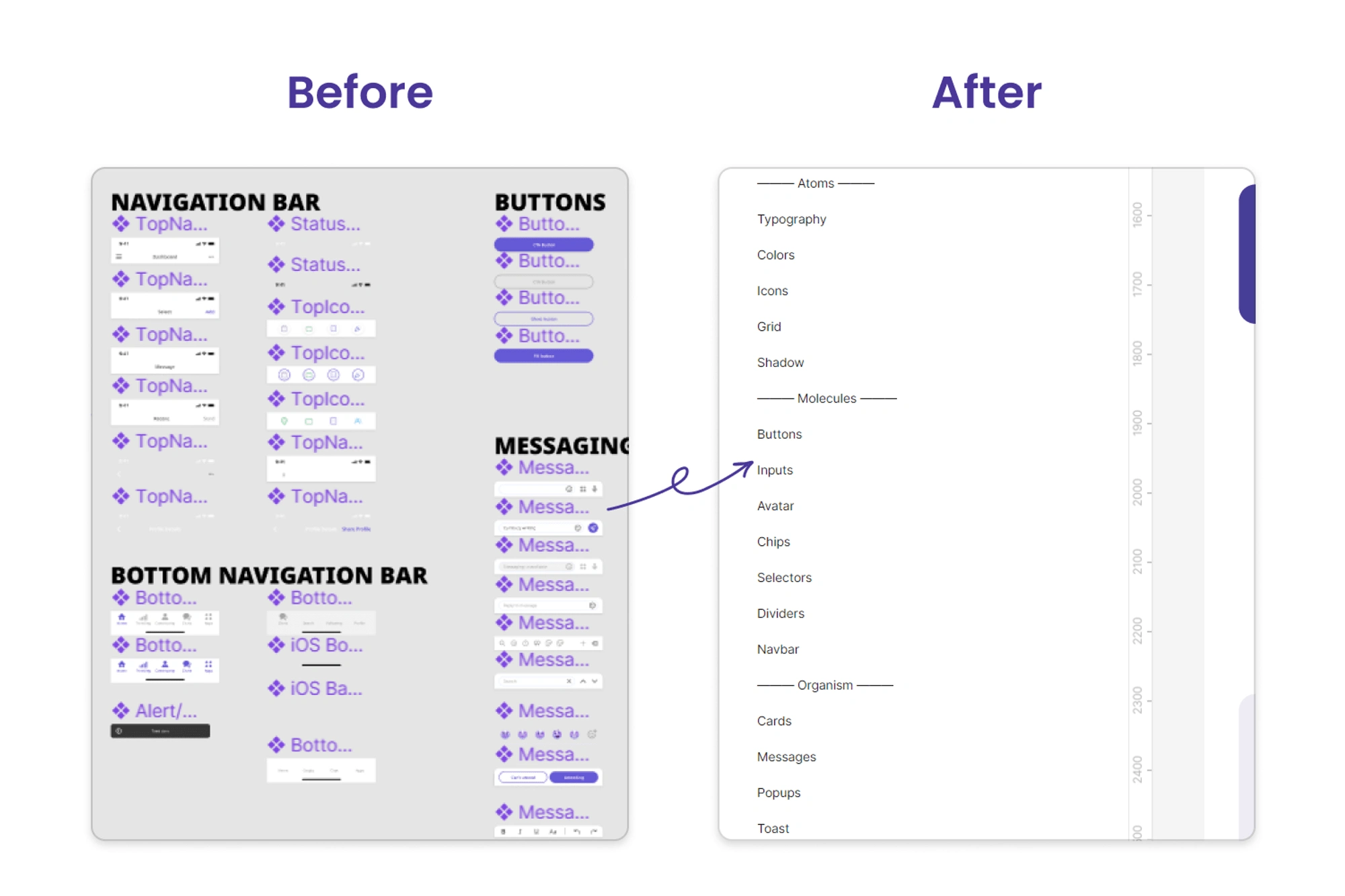
Backstory of problem
I have been with CONNECT2CRYPTO since August 2021; I joined as a founding designer back then, and in 6 months we achieved a lot of things.
What we’ve done
We have component library in Figma
Even though I was only designer working in the beginning stages, I still try to use the component whenever I can. This way, we already have a library of most of the different components that will be used in the design system.
Grew from only one designer to team of 3 designers
Just like any startup, we were moving very quickly. I joined as a founding designer in August 2021, and after just 6 months, we are a total of 3 designers on the team, all working asynchronously on the same app.
We redesigned the app and finalized the visual designs elements with new branding
As you might have seen in the Trending Page case study, previous designs were done by a freelancer before I joined the team. Previous designs have a lot of issues, including not following the WCAG accessibility guidelines and a very flat design with no use of branding colors, just to name a few.
Designed over 1000 unique screens
In the past 6 months, we have finished 10 different user flows with more than 1,000 unique screens. Because of that, we have a very big component library in our Figma.
Why we needed the design system
We already had a lot of components
As you can imagine, creating 1,000+ unique screens in just 6 months means working really fast. Also, we were at the beginning stage of the project, so we were changing a lot of things on the go. Because of those reasons, we had a lot of components in our Figma that were either not following the pattern or completely avoidable.
Our design debt was increasing
With quickly iterating and shipping, we had to make some choices over what to work on and what not. Thus, we end up pushing a lot of less important things to the back, which increases our design debt. The most important of these was to work on the design system.
More designers means more mess
In the last 3 months, we added 2 designers to our team. We were all working on the same app at the same time. And it is quite common that every designer works in their own way, so we already doubled the number of inconsistencies just last month, and it is only going to increase from here.
Why this was the right time
We just finished first version of the app
We finished the entire first version of the app, so we already know what types of different elements we need in our design system. Working on the design system now will give us a chance to look back at all the designs and find some inconsistencies that we might have missed.
Problem is only going to increase from here
We were at that stage where we have the first version of the app designed and we also have a list of planned features in the roadmap; thus, taking the time to build the design system will help us a lot to keep the design consistency for all the planned features. If not, we are going to increase the number of components and the number of inconsistencies.
We finally had some time on calendar
After completing all the designs for the app, our next steps were to fix the UI bugs and test the app. Since the engineering team will need some time to complete a stable build for us to test, we found the perfect time to work on the design system and fix some inconsistencies.
The Design Process
1. Research
Just like every other project, we started this one with research—user research and market research. As a design team, we already identified the problem we were facing and why we needed the design system. But to make sure we are not missing anything, we wanted to interview the project manager, the product manager, and members of the engineering team.
We only had 4 weeks to complete this project, so we divided the work. Jennica, who is a user researcher, started interviewing, and I started doing research on different types of design systems and how other companies build their design systems and what we could learn from them.
2. Identify
From our interviews, we found out that our engineering team is also going to build the code library soon. Thus, we need to build a design system with more detailed documentation since not only designers but engineers will soon be using the design system to replicate it in code databases.
Since our app was built on React Native, we also wanted to make sure that we were not adding any components to our design system that might be difficult to build for engineers. For example, in React Native, the header and body are two separate components, so one cannot overlap them. It is not possible, for example, to have an image that is half in the header and half in the body, or to have a gradient that begins in the header and ends in the body.
3. Design
We decided to go with the atomic design system since it meets all of our needs. Atomic design is a methodology composed of five distinct stages working together to create interface design systems in a more deliberate and hierarchical manner. The four stages of atomic design are:
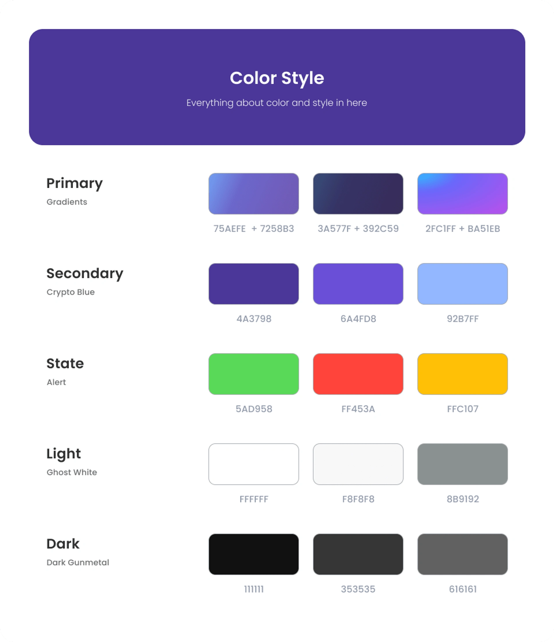
1. Atoms
Atoms are the building blocks of these design systems. Anything from the design library that cannot be divided further is an atom. So for example atoms for our design systems are color system, typography, Buttons, icons etc.
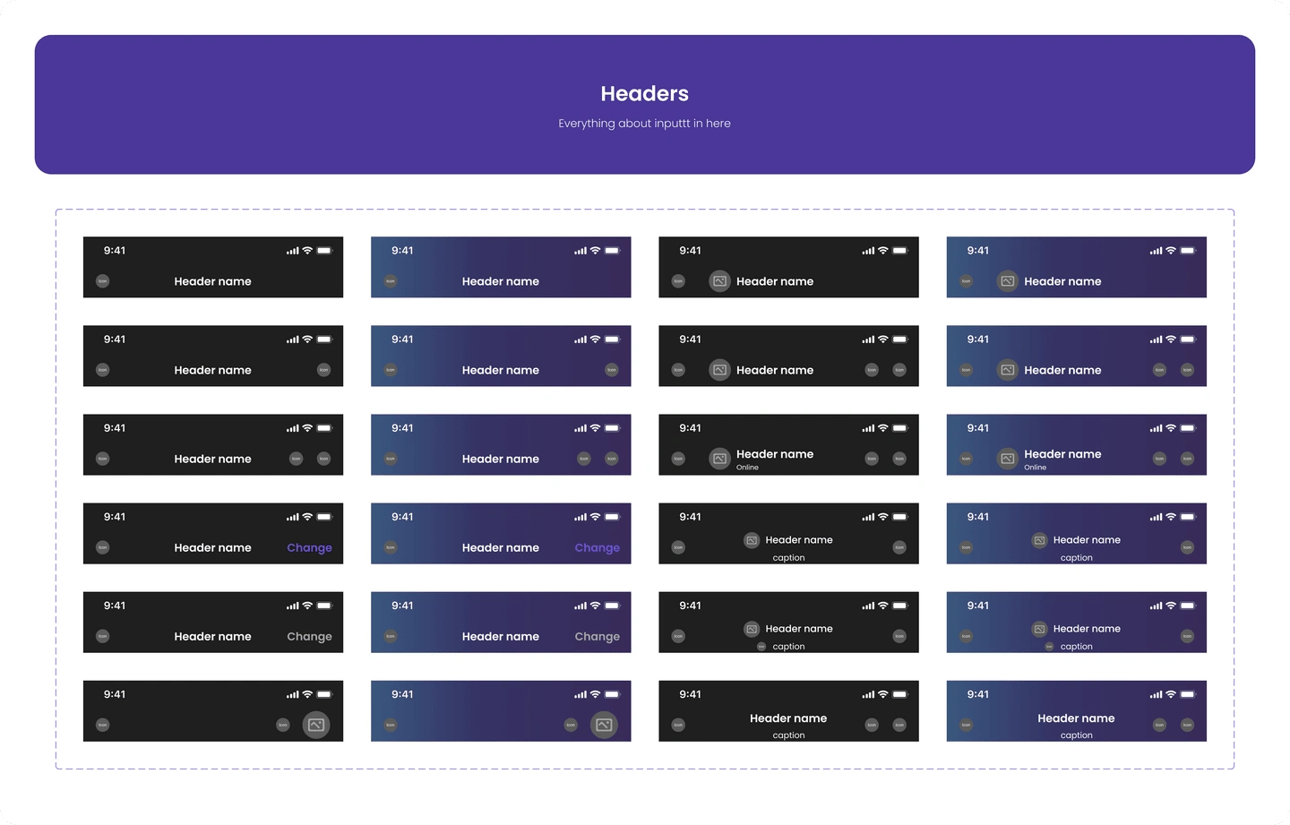
2. Molecules
Molecules are relatively simple groups of UI elements that function together as a unit. For example, a form label, search input, and button can be joined together to create a search form molecule, or a profile picture, a title, and an icon can be joined together to create header molecules.
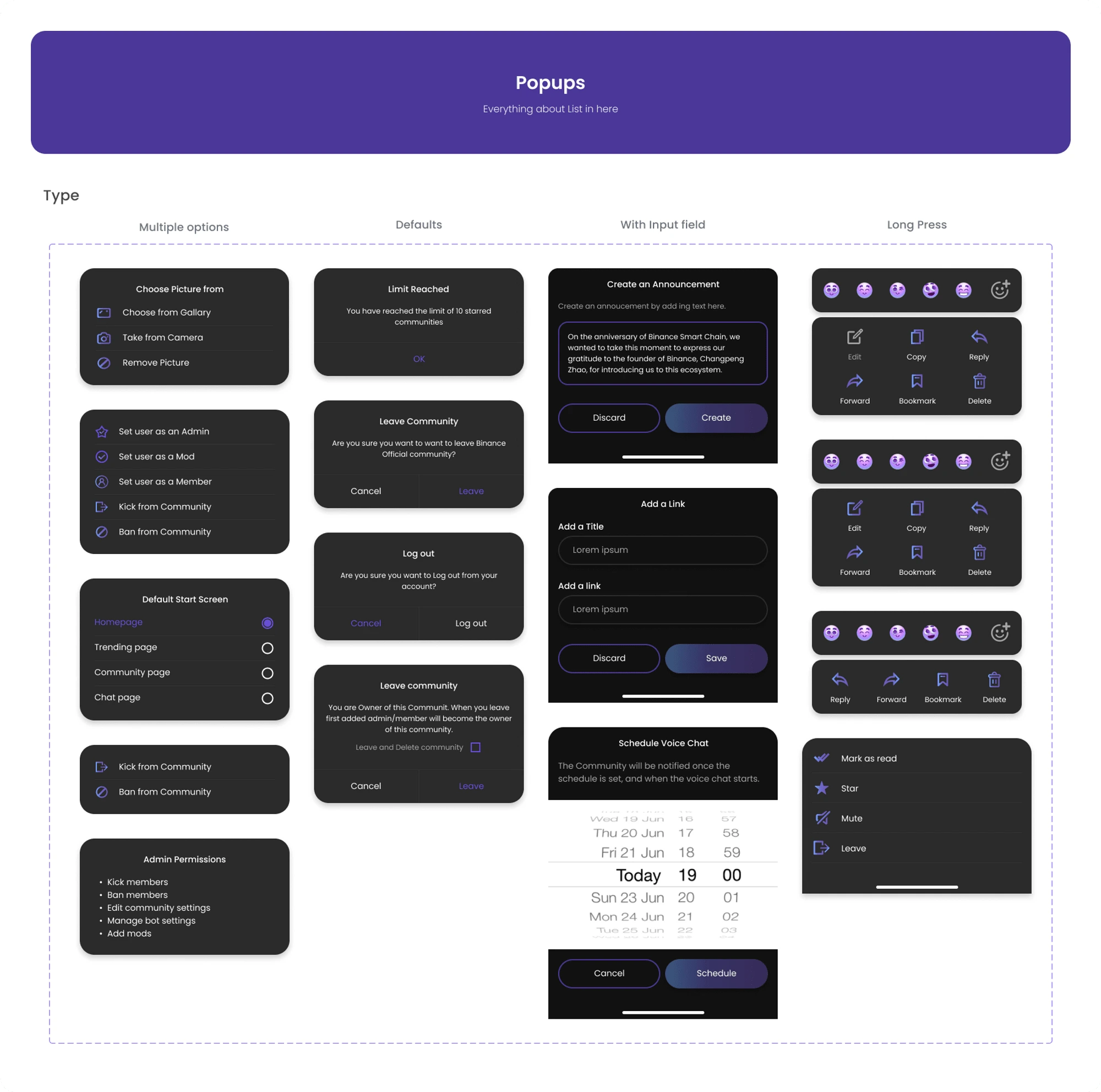
3. Organisms
Organisms are relatively complex UI components composed of groups of molecules, atoms, and/or other organisms. These organisms form distinct sections of an interface. For example, a popup where you have a title, a sub-title, an input field, and submit button is an organism.
4. Templates
Templates are page-level objects that place components in a layout and articulate the design’s underlying content structure. For example, we can take the header molecule and card and apply them to a homepage template.
4. Test
After we finished building the design system, we tested it thoroughly to make sure that it worked well and was easy to use. We conducted internal user testing with our designers and developers and made any necessary adjustments.
We initially kept all of the design documentation in one place, but after some testing, we found that keeping all design documentation in one place was not efficient. Switching between two pages was time-consuming and cumbersome. As a solution, we decided to add documentation for each component at the bottom of the respective component's page. This way, all the relevant information is easily accessible and conveniently located.
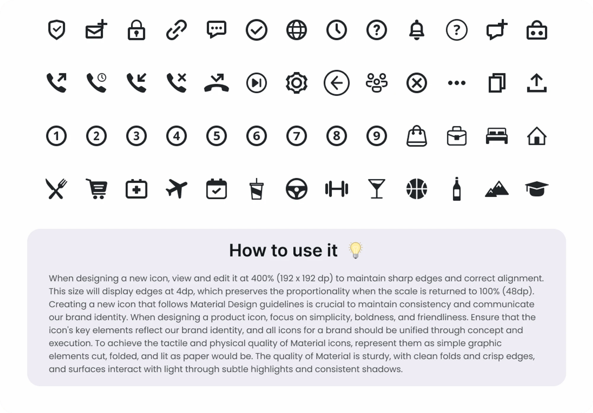
We added how to use it guide at end of each component
5. Launch
Finally, we launched the design system and made it available to everyone on the team. We provided training sessions for designers and developers on how to use the design system and how to contribute to it.
Final Outcomes
The CONNECT2CRYPTO design system has had a significant impact on our design process and the quality of our designs. Here are some of the results we have seen since launching the design system:
Consistency
The design system has helped us achieve greater consistency in our designs, which has improved the overall user experience of our app.
Efficiency
Designers can now create new screens and features more quickly because they have access to a library of pre-built components and styles.
Collaboration
The shared Figma library has improved collaboration between designers and developers, which has reduced the number of design and development conflicts.
Scalability
The design system has made it easier to scale our app because we now have a set of reusable components that can be used across different features and screens.
Savings
By reducing the number of design and development conflicts, the design system has saved us time and money.
Conclusion
Developing the CONNECT2CRYPTO design system was a challenging but rewarding project. We were able to overcome the inconsistencies in our designs and achieve greater consistency and efficiency in our design process. The design system has also improved collaboration between designers and developers and made it easier to scale our app. Overall, it has had a significant impact on our design process and the quality of our designs.
Like this project
Posted May 17, 2023
I worked collaboratively with another talented UX designer/researcher, a project manager, and developers to build the design system for CONNECT2CRYPTO.

