Improving homepage for better user engagement of B2C Crypto App
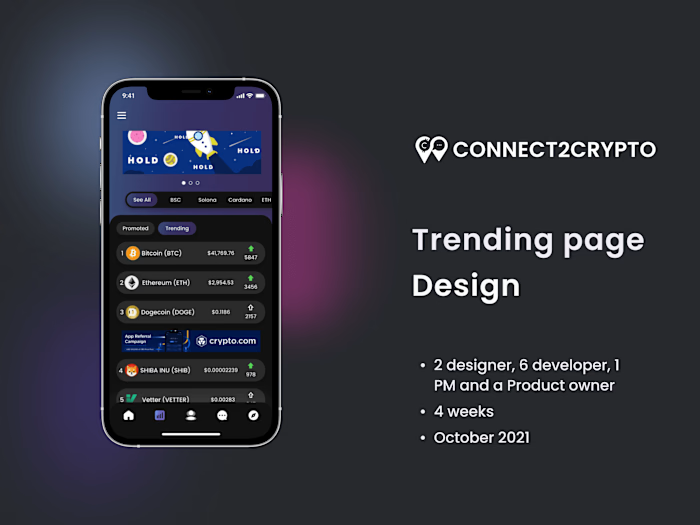
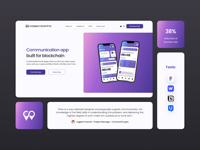
CONNECT2CRYPTO Homepage Redesign
I was the main designer working on this project, with a team of one PM, five developers, and a Product Owner. I worked on research, ideation, wireframe, design, prototyping, testing, and design handoff. This project was done in approximately 6 weeks.
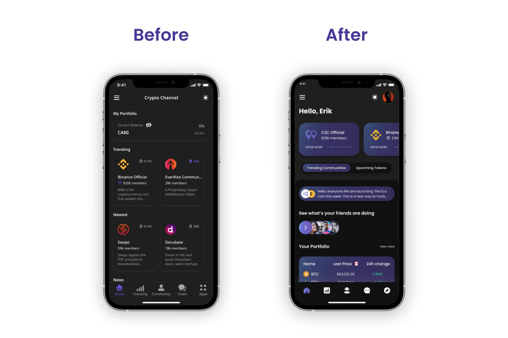
Problem
When I joined the company, 70% of the app was designed by the previous designer. The majority of the designs were simple and performed poorly in the initial testing. The prior homepage was quite basic and fell short of the expectations the team had for the app.
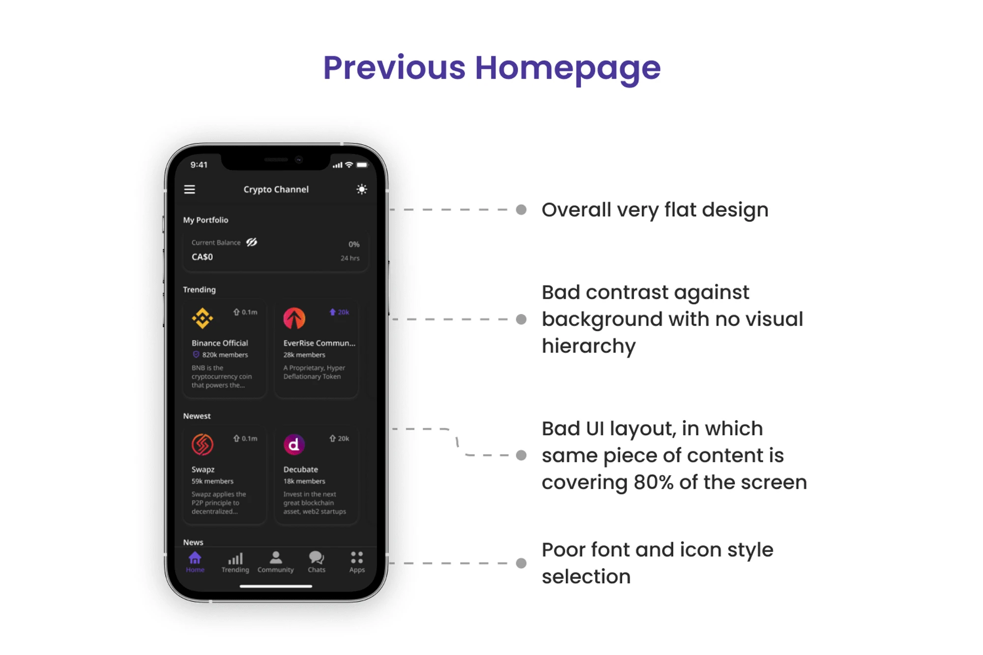
Initial User Testing
Here’s the finding after our initial user testing,
Only 33% of the users joined/opened the community page which was set as the number one goal of the homepage according to the team.
89% of the users did not open the portfolio section which was located at the top of the page.
78% of the users opened at least one news article.
45% of the users got confused with community cards as token cards.
Initial Design Suggestion
When I started working on this redesign process, the development sprint had already started with the previously designed screens on other features of the app. Thus, changing a lot of designs might delay the whole project. So I had to be clever in terms of making changes.
Keeping time constraints in mind, I initially recommended making minimal visual tweaks to current designs. Therefore, following the current timeline of the project and adding major changes in the next version.
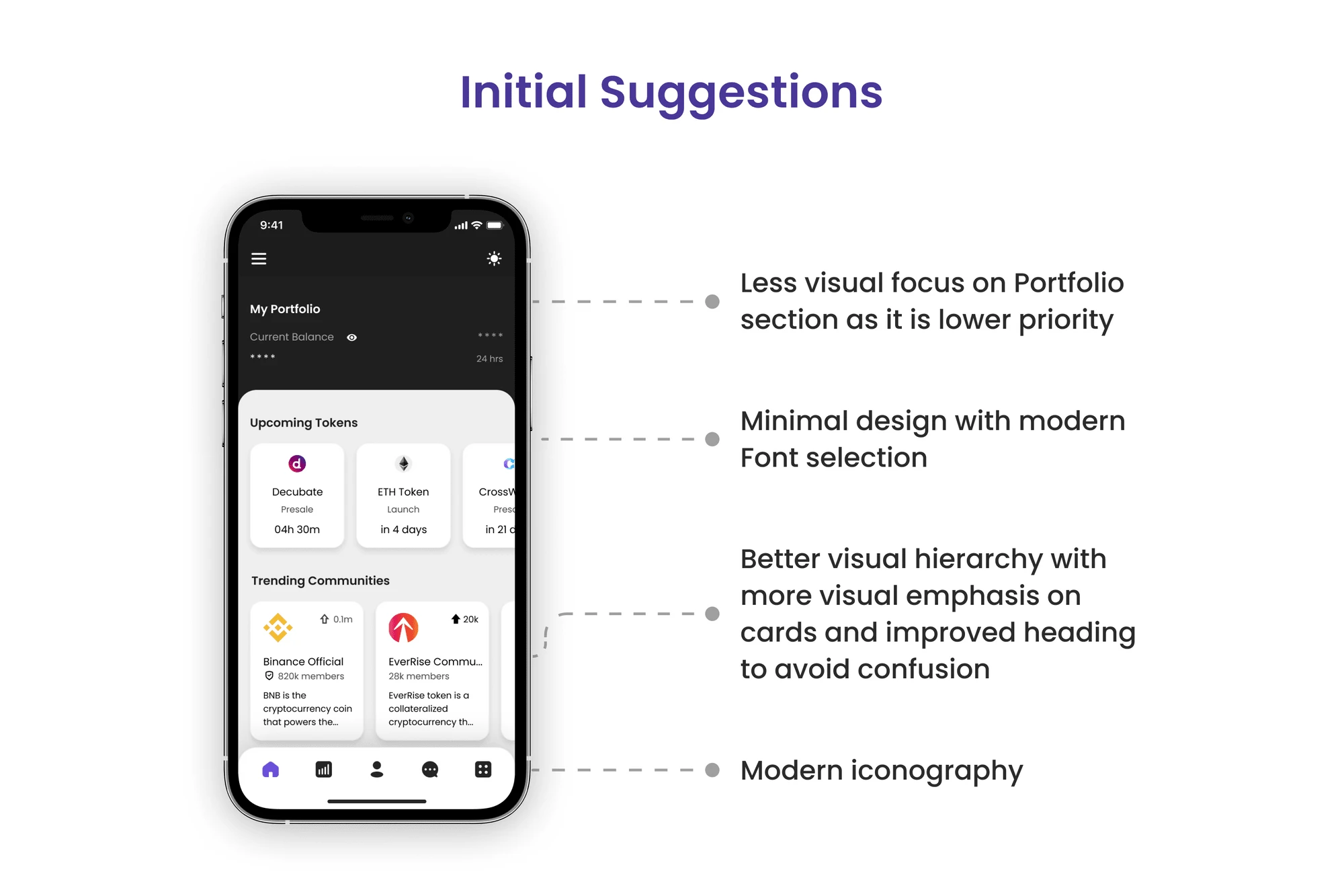
Even though these changes addressed most of the major pain points we found in user testing, stakeholders were keener on minimizing all of the pain points.
They were really impressed with what I found out in just one week of joining the project. Therefore, they wanted to give me more time to work on this project from the basics.
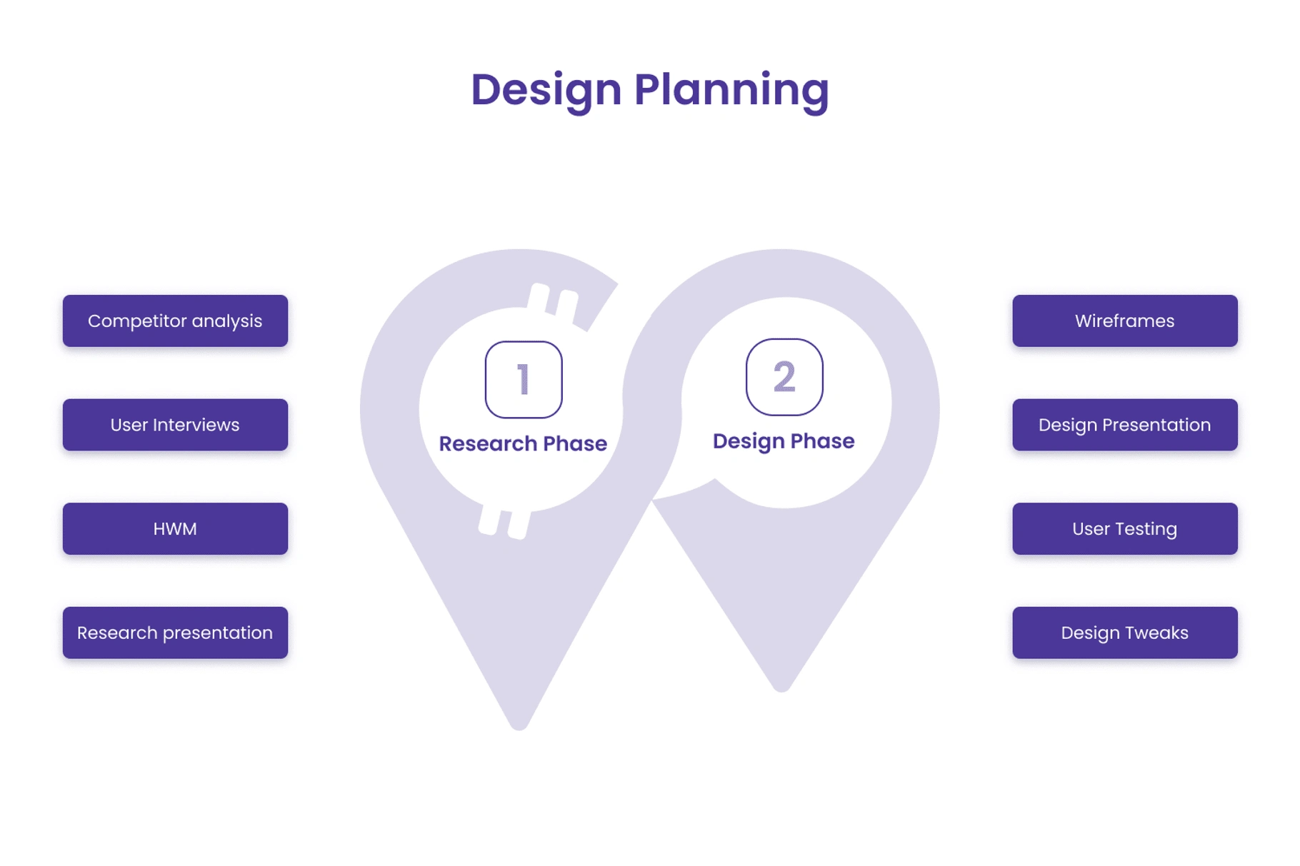
The Design Process
Since previous designs lacked proper user research and lacked the ability to identify user pain points, I have decided to start the project with user interviews to better understand the problem space.
By already knowing what did not work in previous designs, I was able to narrow down my research direction, which provided us with a better solution in less time.
Research Phase (focused on finding the right problem space)
Design Phase (focused on building the right solution)
Final Outcome
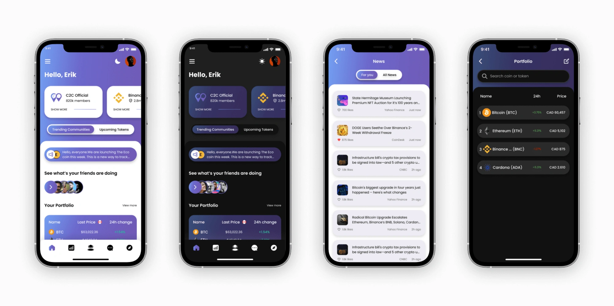
Through A/B testing and usability testing, we ended up validating all of our assumptions, which gave us the confidence to go ahead with the final design without too many changes.
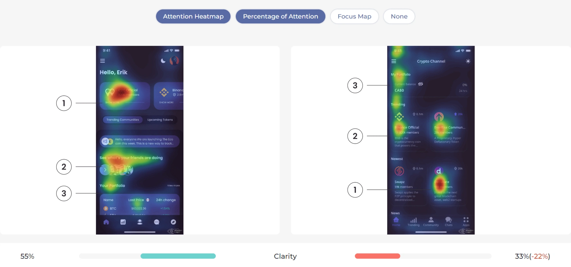
Screenshot from the comparison of two attention heatmaps from user testing
From the heatmap comparison above, you can see how the new design (on the left) has a clear visual hierarchy from the most important features of the app to the less important features. While previous designs (on the right) have no hierarchy or consistency of user’s attention.
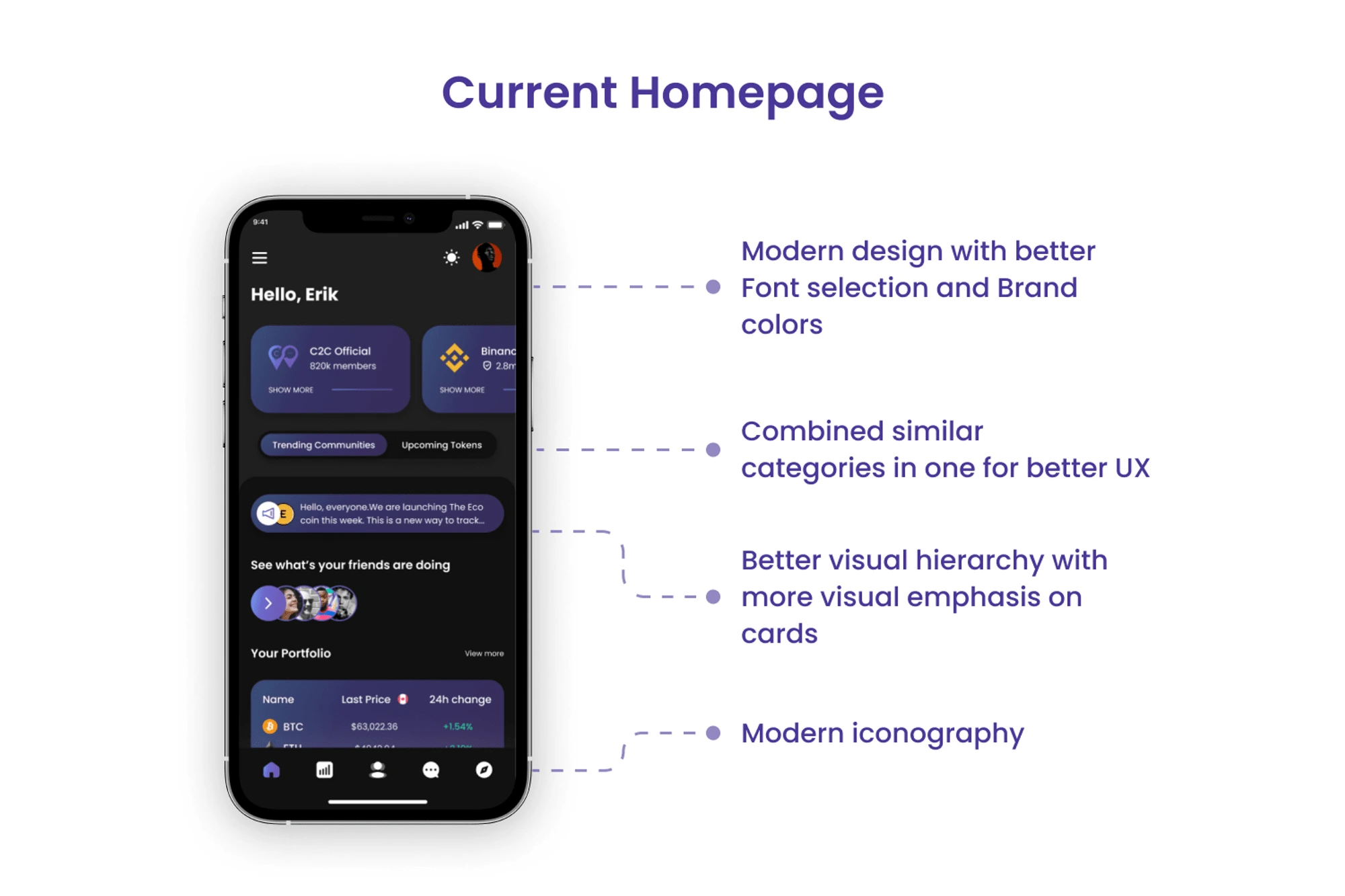
Improvements
These are the findings from our testing on a redesign which showed improvement in key metrics,
82% of the users joined/opened a community page compared to the previous 33%, an increment of 248%.
42% of the people opened the portfolio section compared to the previous 11%, an increment of 281%.
100% of the user were able to differentiate the community tab and the token tab.
Learnings
As things do not always end as planned. Near the end of our development sprint, we did not have enough time to facilitate one of the features, which had some technical difficulties and required more time to develop. So we decided to push it to the next version.
Other than that, the whole experience was pretty smooth and we had a few small difficulties, which were solved with the help of an amazing team of developers and PMs. One thing I learned after finishing this project was the importance of collaborating with developers early and often.
Like this project
Posted May 17, 2023
I was the main designer working on this project, with a team of one PM, five developers, and a Product Owner.

