Helping Crypto investors find their next investment
CONNECT2CRYPTO Trending Page
I was the main designer working on this project while teaming up with another UX designer, a PM, six developers, and a product owner. I worked on research, ideation, wireframes, design, prototyping, testing, and design handoff. This project was done in four weeks.
Project Goal
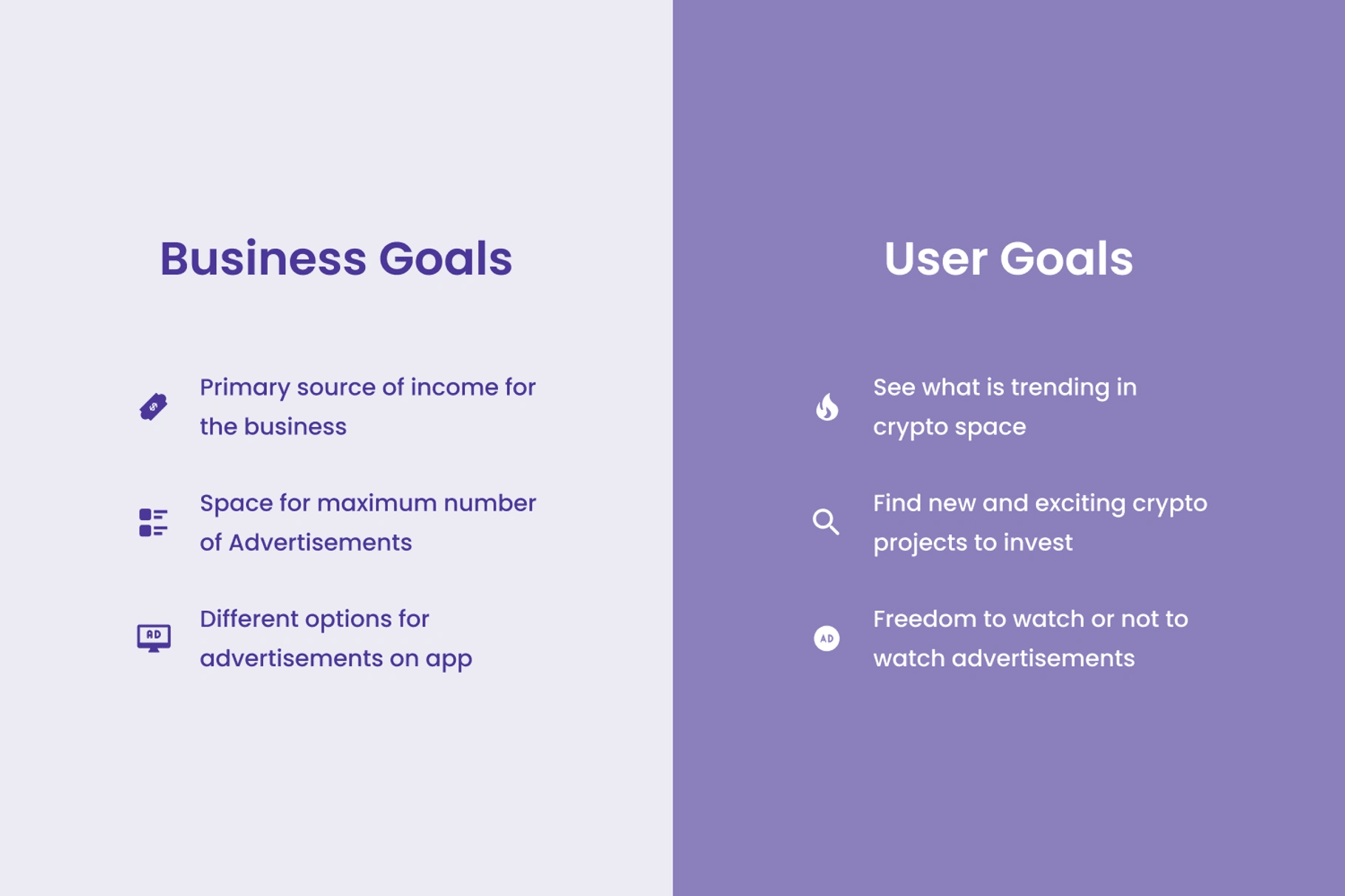
We wanted to create a place for crypto investors to easily find their next great investment opportunity while also showing ads about the upcoming crypto tokens without making them annoying to the users.
Backstory of problem
When I had my first meeting with the stakeholders regarding their vision for this page, I discovered they were looking to maximize the monetization of this page. They wanted to show 100% of the ads about upcoming blockchain projects on this page, which could bring in the most money.
From a business perspective, it totally makes sense, but for users, ads are not only annoying but also harmful to their overall experience. Especially in the Web3 space, where such details can make or break the deal. It was now my job to implement that idea while keeping it user-friendly.
The Design Process
This was one of those projects that started with the solution already in the stakeholders’ minds. Thus, to make sure we are not blindly heading in the wrong direction, I decided to create an assumption board.
Basically, at the start of the project, we wrote down all the assumptions we were making in our minds, and the design team made sure to validate most of those assumptions during the design process.
We had a total of 8 assumptions about the users, problem, and solution, the key ones being,
By showing ads for upcoming crypto projects we are helping users with their next investment.
By showing more ads we will make more money.
Validating Assumption 1
By having a list of assumptions with us, we had a very clear goal while planning user research and user interviews. It was particularly helpful to us while we were coming up with a list of questions for user interviews. We interviewed users from various backgrounds about their process, starting from hearing about a new coin to actually investing in it.
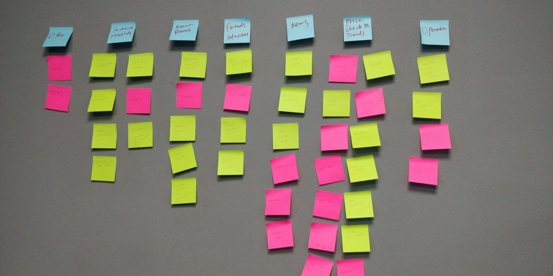
Collection of the data from user interviews
Through user interviews and empathy mapping, we found out details such as,
The top 3 ways users find out about new coins they have previously invested in was
Only 7% of the users mentioned ads when we asked them about how did they first hear about the coin they invested in.
Only 23% of the users remember visiting the website of the ad they saw about the new crypto project.
As you can see, the findings show that users rarely invest in crypto projects that they come across as an ad. We also found that users prefer to view ads when they are more naturally presented to them.
Also, they clicked most amount of ads when they were on websites that have more organic content, websites like coinmarketcap.com, coingecko.com, and rarible.io rather than websites which is very advertisement heavy such as coinhunter.cc and coinsniper.net
This proved our biggest assumption, on the basis of which we were building the solution, was wrong. Thus, we changed our strategy from showing 100% of the ads to showing more organic content and then placing ads in between.
Similarly, the design team validated all of the assumptions, and we found out that we were correct about only 2 assumptions, which showed the value of user research and improved the overall UX maturity of the organization.
First Version
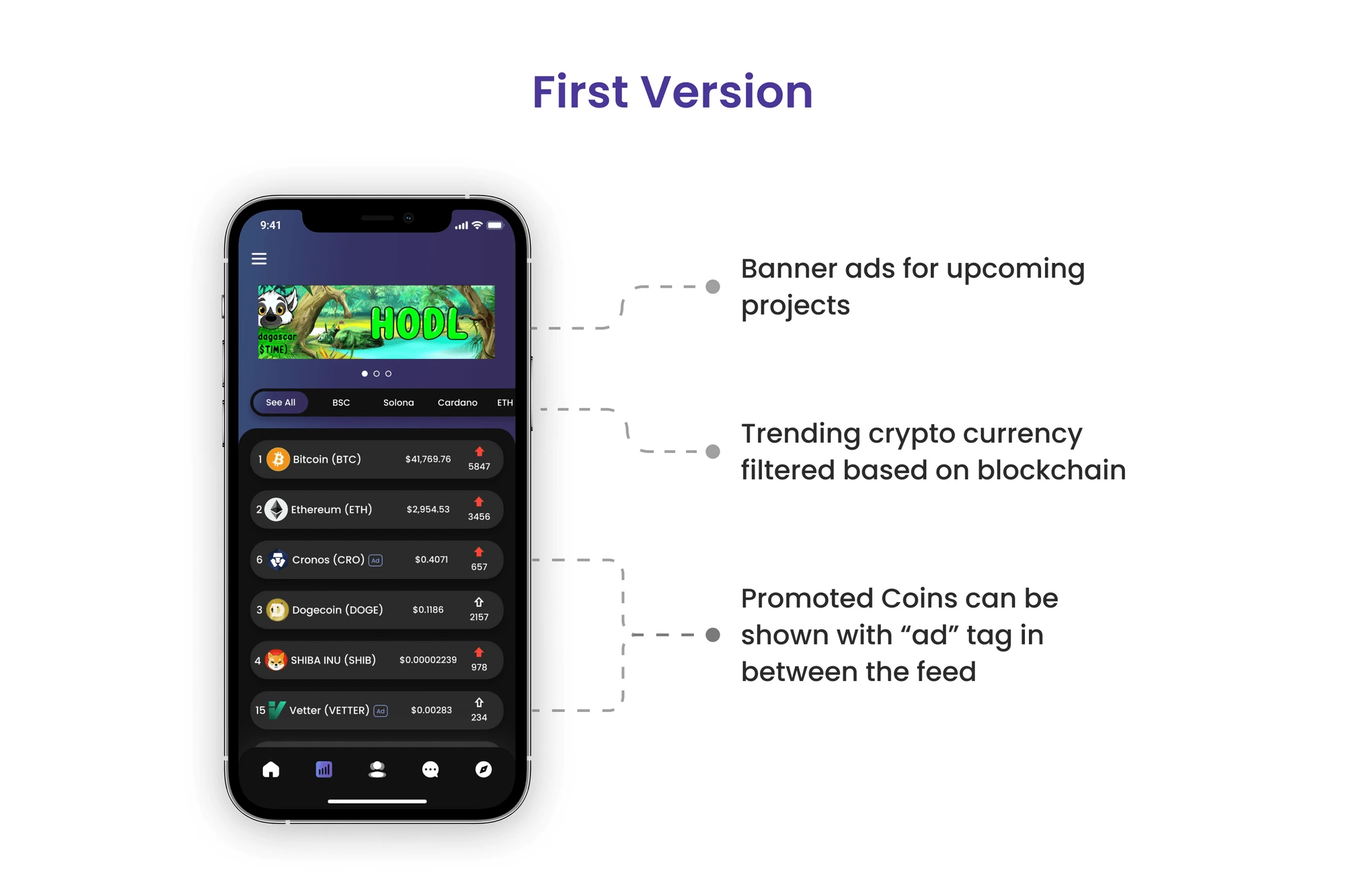
We created the first version, showing all the trending crypto projects with multiple category filter options at the top and displaying advertisements in between the list. We also kept the space for banner ads at the top for upcoming projects.
Testing
We created a high-fidelity prototype in Figma to test our designs. From the testing, we had some good and bad findings. Some of which are,
100% of the users were able to understand the functionality of the page.
NPS score for this page was 8.75.
78% of users did not interact with the banner ad thus they only saw the first ad.
Only 14% of the users remembered the price of the coin which was tagged as “Ad”
The first two findings show we created a good user experience and a solution that is easy to use. But later findings show that this is not an ideal solution for business. If ad creators show fewer impressions on their ads, they might stop promoting their project on our platform, which can harm the total revenue of our business.
To solve this issue, we dug deep into finding more data about user behavior and interaction with the ads. During this research, we came across a great article and study by the NN group. This explains why most of the users were not able to remember the price of the ads or promoted coins.
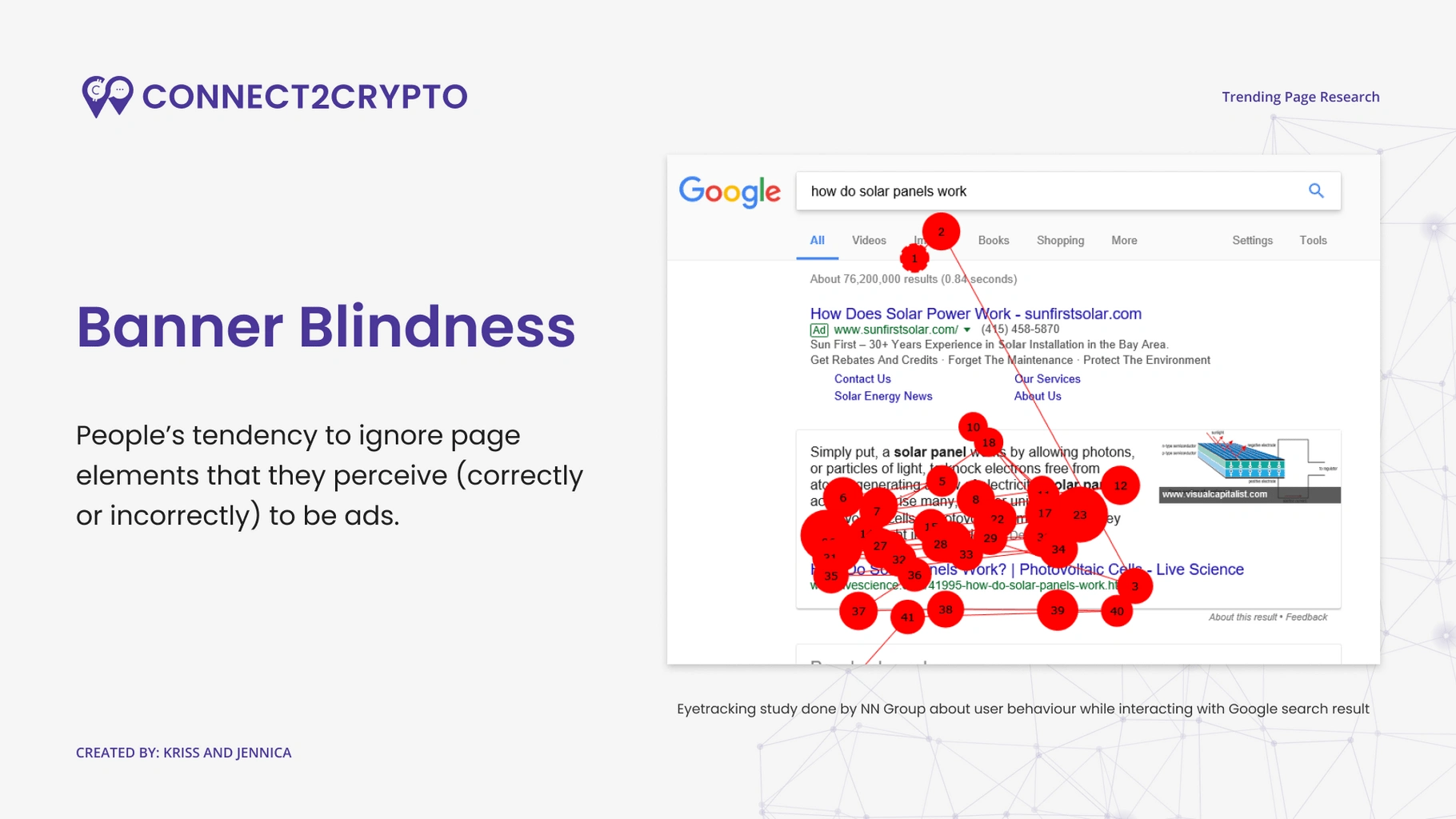
Screenshot from “Trending Page Research” presentation
Improvements
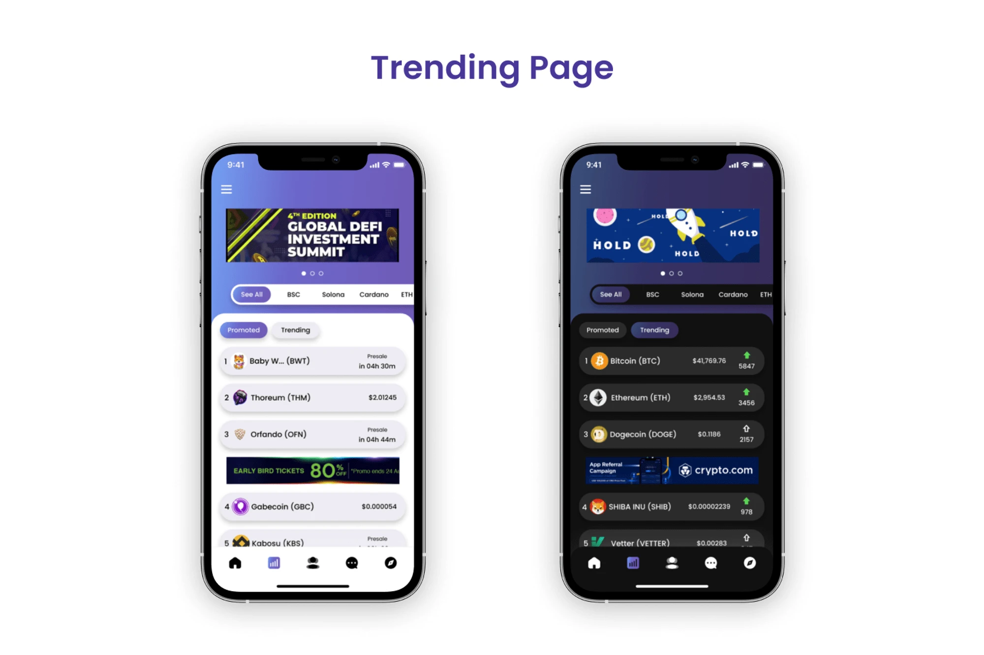
To tackle this problem, we changed our designs by adding an extra category at the top named "Promoted.” This solved two problems. First, there is more space for advertisements. Second, users now know which is paid content rather than seeing ads that were disguised as content. We also changed the color of the upvote button from red to blue to promote correct user behavior.
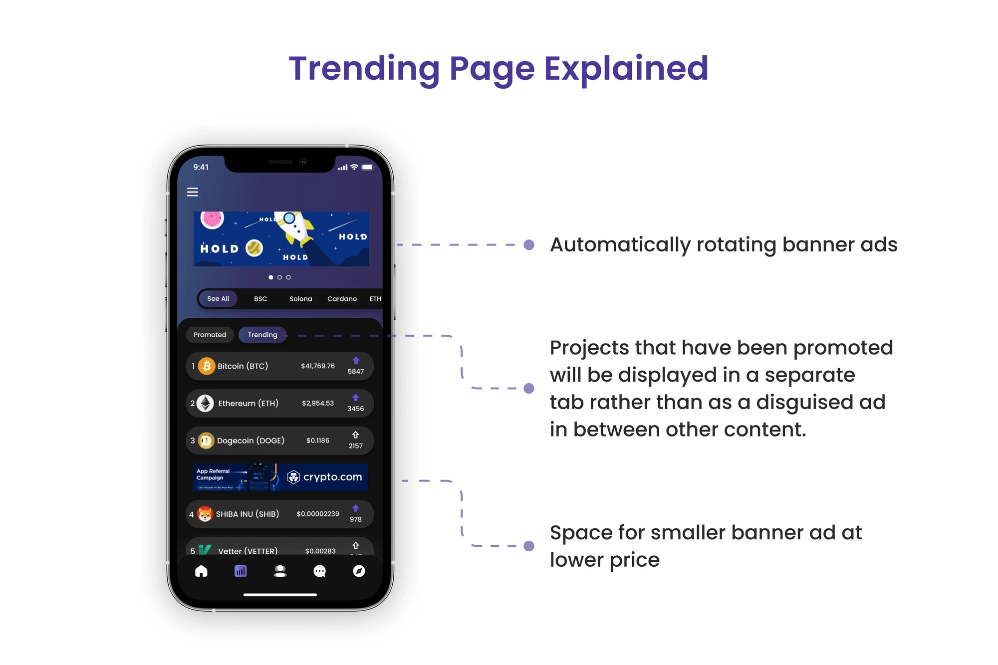
Learnings
At the start of the project, everyone had a different mindset about what the solution could be. However, it gave us an opportunity to advocate for users and data-driven design decisions, which brought all of the team together on one solution that had a good balance of revenue generation and user engagement.
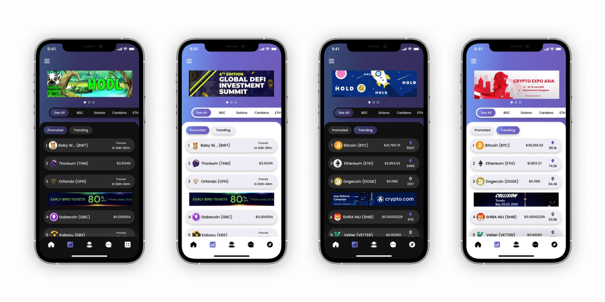
Like this project
Posted May 17, 2023
I was the main designer working on this project while teaming up with another UX designer/researcher, a PM, six developers, and a product owner.

