Power BI Dashboard for SPIFF Incentive Tracking
Darren Pierson
Project Summary
A client provided three CSV exports (sales, products, customers) and asked me to build a proof-of-concept Power BI dashboard to demonstrate how Michelin might track SPIFF incentive payouts across tirelines. The goal was to highlight KPIs that show how different products, regions, and time periods contribute to overall payout obligations.
What I Changed
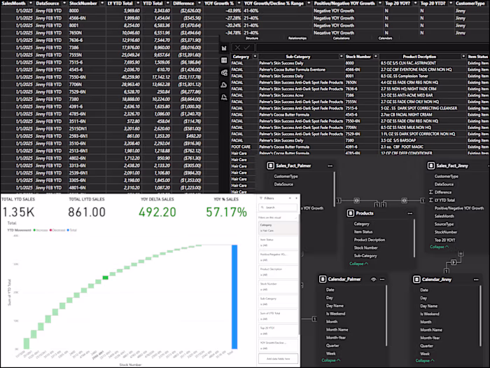
Imported and cleaned the three raw CSVs in Power Query
Built a relational model linking sales activity to products and customers through a shared calendar
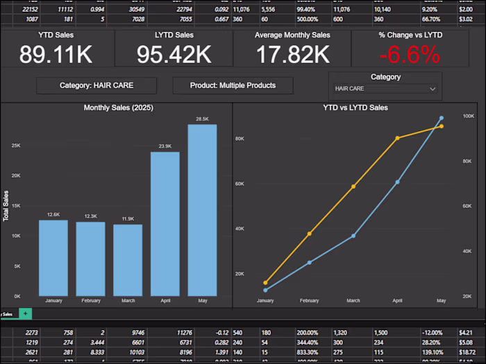
Created DAX measures for SPIFF totals, YTD vs. LYTD, rolling 12 months, monthly averages, and payout % change
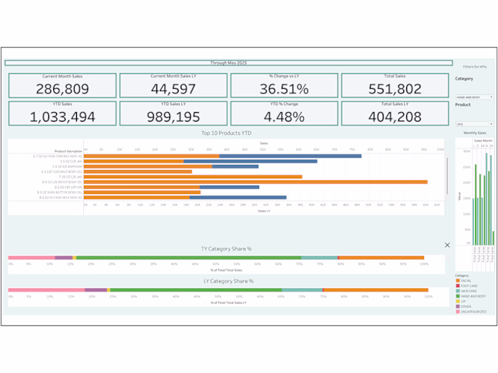
Designed visuals to surface KPIs such as:
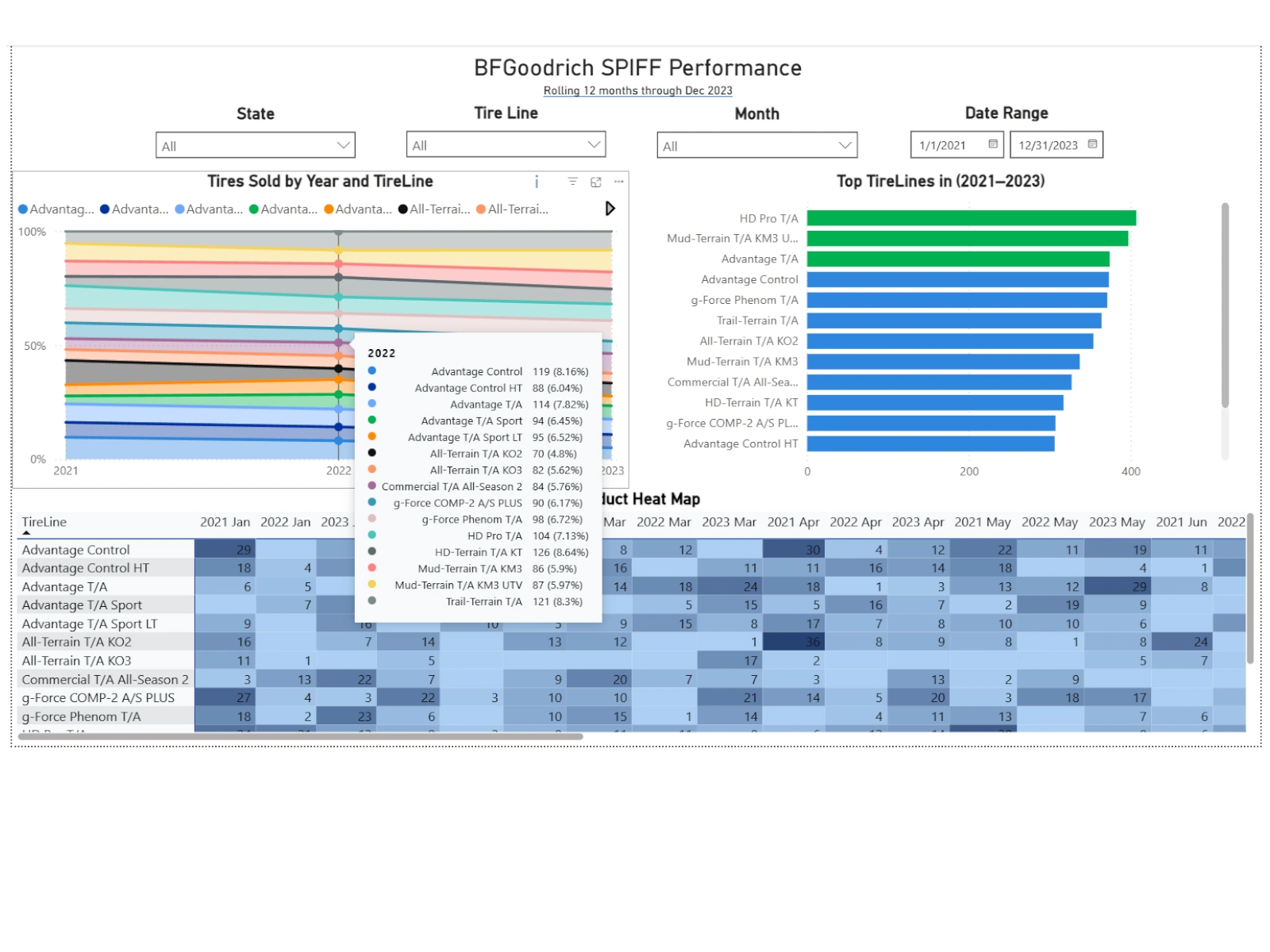
SPIFFs by TireLine and Year (share of payout mix)
Top TireLines by SPIFF payout across multiple years
Heat Map of monthly SPIFF payouts to reveal seasonal and regional trends
Result
Delivered a proof-of-concept dashboard showing how incentive dollars are distributed across tirelines
Enabled dynamic drilldowns by state, product, and date range to uncover which areas or products drive the highest payouts
Replaced static CSV files with a refreshable model that can scale as programs expand
Produced an actionable SPIFF performance view to support sales incentives planning and budget oversight
Tech Used
Power BI, Power Query, DAX, Relational Data Modeling, KPI Design, Interactive Dashboards
Like this project
Posted Oct 2, 2025
Built a Power BI proof-of-concept dashboard modeling Michelin SPIFF payouts by tireline with YTD vs LYTD trends, top products, and seasonal insights.
Likes
2
Views
26
Timeline
Sep 29, 2025 - Sep 30, 2025