Sales Waterfall Upgrade in Tableau
Darren Pierson
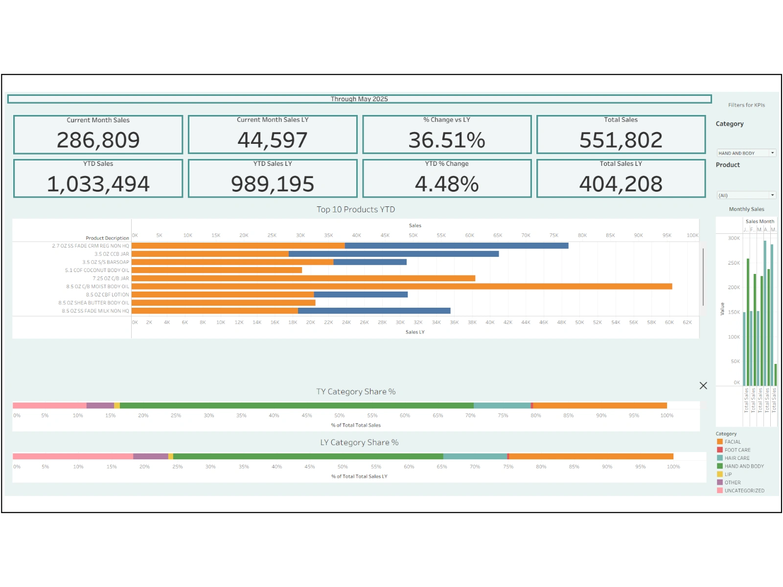
Project 1: Sales Waterfall Upgrade in Tableau
Project Summary
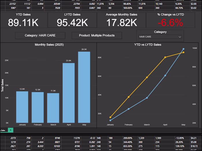
The client’s Excel-based sales table was presented as a static cumulative report with limited visibility into changes between periods. This restricted the ability to spot month-to-month fluctuations and made the reporting feel flat and manual.
What I Changed
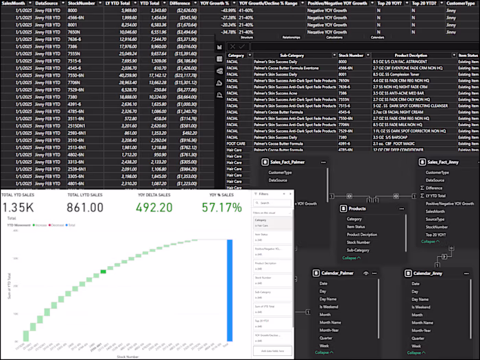
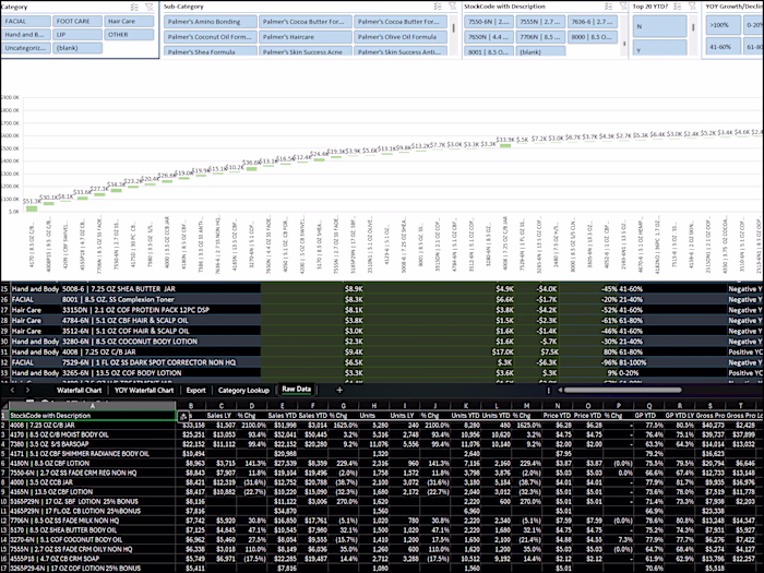
Imported the raw sales tables into Tableau
Built a waterfall visualization to show contributions and declines over time
Applied color-coded highlights to distinguish positive vs. negative changes
Structured the dashboard with a cleaner layout and improved readability
Result
Transformed static tabular output into an interactive visualization
Allowed stakeholders to quickly identify periods of growth vs. decline
Delivered a professional presentation more suitable for decision-making
Published the final dashboard to Tableau Public for easy sharing
Tech Used
Tableau, Data Cleaning, Waterfall Visuals, Interactive Dashboards
Like this project
Posted Aug 21, 2025
Converted static Excel sales table into an interactive Tableau waterfall, exposing monthly changes and reducing manual updates.