Interactive Tableau Map – U.S. & Canada Breweries
Darren Pierson
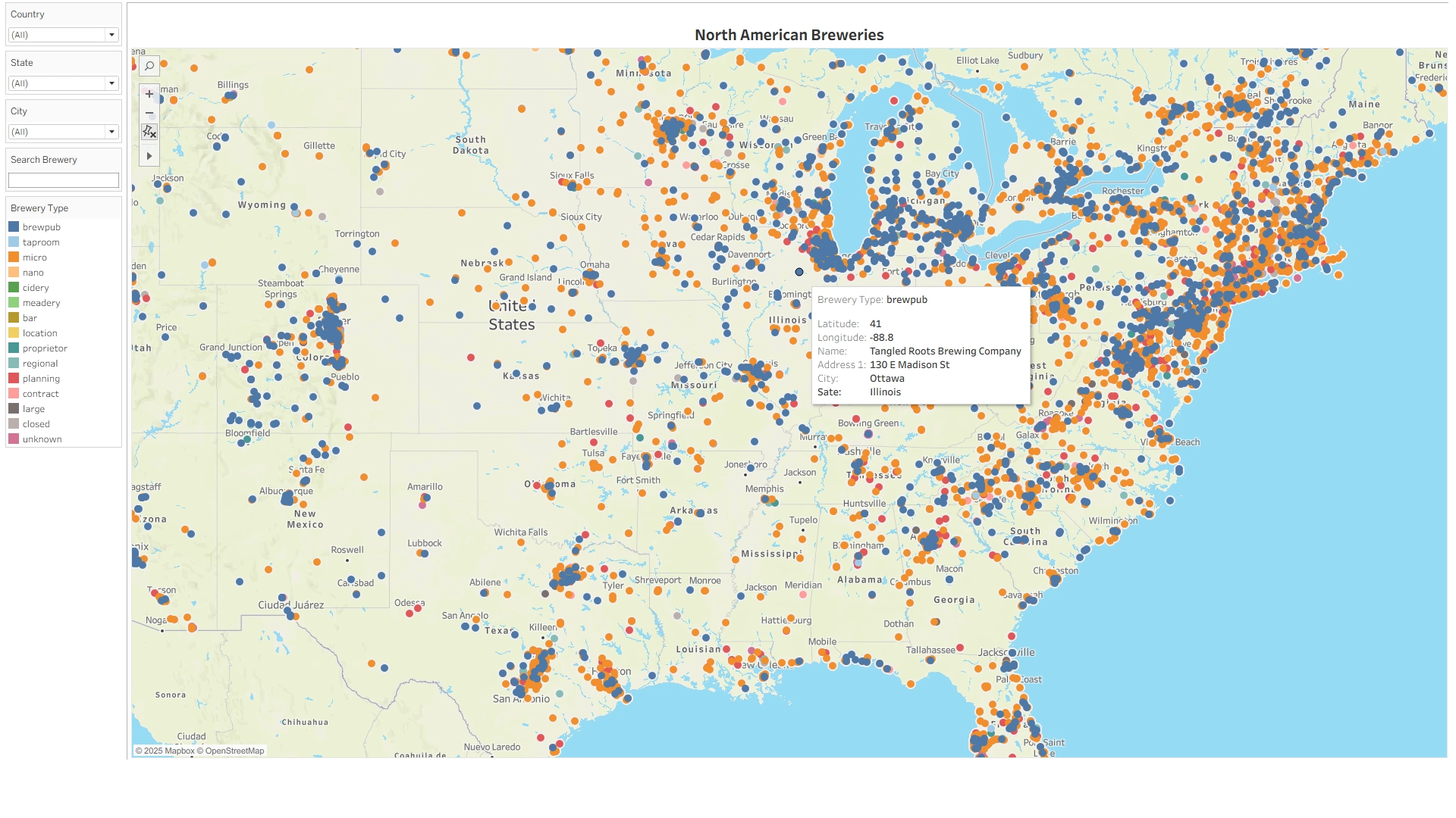
I built an interactive Tableau Public dashboard visualizing breweries across the United States and Canada. The goal was to integrate multiple open data sources into one normalized dataset and present a live, filterable map showing brewery locations, types, and key attributes. This project demonstrates how public APIs can be combined and enriched to produce clear, actionable insights through Tableau.
What I Changed
Collected and merged brewery data from OpenBreweryDB, OpenStreetMap, and Google Places APIs
Cleaned and standardized city, state, and province names, including accent and punctuation normalization
Deduplicated overlapping records and added manual corrections for missing breweries
Synced the combined dataset to Google Sheets for live Tableau connectivity
Designed Tableau visuals including:
Interactive map of breweries by type and region
Dynamic filters for name, city, and postal code
State and province-level summaries for regional comparison
Result
Delivered a refreshable Tableau dashboard allowing users to explore brewery distribution and characteristics across North America.
Enabled real-time geographic and categorical analysis through a clean, normalized data model.
Showcased the complete workflow from API ingestion and data cleaning to visual analytics and live publishing.
Tech Used
Tableau, Python, Google Sheets, OpenBreweryDB API, OpenStreetMap, Google Places API, Data Cleaning & Normalization, Interactive Maps, Filter Actions
Like this project
Posted Oct 21, 2025
Interactive Tableau map of U.S. and Canadian breweries, built from public APIs to explore locations, types, and regional patterns.
Likes
0
Views
7