Presentation Design: Merging Two Brands Into One Cohesive Story
Ali Javaid
Merging two brand identities into one seamless presentation? Challenge accepted.
❇️ The Goal ❇️
With just 12 days, I was tasked with merging two distinct presentation decks: each with its own brand identity and guidelines: into a single, cohesive 27-page presentation.
❇️ Process ❇️
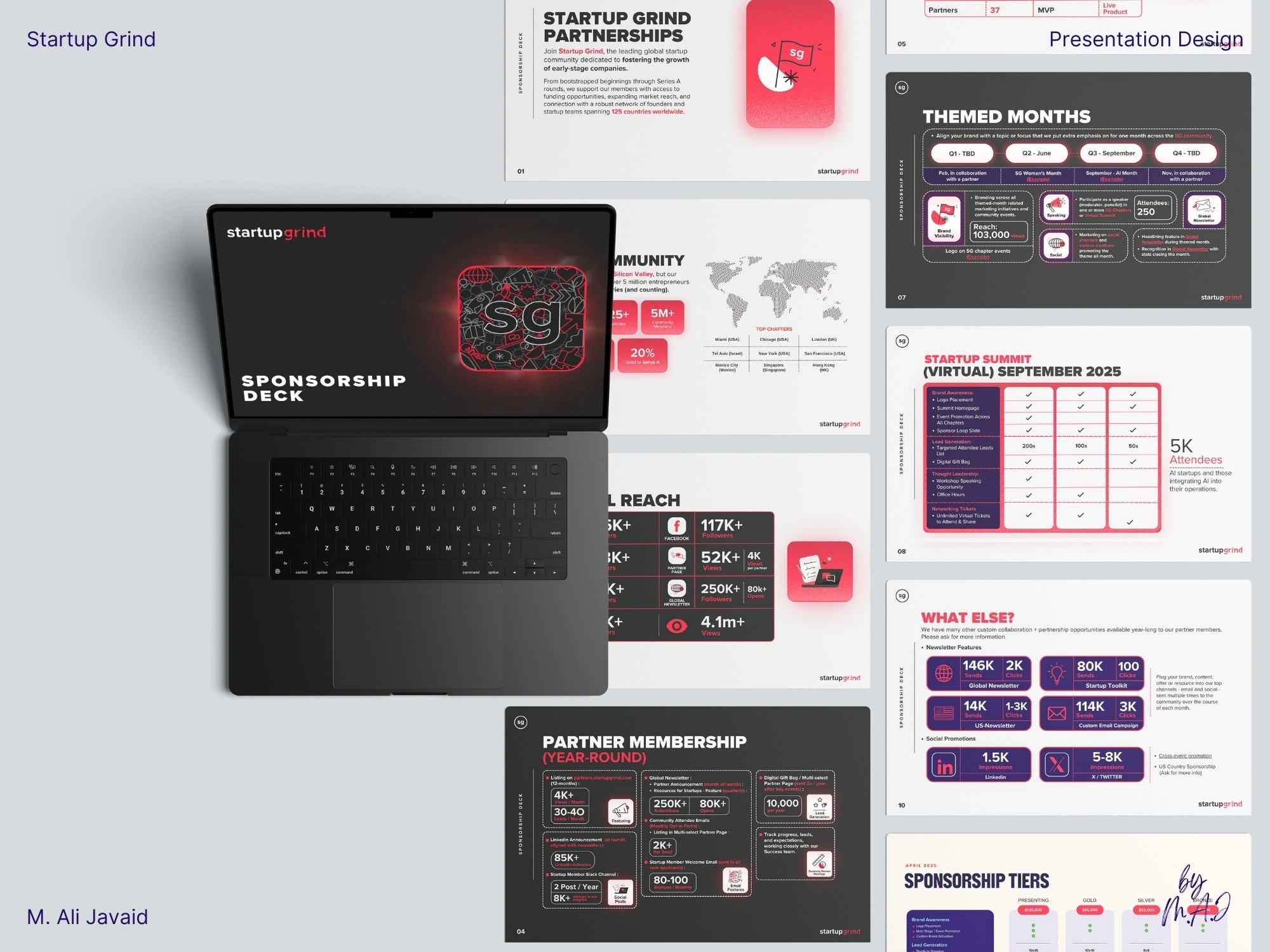
I redesign and create a smooth visual transition so slides 1–12 (brand 1) and 13–27 (brand 2) felt like a single, unified brand: no visual disconnect.
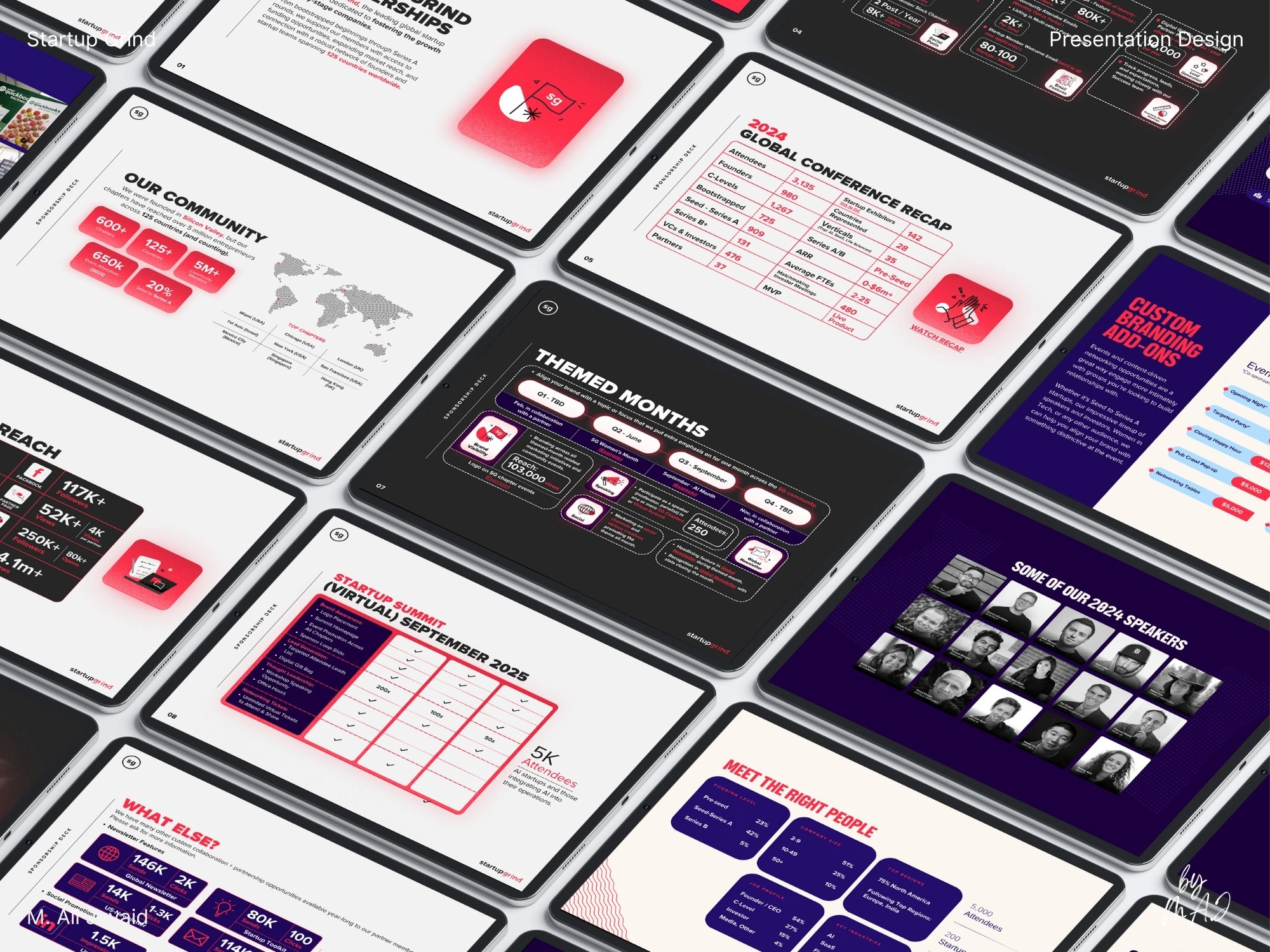
The original deck lacked energy and cohesion. I reimagined the entire presentation design: replacing flat visuals with custom graphics, modern layouts, and strong visual hierarchy.
Instead of basic color tweaks, I strategically unified two brand identities through color theory and modern custom infographics.
Both brands shared red (#FF2A45), which I used prominently in slides 1–12. From slide 8, I gradually introduced purple (#240E6C) to bridge the shift. The color shift let the second brand from page 13 take over smoothly: meeting the brief for unified design.
❇️ Results ❇️
The results: a bold, engaging presentation that looked alive, aligned, and professional: leading to a 25% spike in sponsorship inquiries.
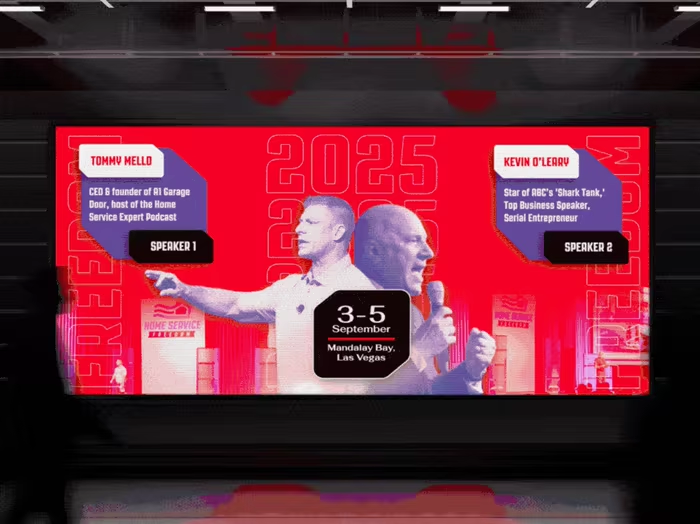
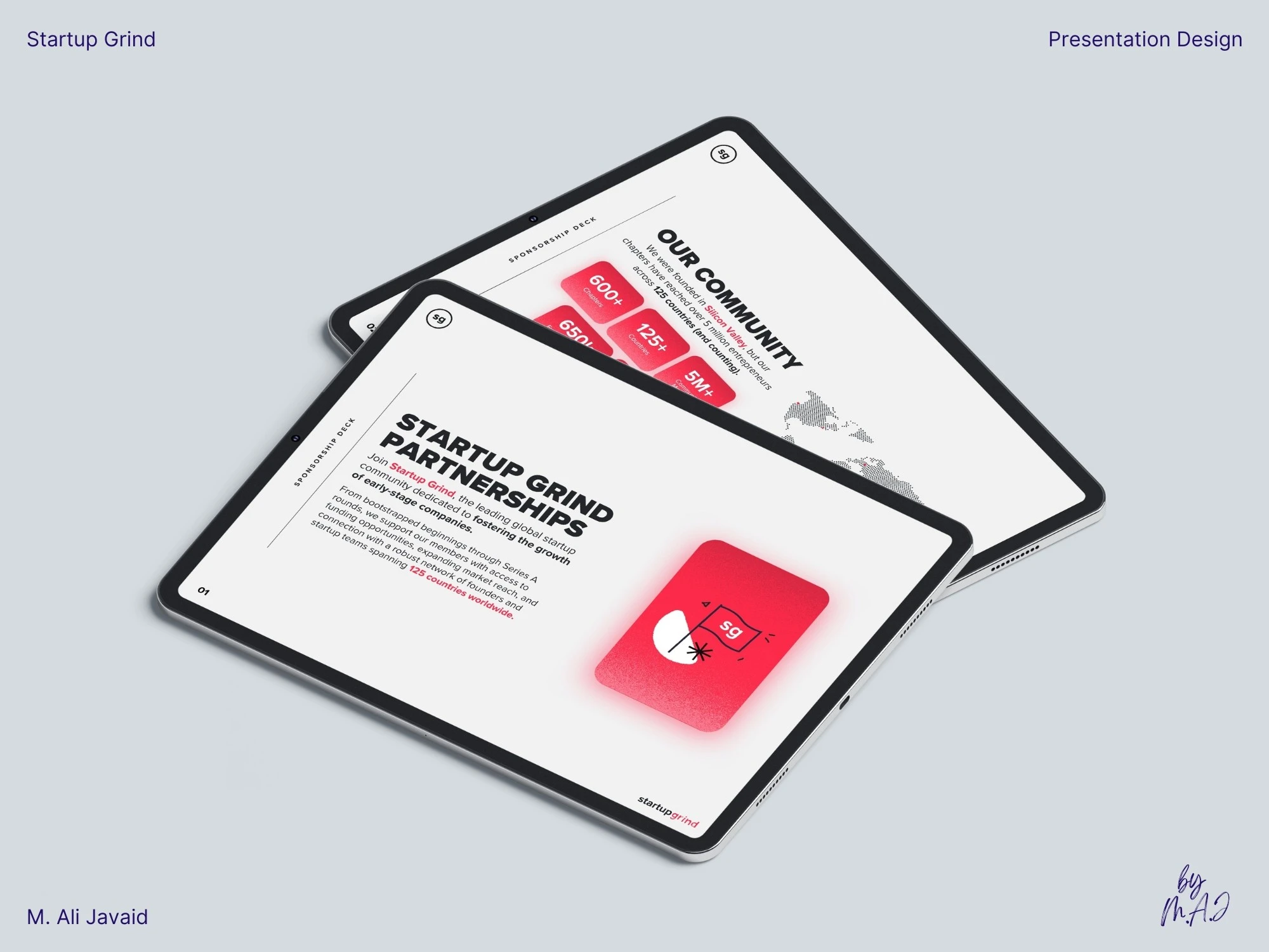
Slide: 1-9. To merge two distinct brand identities, I used red (#FF2A45: a shared brand color) : as the visual anchor across slides 1–12, setting the foundation for a unified design.
Slide 1 & 2
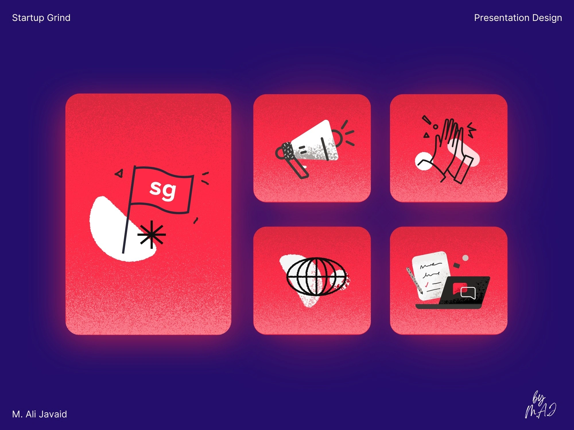
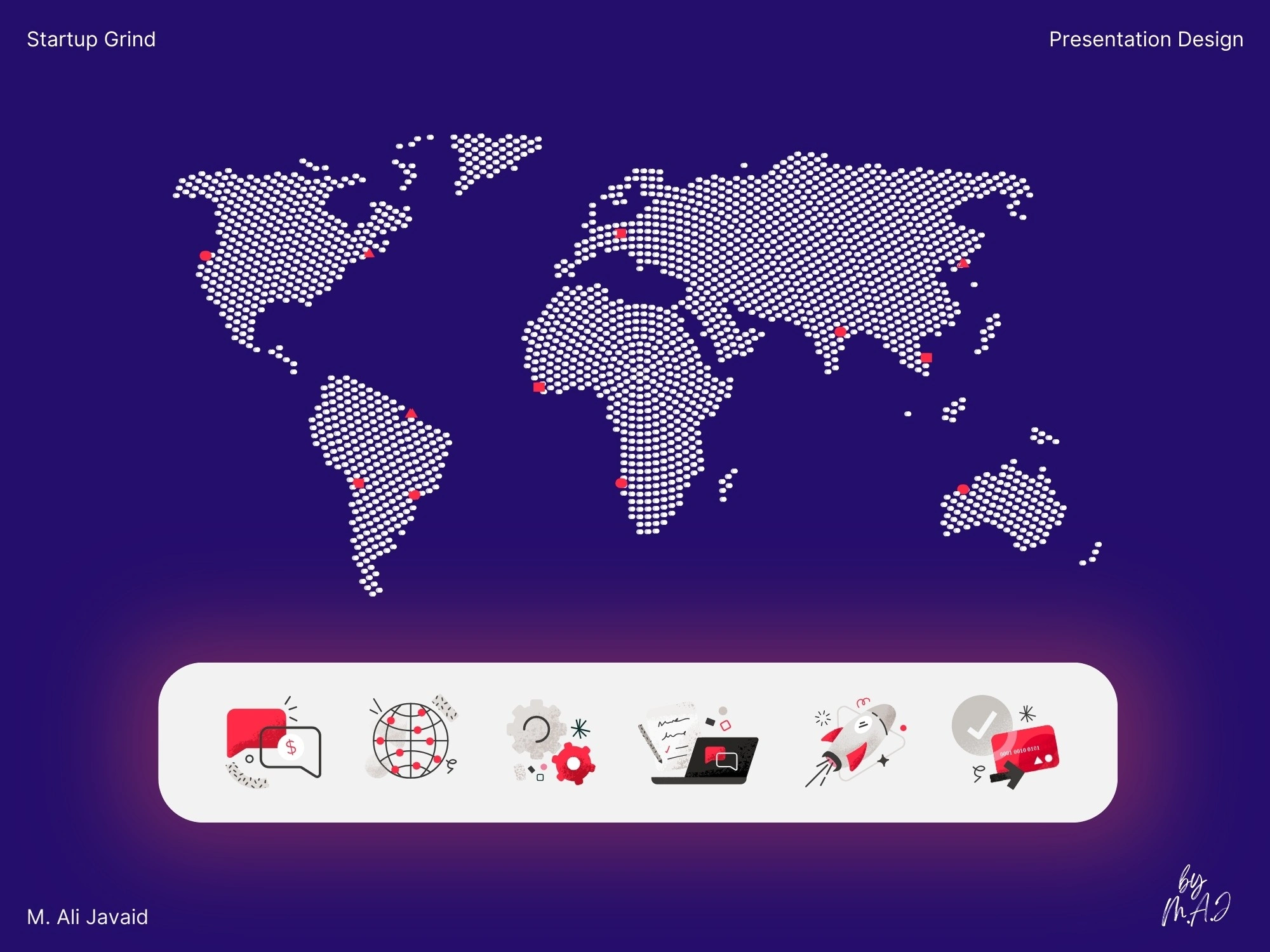
Using Adobe Illustrator, I designed custom brand elements inspired by static TV noise: adding texture, energy, and a consistent visual identity throughout the deck.
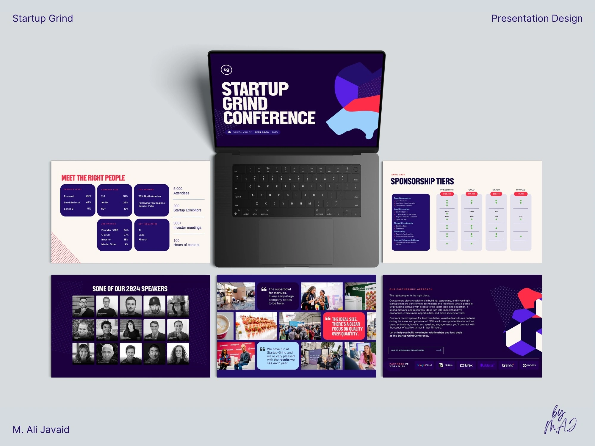
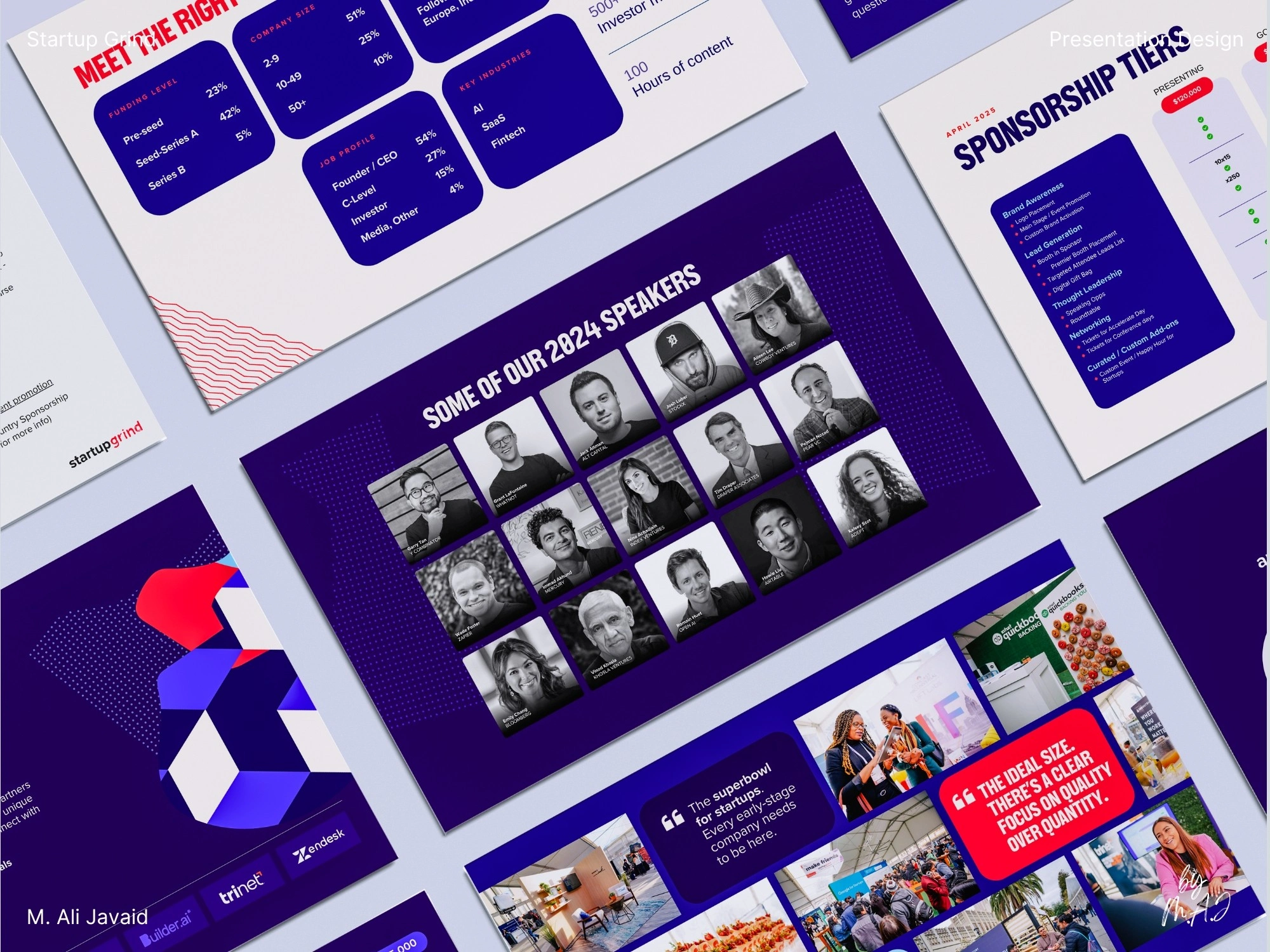
Starting at slide 8, I gradually introduced purple (#240E6C) to transition into the second brand (slides 13–27), using color theory for a smooth, cohesive shift from 1 brand into another brand.
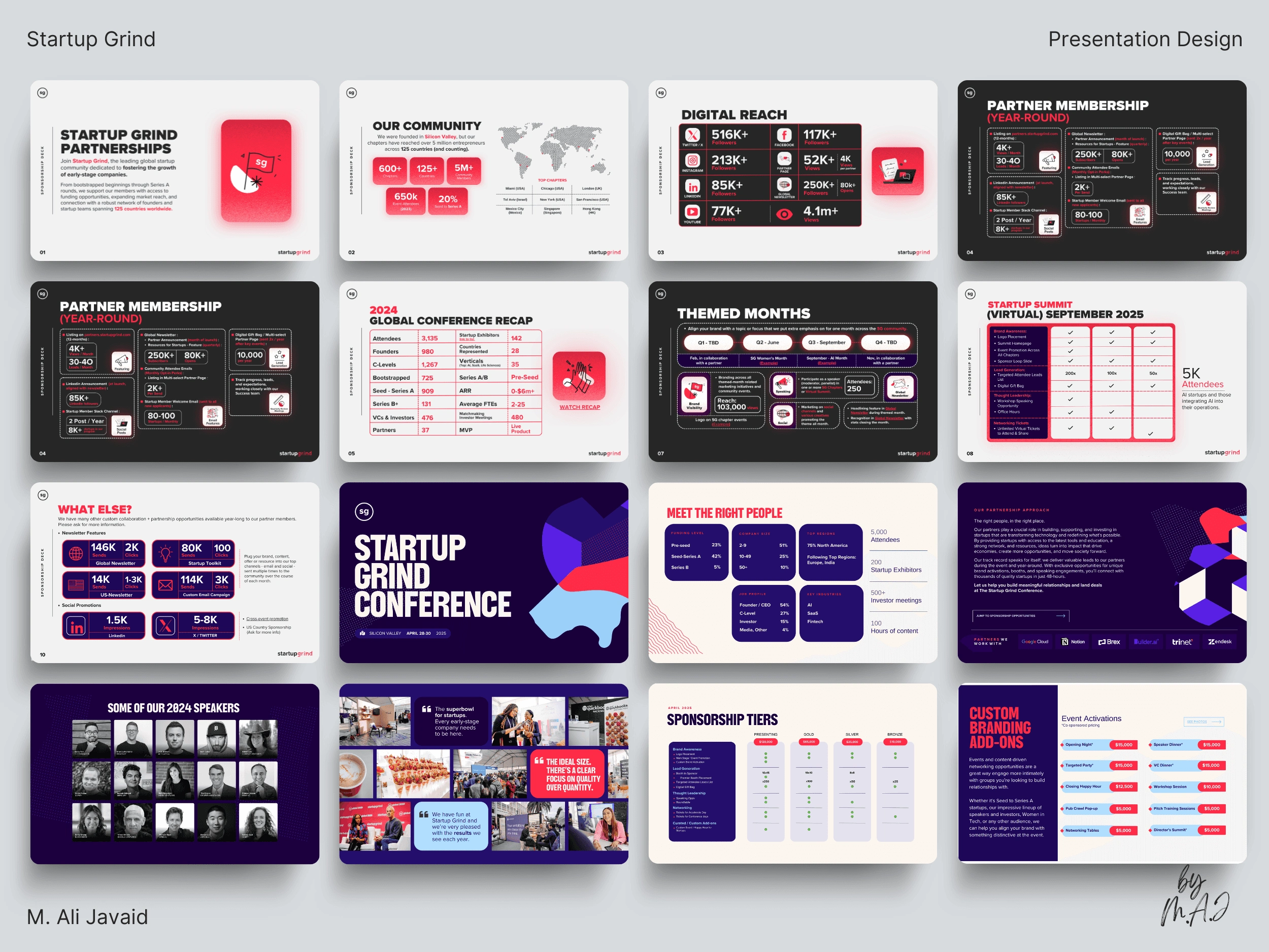
25% spike in sponsorship inquiries following the 27 pages purposefully designed, unified presentation design launch.
❇️ Project Highlights ❇️
• Met a tight 12-day deadline driven by urgent launch needs.
• Overcame the challenge of merging two distinct brands into one unified presentation.
• Delivered in Google Slides (primary) and PowerPoint with added animations.
• Used Illustrator to design brand elements and build modern, clean layouts.
• Sponsorship presentation attracted about 25% increase in partnership inquiries than last year's sponsorship campaign.
Like this project
Posted Jul 7, 2025
With just 12 days, I was tasked with merging two slide decks: each with its own brand identity and guidelines: into a single, cohesive 27-page presentation.
Likes
0
Views
5
Clients
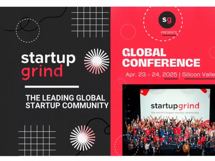
Startup Grind