SaaS Rebranding: From One Screenshot to a Full Visual Identity
Ali Javaid
Turning one screenshot into a complete rebrand? Challenge accepted!
❇️ The Goal ❇️
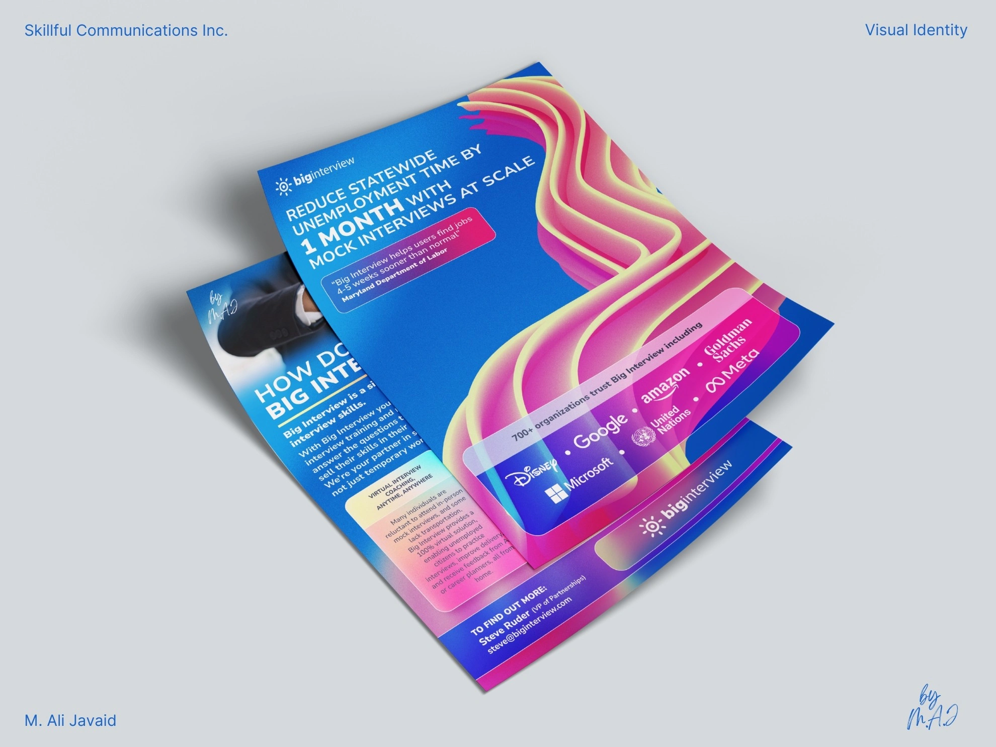
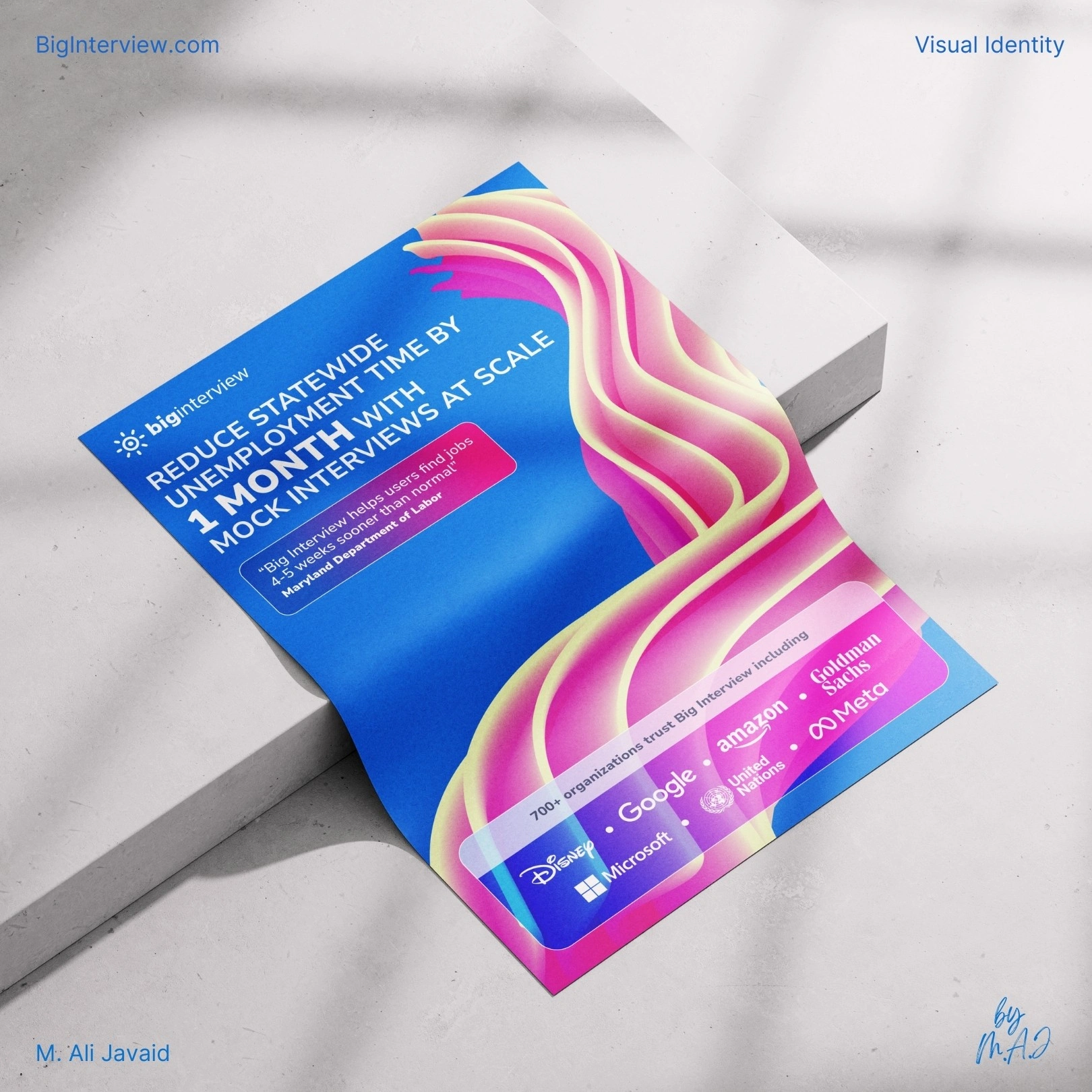
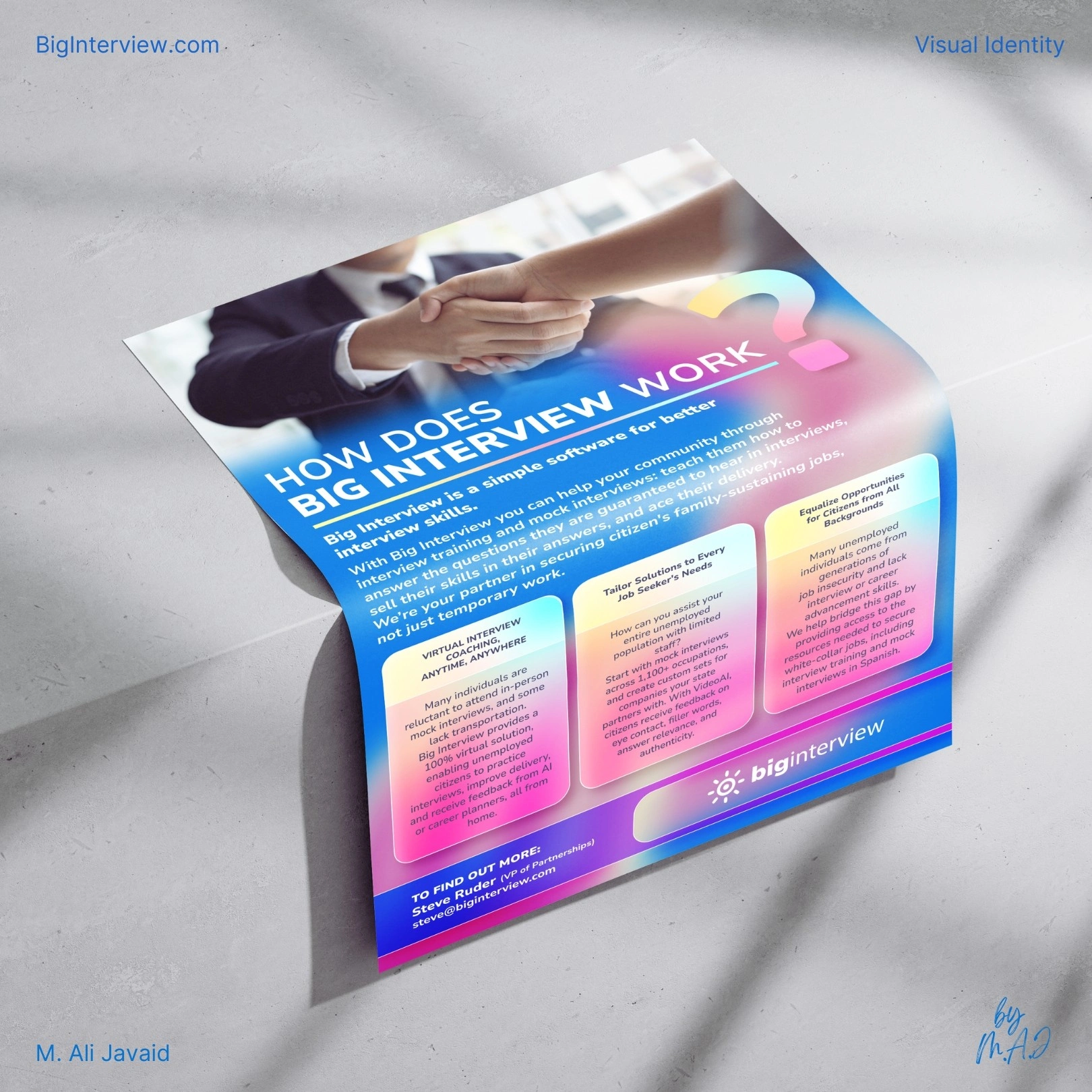
The goal was to test rebranding for a "job interview preparation SaaS-based service called BigInterview." It started with print design for conference distribution, ensuring a professional yet approachable identity.
The client’s message was clear: "Fun with colors, corporate yet not too corporate serious."
❇️ The Solution ❇️
I took inspiration from their sun-shaped logo, developing a color palette that transitions from sunrise to sunset, mirroring the 9-to-5 workday.
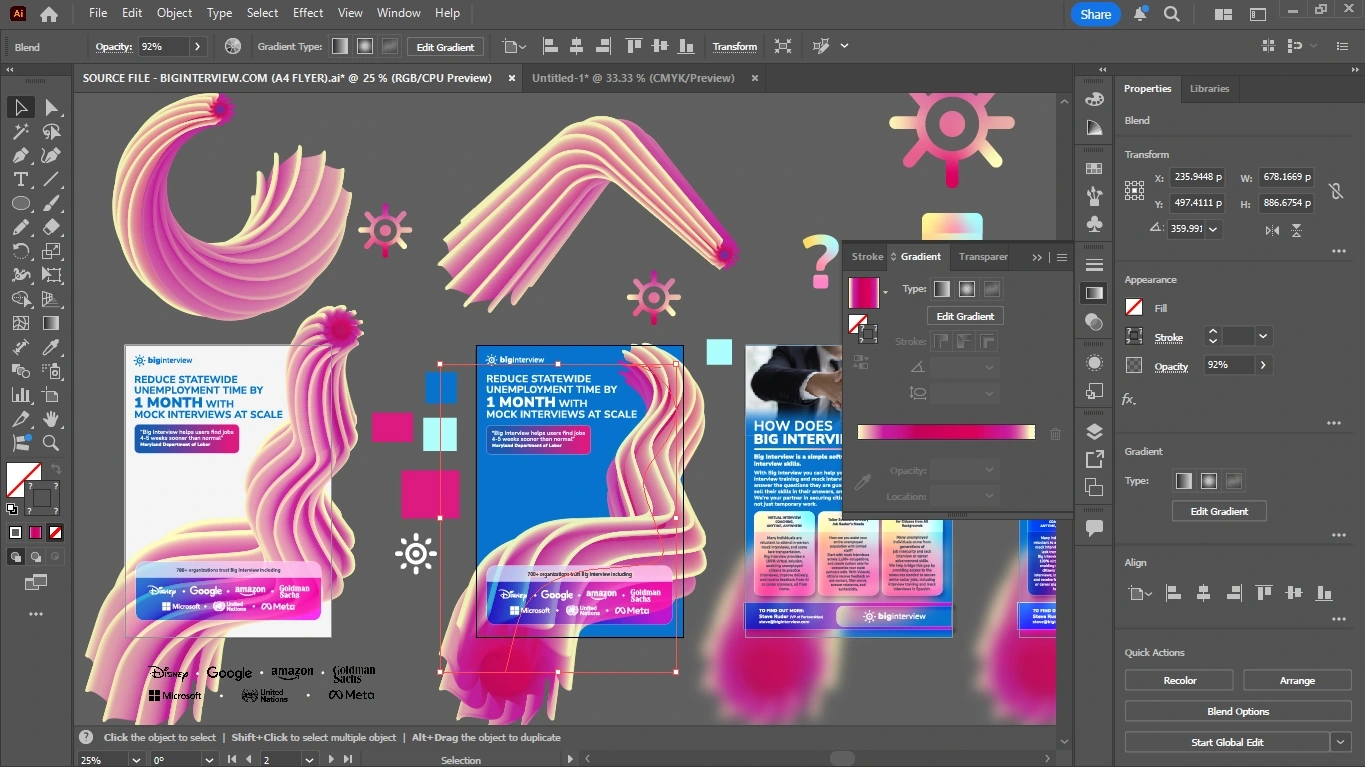
Using Adobe Illustrator, I created custom brand elements (such as 3d shapes) and a modern layout system: ensuring consistency across all print, digital, and web.
❇️ The Results ❇️
The rebranding launched with conference print materials, leading to a 45% increase in booth traffic and sponsorship inquiries. Expanding into social media and landing pages: engagement grew by 30%, while streamlined email marketing designs contributed to a 25% boost in subscriber retention.
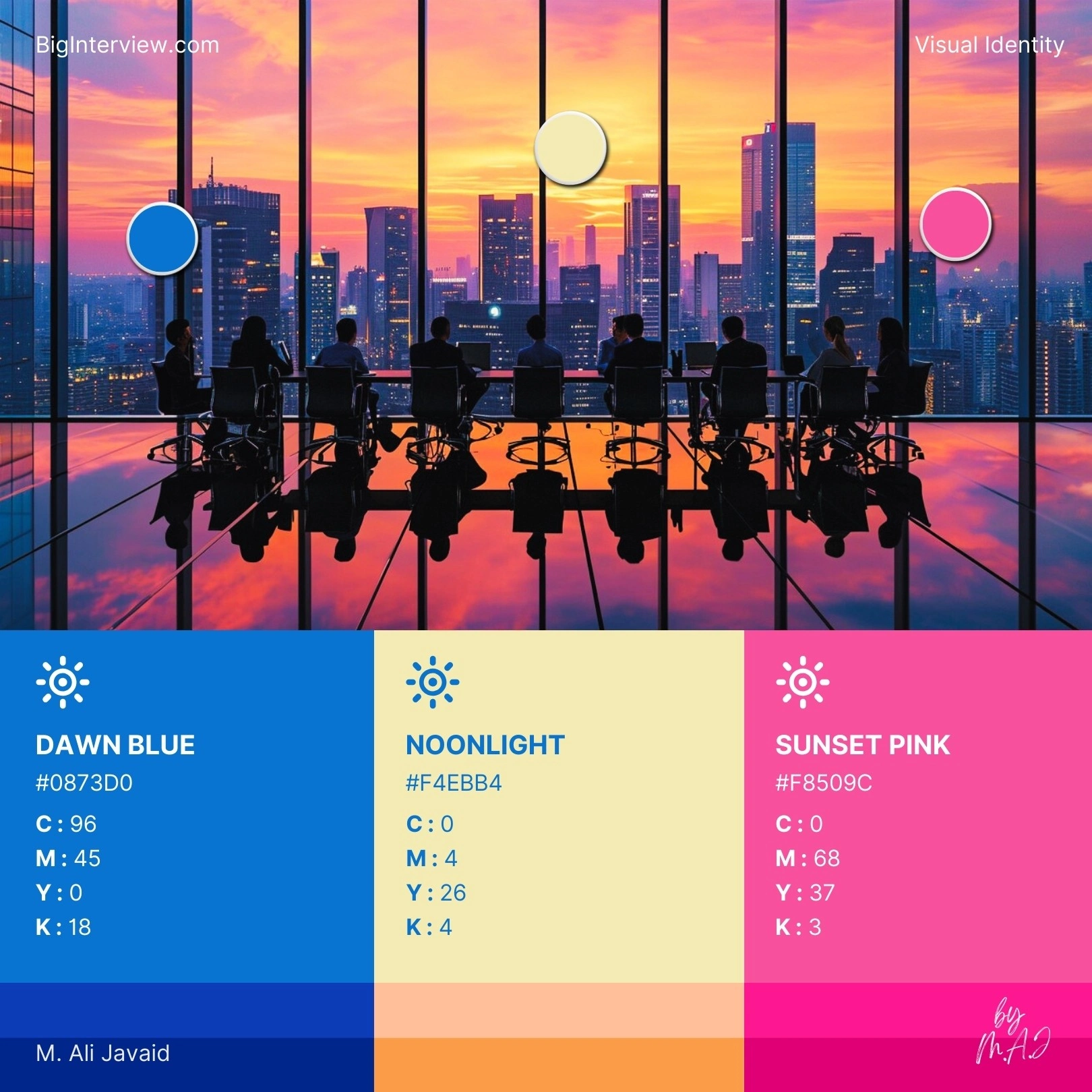
Drew inspiration from the sun-shaped logo to create a dynamic color palette that flows from warm sunrise tones to calm sunset hues: symbolizing a full, productive workday and visually reinforcing the brand’s connection to daily growth and progress.
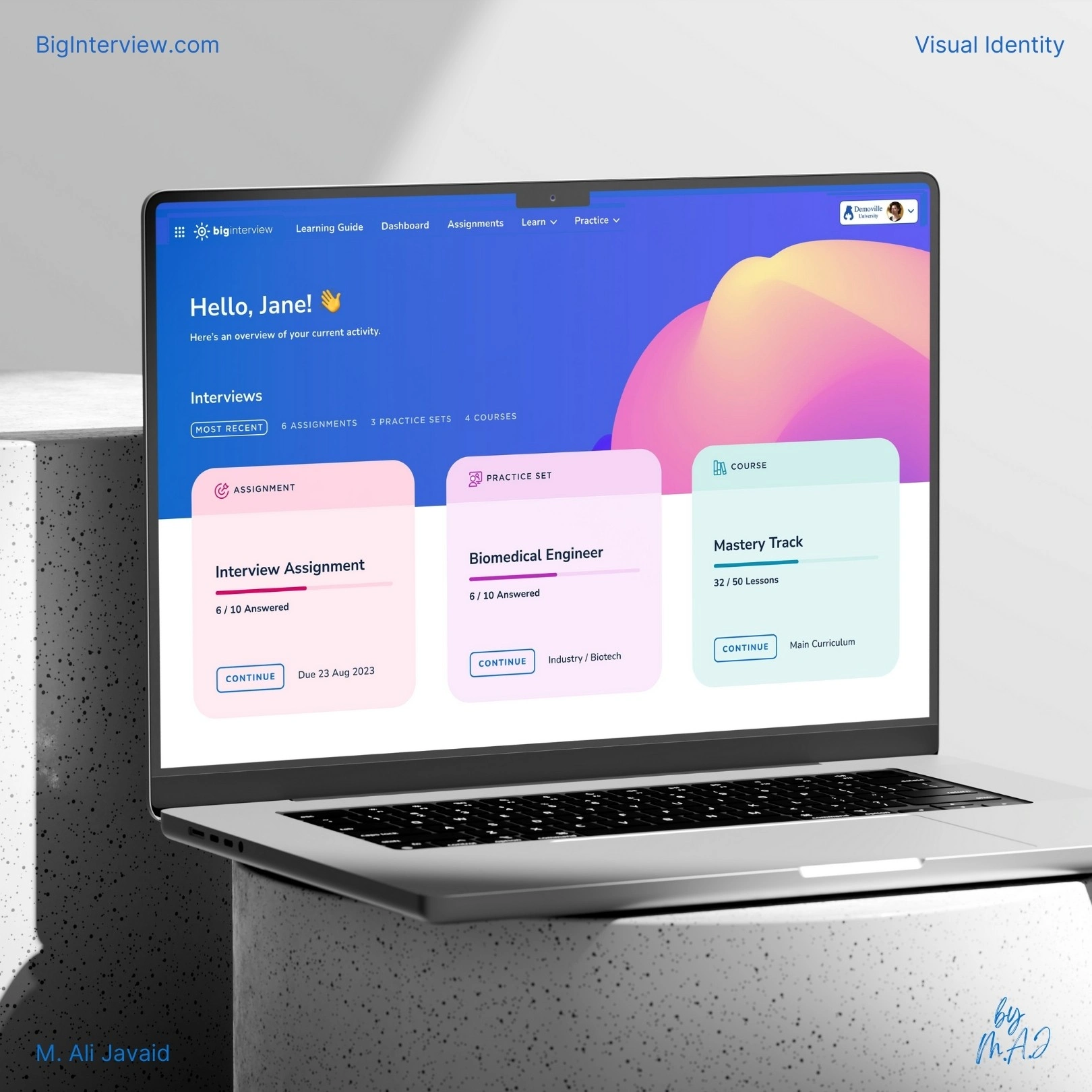
Landing Page Rebranded

❇️ Project Highlights ❇️
• Rebranded "BigInterview.com" from a single screenshot.
• Built a color system inspired by their sun shaped logo and 9-5 workflow.
• Designed custom 3D elements and modular layouts in Adobe Illustrator.
• Delivered print materials that boosted booth traffic by 45%.
• Extended visuals to landing page UI and email design to ensure consistency.
Behind The Scenes
Like this project
Posted Jul 7, 2025
Rebranded Big Interview with new visuals: color palette, 3d elements and print & UI design that led to 45% increase in booth traffic and sponsorship inquiries.
Likes
0
Views
3
Clients
Skillful Communications