46 Pages Catalog Design for NoErrors.com
Ali Javaid

What happens when a sports brand wants to stand out: without using its signature colors? That was the challenge.
In March 2023, I joined No Errors, a U.S. brand known for customizable baseball and softball gear. I started working on their full custom product line: team merchandise design, 3d mockups, marketing materials and factory discussion as a job.
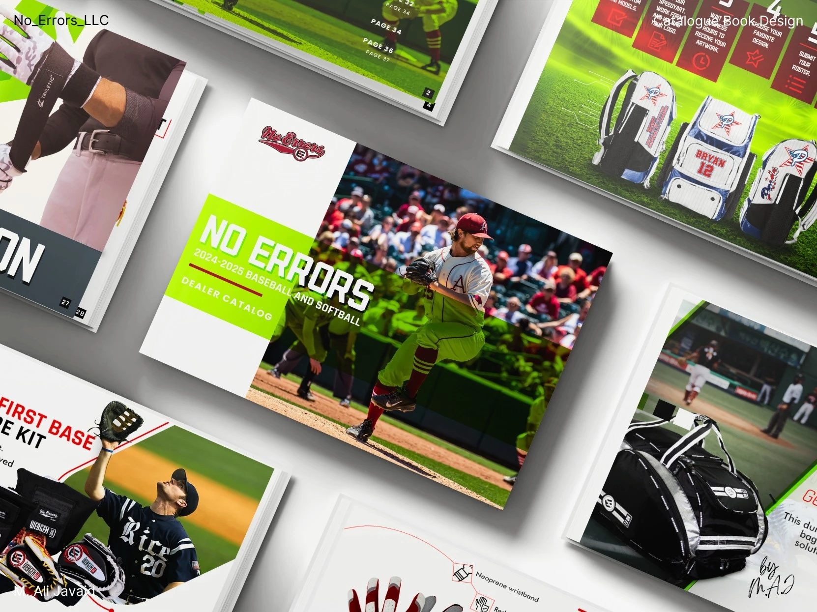
After a year and a half of working together, founder Ron Reed asked me to take on something new: a 46-page catalog book (print and digital) to showcase the brand and support vendor sales.
It was my first time designing a catalog book: but I didn’t hesitate. I didn’t see it as a challenge. I saw it as a chance to expand my experience. I replied "Hell Yeah!" (literally that was my reply :)
❇️ The Goal ❇️
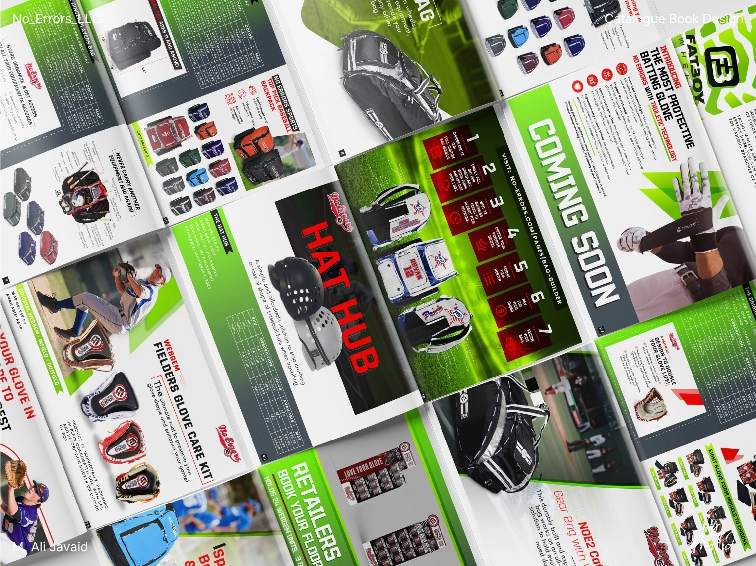
The goal: design a catalog that clearly communicates the product range, reflects the brand’s identity, and dives into each product with clarity. Ron emphasized a new visual direction: no red or blue. He wanted a fresh look that felt connected to the sport, but unlike anything they’d done before.
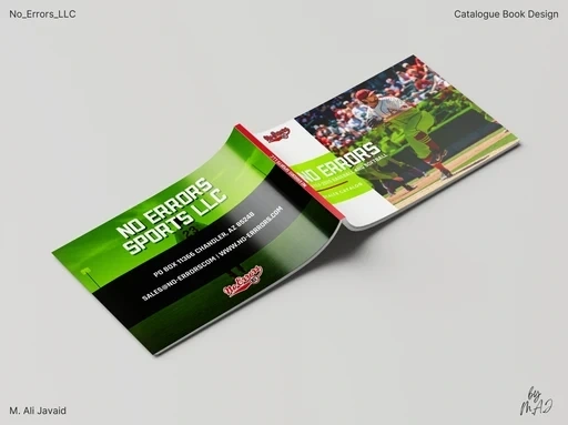
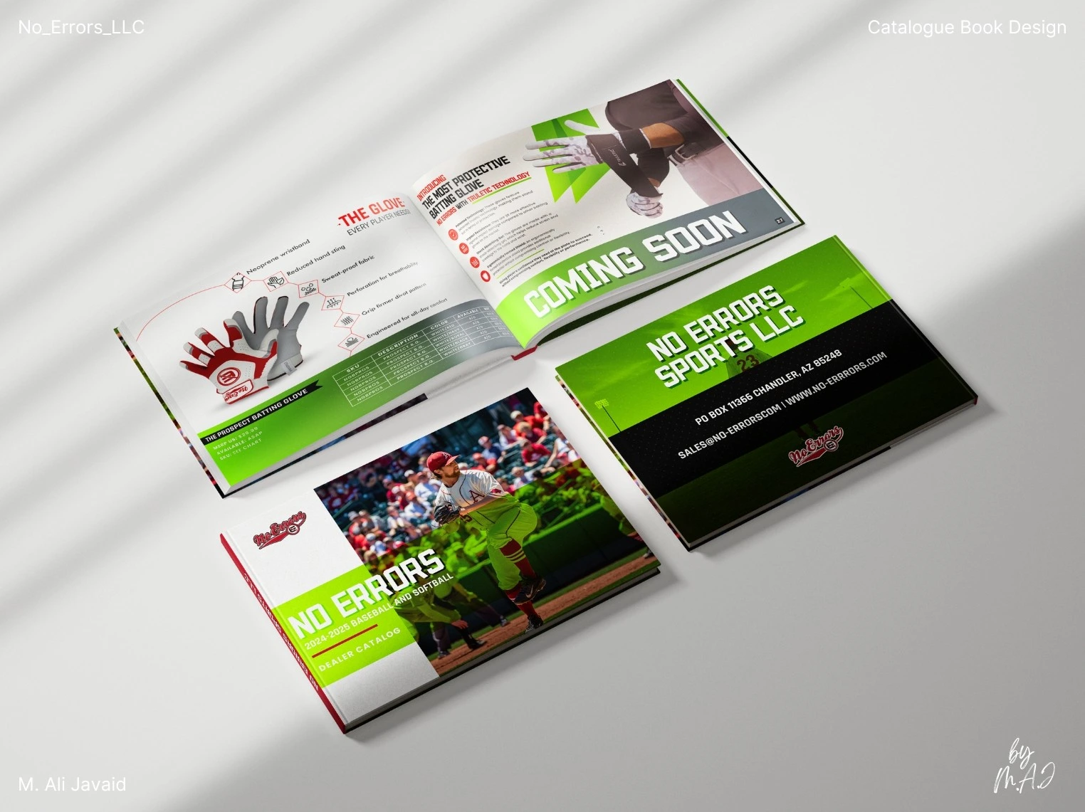
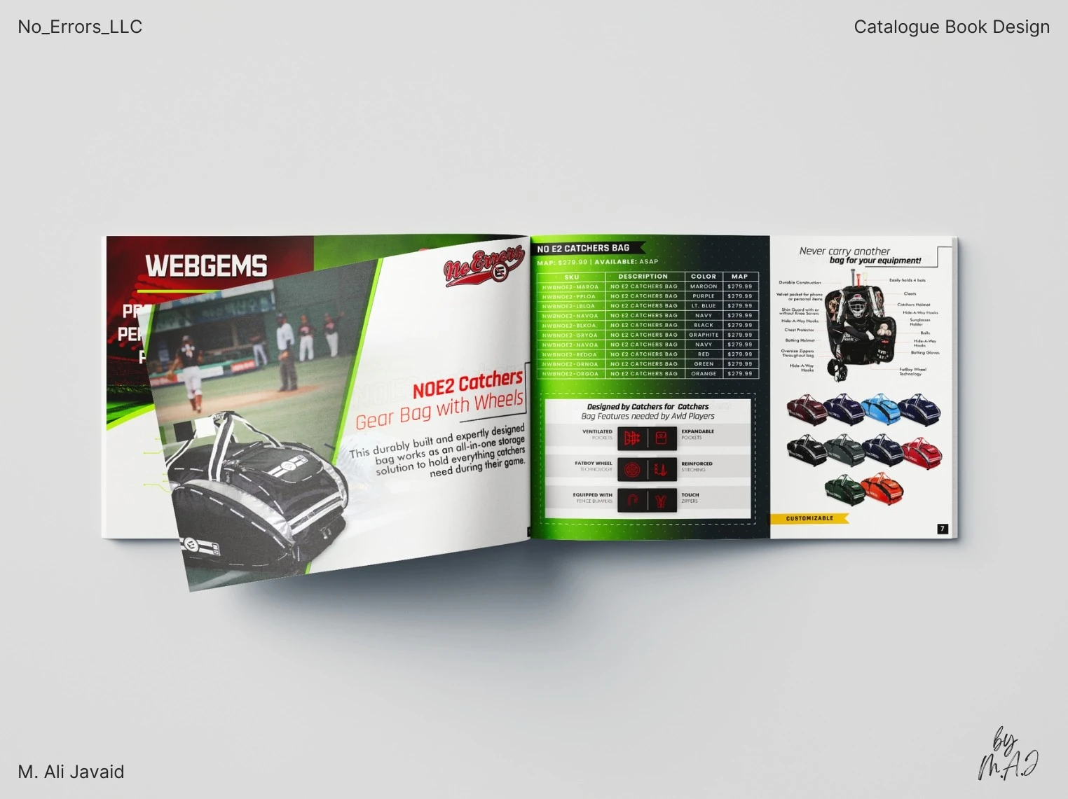
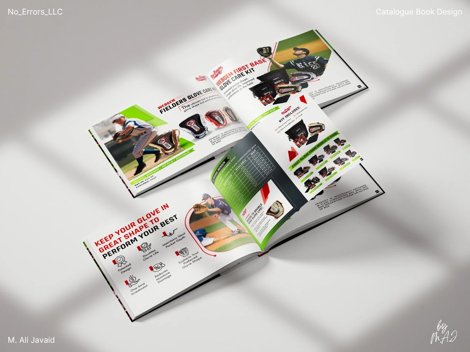
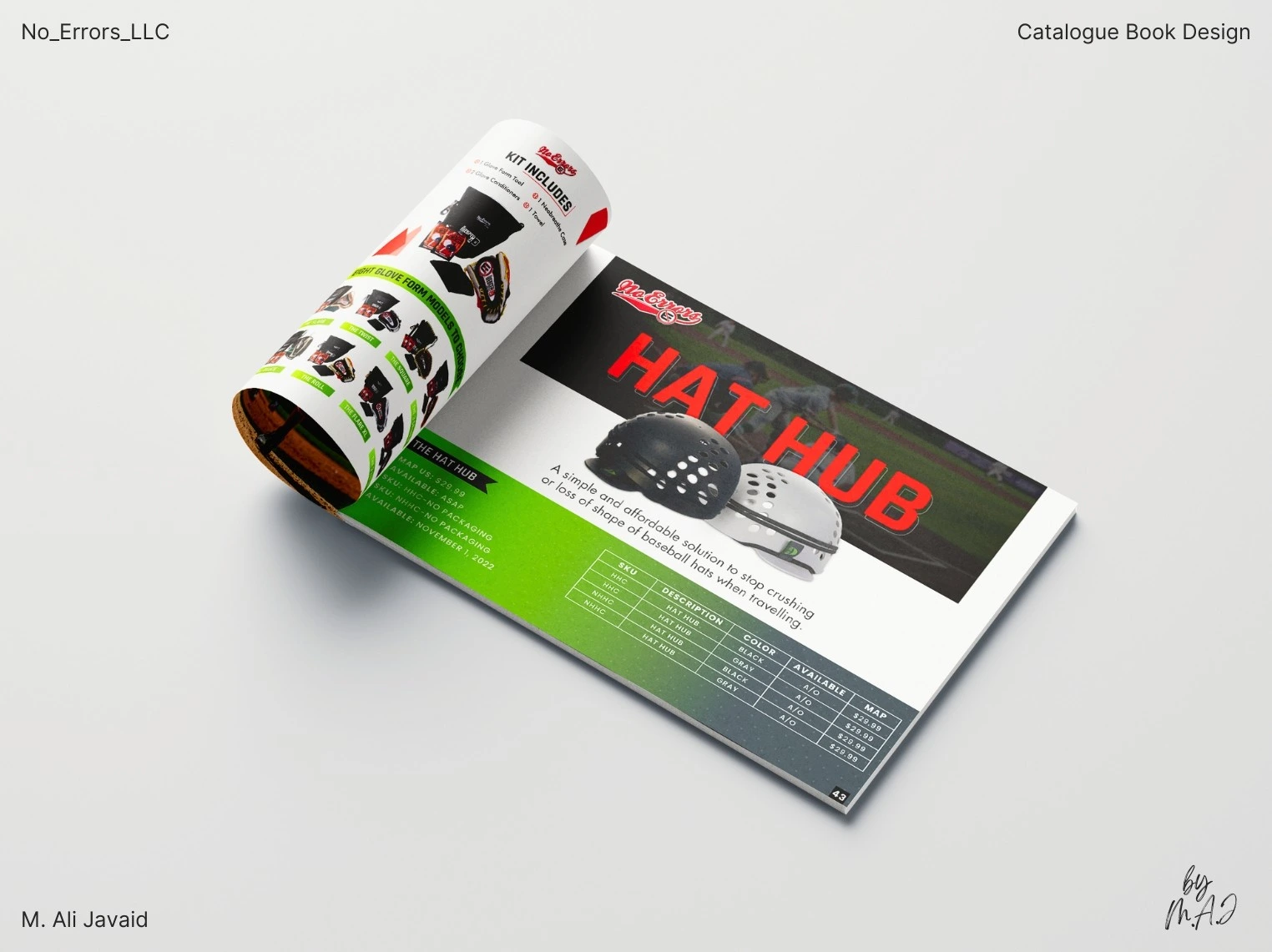
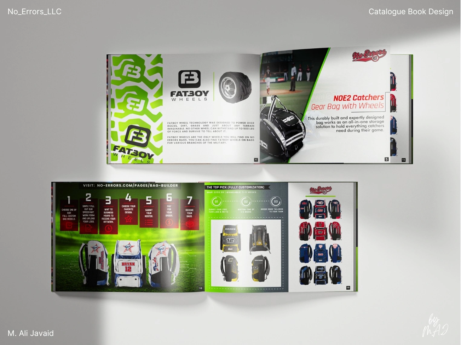
I designed the full 46-page catalog in Adobe Illustrator and InDesign, combining product visuals, detailed descriptions, and layout systems for both print and digital formats.
❇️ The Solution ❇️
To move away from the brand’s usual red and blue, I introduced a secondary color palette centered on yellowish-green (#9ACD32). This choice wasn’t random: it was rooted in the sport itself. The tone mirrors the color of softballs and the field, while large areas of white space reference the clean, minimal aesthetics of baseball uniforms. Together, the gradient blends gave the catalog a look that felt fresh, focused, and directly tied to the world No Errors serves.
While working on the catalog, I continued leading the custom product line. Acted as both designer and project manager: team merchandise design, tracking timelines, communicating with factories, ensuring CMYK/Pantone accuracy, and approving test prints from start to finish.
❇️ The Results ❇️
Results: Full custom product line generated $82K+ in year one, doubling to $175K+ in year two. Helped open new vendor relationships and boost sales reach. Achieved record-high customer retention and repeat sales from 2023 - present.
❇️ Project Highlights ❇️
• First time challenge of designing a catalog book.
• Handled catalog and product line design simultaneously under tight timelines.
• Introduced #9ACD32 to replace standard brand colors.
• Used Illustrator and InDesign to create clean, print-ready layouts.
• The prioritized PDF version became a central part of the design process: not just as a digital copy, but as a tool for vendors: easy to send, quick to open, and more sustainable than print alone.
Like this project
Posted Jul 7, 2025
Designed a 46-page catalog for No Errors, enhancing brand identity and boosting sales.
Likes
0
Views
6
Timeline
Mar 1, 2023 - Sep 1, 2024