Freedom Event 2025 Visual Identity: Branding Event's Adrenaline
Ali Javaid
BRANDING "THE ADRENALINE" OF FREEDOM EVENT 2025 Through Marketing Materials
Home Service is gearing up for Freedom Event in Las Vegas, August 2025.
My task was to create promotional materials using the existing brand colors.
❇️ The Goal ❇️
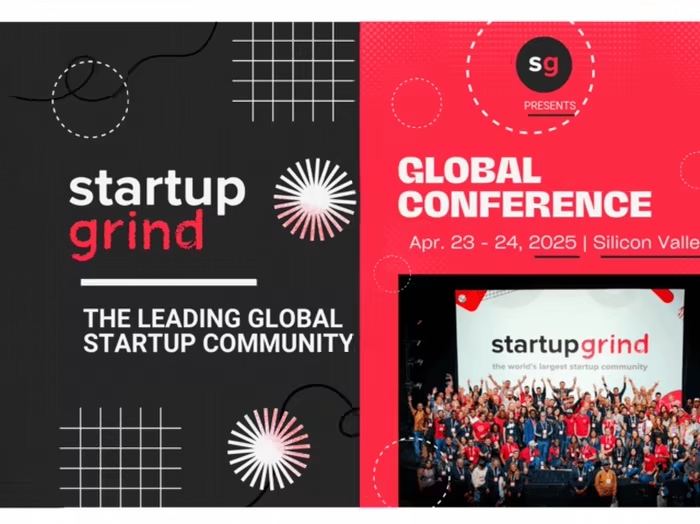
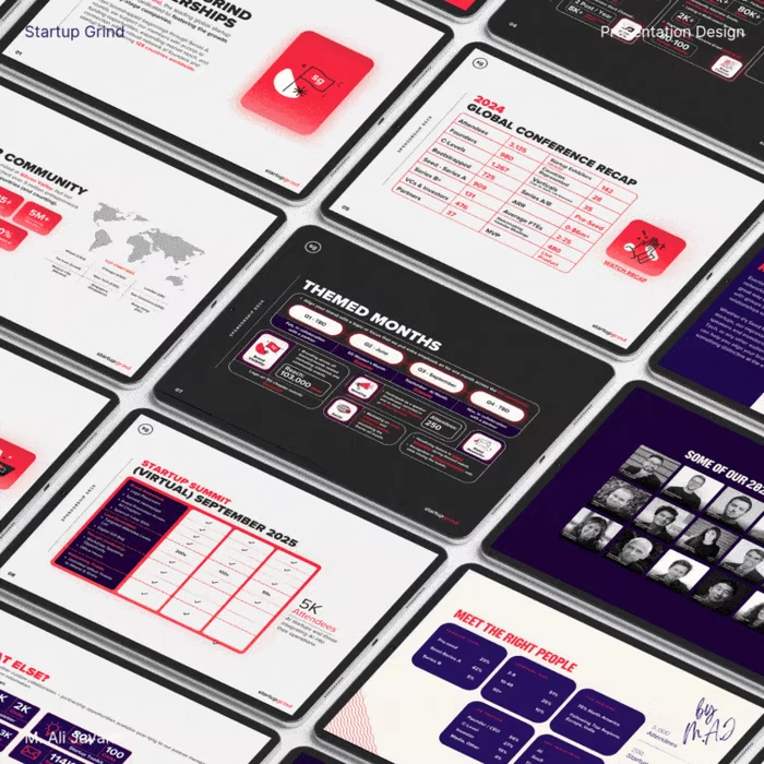
With hands-on experience of marketing conference events (like startup grind before), I noticed past Freedom Event promotions all looked the same: clients couldn’t tell difference from each year's event.
The goal was to build a new cohesive visual identity that feels fresh and dynamic across social media, print, and all marketing materials: while still respecting the event’s history.
❇️ Solution ❇️
While researching event branding, I read "Jason Wyman’s article on Sans Serif", which explains how repeating the same conference visuals each year dulls audience energy. I shared this insight with stakeholders, who agreed a fresh approach was overdue.
• One comment online described the Freedom Event as a space “where champions of the industry collaborate: not for profit, but to teach, inspire, and empower.” That line pushed me to design a bold, high-energy identity: using only existing brand colors, and building a sporty visual language from scratch (no proper guidelines).
• I used duotone palettes and curved, angled elements to evoke motion, urgency, and adrenaline: mirroring the high-stakes tone of the event without losing clarity.
• Bold sans-serif type and tight hierarchy gave structure to the visual noise: keeping things readable across print, digital, and outdoor formats.
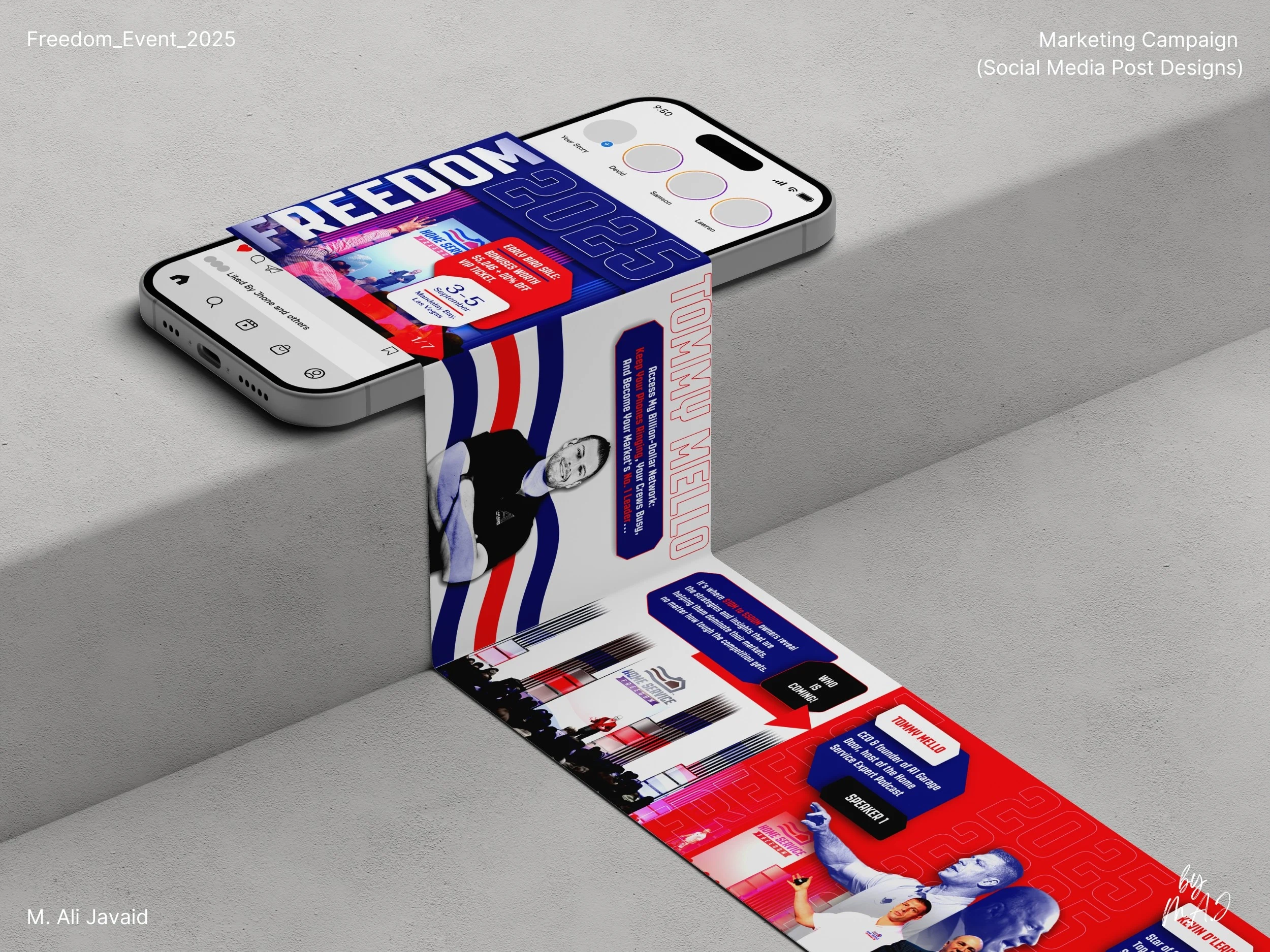
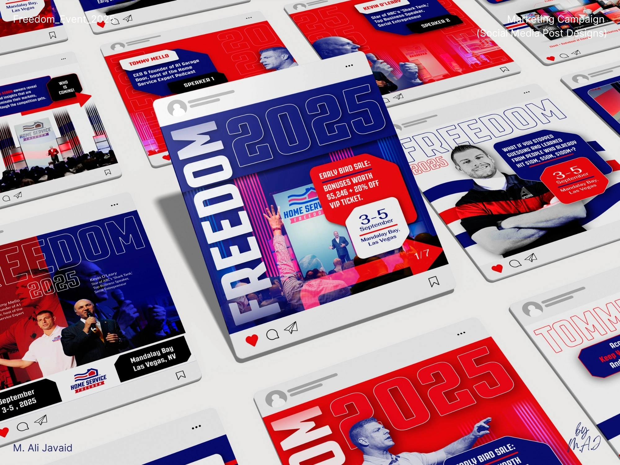
Carrousel Design (1:1 aspect ratio, 1080 x 1080 pixels)
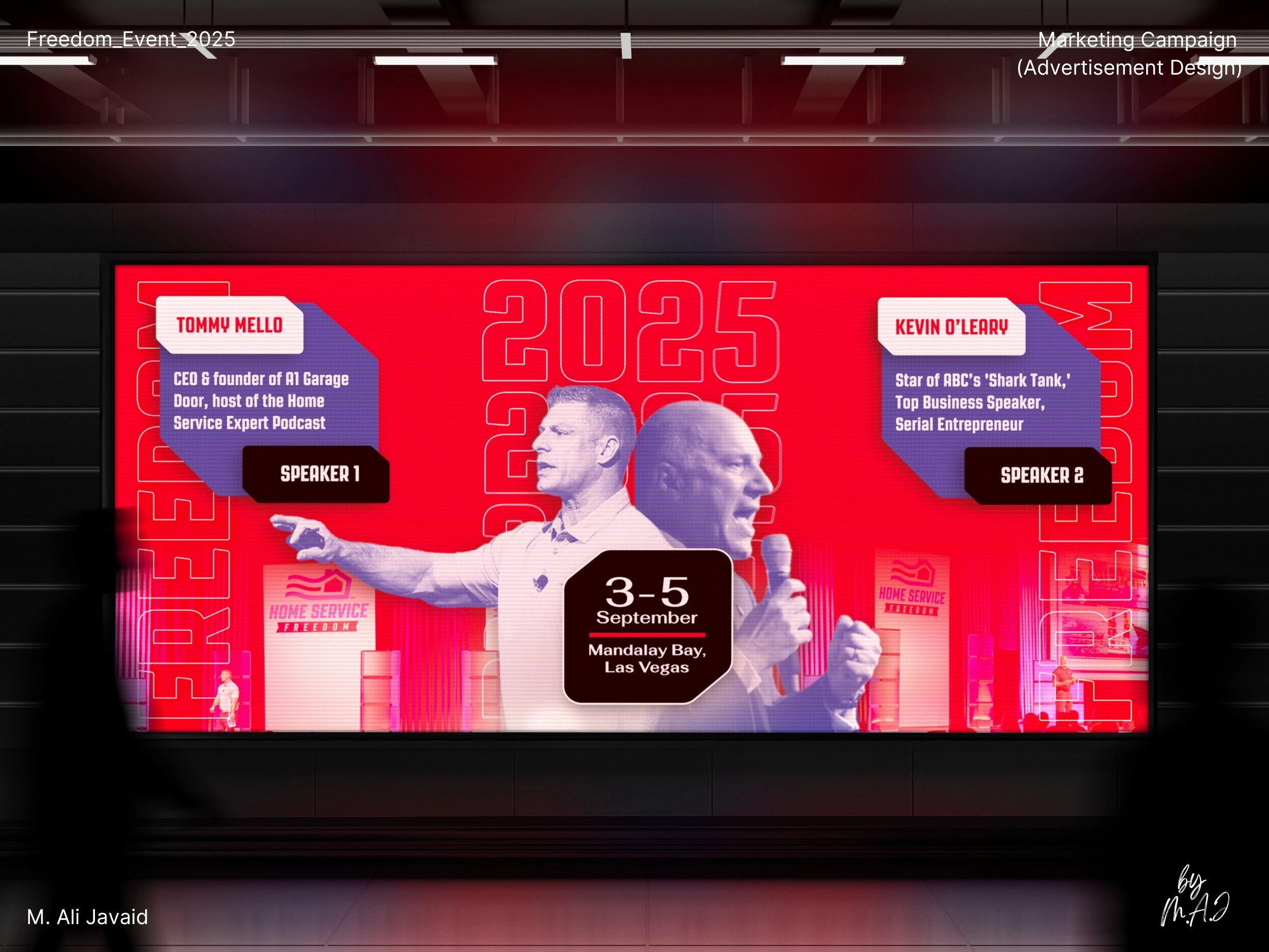
Ad Design 1
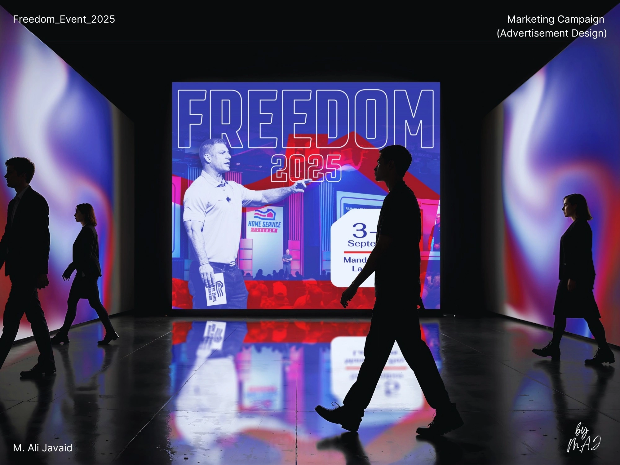
Ad Design 2
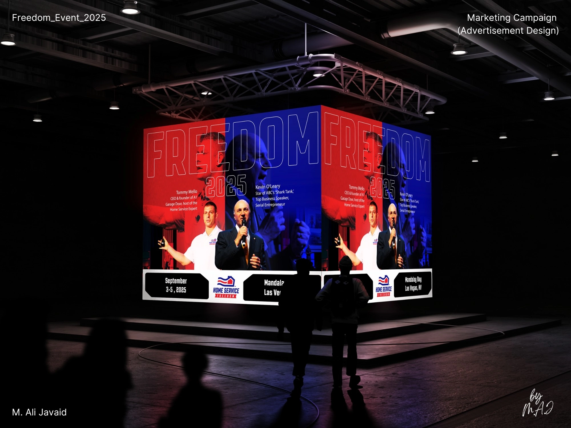
Ad Design 3
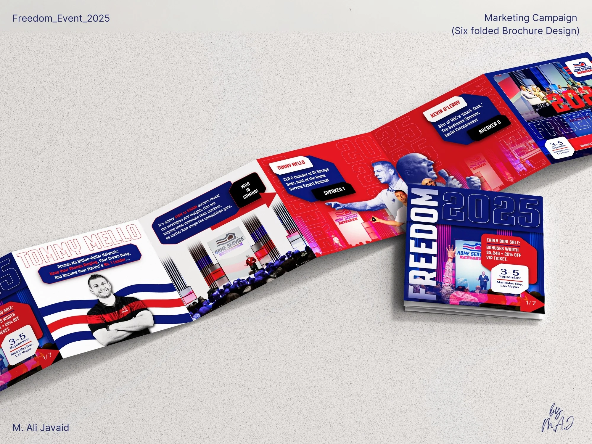
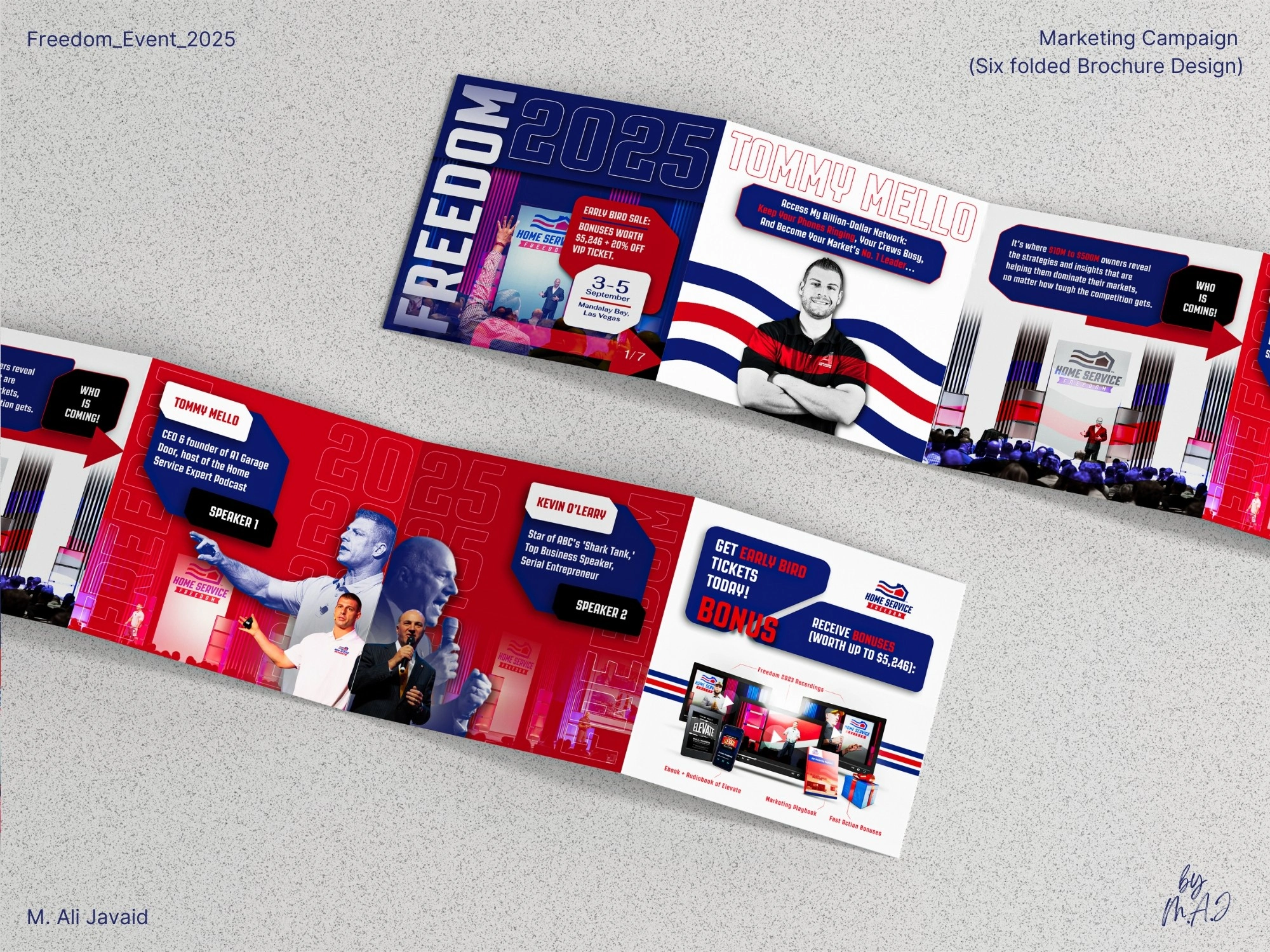
Print Design: 6 Folded Brochure
❇️ Poject Highlights ❇️
• Created a fresh visual identity using only existing brand colors (no branding guidelines)
• Shaped high-energy, sports-inspired visuals based on real attendee insights/experience.
• Designed with consistent visual identity across print, social, and outdoor formats.
• Advocated for changing yearly conference visuals: backed by design research on visual fatigue and brand freshness by "Jason Wyman’s article on Sans Serif."
Like this project
Posted Jul 7, 2025
"BRANDING THE ADRENALINE" OF FREEDOM EVENT 2025: Developed a new visual identity for Freedom Event 2025 using existing brand colors.
Likes
0
Views
5
Clients
Home Service