An extensive design system
Sarassola
A design system that behaves like a product spine
A shadcn ui and Tailwind token driven system that keeps teams aligned from file to repo
The problem it solves
I kept running into the same wall on product teams. Tokens lived in one place, components in another, docs in a third, and everyone hoped the handoff would align by magic. So I built a system on shadcn ui that acts like a single spine. It gives one place to think, design, and ship without guessing what lives where.
How it is built
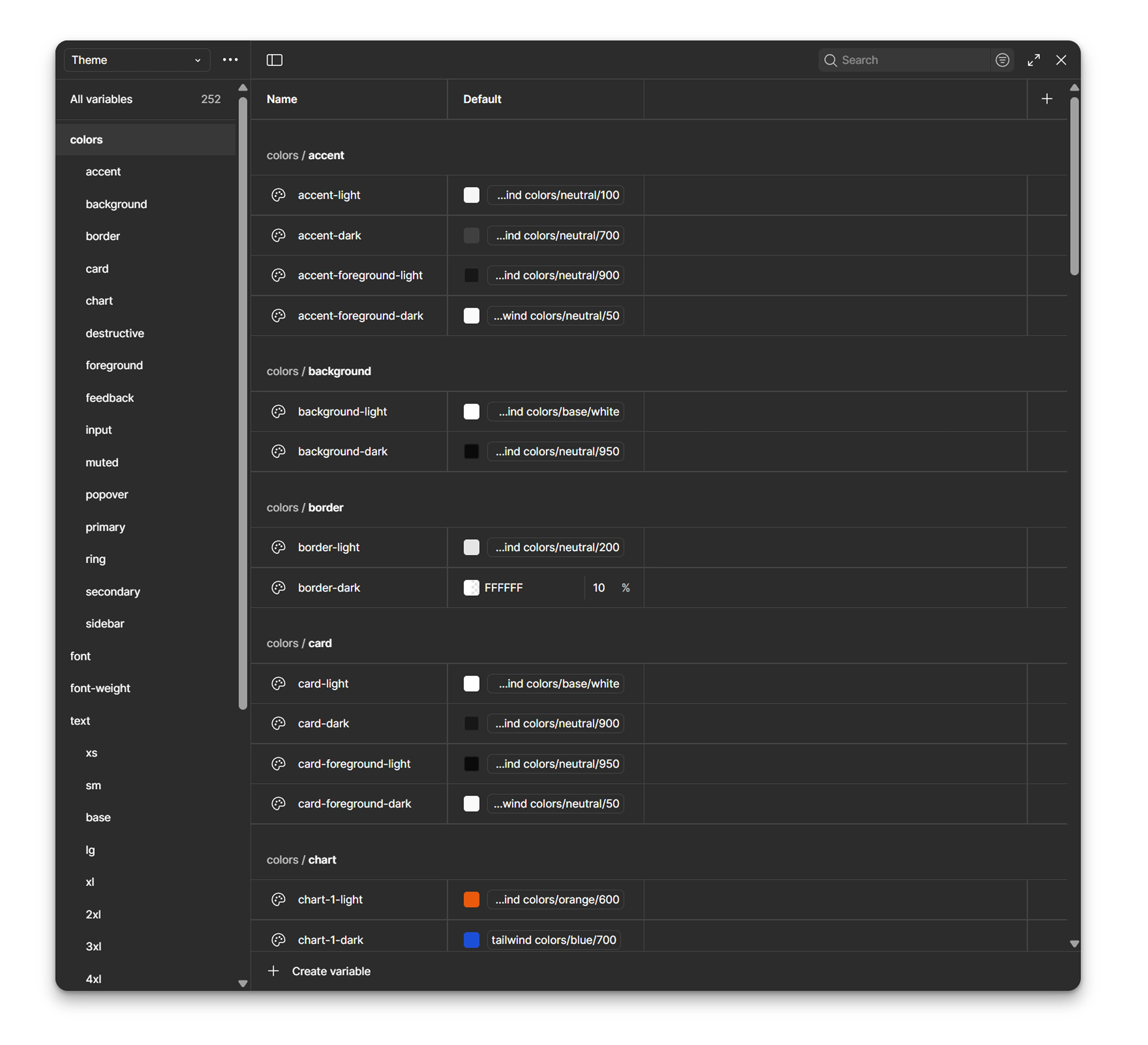
Foundations that set the tone
Color is defined as semantic roles that hold in light and in dark. Spacing follows a steady rhythm that keeps density predictable from tiny mobile screens to data heavy layouts. The type scale carries presence in headings and stays clear in labels and inputs. Elevation and radius support structure rather than decoration. This is the steady pulse the rest of the product depends on.
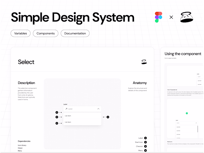
Components that grow up for real use
Components start with shadcn primitives and then go further. Variants and sizes are there from day one. States like hover, focus, loading, pressed, and disabled are designed and documented with the same care as the default state. Icon only cases ship with proper labels and focus behavior. The button shows the full recipe from props and copy guidance to a simple path for adding a new variant without breaking the set.
The same structure carries to inputs, selects, dialogs, sheets, toasts, tabs, and pagination so teams stop reinventing the same details every sprint.
Icons and type that set the voice
The icon set keeps a stable stroke and optical balance with names that developers can predict. The typography choice favors clarity in the interface first and character second. The scale pairs with sensible line heights so long copy breathes while labels stay compact.
Microcopy guidelines keep actions direct, errors human, and empty states useful to reduce mental tax on every click and line of text.
Accessibility designed in from page one
Contrast holds in every state and theme. Focus styles stay visible on light and on dark. Touch targets match real fingers. Screen readers receive proper roles and labels by default. Accessibility is not a late checklist. It is the default.
Theming that is fast because it is token first
Light and dark switch cleanly. A new brand means defining a small set of variables rather than touching every component. If a team needs a high contrast theme the system keeps meaning and readability intact. Multi brand work becomes planning rather than a rewrite.
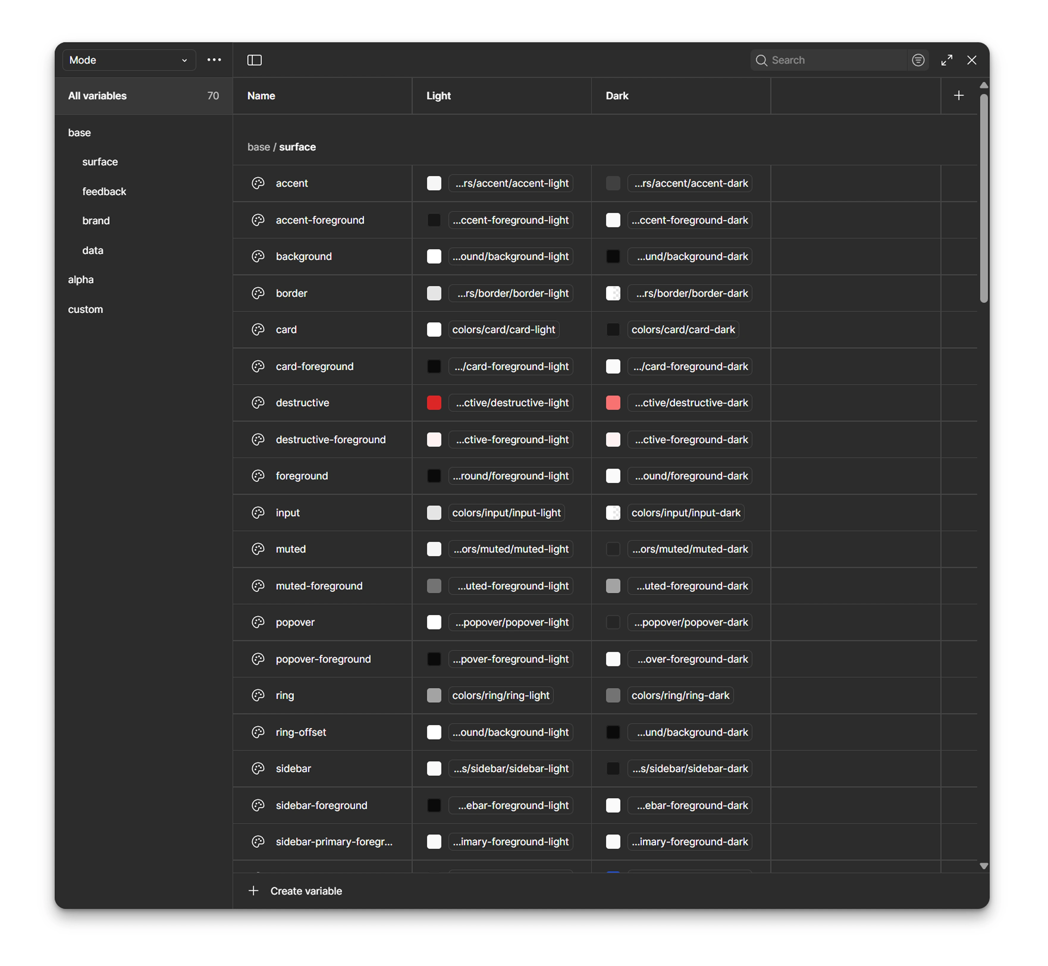
Library and handoff that stay close to the work
Everything ships as a Figma library with inline documentation. Designers and developers see structure, props, states, and usage where they are working. Tokens map one to one with Tailwind which makes handoff predictable. Changes are easy to validate with quick visual tests. You can publish it, reuse it across files, and extend it without breaking the core.
How it behaves in practice
Teams theme it in minutes, stay consistent without heavy policing, and hand off patterns that read the same in the repo as in the file. It looks clean because it is built right. If you want to see the approach live I am happy to share the library and walk through how we would tune it to your stack.
Built on shadcn ui. Driven by tokens. Designed for real product work.
Like this project
Posted Nov 6, 2025
Developed a token-driven design system for team alignment using shadcn ui and Tailwind.