Branding & UI Design - Knock IQ
Ronan Drumm

Branding & UI Design - Knock IQ
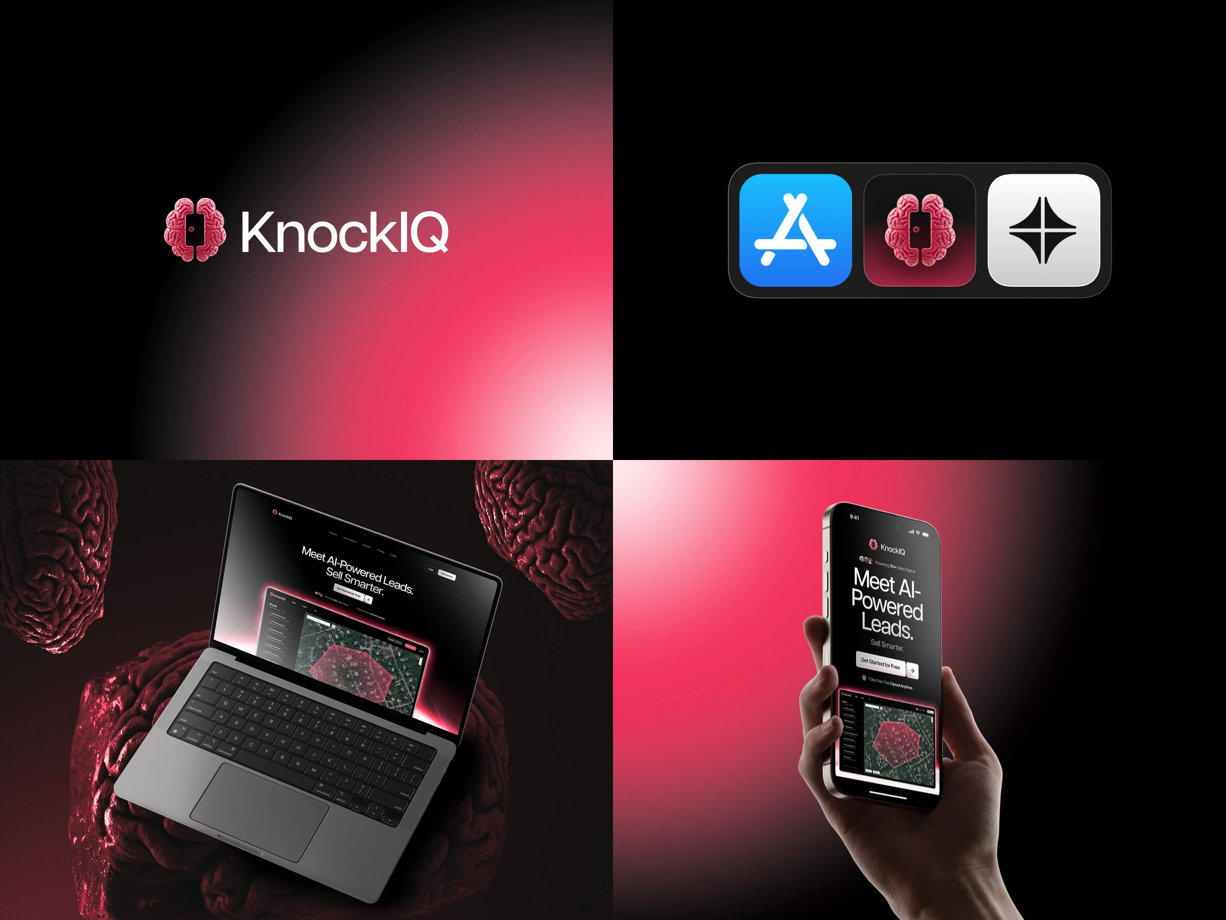
KnockIQ is a data platform that helps sales teams identify and pre-qualify potential homeowners before outreach. Users draw an area on a map and receive verified contact information, property insights, and other details that make outreach more targeted and worth the time.
Who it’s for
The platform serves sales reps and teams who prospect daily but lack clarity on who is actually worth contacting. They need fast access to accurate information without switching between several tools or digging through public records. The main value is speed and confidence before a call ever happens.
I was responsible for the branding, landing page, and app dashboard design. The main design challenge involved organising dense homeowner and property data in a way that felt usable rather than overwhelming.
My approach centred on turning raw data into something that supported quick decisions. High-signal information was surfaced early so users could tell at a glance whether a homeowner was viable, while deeper property details sat behind discreet expansion panels for users who needed to verify specifics. Filters and sorting helped users narrow large sets of results without breaking flow. On the marketing side, the landing page framed KnockIQ around reduced wasted outreach and improved close rates, giving buyers a clear reason to adopt the tool without having to read between the lines.
Like this project
Posted Jan 16, 2026
AI-powered lead tool that finds verified homeowner contact info and insights in just a click, helping businesses pre-qualify prospects and close deals faster.
Likes
0
Views
5