Accura - Branding & UI Exploration
Ronan Drumm
Branding + UI Design - Accura (Conceptual)
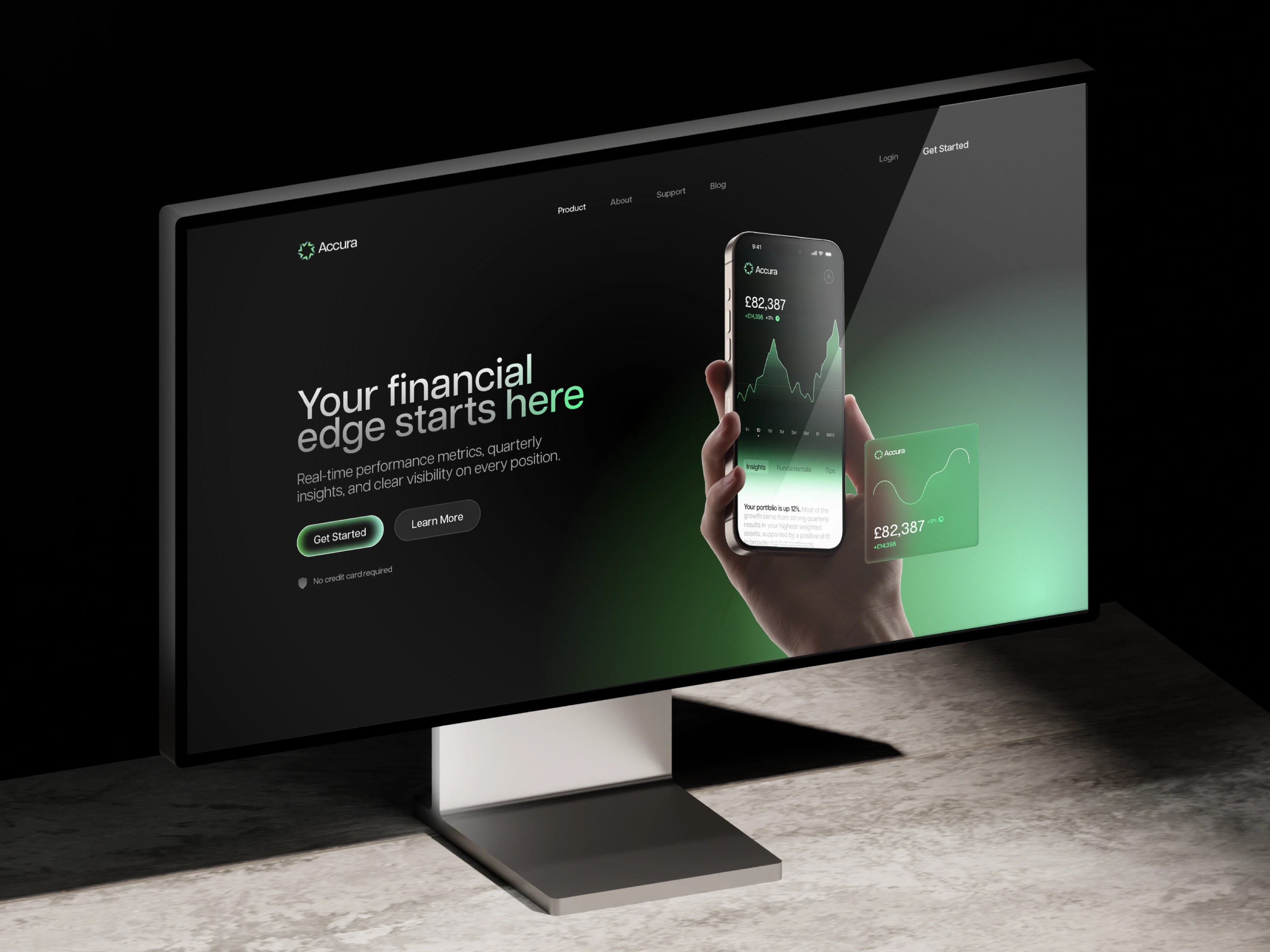
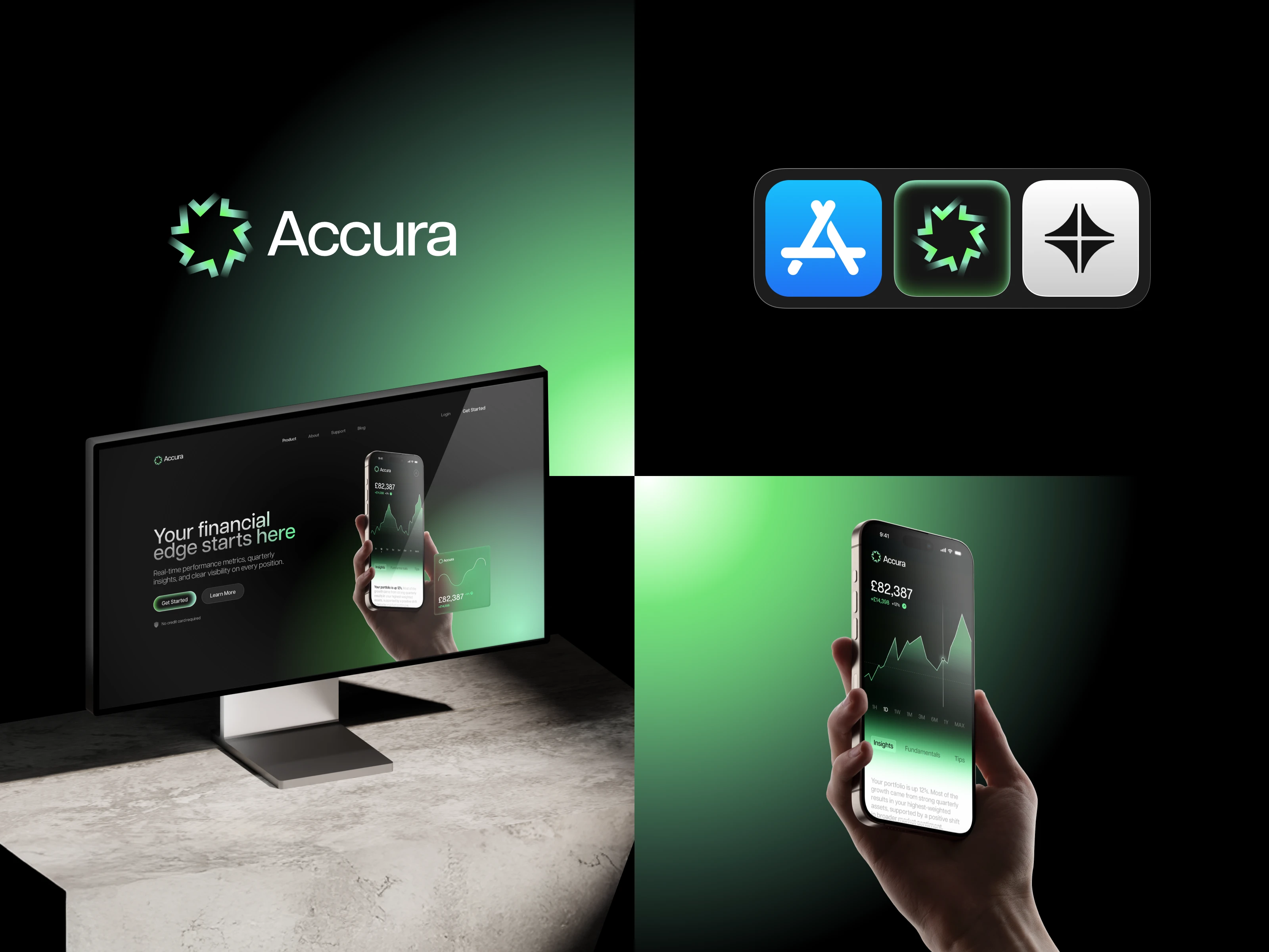
Accura is a conceptual premium finance application designed to help users understand portfolio performance with more clarity and less cognitive effort. The product combines real-time data, risk insights, and position-level visibility to give users an analytical edge without requiring them to sift through spreadsheets or charts.
Who it’s for
Accura is aimed at users who actively monitor their investments and care about performance, volatility, and risk exposure. They’re comfortable with financial products but often encounter interfaces that are either overly simplistic or overwhelming. The appeal here is a tool that feels professional without being hostile, and premium without being cryptic.
I was responsible for the branding, visual language, and UI design across mobile and web. The goal was to create a premium identity and interface that felt sharp, modern, and data-oriented without drifting into cold enterprise styling.
The design approach balanced precision with restraint. Typography and spacing carried most of the visual weight, while colour gradients and light motion cues served to highlight important shifts in portfolio health rather than decorate the interface. Data was organised so that users could read headline signals quickly and dive into granular views only when needed. This reduced the feeling of being confronted by charts and replaced it with a sense of guided insight.
UI/Brand Concept
Like this project
Posted Jan 14, 2026
Conceptual finance app that makes performance and risk easier to understand through clean UI, strong branding, and restrained data visuals.
Likes
0
Views
4