Designing AI-Driven Solutions for SummarAIze
Prathamesh Agrawal
As a freelance product designer, I had the opportunity to collaborate with SummarAIze, an AI-powered platform that transforms audio and video content into engaging, shareable formats like summaries, quotes, and social media posts. This case study highlights the features and interfaces I designed during the project, showcasing how each element was crafted to enhance user experience, streamline workflows, and bring SummarAIze’s vision of intelligent content repurposing to life. Each feature is accompanied by a brief explanation, providing insights into the design rationale and functionality.
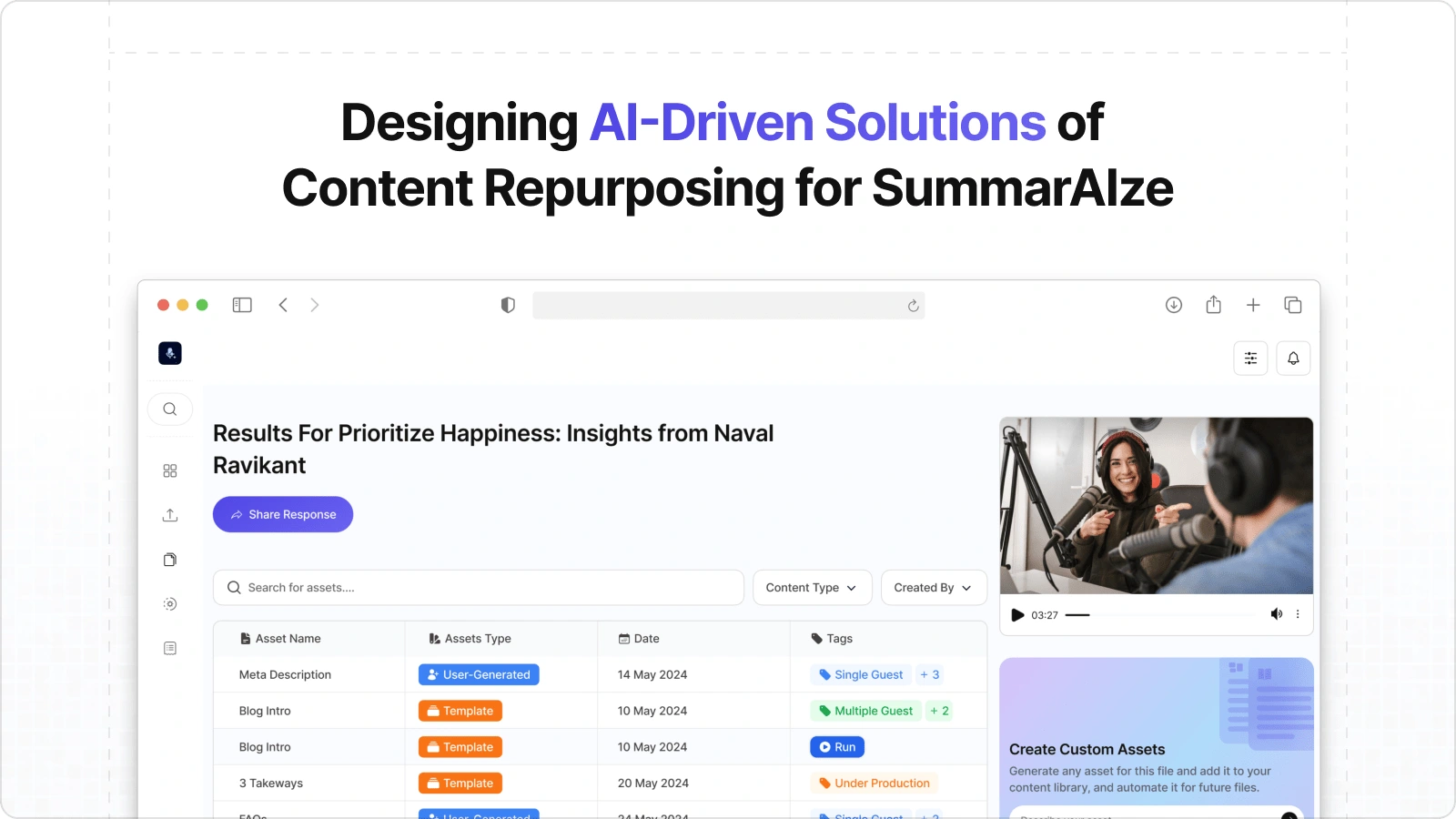
Thumbnail
Streamlining AI Responses: Redesigned for Clarity
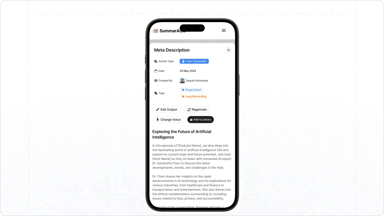
The redesigned response screen optimizes readability and interaction. It presents AI-generated outputs in an organized format with improved action buttons for seamless user engagement.
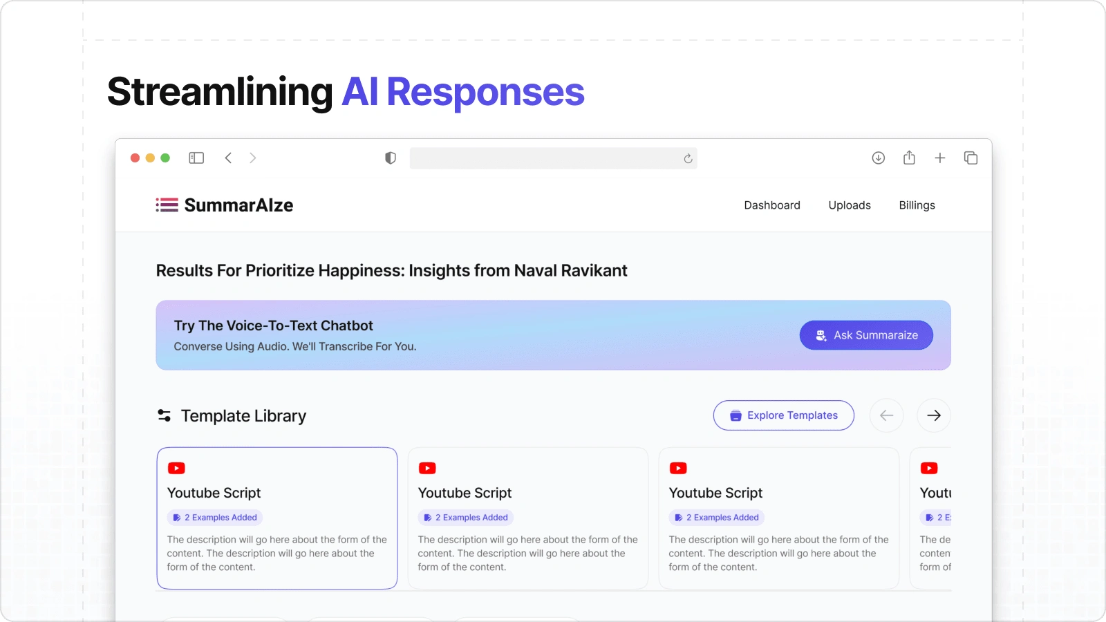
Response Page
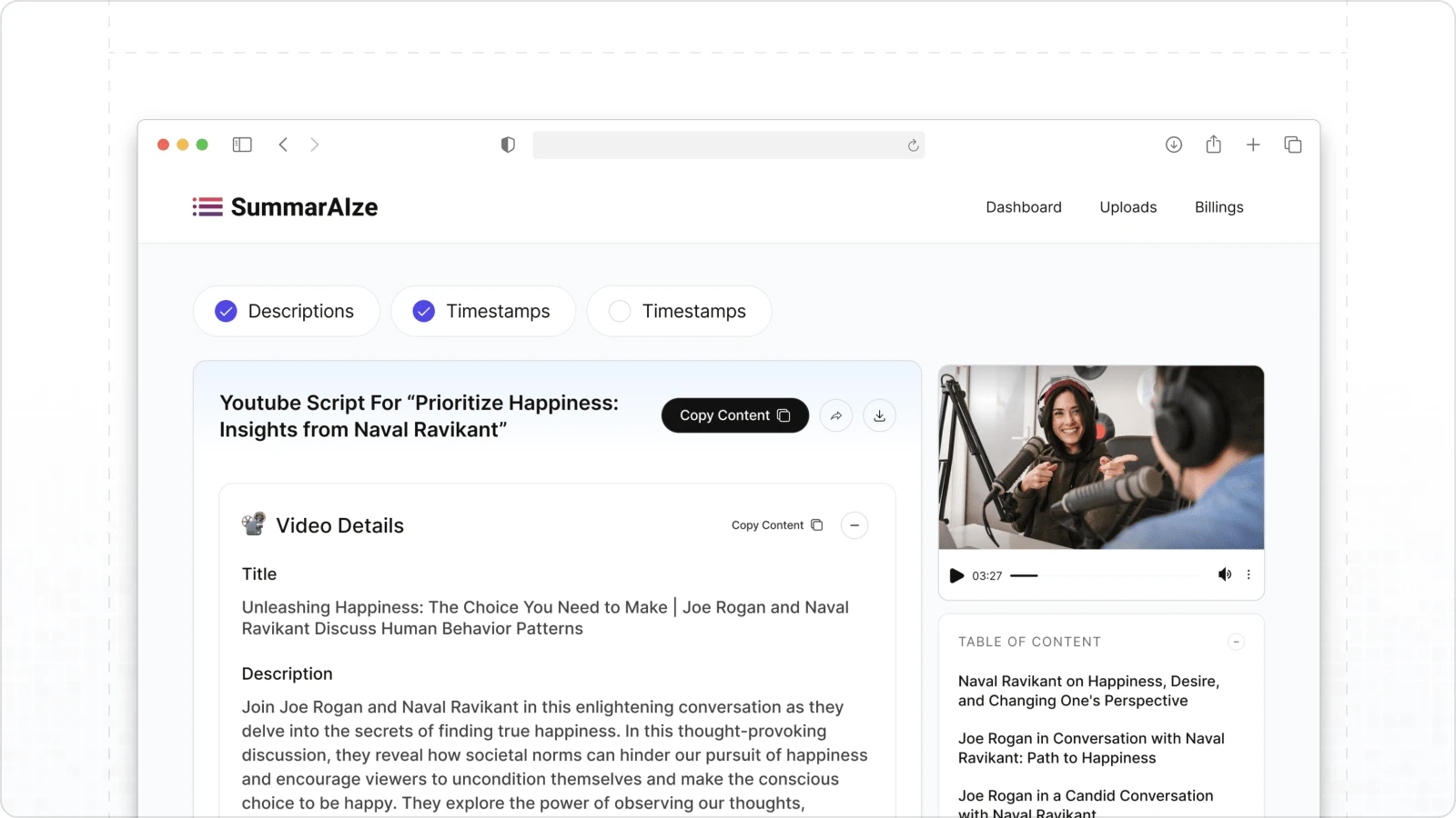
Response Page
The Template Marketplace
A curated library of templates, empowering users to repurpose content effortlessly, offering customizable layouts for diverse content formats and platforms.
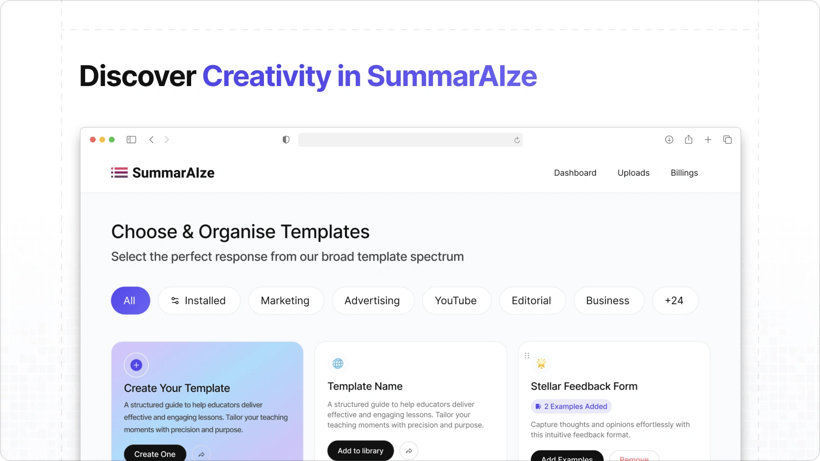
Template Marketplace
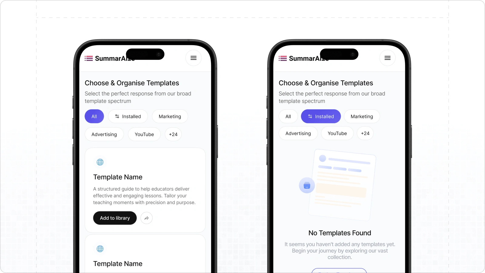
Phone View
The SummarAIze Pricing Page
A clean, user-friendly pricing page designed to clearly communicate subscription tiers, feature comparisons, and benefits, aiding users in making informed decisions.
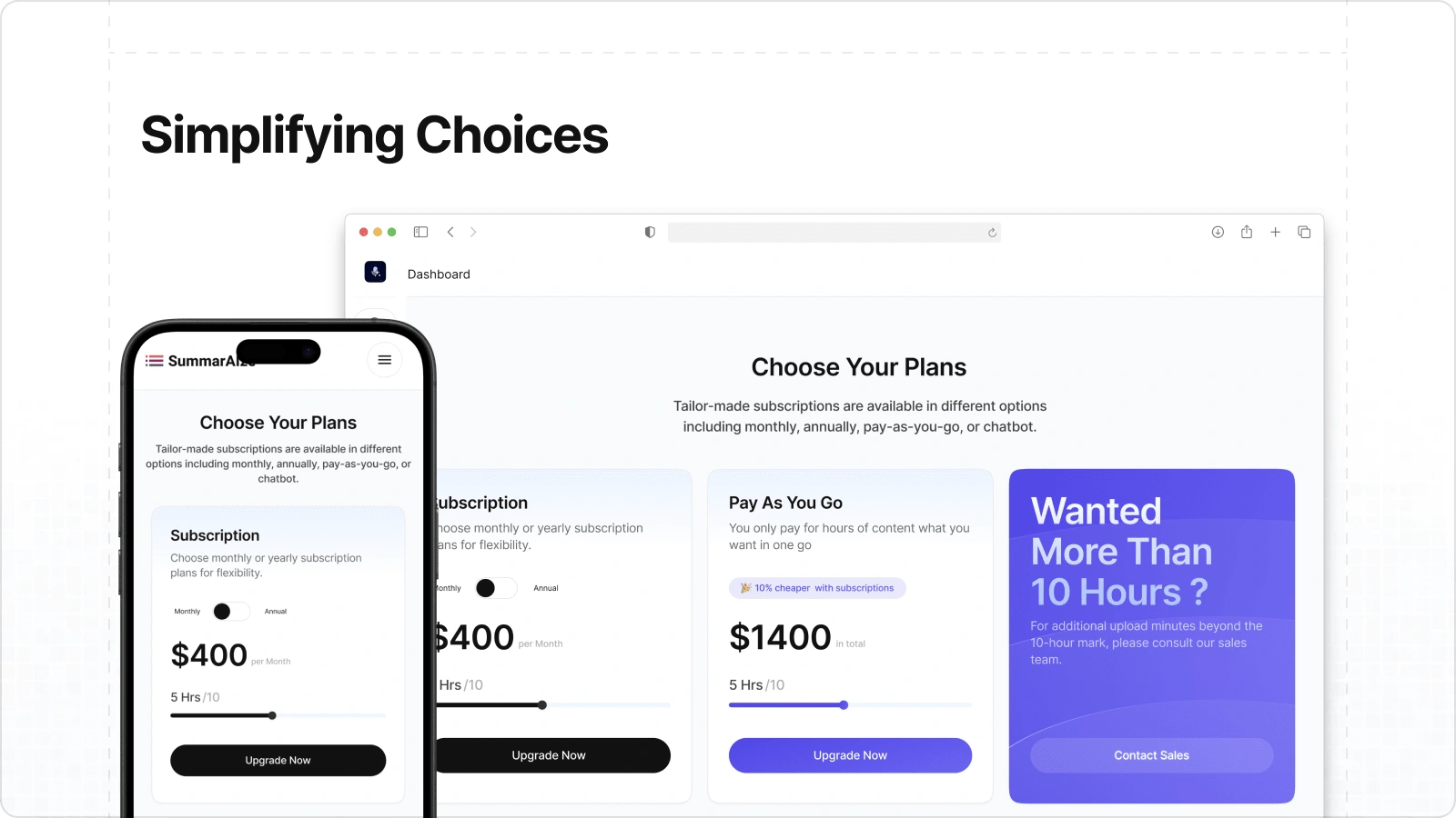
Pricing Page
Your AI Assistant: The Chatbot
A dedicated page for engaging with the SummarAIze chatbot, providing an intuitive interface to access AI features, manage conversations, and boost productivity.
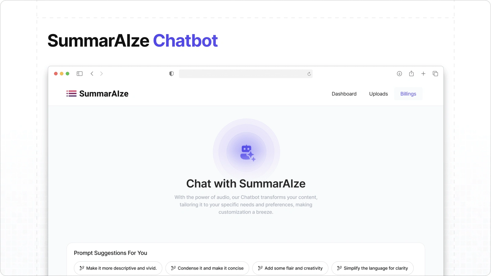
Chatbot Page
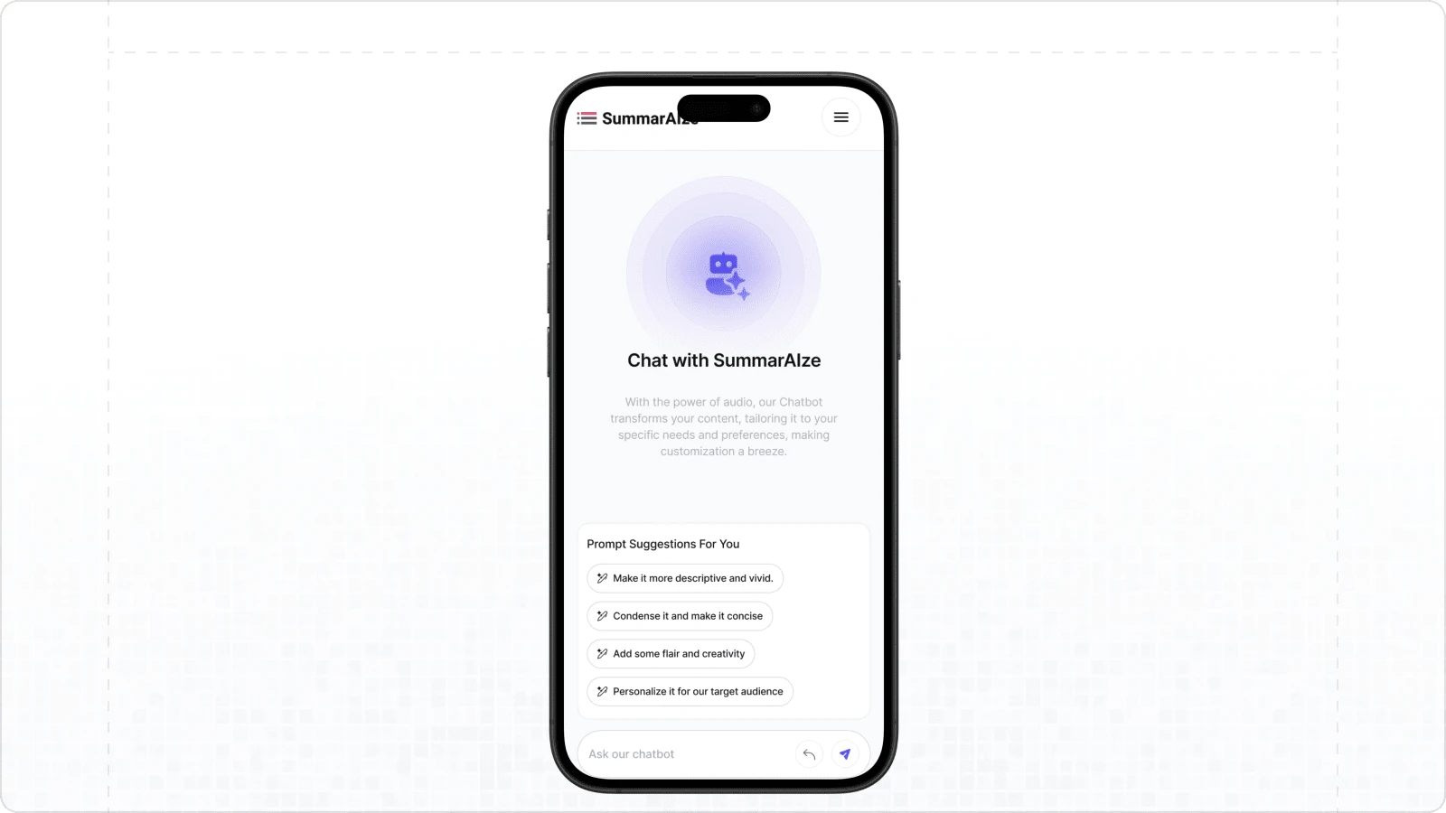
Phone View
Navigating Smarter: The Revamped Navbar
A modernized navigation bar that enhances accessibility, simplifies exploration of key features, and adapts seamlessly to varying screen sizes for a consistent experience.
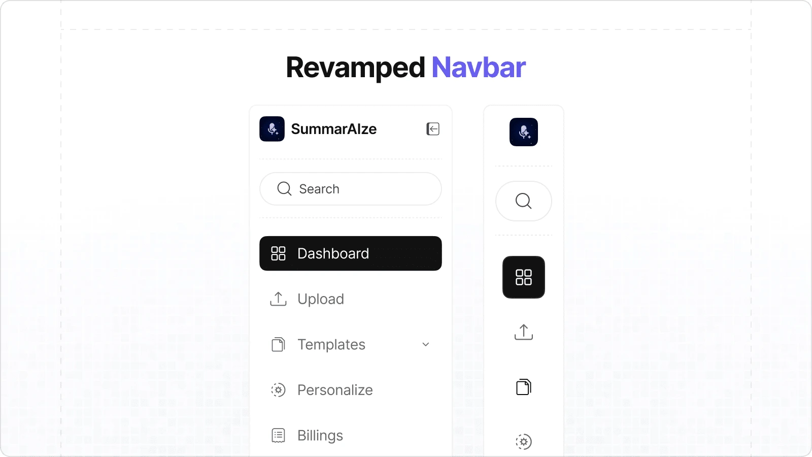
Navbar
Personalising Outputs with Examples
A feature allowing users to add reference examples to templates, enabling the generation of highly tailored and context-rich AI responses.
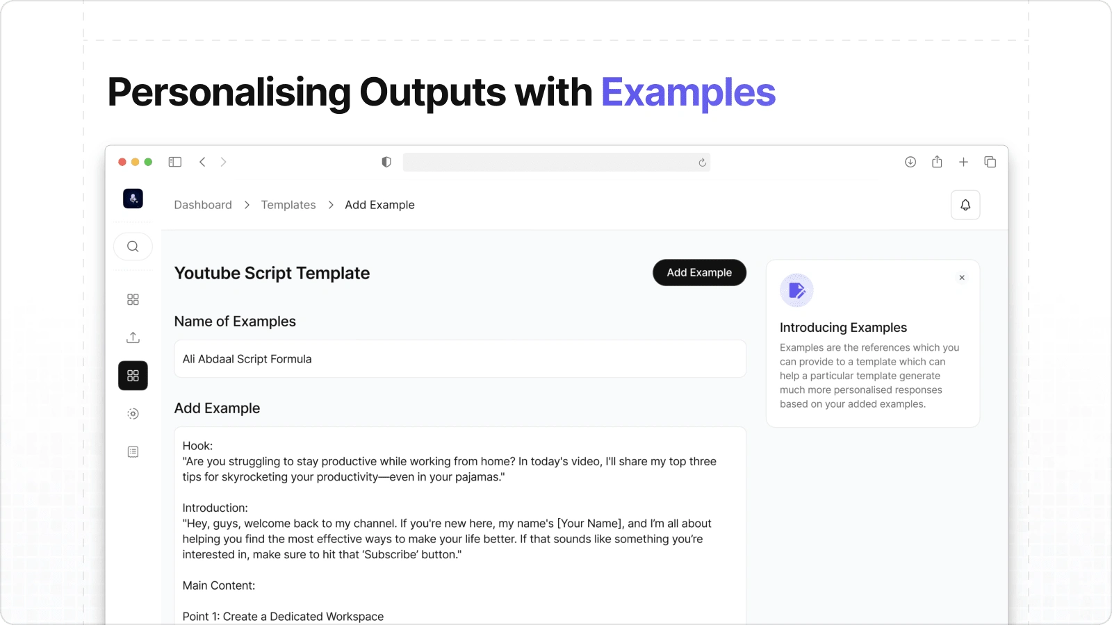
Example Page
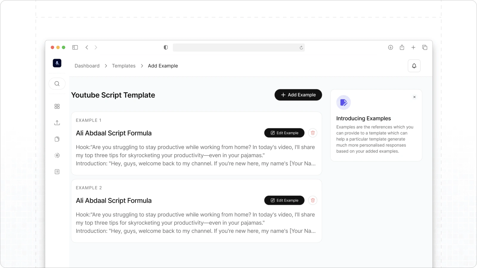
Example Page
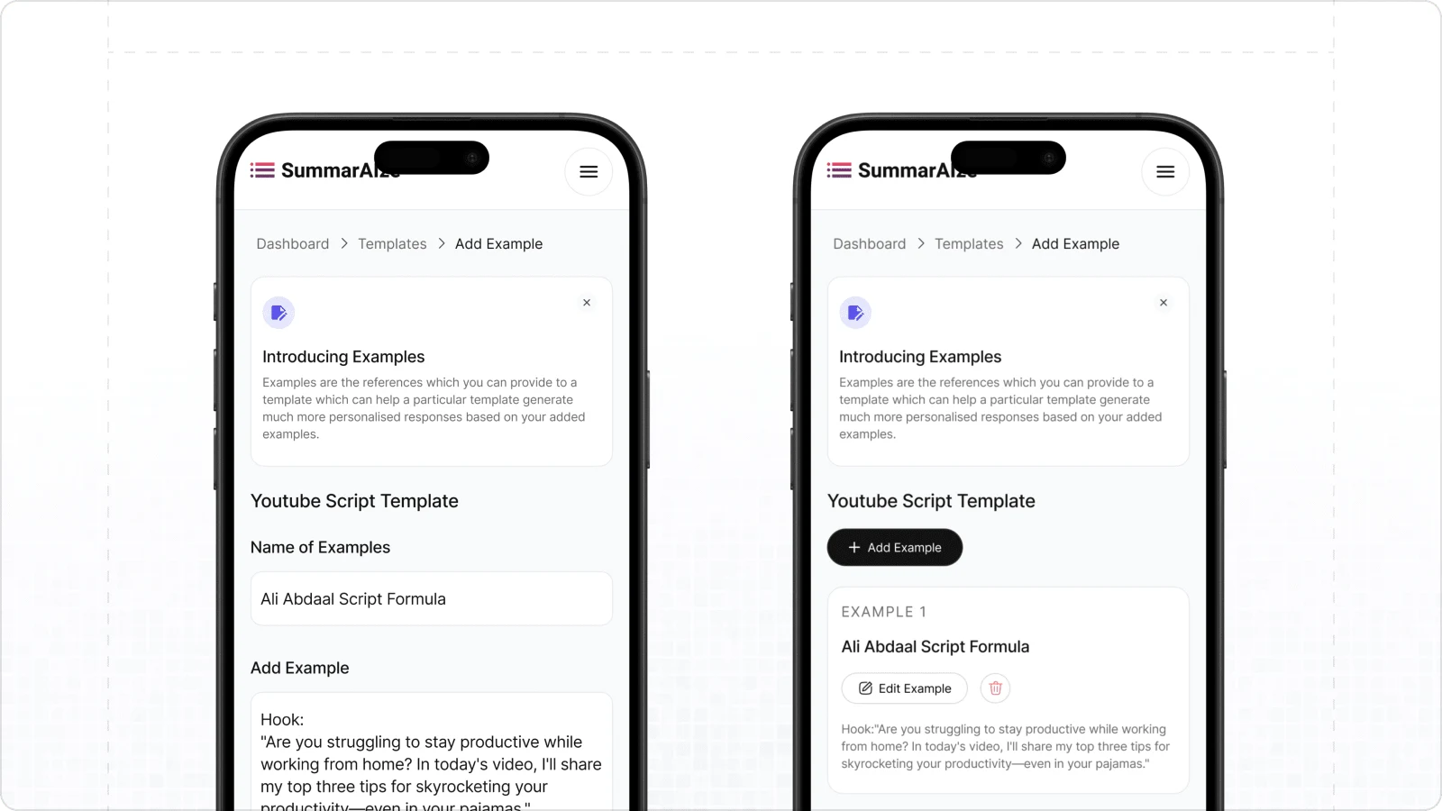
Phone View
Content Reuse Made Simple with Snippets
With the Snippets feature, you can quickly add pre-existing content to your AI responses, streamlining workflows and ensuring consistency in outputs.
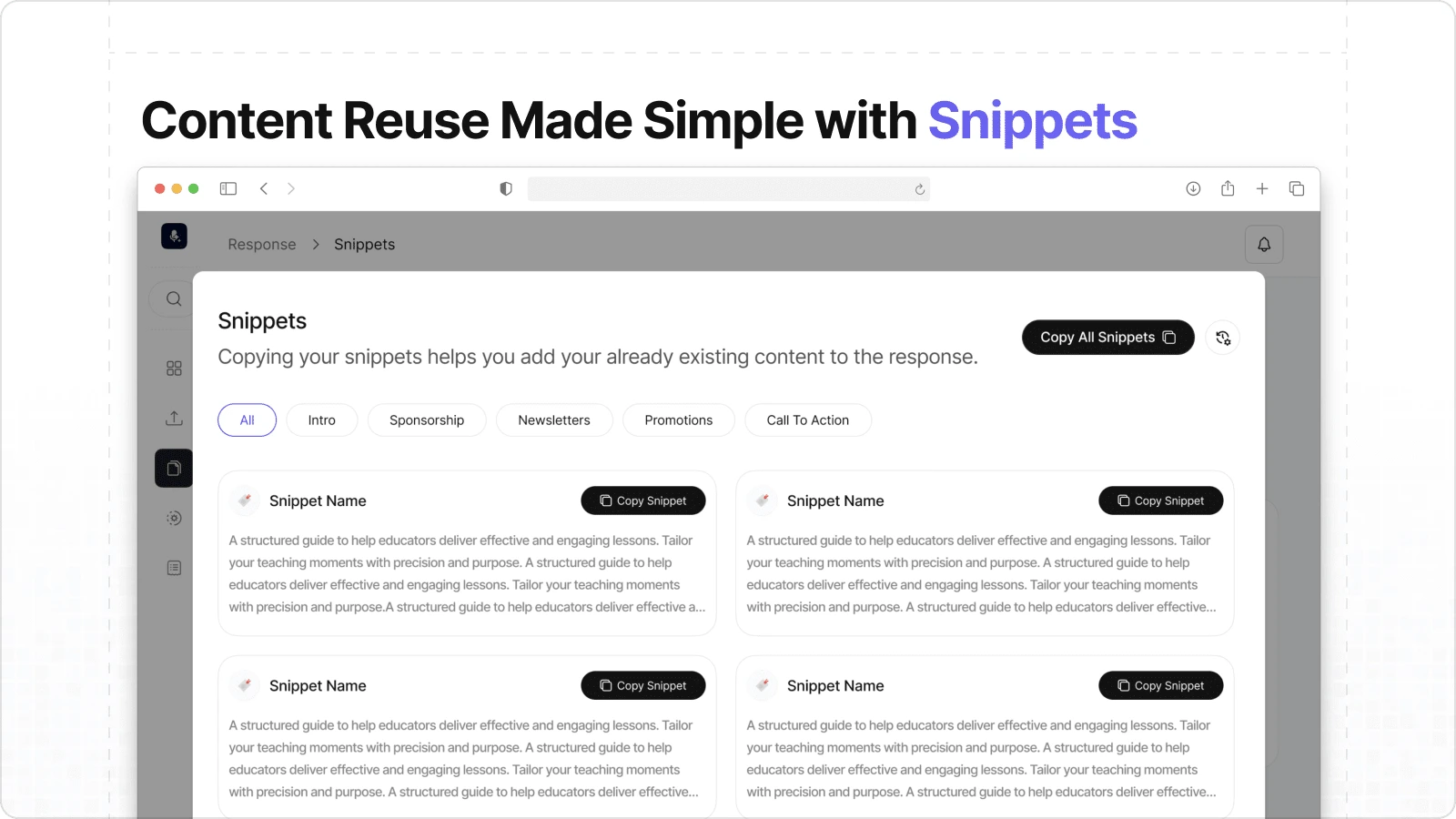
Snippet
The Enhanced Upload Flow
An optimized upload process designed to capture richer context, improving the precision and quality of AI-generated responses.
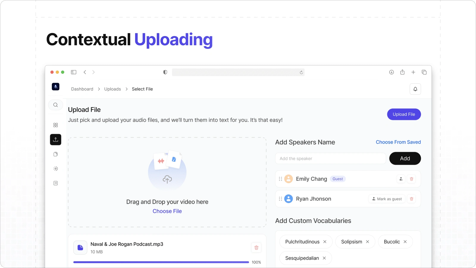
Upload Flow
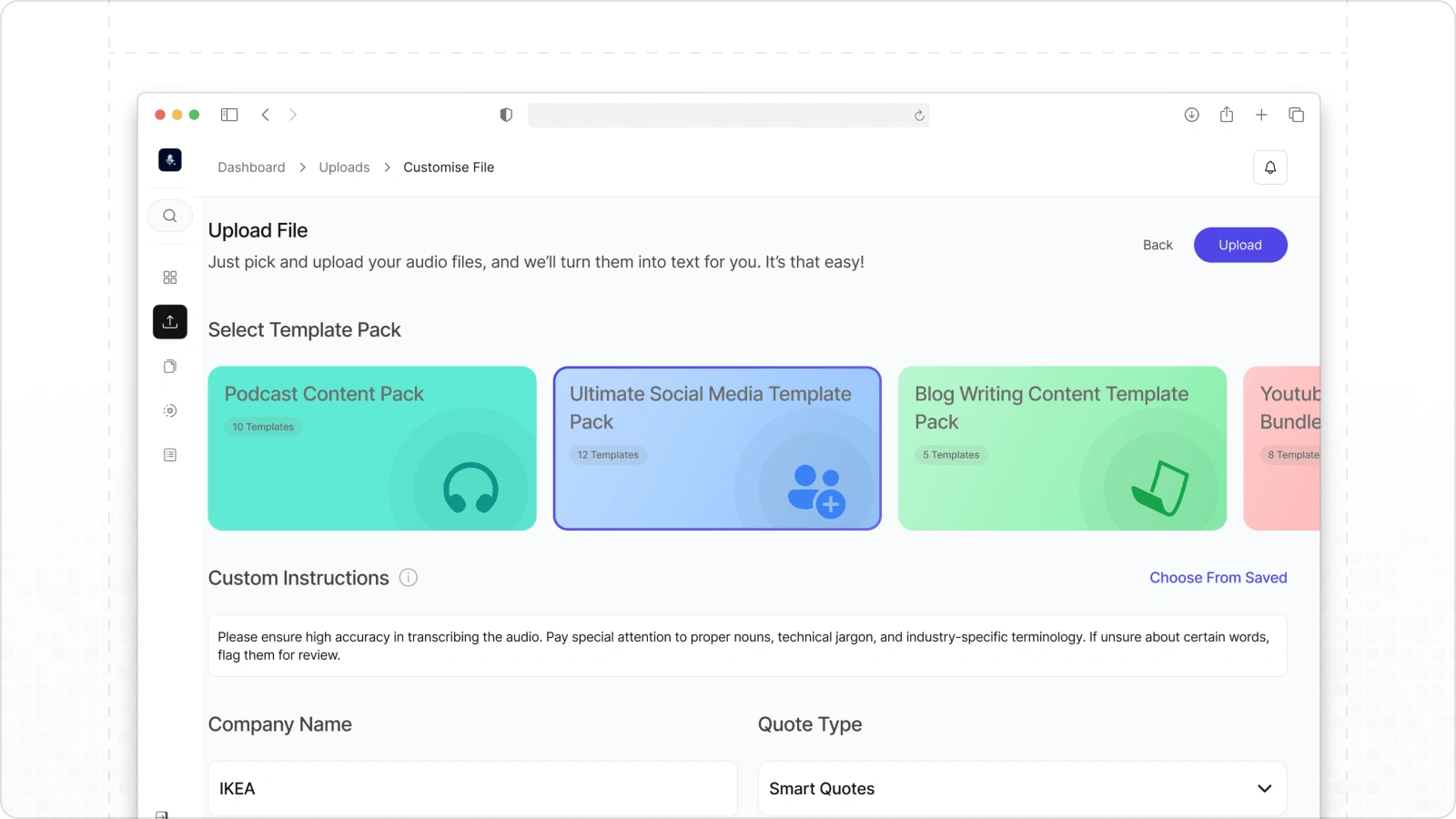
Upload Flow
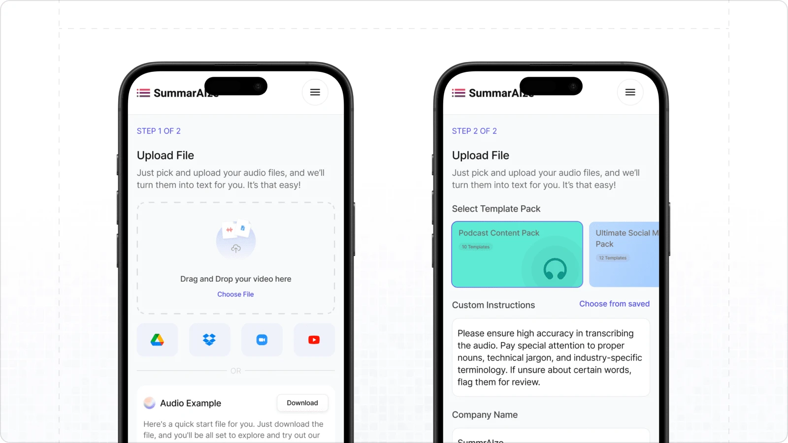
Phone View
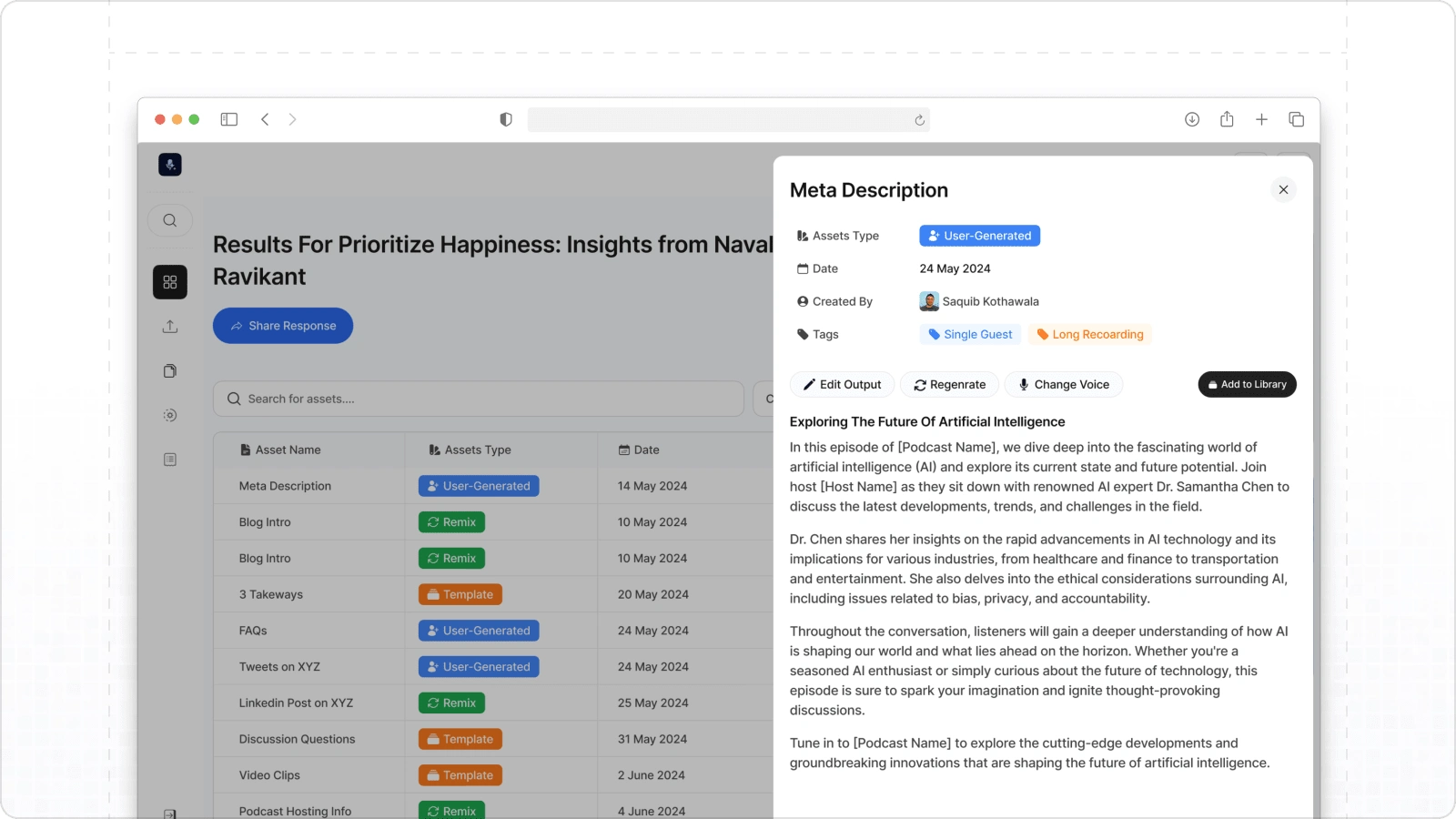
Response Index Page
A tabular interface presenting all generated responses in an organized manner, enabling easy navigation and efficient reuse of outputs.
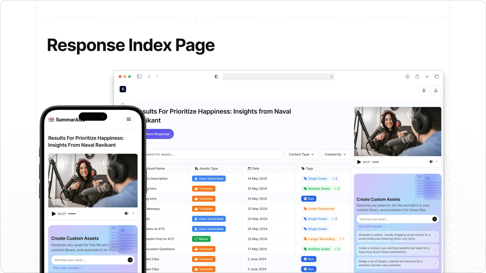
Response Index
Response Index
Phone View
Recommendations & Testimonials
Jay Desai, the founder of SummarAIze, shared his thoughts on my work as a freelance product designer:
“Prathamesh went above and beyond to deliver an awesome re-design for one of our most important screens in our product.”
“This is the second time we've worked with Prathamesh. He was again excellent to work with and went above and beyond to make this project successful. We will continue working with him!”
“Prathamesh once again delivered an amazing design for us. We've worked with him multiple times and each subsequent project feels more aligned than the last. Prathamesh's ability to understand our how products works has been key here.”
Like this project
Posted Sep 7, 2023
Designed SummarAIze’s platform as a freelance product designer, creating user-centric features like templates, chatbot, pricing, and response management tools.