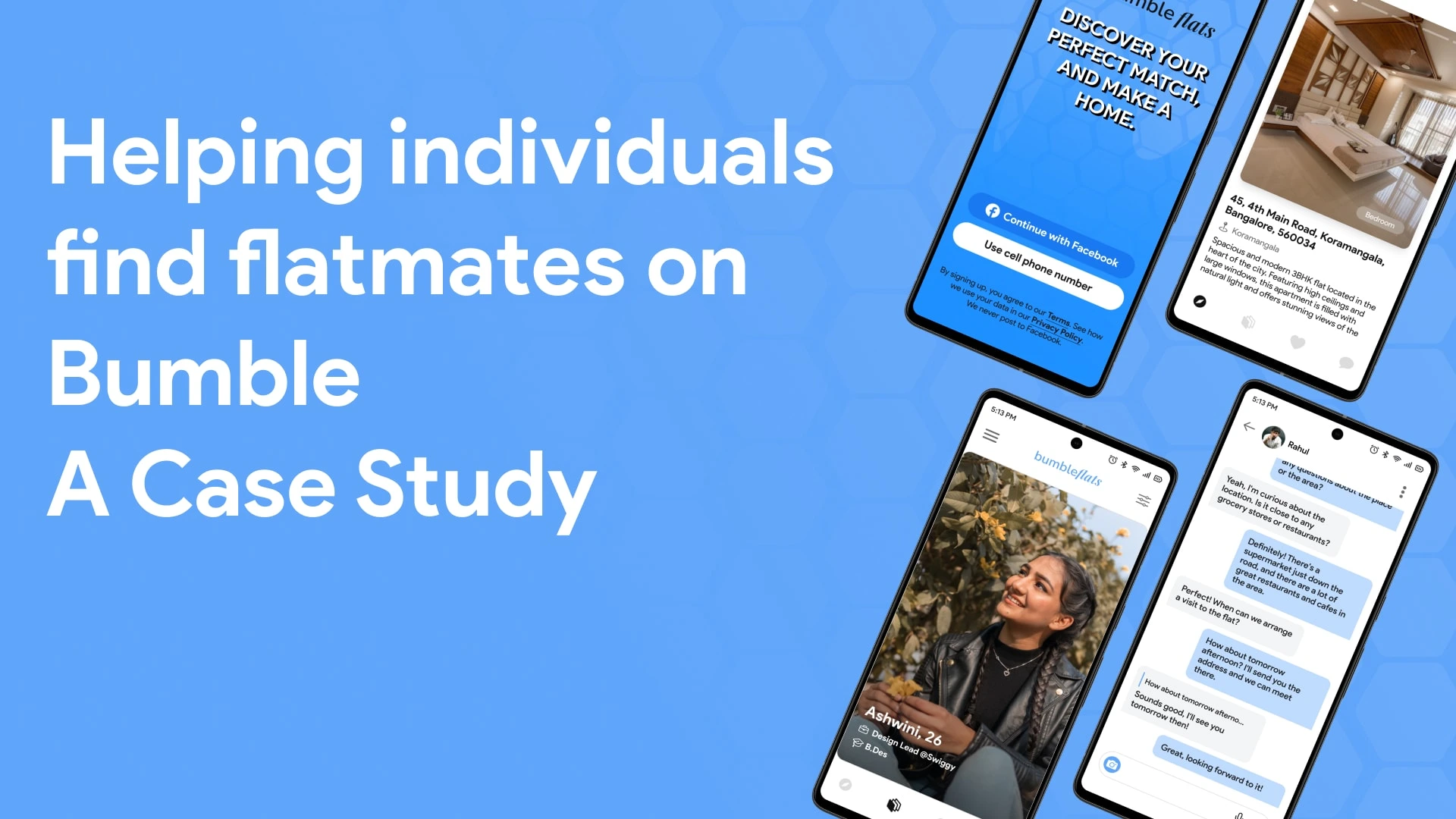
Helping individuals find flatmates on Bumble: A Case Study
Prathamesh Agrawal
Checkout The Video Explaining Whole Project
Try The Design
Let me take you through my process of designing the flatmate-finding experience on the Bumble App.
Project Thumbnail
About Bumble
Bumble is a popular dating app that allows users to connect with potential partners based on location and interests. It was launched in 2014 and has since expanded to include features such as Bumble BFF and Bumble Bizz, which allow users to connect with friends and professional contacts, respectively.
In this case study, I will design the experience of finding a flatmate on the Bumble App.
Introduction
This case study outlines the process of designing a mobile application that addresses the needs of individuals searching for roommates in a shared living space. Throughout this case study, we will explore the various stages of the design process, including research, ideation, prototyping, and testing. The goal of this project was to develop a user-friendly platform that enables users to find compatible roommates based on shared interests, lifestyles, and preferences.
Understanding Problem
People who move to new cities, especially young professionals and students, face difficulties finding trustworthy roommates with similar interests.
This leads to a stressful and unpleasant living experience, negatively affecting their personal and professional lives.
From the problem mentioned above, we figure out our problem statement as “How might people who are moving to an unfamiliar city find a reliable way to find great roommates with similar interests to stay with?”
Design Process
Our design process involves several steps, which we follow to ensure that we create a user-centred and efficient design for our app. Here are the steps we follow:
Research
During the research phase, we used a variety of methods to gain insights and better understand the problem we were trying to solve. Here is a breakdown of each method we used:
Survey - I designed a survey and distributed it to people who had recently moved to a new city and were seeking housemates. I was able to acquire information about their experiences, pain spots, and preferences thanks to the survey.
Interview: I also interviewed people who had recently moved to Bangalore and were seeking housemates. These interviews provided me with a better understanding of their requirements and problem spots, as well as the opportunity to ask follow-up questions to obtain more specific information.
Competitor analysis: I analyzed the websites and apps of popular roommate search platforms, such as Spare Room, Airbnb, and Roosters. This helped me gain insights into their features, strengths, and weaknesses, which we could use to inform our own design decisions.
Personas
Creating user personas is an essential part of my design process. It helps me understand who I am designing for and their needs. By building a user persona named Samantha, I gained valuable insights into the needs, goals, and motivations of our target users. Based on the primary and secondary research we conducted, I was able to create a clear picture of Samantha, who recently moved from Gujarat to Bangalore. These insights guided me throughout the design process, ensuring that I kept Samantha's needs and goals in mind while designing the app.
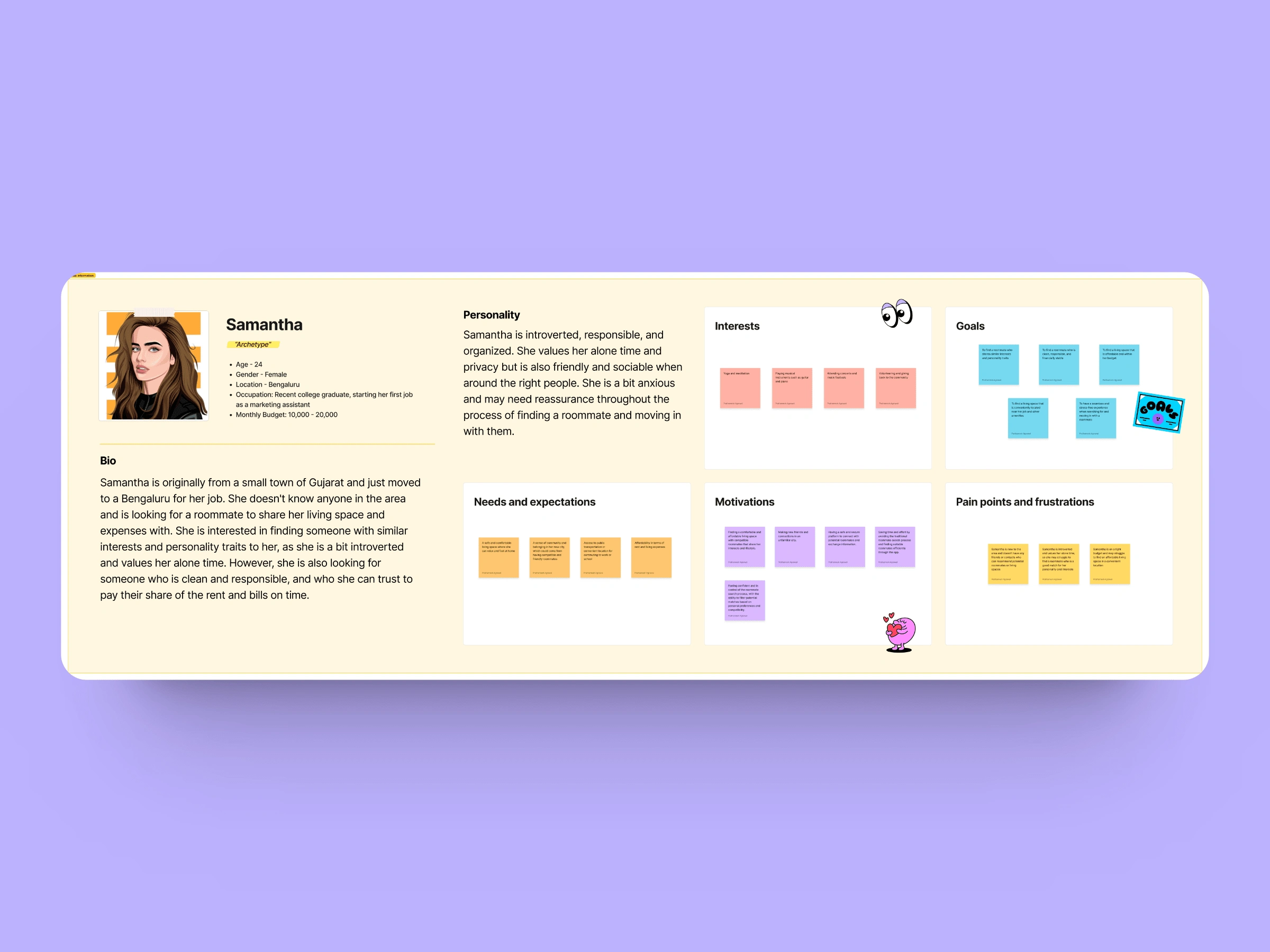
User Persona
Information Architecture
Based on the insights gained, we designed the information architecture of the app by categorizing the features into various sections and sub-sections. We made sure to use user-friendly language and avoid any technical jargon. We also made the navigation process simple and intuitive, enabling users to move easily from one section to another.
Feature Conceptualization
Once the information architecture was created, the next step in our design process was to conceptualize the features that would be added to the app. These features needed to be not only innovative but also unique to both the industry and our app. Our goal was to ensure that our app provided a user experience that was unparalleled in terms of functionality, usability, and convenience.
During this phase, I brainstormed and conceptualized several features that would provide value to our users. After careful consideration and analysis, we decided to include the Flat Filter, AI Chat, and Ghosting Mode features.
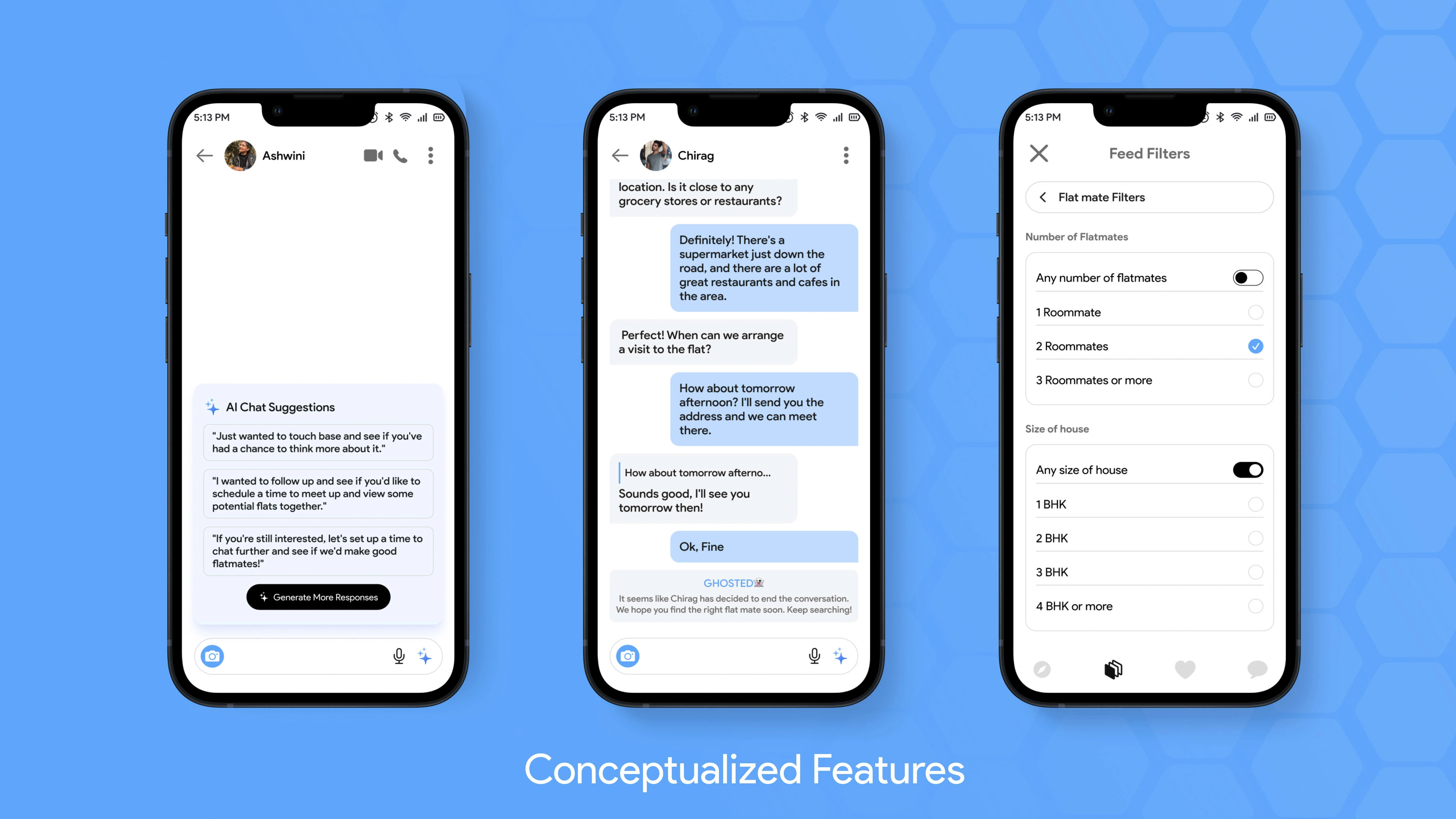
Feature Preview
Wireframing
During the wireframing process, I began by creating the onboarding section first, as it is an essential component of the app and sets the tone for the user experience.
To maintain consistency with the Bumble app's layout, I initially kept the app's design layout similar to that of the standard Bumble app. However, once I had a good understanding of the layout, I proceeded to design all the wireframes independently.
To optimize the design process and save time, I avoided designing repetitive screens that already existed in the old Bumble app and only made minor adjustments as necessary. This allowed me to focus my efforts on creating new, innovative designs that would enhance the user experience.
Once the wireframes are finalized, we move on to the high-fidelity design stage, where I add colour, typography, and other design elements to bring the wireframes to life. This allows us to see how the app will look and feel once it is developed and provides a clear vision of the final product.
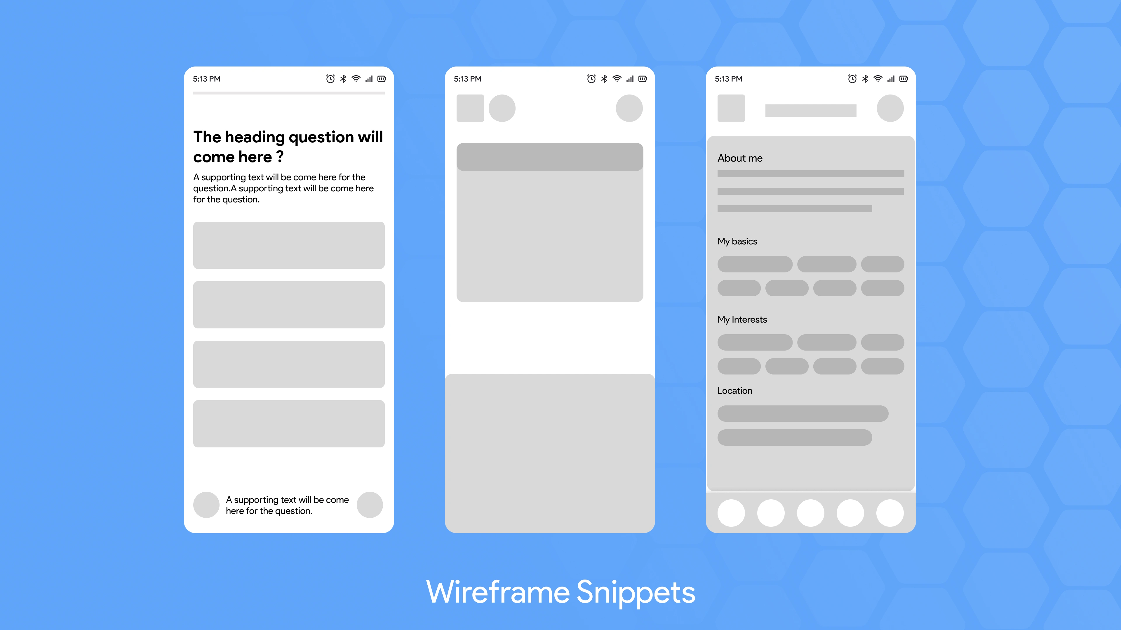
Wireframes
Visual Design
When I started working on visual design, I felt that a change in branding was needed to distinguish the app's different conversation categories. Therefore, I decided to switch the app's colour scheme from yellow to blue for the flatmate conversation category.
I picked blue because it gives a sense of companionship and freshness, which corresponds to what our users seek in a roommate and what they experience when moving to a new location. This branding adjustment helped to distinguish the "flatmate" discussion category from the app's other conversation categories and made it more appealing to our target audience.
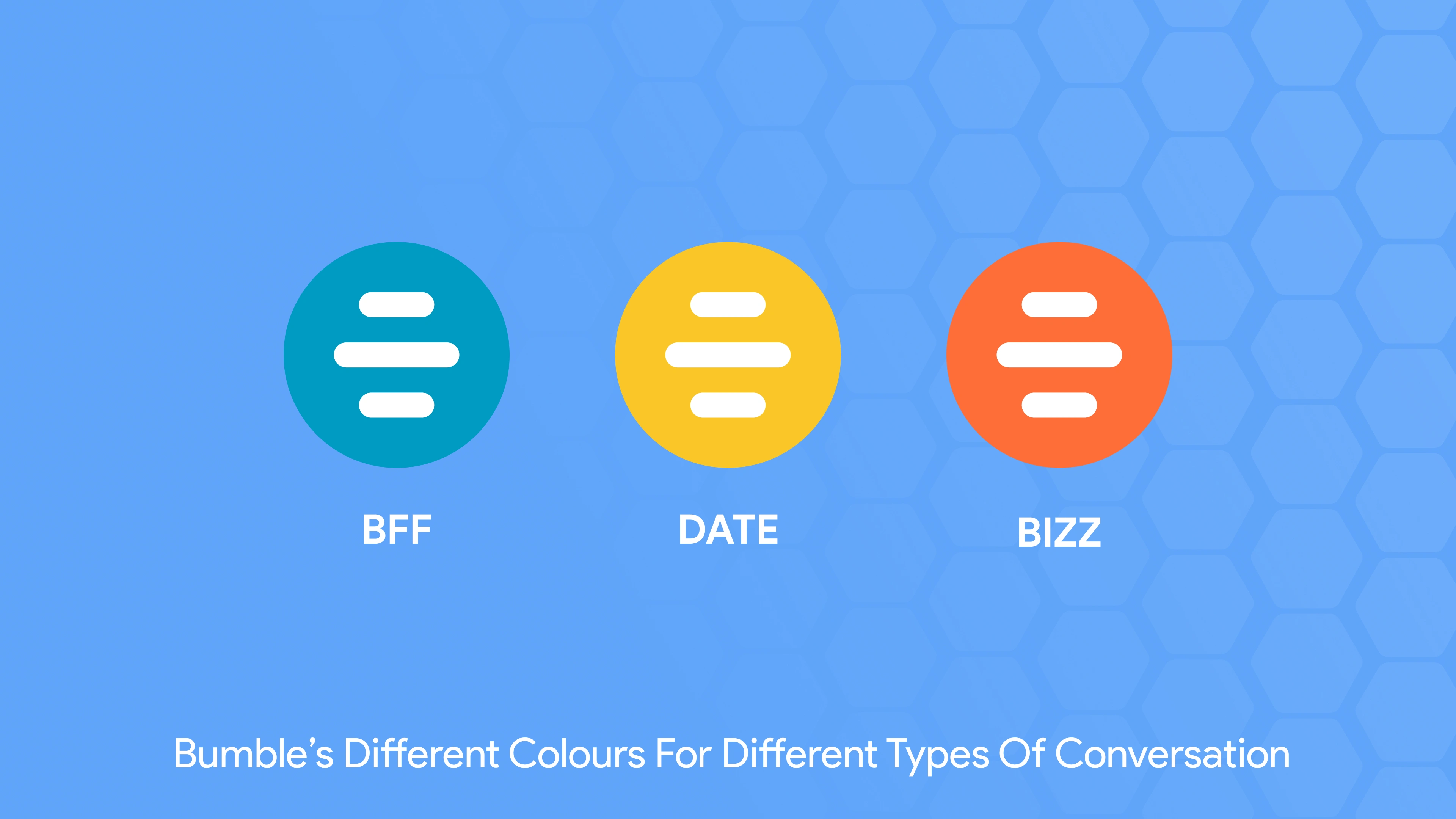
Bumble Modes
Bumble Flats (Unofficial)
Onboarding
During the visual design stage, I considered the onboarding stage as a critical component of our app's user experience. To make it easier for users to supply the essential information, I structured the onboarding process into four sections. These sections are as follows:
Basic Information: This part involved collecting the user's basic details such as name, age, and gender.
Mode Selection: This part gave the users the option to select whether they are looking for a flat or a flatmate.
Personal Info: In this part, I asked users to provide more personal details such as their hobbies, interests, and occupation. This information helped in creating more accurate and detailed user profiles.
Flat Locality and Flatmate Preference: This part allowed users to input their preferred location and flatmate preferences, including budget, lifestyle, and living habits.
By segmenting the onboarding process, I ensured that the user could supply all of the essential information clearly and straightforwardly, lowering the likelihood of confusion and increasing the overall user experience.
Onboarding
Explore Feed
During the design of the explore feed, I made it a priority to ensure that it was user-friendly and easy to navigate. To achieve this, I incorporated several major components, including:
Header: I designed the header to include a list of conversation modes available on the app, the user's profile section, and settings options.
Greeting Card: The greeting card serves to display the current weather and the city name, providing a personalized touch to the user's experience.
Flat List: To provide users with a comprehensive list of available flats, I created a scrollable flat list that was segmented based on various parameters such as most liked, popular, and recommended. This allowed for an organized and efficient display of the flats to the user.
Explore Section
Flat Profile
While designing the flat profile, I had to consider several factors to ensure consistency throughout the app. The main components of the flat profile include:
Flat Images: The images of the flat are displayed in both automatic and manual carousel formats with annotations at the bottom of the image.
Flat Information: The flat's information is displayed in a pill/capsule/badge format similar to the profile view.
Flat Amenities: The flat amenities are also shown in a circular format to provide easy-to-read and visually appealing icons.
Roommate: At the bottom of the flat profile, a roommate card is included, which displays basic information about the roommate, such as education and occupation, along with a CTA that redirects users to their profile for more information.
Flat Profile
Individual Profile
To improve the profile section of our app, I decided to follow the standard Bumble BFF profile format but made changes to the colour scheme to align with our blue branding. Here are some details about the different sections in the profile:
Image & Info: This section is the primary focus of the profile and consists of the user's image and basic information about their job and education. The section takes up the whole screen, ensuring that users can see the individual.
Info: The info section includes additional details about the user's bio, interests, hobbies, and other relevant information.
Flat Card: Every user who has a flat listed on the app has their flat card attached to their profile. The flat card contains information about the flat, such as rent, location, and the number of roommates. This helps users decide whether they want to right or left swipe on the individual based on their flat information.
Individual Profile
Liked Profile
When designing the liked section for my app, I wanted to take a different approach than the standard Bumble format. I decided to include filters in the liked section so that users could easily sort and filter their likes and matches based on activity time and area.
The liked section also includes a "Liked By" card that displays basic information such as the person's image, name, age, and flat information. Additionally, the matched card displays information about the matched individual such as their image, name, age, education, and job. A call-to-action button is also included on the matched card, which prompts users to start a conversation.
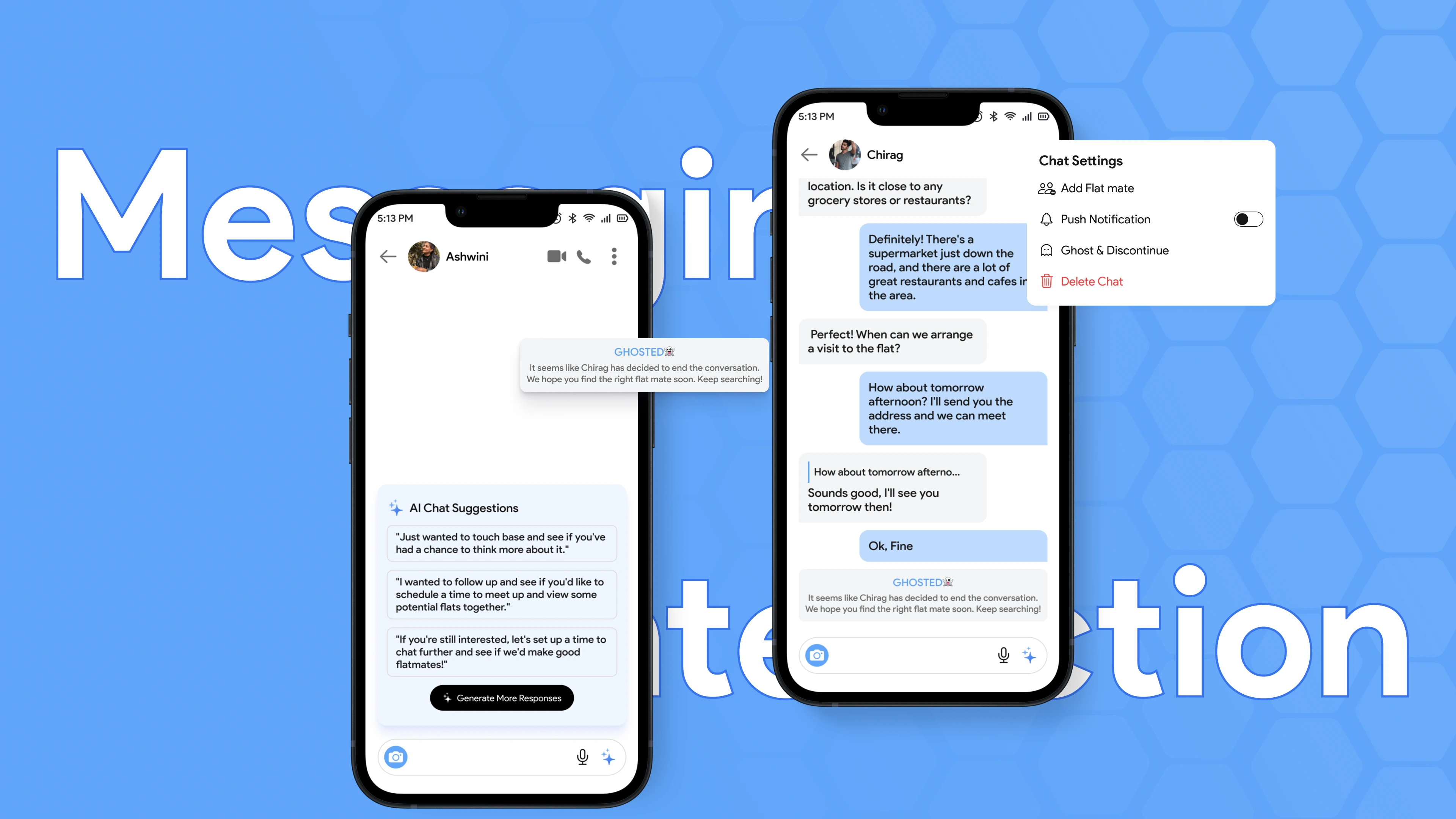
Messaging
The messaging section is one of the most significant parts of our app, as it is where users will be interacting, talking, and discussing. I have designed the messaging list in a standard format that is familiar to users. In addition to this, I have also conceptualized and added various features to enhance the chat experience. These features include AI Chat Recommendations, Ghosting, and Adding Flatmates in Chat.
The messaging section is one of the most significant parts of our app, as it is where users will be interacting, talking, and discussing. I have designed the messaging list in a standard format that is familiar to users.
In addition to this, I have also conceptualized and added various features to enhance the chat experience. These features include AI Chat Recommendations, Ghosting, and Adding Flatmates in Chat.
AI Chat Recommendations - The AI Chat Recommendation feature uses artificial intelligence to suggest conversation starters to users. This helps users who may be shy or unsure of how to start a conversation.
Ghosting - The Ghosting feature allows users to temporarily hide their profile from someone they no longer wish to chat with. This feature is particularly useful for users who may have changed their minds or have other reasons for not wanting to continue a conversation.
I have also added the feature of Adding Flatmate in Chat, which allows users to add a potential flatmate to an existing conversation. This feature enables users to discuss their future living arrangements with potential flatmates without the need for separate conversations.
Ghosting Option - The Ghosting feature allows users to temporarily hide their profile from someone they no longer wish to chat with. This feature is particularly useful for users who may have changed their minds or have other reasons for not wanting to continue a conversation.
Add Flatmate - I have also added the feature of Adding Flatmate in Chat, which allows users to add a potential flatmate to an existing conversation. This feature enables users to discuss their future living arrangements with potential flatmates without the need for separate conversations.
Messaging
AI Chat Recommendation
Ghosting
Conclusion & Learnings
When it comes to designing an app like this, there are several key factors to keep in mind:
Research: Conducting thorough research is critical, and it's essential to recognize that the research phase will involve multiple iterations and revisits.
User Interaction: Social apps are all about interaction, so it's vital to consider the different ways users will be communicating with each other. For example, when designing a messaging feature, it's important to consider how users will be texting and what features they will need to facilitate their conversations.
Significant vs. Incremental: To build a successful app, it's crucial to focus on building features and functionalities that have significant value for users, rather than simply adding incremental improvements. This means identifying the core needs and desires of your target audience and prioritizing those features that will have the greatest impact on their experience.
Like this project
Posted Mar 27, 2023
Bumble Flatmate is a social networking app that helps people find compatible flatmates based on their preferences and location.
Likes
0
Views
437