Transforming B2B Insurance: Designing Smartsure's MVP
Project Overview
Smartsure, a seed-stage InsurTech startup founded by industry veterans, sought to innovate the traditional B2B insurance space with their flagship product: a first-of-its-kind B2B digital insurance program and capacity marketplace. I was brought on board as the Lead Product Designer to spearhead the design and strategy for their MVP.
Team: Lead Product Designer 🙋🏻♀️ • Head of Tech • 2x Developers • CEO + Founder • Director of Business Development
Scope of Work: Research and Discovery • Vision and Strategy • Journey and User Flow Mapping • Information Architecture • Information Design • Visual Design • Design System lite • Lo and Hi-Fidelity Prototyping • UX Writing • Interaction Design • Handoff and QA
Timeline: 4 Months
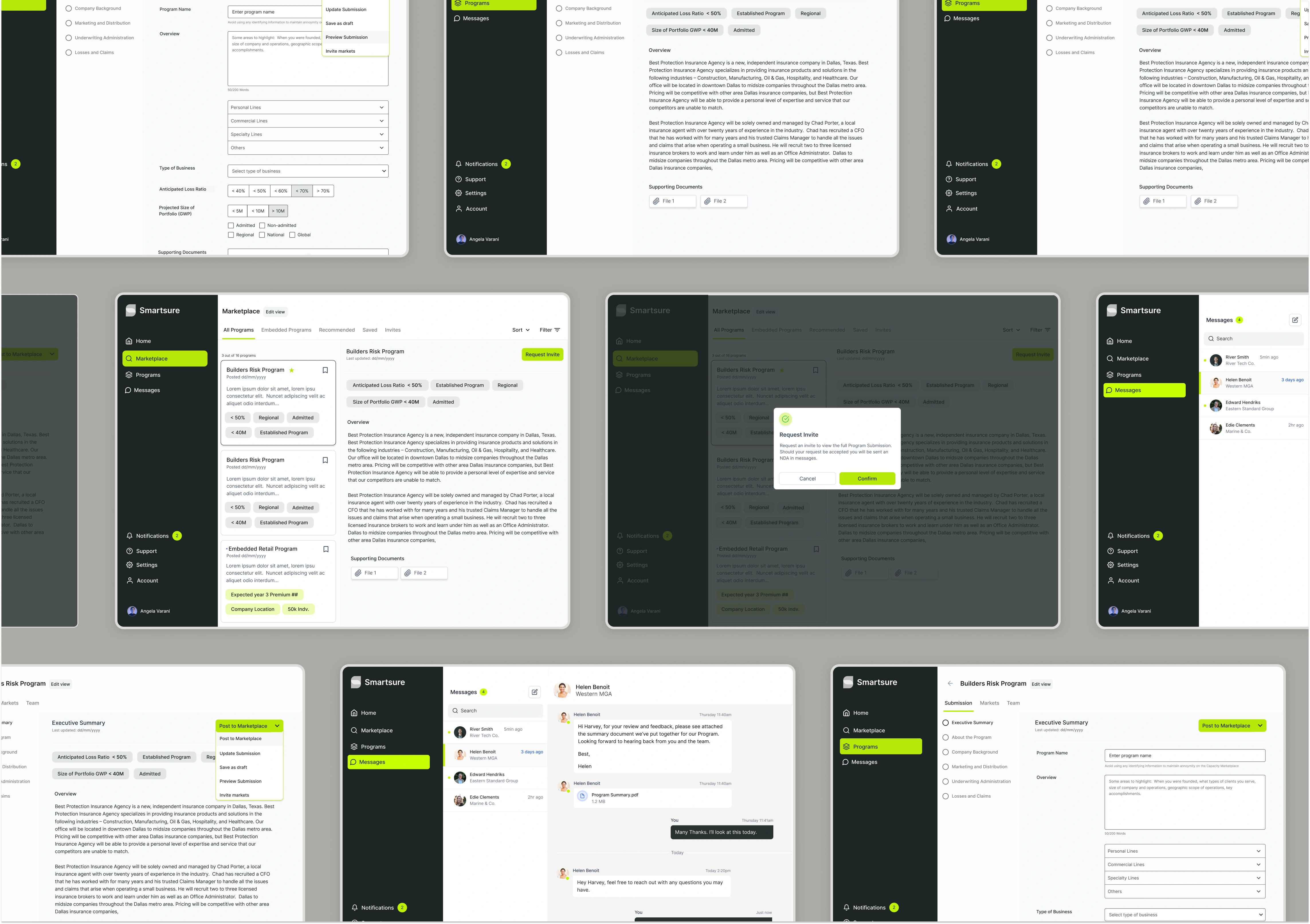
The Challenge: Understanding User Frustrations
An initial experience audit, along with user and stakeholder interviews, revealed a daunting onboarding process for users. The first iteration of the MVP—a digital insurance program CMS—was complex and time-consuming, with an offline approval process taking several business days.
Users found the platform challenging to navigate, leading to a 100% drop-off rate during onboarding. Traditional, change-averse B2B insurance professionals expressed feelings of overwhelm, believing they simply “didn’t get it.”
Our Solution: A Seamless User Experience
The research phase highlighted the urgent need for a user-friendly interface that prioritized intuitiveness and efficiency. To ensure the success of the marketplace MVP, it was essential for Managing General Agents (MGAs) to quickly create and list their insurance programs.
The final design transformed the onboarding flow into a streamlined process, providing value to users early on and supporting the product's overall success.
Key Innovations
Modularized Onboarding: Divided the onboarding process into smaller, manageable sections, starting with a concise one-page "Executive Summary" to gather essential information.
Progressive Completion: After filling out the Executive Summary, users can post their insurance program immediately, encouraging first steps and creating a sense of accomplishment.
CMS-Style Management: Redesigned the platform to resemble a Content Management System, allowing users easy access to edit and manage their insurance programs.
Document Upload Guidance: Provided clear instructions and visual cues to help users submit supplementary documentation, paving the way for digital transformation.
Key Screens
Step 1: Executive Summary
Users access a straightforward CMS interface to complete the Executive Summary of their insurance program.
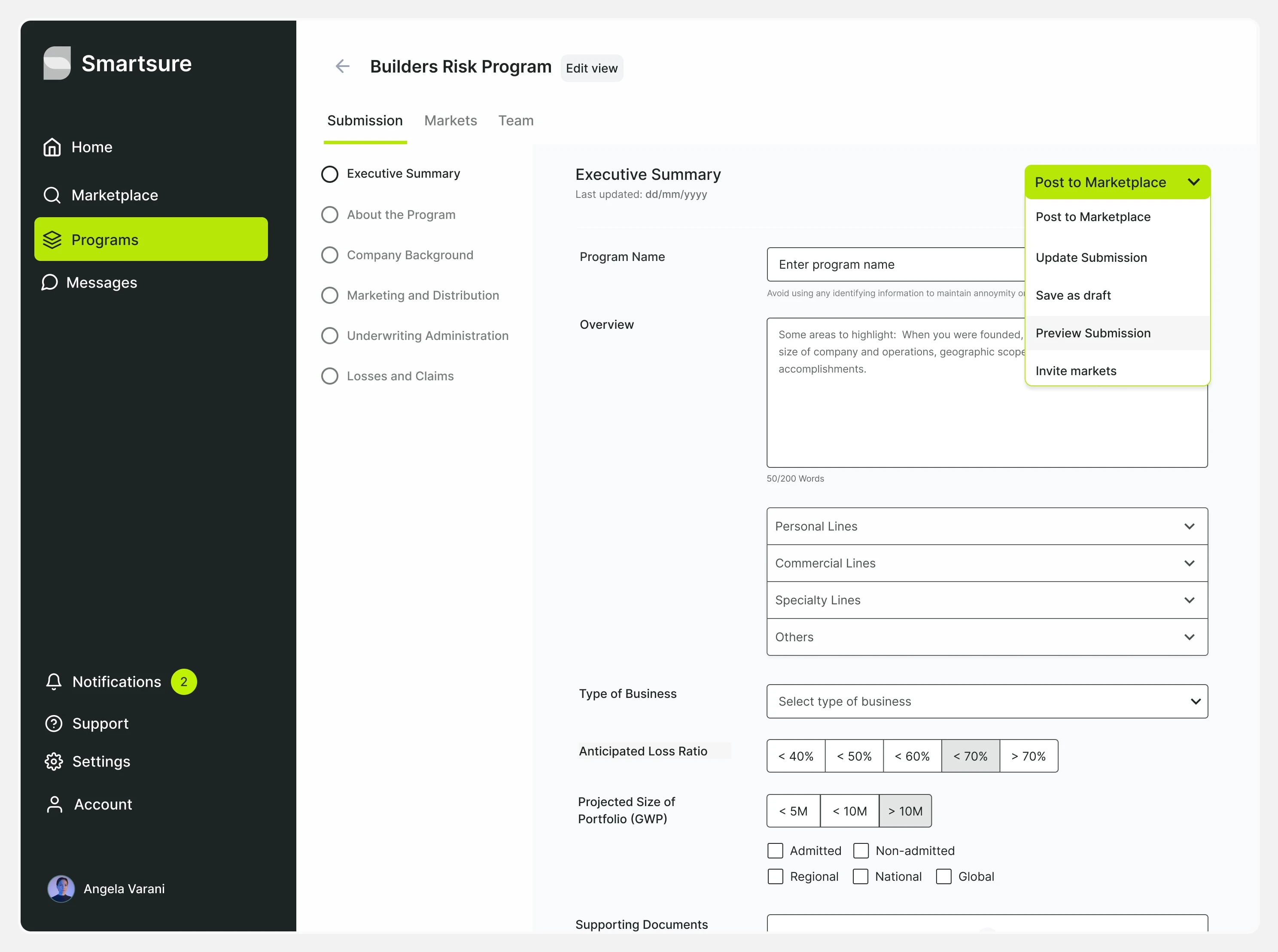
Executive Summary Form
Step 2: Preview
Once the summary is complete, users can preview it before posting.
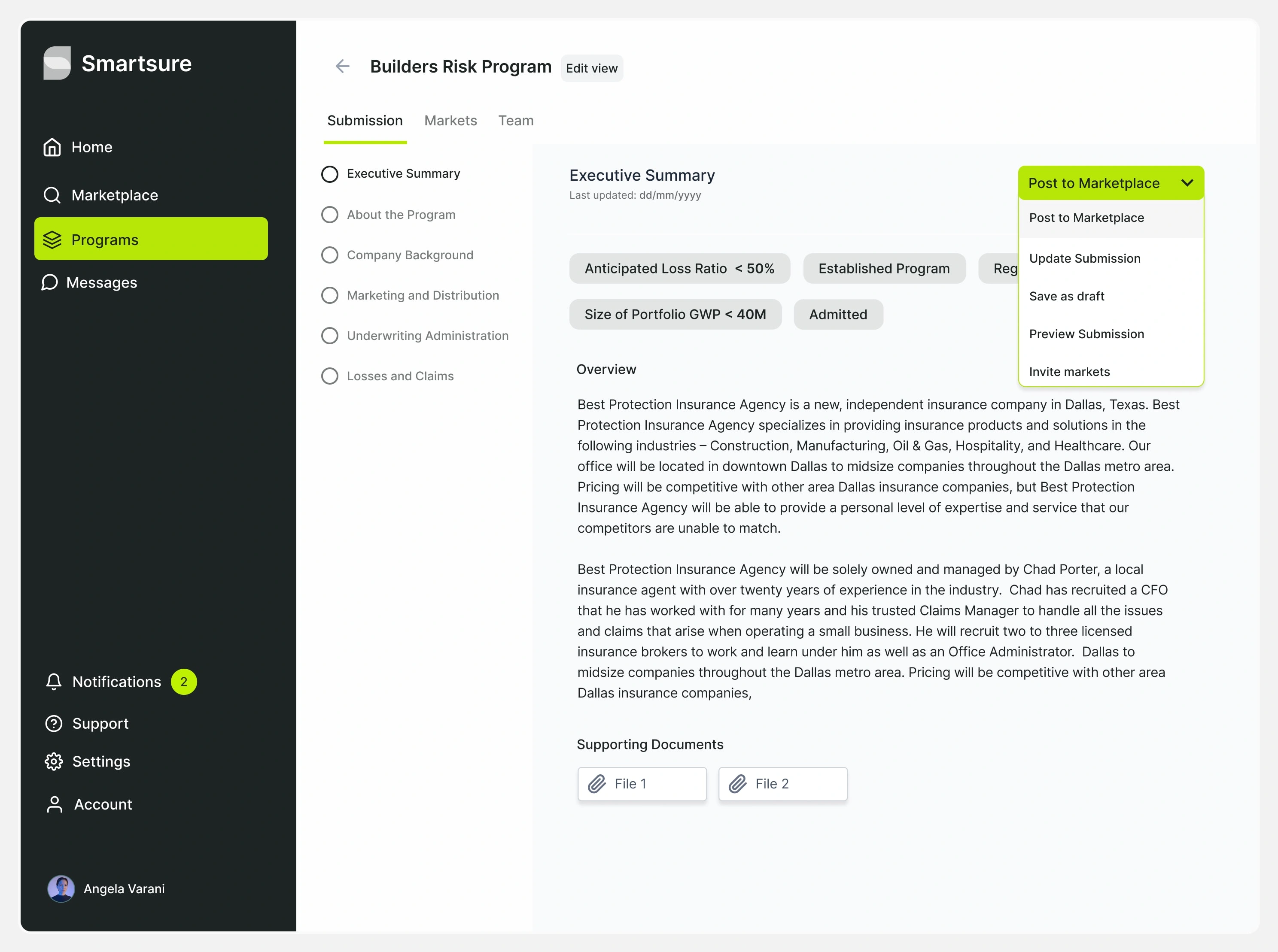
Executive Summary Preview
Step 3: Confirmation Modal
With just six questions answered, MGAs can share their executive summary with the marketplace.
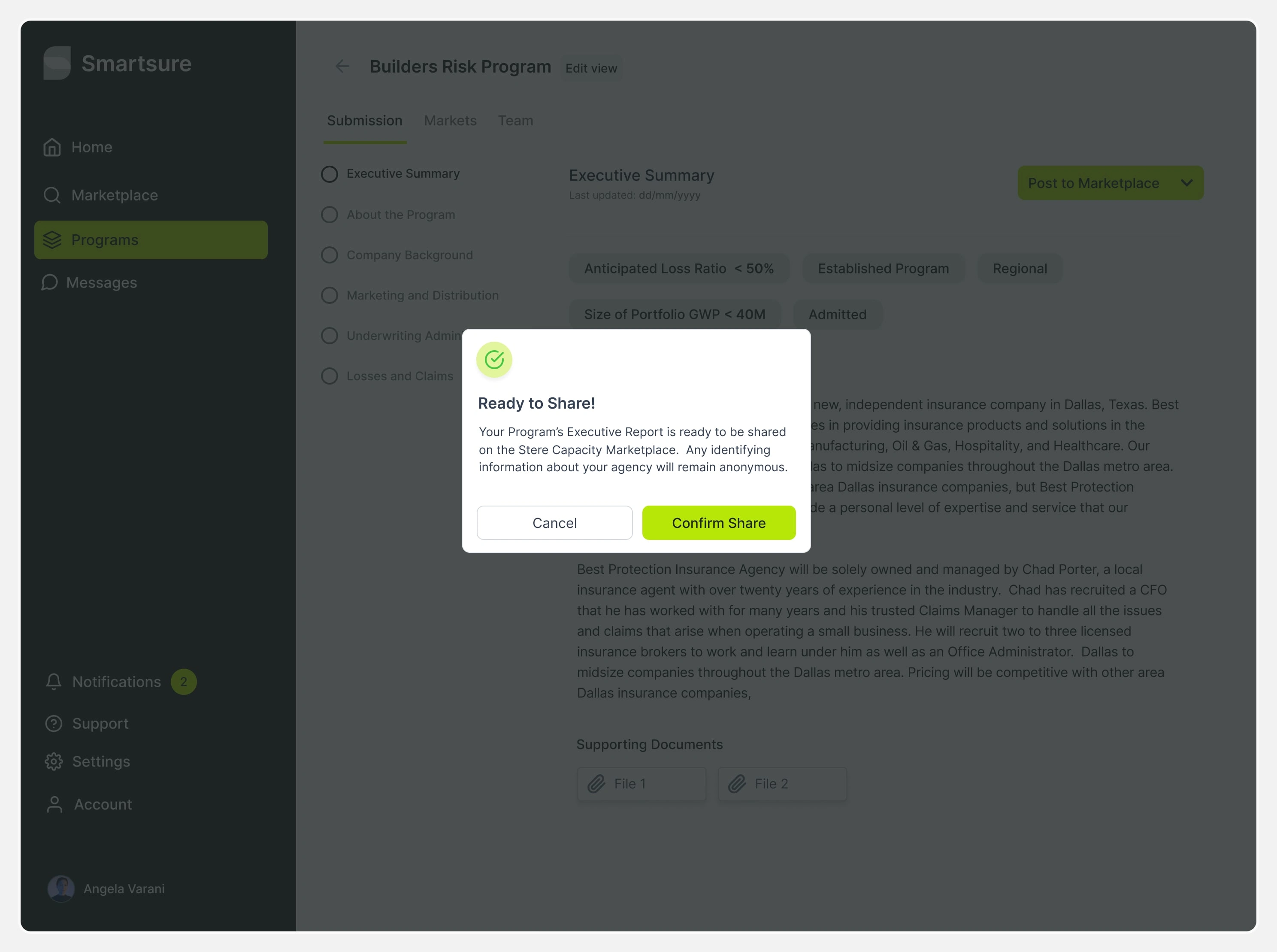
Confirmation Modal
Step 4: Marketplace
The redesigned marketplace allows program creators and capacity providers to explore new opportunities.
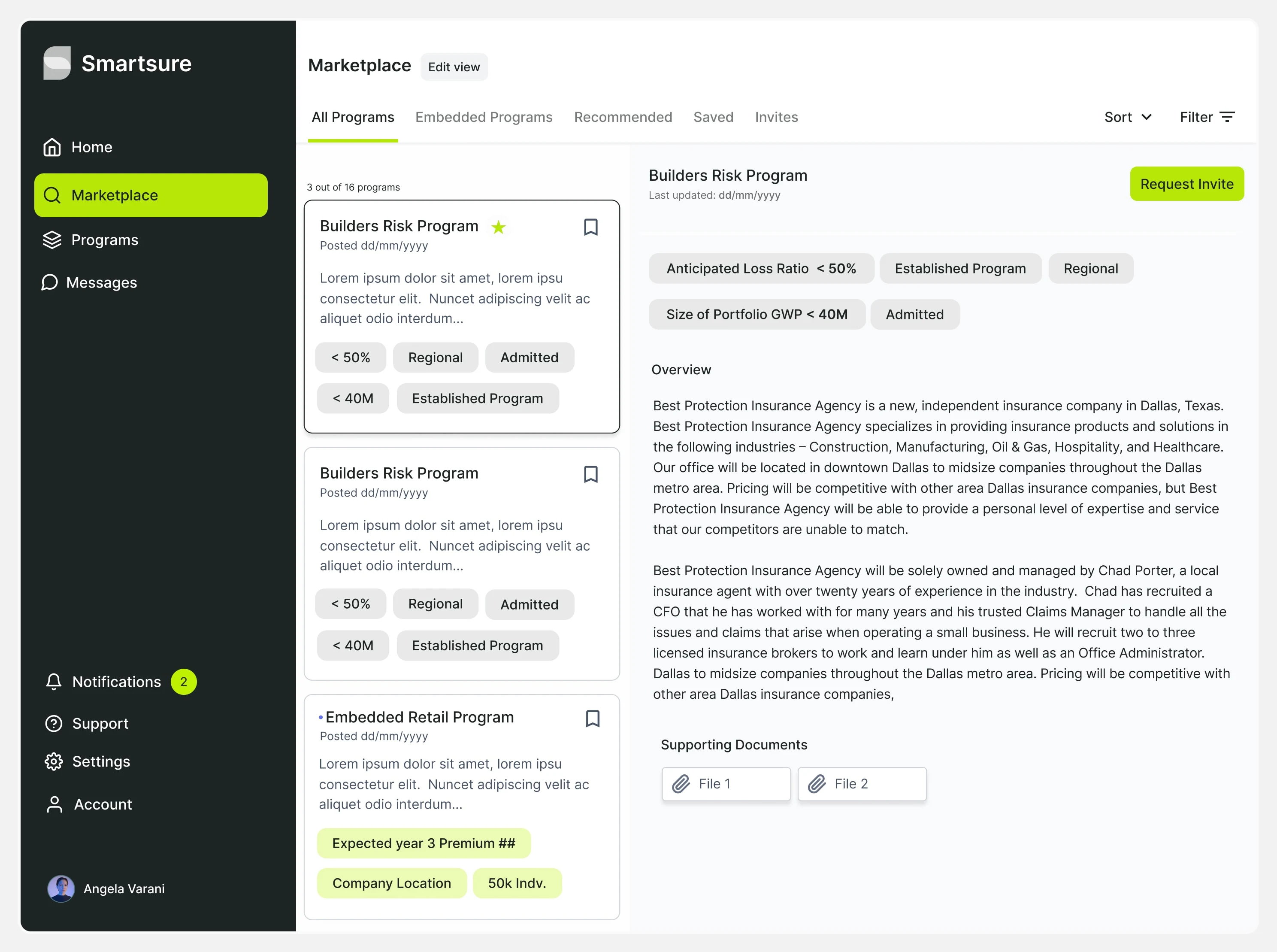
B2B Insurance Marketplace
Step 5: Invite Request
Insurance carriers can request access to MGA programs that fit their portfolios.
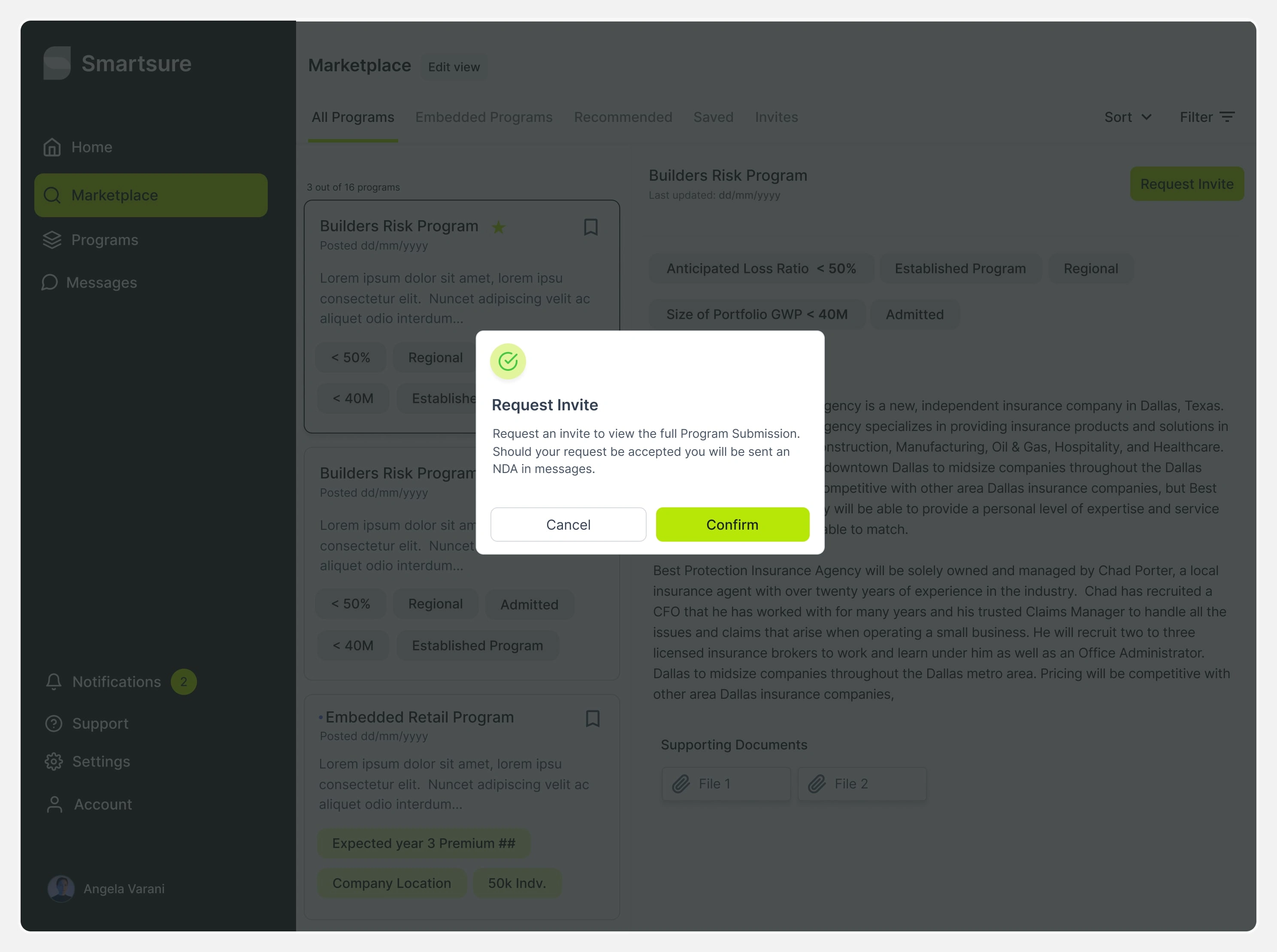
Request Invite Modal
Step 6: Notifications
Invite requests appear in the MGA's messages for in-app communication.
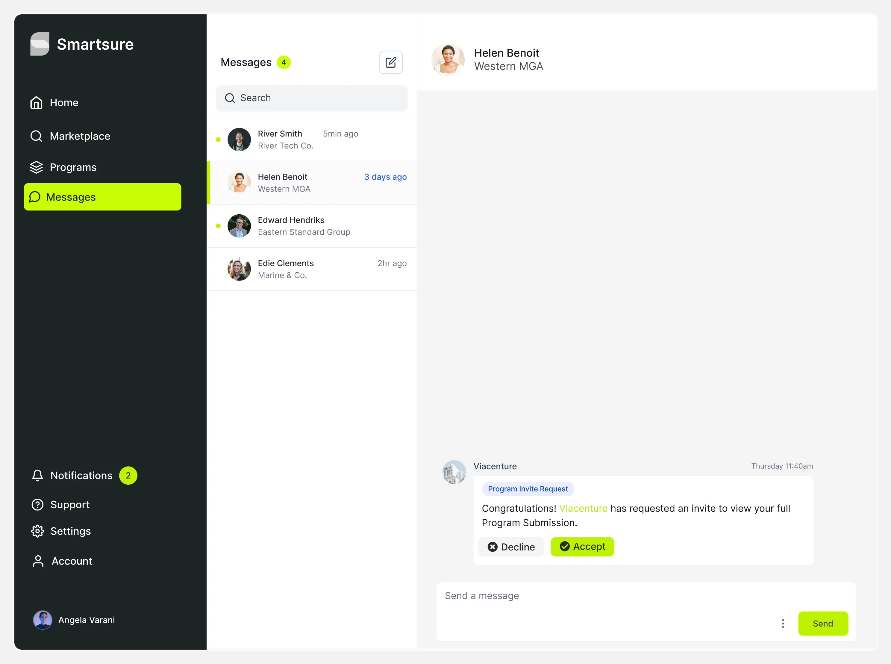
Messages
Step 7: Messaging
After accepting an invite, users can exchange information to determine compatibility.
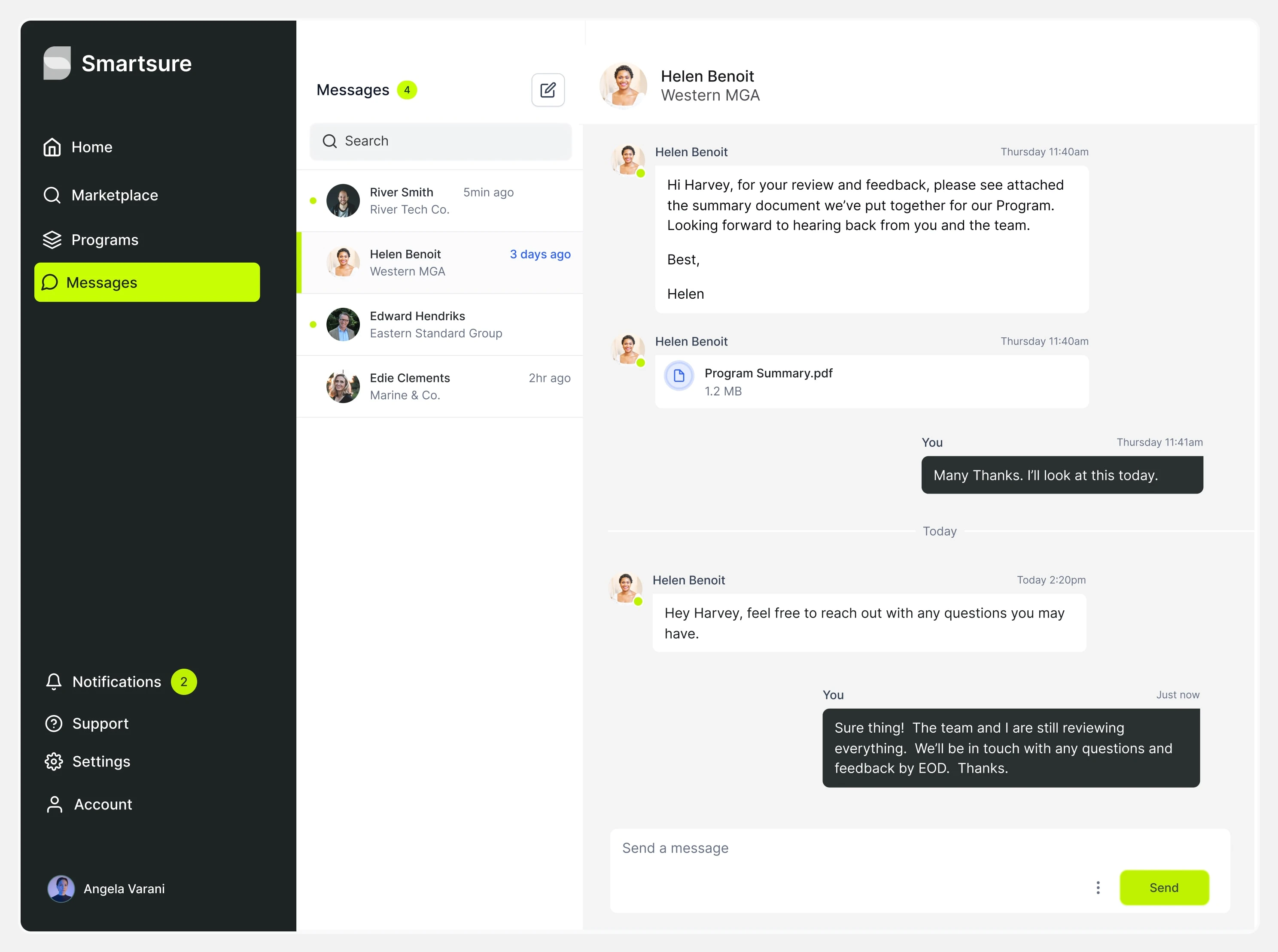
Messages
Outcome
The redesign led to significant improvements:
90% Increase in Completion Rates: The progressive approach reduced drop-offs, with users more likely to complete their submissions.
Enhanced User Satisfaction: Traditional insurance professionals expressed greater satisfaction with the streamlined workflow.
Faster Time to Market: Users could post insurance programs more quickly, enabling faster revenue generation.
Higher Retention Rates: Users who posted early were more likely to return, resulting in increased engagement.
Conclusion
The redesign of Smartsure's onboarding flow effectively addressed high drop-off rates among traditional, technology-averse B2B insurance professionals. By implementing a modular, progressive completion approach and a user-friendly CMS-style interface, we achieved a 90% increase in task completion, enhanced user satisfaction, and improved retention.
This project transformed the MVP from a complex, high-attrition process into a highly functional digital product, setting the stage for increased value and future growth while laying the groundwork for upcoming features and product expansions.
Discover More
Explore how we bring innovative ideas to life in the innovation sector at Astro Design Studio.
Like this project
Posted Sep 20, 2023
As Lead Product Designer for Smartsure, I redefined the B2B insurance experience, streamlining the marketplace MVP and boosting user engagement by 90%.
Likes
0
Views
33

