SaaS Review Management Dashboard Revitalization
Revitalized a SaaS Review Management dashboard, achieving a 70% increase in user task completion rates through a simplified and actionable UX/UI.
The Problem
The Reputation Manager solution, designed for Small and Medium Businesses (SMBs), had not been updated since its launch in 2018. Recent data from HotJar and user feedback gathered by our team's product manager indicated that SMB users were abandoning the review manager without completing the product's key task of responding to reviews.
Before the redesign:
The original dashboard lacked clarity, was confusing for users, and featured no clear call-to-action (CTA). Additionally, the visual design was outdated, and the product was not responsive, posing a significant issue for users who often accessed the application on their iPads or phones.
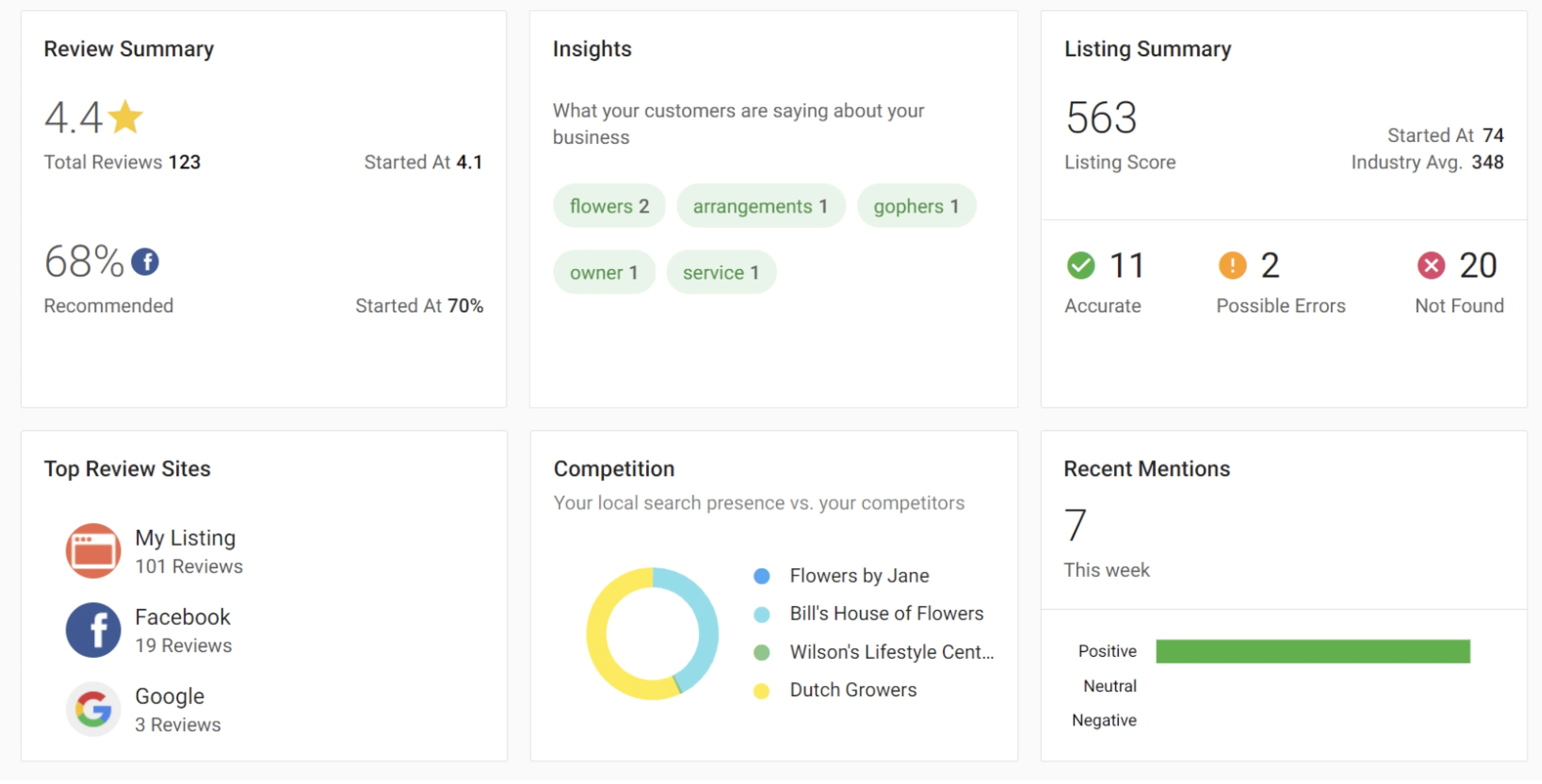
Dashboard cards before the redesign.
The Solution
Through usability testing, feedback surveys, and analytics data, we gained insights into user behavior and pain points. It became evident that users needed a clearer path to take action and felt overwhelmed by the presented information.
The design objective was to create a dashboard that effectively displayed data while guiding users toward meaningful actions, specifically the primary task of responding to reviews.
Key Changes Implemented:
Clarity and Simplification: Reduced data clutter by focusing on key metrics and presenting them in a visually digestible manner to enhance user comprehension and focus.
CTA Integration: Introduced a prominent CTA guiding users to take action based on the data, strategically placed at the top of the dashboard with copy encouraging users to “Respond to Reviews.” Secondary CTAs were added to direct users to engage with other metrics and insights.
Visual Hierarchy: Utilized color and typography to establish a clear hierarchy of information, making it easier for users to identify critical data points.
Responsive Design: Ensured the new design functioned seamlessly across different devices and screen sizes.
Final Designs
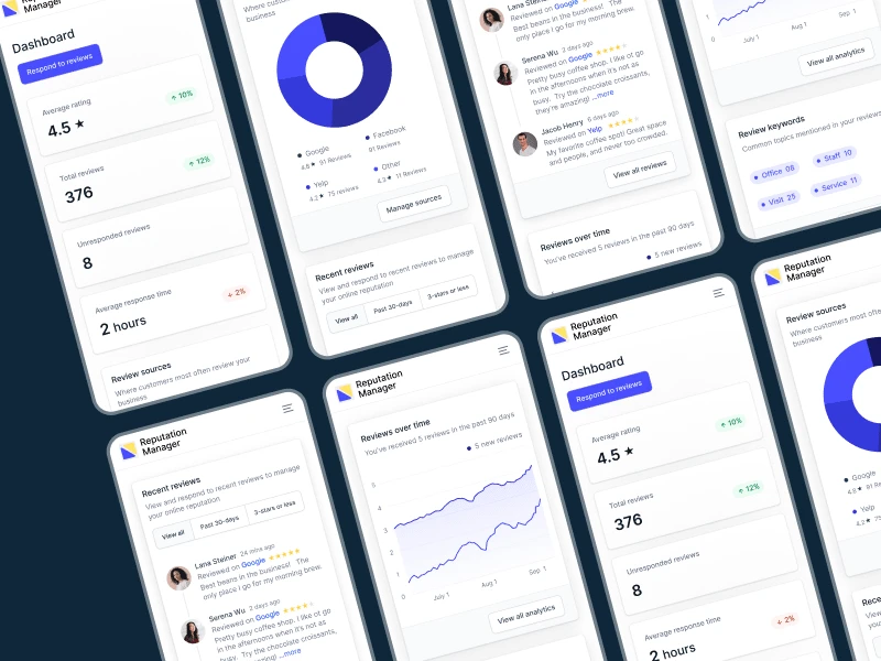
The redesigned Reputation Management dashboard effectively addressed the issues of user drop-off and engagement. By prioritizing user engagement, simplifying data presentation, and establishing a clear visual hierarchy, the new design empowered users to take informed actions based on insights derived from their data.
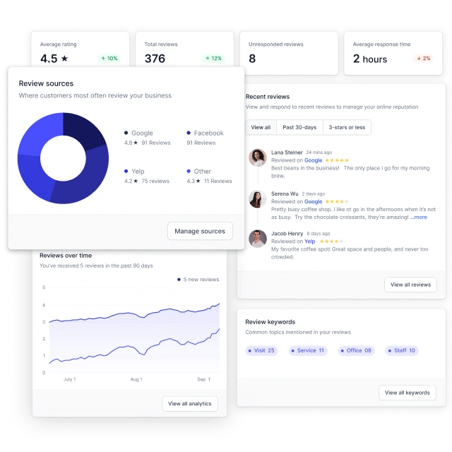
Outcome
The redesign led to a significant increase in completion rates for the primary task of responding to reviews among SMB users, fostering greater engagement with the platform and enhancing their overall experience.
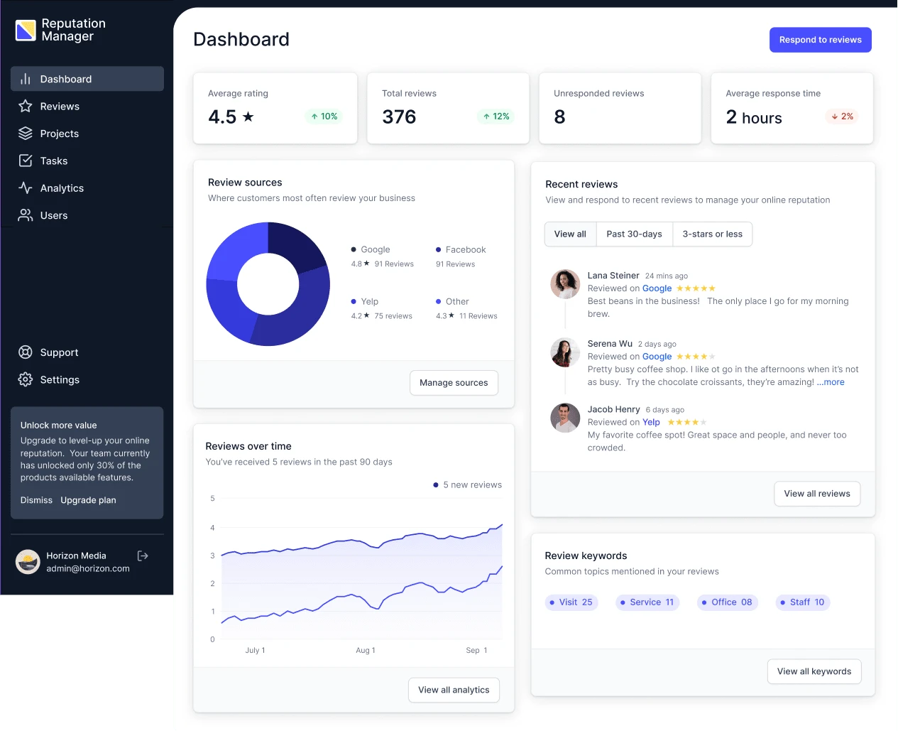
Desktop view
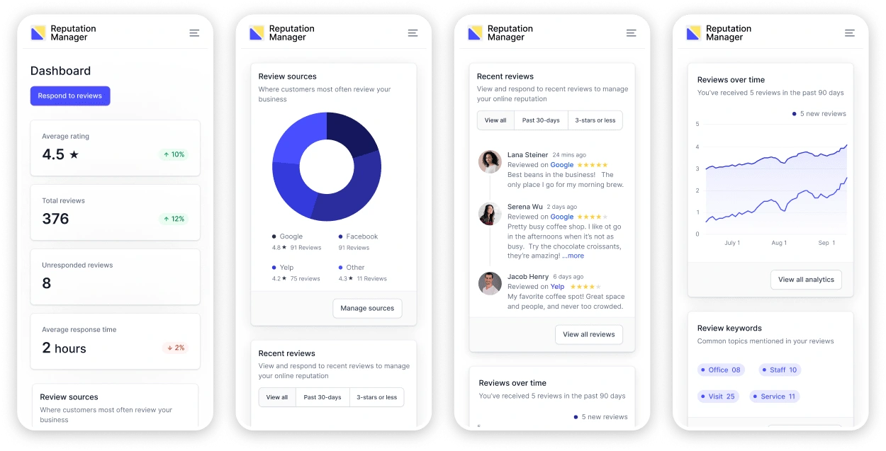
Mobile view
For more innovative design solutions and insights, explore Astro Design Studio, where we transform ideas into impactful digital experiences.
Like this project
Posted Sep 1, 2023
Revitalized a SaaS Review Management dashboard, achieving a 70% increase in user task completion rates through a simplified and actionable UX/UI.

