Design-Led Revitalization of a Settings Page User Experience
From Single Product Refinement to a Platform-Wide Transformation
Introduction
Vendasta, a high-growth SaaS company headquartered in Saskatoon, Canada, offers a diverse range of products in the marketing sector. With 750 employees and generating $50M in revenue, Vendasta's scale is commendable. However, with this scale came challenges.
Vendasta's rapid expansion and siloed operational teams resulted in inconsistencies across the settings pages of its extensive product portfolio. Not only did the settings page vary dramatically from product to product within the platform, they were outdated, complicated, and confusing.
The Solution
Initial Focus
The project initially began as a focused effort to redesign the settings page of a single product within Vendasta's portfolio. The aim was to enhance user experience and reduce the need for customer support interventions.
Expanding the Scope
However, an exploratory scan of other product settings within the platform revealed broad inconsistencies across the platform.
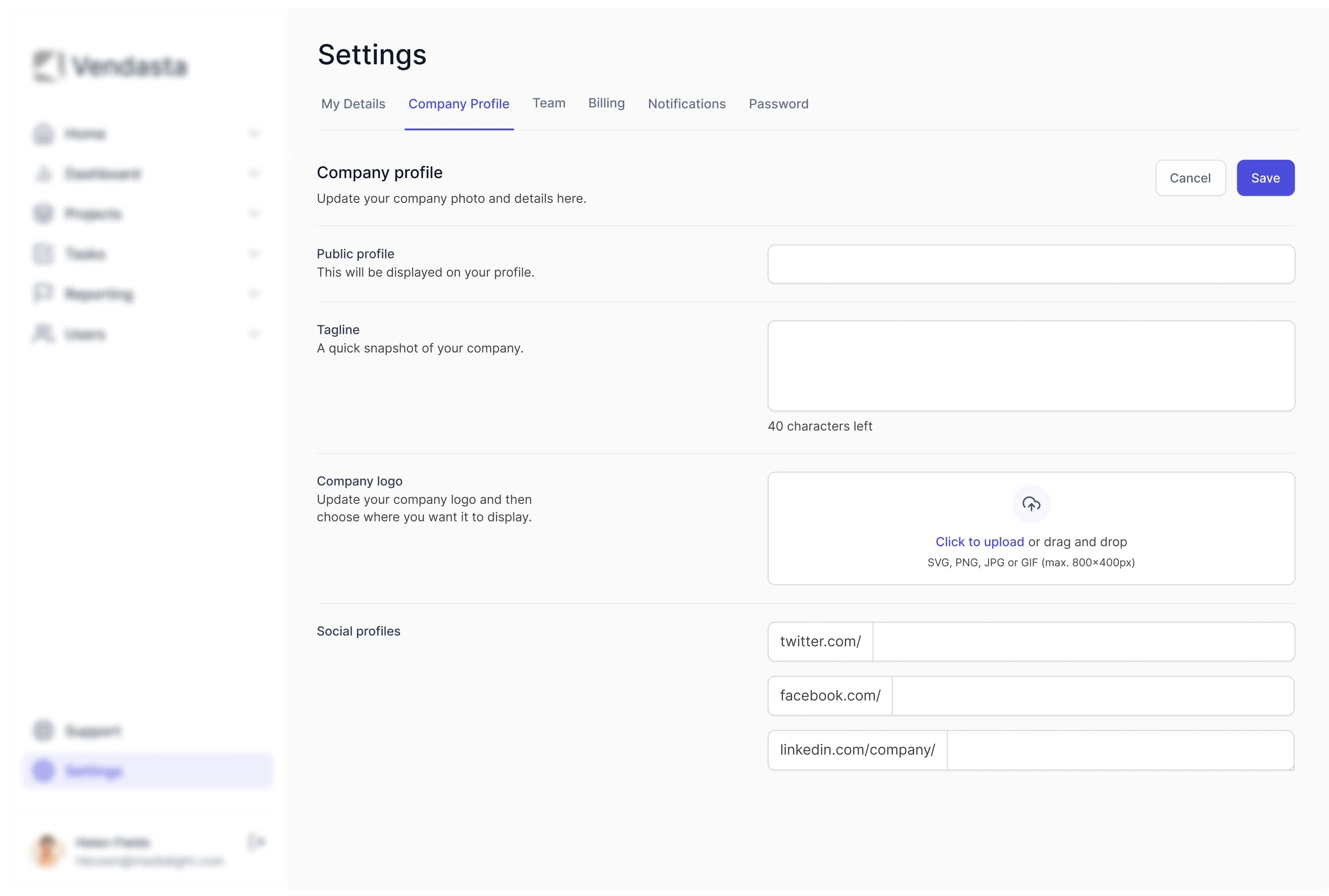
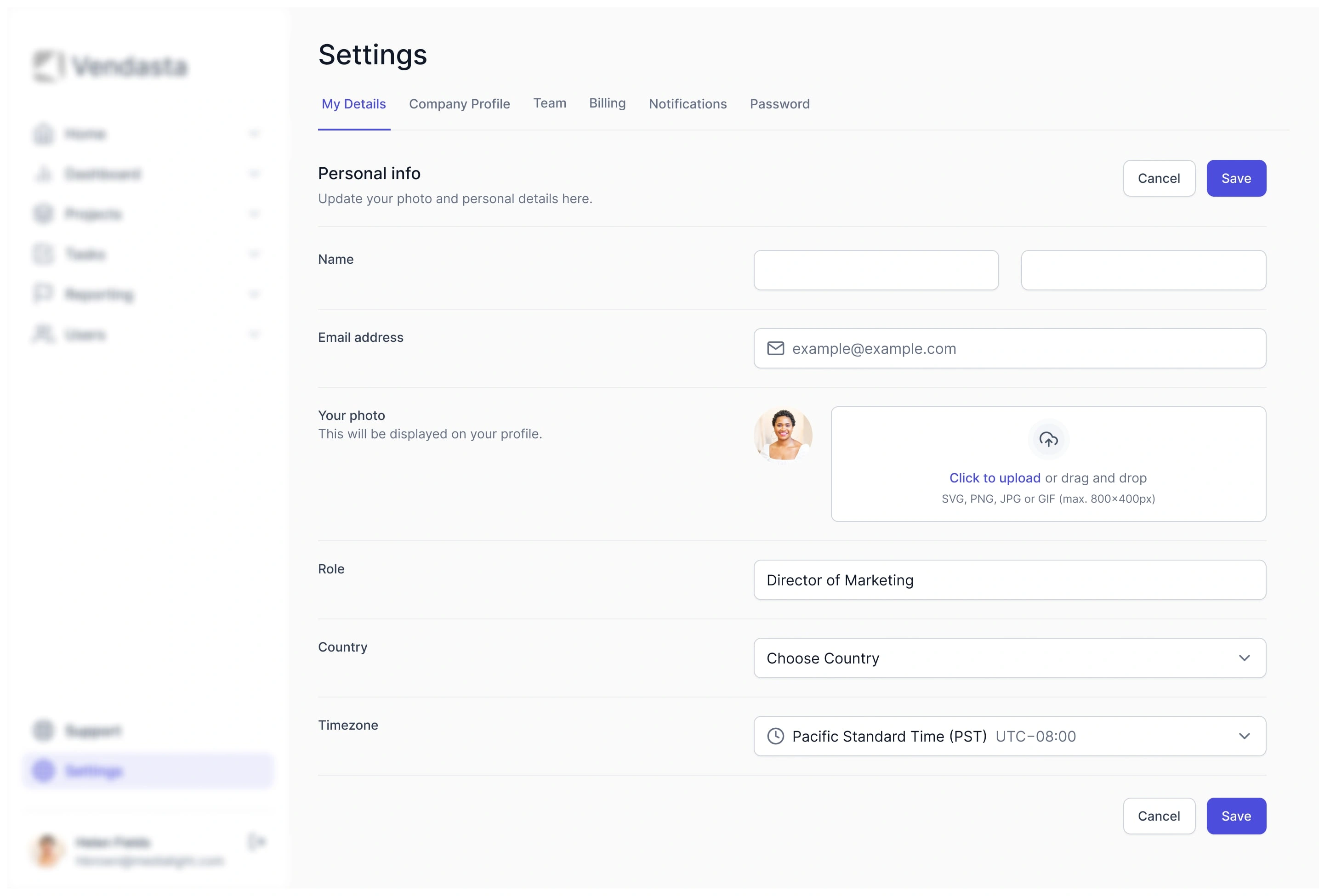
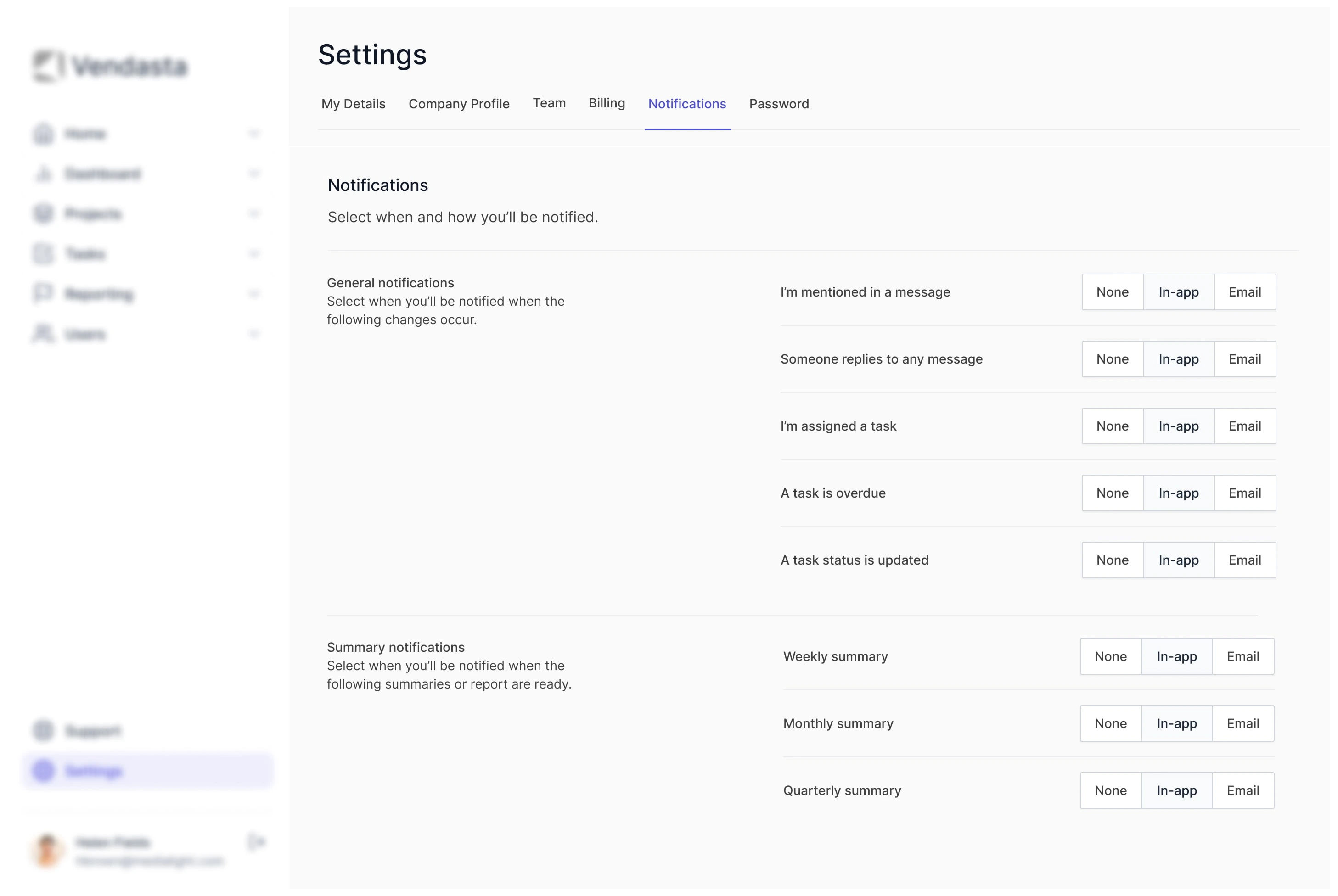
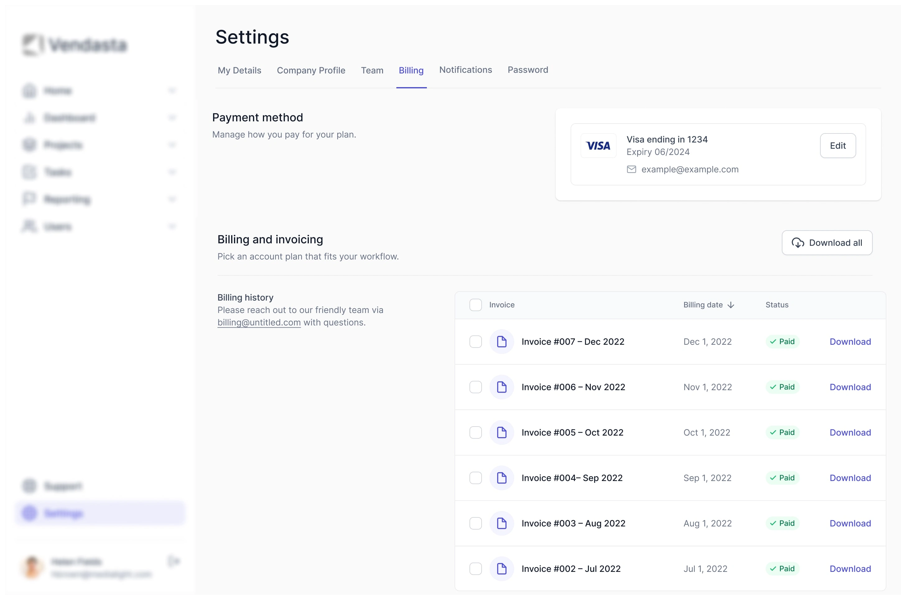
This discovery necessitated a broader vision: Craft a versatile settings page that would seamlessly integrate across the entire platform and supplement Vendasta's design system library, ensuring a consistent and modern experience for all users
The Process
As a product designer, I was part of a cross-functional team dedicated to revamping the settings page over a three-month period. Our approach was:
Research & Discovery: Comprehensive analysis of product settings uncovered platform-wide inconsistencies, highlighting user challenges like unclear categorization, inconsistent labels, and navigational issues. Our methods included surveys, usability tests, and competitive analysis.
Collaboration and Bridging Silos: Inter-departmental collaboration and communication were emphasized to understand diverse platform requirements. Cross-team workshops and stakeholder check-ins were instrumental in ensuring a design that would suit all product variations.
Iterative Design & Prototyping: Various fidelity prototypes were developed to explore patterns and content hierarchy. Feedback from stakeholders, the design systems team, and select users was integrated to enhance design adaptability and user-friendliness.
Development & Implementation: Collaborated with developers for a smooth design-to-development transition, integrating design elements into Vendasta's system. Held review sessions, conducted a beta rollout, and gathered feedback before full deployment.
Final Designs
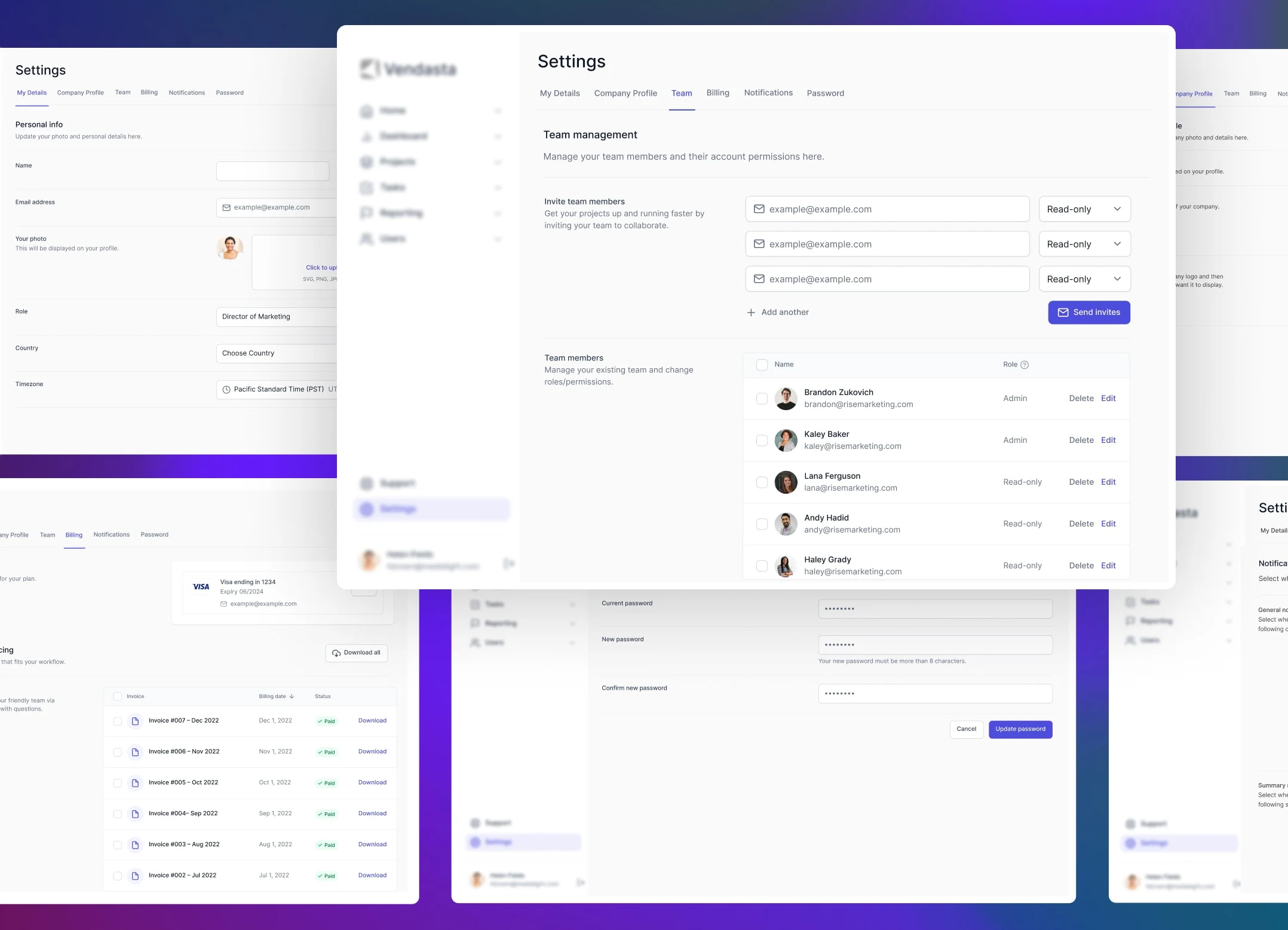
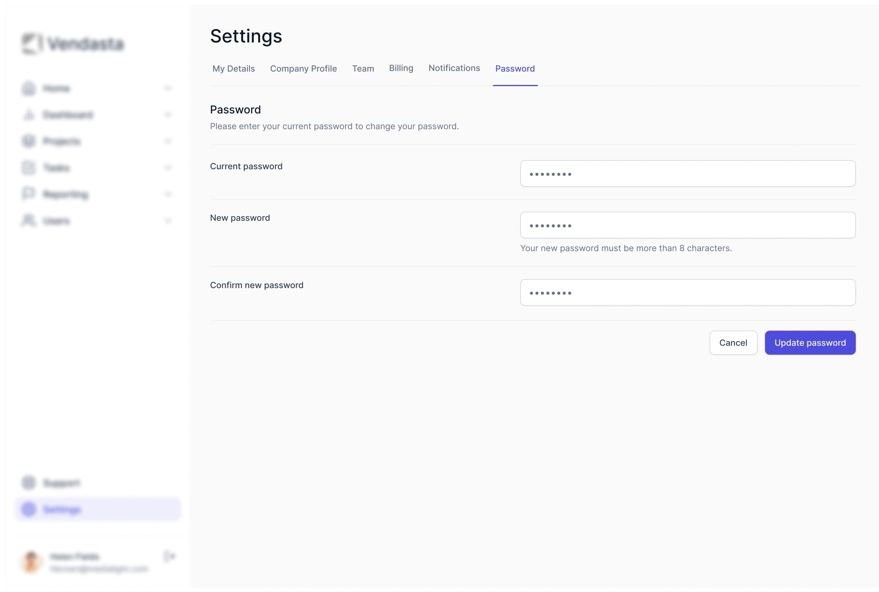
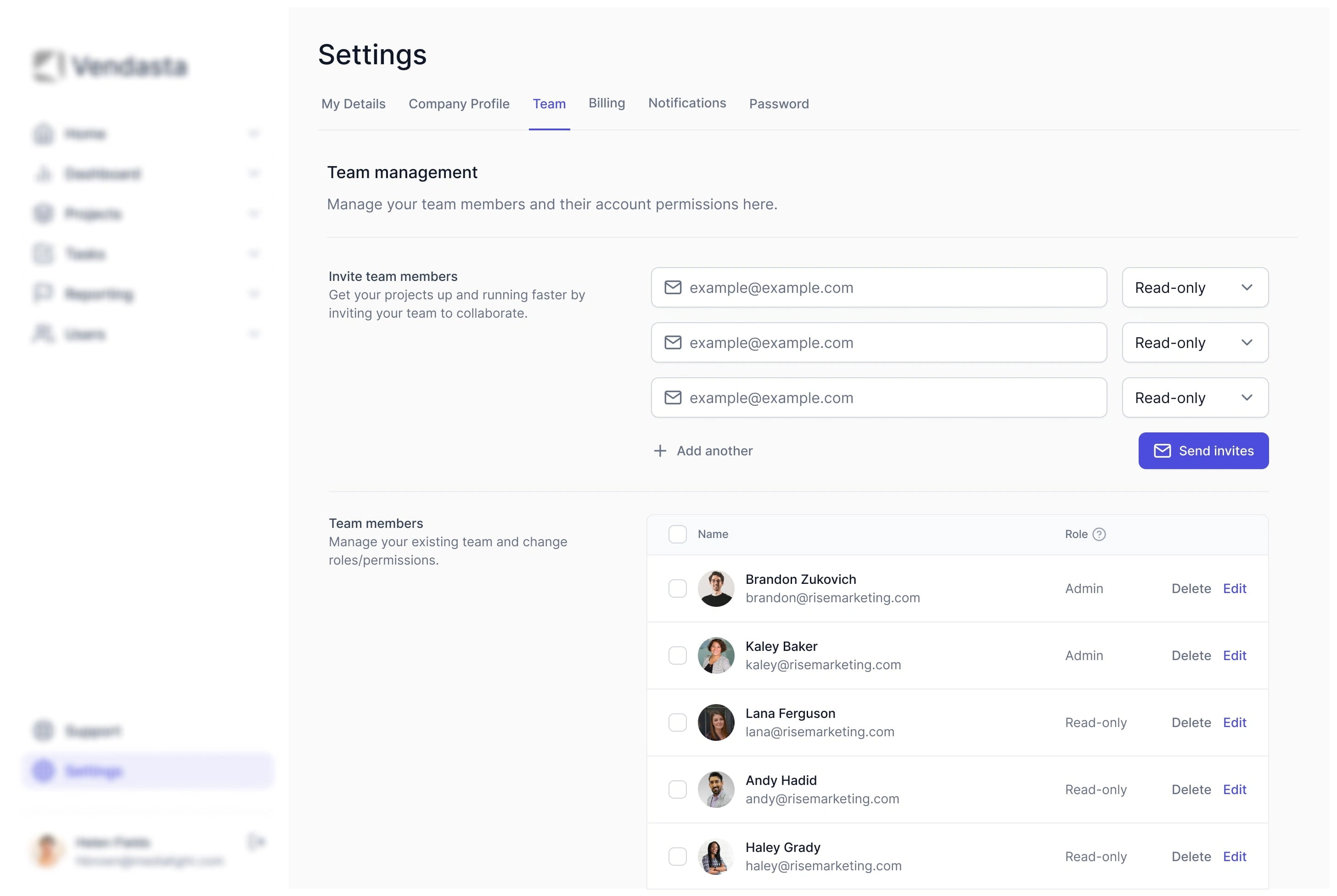
The final design achieved a cleaner, more intuitive settings page. It featured well-organized categories, clear labels, and streamlined navigation. Advanced settings were elegantly hidden, and tooltips provided additional context where needed.
Key Changes Implemented
Intuitive Navigation: Overhauled navigation to be more intuitive, reducing unnecessary steps and streamlining user journeys.
Categorized Settings: Grouped settings into logical categories to reduce clutter and improve findability.
Simplicity: Simplify the settings page structure and remove unnecessary complexity.
Clarity: Use clear and consistent labels, helping users understand the purpose and impact of each setting. Employed descriptive and concise labels for each setting to minimize confusion.
Efficiency: Improve navigation to reduce the time users spend looking for specific settings.
Accessibility: Ensure the redesign is accessible to users with diverse needs.
Like this project
Posted Feb 7, 2024
Cross-platform settings pages redesign contributing to the design system, reducing dev time by 30%, and ensuring consistency across product lines.

