The most important person in your life - Personal Growth App
Study Case about Ironhack`s third Project of the UX/UI-Design Bootcamp
Become — Unlock your potential!
I want to start this study case with a self-reflecting question for everyone reading this right now: When was the last time you set aside time just for yourself? To pause, reflect and define who you are and who you want to become?
I guess you all came many times in a situation where you just didn’t had time for it — set other things as a priority as you thought it’s more important. But the most important thing, the most important person in your life will always be you.
But what does personal growth mean? And how can you manage your busy life schedule and your self improvement journey in an efficient way?
Overview 📢
Assignment: UXR, MVP, High-fidelity — Prototype, Design Critique and Presentation
Project overview: mHealth App of simulated Client “Daily Health Conference” a non-profit organization dedicated to promoting health and wellness. Want to offer more value to its members by exploring how technology can be used to help people live healthier lives in new ways.
Roles: UX researcher, UX writer, UX/UI Designer
Duration: 10 Business Days
Team:
Methods & Materials: Secondary Research, Market Research, Brand Comparison Chart, Lean Survey Canvas, Lean UX Canvas, Empathy Map, Quantitative and Qualitative User Research, Affinity mapping, User Persona and UJM, Crazy 8, MoSCoW Method, MVP, Wireframes, Low, Mid, and High — Fidelity Prototyping, Concept and Usability Testing, Moodboard, Branding, Figma, Figjam, Zoom, Google Survey, Slack, Notion
An innovative approach 💡
Brief
The Daily Health Conference is a non-profit organization dedicated to promoting health and wellness through impactful public talks, participatory workshops, and professional training all over the world. Even though The Daily Health Conference has numerous years of experience in the field, its program has been slow to catch up with technology. They have seen a substantial drop in memberships. Therefore, they want to curate a new set of digital mobile apps for members with a fresh brand that reflects an innovative approach to wellness.
However, they are not exactly sure where to begin! As a result, they’ve organized a competition for the upcoming conference.
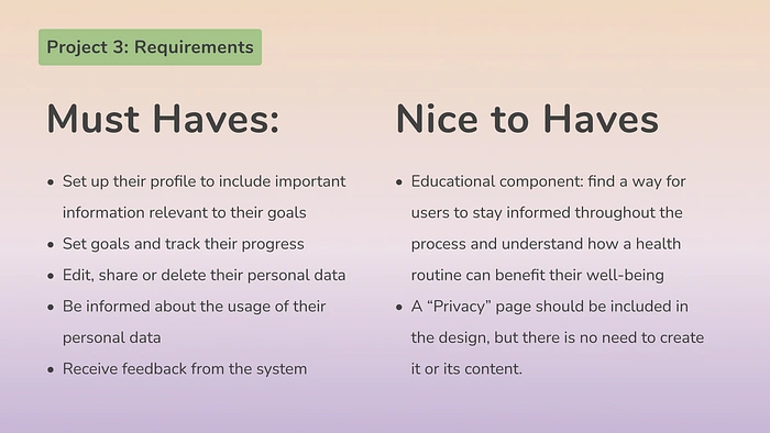
Project Requirements
Emotional Growth — A better place, a better future 🌍
Empathize
We started this project with the quantitative user research and crafted a user survey to collect data from our idea, we brainstormed after a quick market research.
“Choose a niche that is remarkable in the wellness industry. Something we haven`t seen yet!”
My brain started to pick up ideas out of the colorful wide space of creative concepts, while our teacher Ayesha Mutiara was still briefing. A meditation or yoga app? Cancelled. Sleep and Habit Tracker? To many on the market. An app that helps neurodivergent individuals? Too many projects in this field from the last class. After an entertaining and brain stimulating ideation session with my teammate, we merged our ideas together in one:
An app that focuses on self improvement and personal growth with different kind of tasks the user can track.
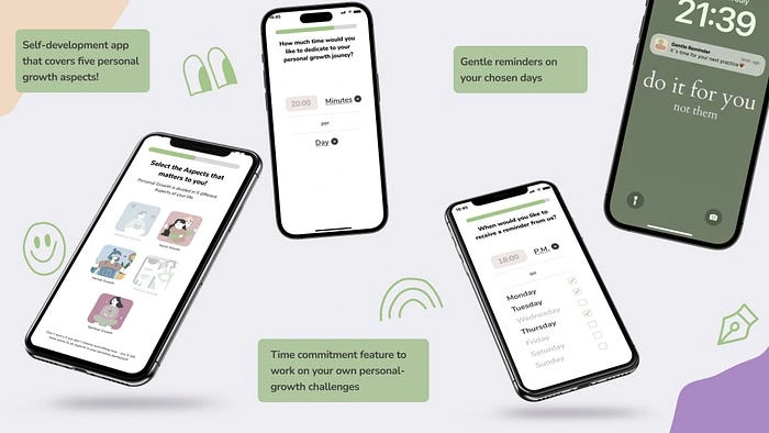
Mockup Sneak Peak of Become App
But what does personal growth mean? How does meditating or journaling benefits the human health? And are there any scientifical studies or theories about self-esteem? With much curiosity we have dived deep into the world wide web and found interesting numbers, facts and studies about 4 topics we chose beforehand.
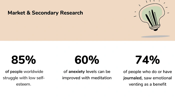
Insights of Market & Secondary Research
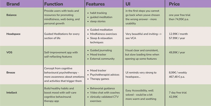
Brand Comparison Chart
In the competitive analysis we realized that the idea we emerged earlier in the process to develop, doesn´t has many direct competitors. There were many other mental health apps such as Balance or Headspace who were more a meditation or habit tracking app and VOS, who has the feature to led people journal or connect in a community. But there were no apps that focused on personal growth and had tasks to construct the user experience more engaging.
The Lean UX Canvas helped us to establish nine questions that´d help us to validate our results from the secondary research and refine our user persona and UJM in the further design thinking process.
After publishing the survey on multiple social media platforms and sending it to friends and families, we worked out our UX Lean Canvas to obtain a clearer and refined vision for our app.
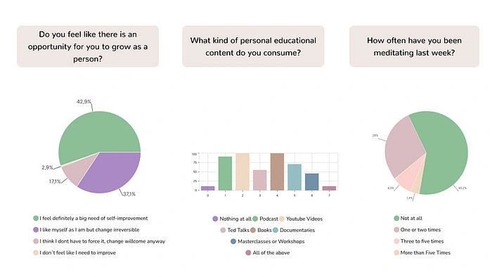
Insights Qualitative UXR
With the results from the qualitative user research and the help of our UX Lean Canvas we created an Empathy Map to empathize with our ideal target user. We also took the opportunity to directly formulate questions for our qualitative user research and not create assumptions for aspects, we couldn't draw informations from our survey out.
Full Interview-Guide: here.
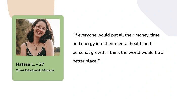
User Quote qualitative UXR
The questions we created guided us to dive deep into our users’ thoughts and created mind stimulating conversations, that led us with self-reflexional thoughts, about ourselves and the world, back.
Mental Growth — The clarity in the chaos 🧠
Define
We collected the Insights from the interviews on virtual sticky notes and created an Affinity Diagram. We differentiated the answers in two sections. One helped us to create our ideal user and it´s journey and the other part helped us to ideate in the further process.

Affinity Diagram Feature Ideas from UXR
We also considered our qualitative UXR Insights while defining our User Persona. We saw a huge trend in the people we picked to ask. Almost all of them expressed an interest in their personal growth and self-improvement journey but can´t find time in their busy life schedule. Consistency, balance, and resources our users take advantage of to learn about themselves, led us to conscious Chloé.
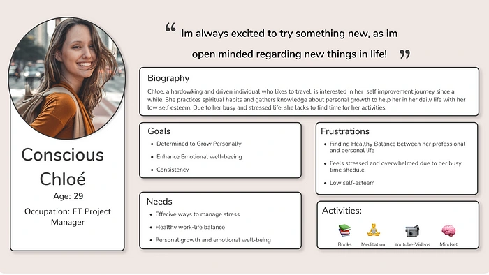
User Persona Conscious Chloé
Meet Chloé! Chloé is determined and interested in her personal growth in all aspects of her life. She loves to explore and try new things out and as an open-minded person, she practices regularly spiritual habits, such as meditating. Due to her busy and stressed life as a full time Project Manager, she lacks to find time for these activities, that help her to grow and become the person she wants to be.
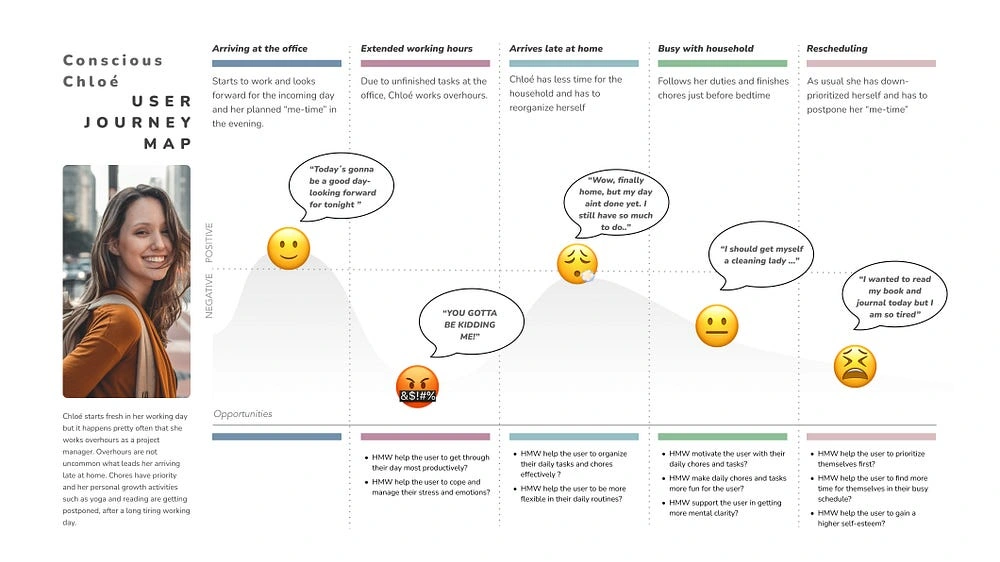
User Journey Map of Conscious Chloé
We considered in the UJM the insights from our Qualitative and Quantitative UXR as well. Self Esteem and Mental Clarity was a trend in our research as well, that we took into account.
In her journey she is going through, we dot voted on the last two phases to focus on. One was arriving at home and being busy and overwhelmed by the chores and tasks in her household and the last one where she down prioritizes herself. We picked those two phases, as we realized in the main HMW-Statements an opportunity for the topic we chose to go for in the wellness industry.
Main HMW Statements were:
“HMW support the user in getting more mental clarity?”
“HMW help the user to gain a higher self-esteem?
“HMW help the user to prioritize themselves first?”
These HMW statements contributed to our Problem Statement that was:
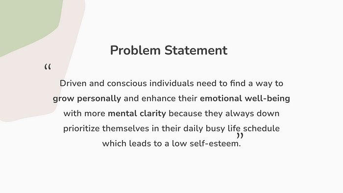
Problem Statement of Become App
Spiritual Growth — The wideness of creativity 🧘
Ideate
Aaaah, the lovely ideation. I think I can speak in the name of most designers, that this part is one of our favorites. Creativity strikes the mind, and we can live it out with different methods to collect our ideas. We chose to go for the Crazy 8´s as it´s beneficial for the further process in creating the wireframes. We often hear ideas from our teammates, but visualize it completely different.
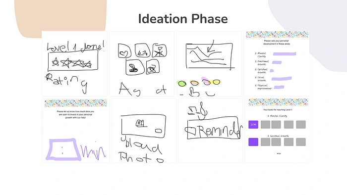
Crazy 8´s Sketches for Become App
We transfered the ideas in the MoSCoW Grid and realized quickly we thrifted in getting featuritis. When two people come together who adapt quickly to the brief of the client, consider all the must haves in it, the feedback from our quality UXR in the affinity diagramm and taking the Problem Statement into account, a lot of ideas and features are coming together. With the time in the back of my head and the scope we had to finish, I indicated to move lots of features in the could have and future iterations. Combining strategic and creative vision is a challenging balance but not impossible!
The overview of our MVP Statement has composed to be:
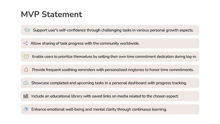
Overview MVP Become App
With our MVP and the sketches from the Crazy 8 earlier in the process, we started to map out the structure of our app in a Sitemap and created a main user flow, that covered all features in the MVP. We also considered 3 Screen States to display. One is when a video would be downloaded in Chloés library (to watch later in a plane for example), an error state and an upload state when she wants to add a picture to her task post.
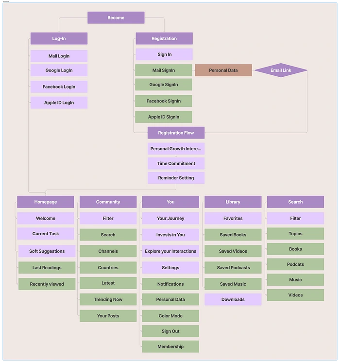
Sitemap Become App
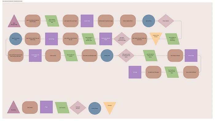
Main Userflow Become App
Finding a structure in all the features an app has with it´s screen states is crucial to make the ideas real and plan all the wireframes accordingly.
We mapped out all the screens we need and decided, due to lime limitations, to create two Low-Fi Wireframes for our concept test and instead come with a much more detailed pitch about our app — including our MVP and a round of questions from our concept tester, before we asked them about their thoughts about its concept.
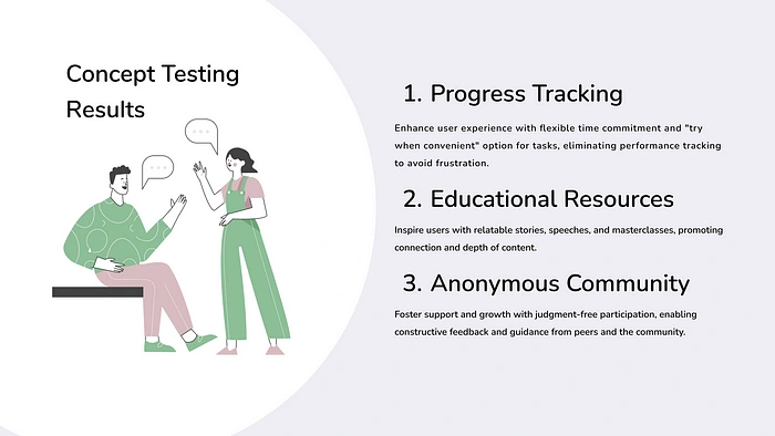
Results Concept Testing Become
The results of our concept test brought us to the conclusion to be more flexible with the time commitment goal settings, so the user doesn´t feel too much pressured when they can´t keep track. It also reassured us in features such as the anonymous sharing option into the community and the educational resources, that we were on the right track and inspired us to adjust them to the users’ needs and goals.
Physical Growth — Cohesive and Trust ⚙️
Prototype
With the concept test result in our mind, we divided the number of screens in the team and started to create components together to design cohesive. Pulling on the same strand in UI within the same project, is crucial to create a valid and cohesive interface and built trust with the user and costumer.
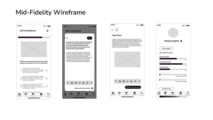
Some Screens of Mid-Fi Become
Social Growth — When it all comes together 🎨
Test & Branding
We interviewed people live for our remote usability testing with 5 main task they had to complete and asked them to share their screen in
while we observed their desktop and facial expressions. While doing the task we asked them to give immediately feedback when they get stuck or confused. We noted all the comments from our testers in our Figma File right on the Mid-Fi Wireframes to work with those insights on the High-Fi Wireframes later in the process.
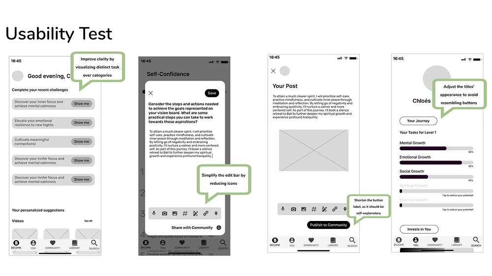
Some Insights of Usability Testing Become
Earlier in the Process we picked a couple of brands for our Brand Comparison Chart and simultaneously collected screenshots of the apps in a VCA. We used the collected screenshots to dive deeper in the VCA and pick up the colors and typography of each brand and came to the result that each brand might have different colors and typography, but their style of illustrations and iconography are connected.
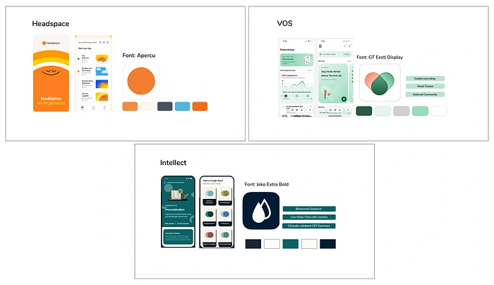
VCA Become
So, we decided to go into a direction none of these apps went yet. A brave direction of naturalness, authenticity, and calmness. An app that doesn´t overstimulate the user with colors — as we all might be daily on our phone with the number of apps loud and app we are using.
While collecting our Brand Attributes on a Moodboard, we considered the earlier UXR research results and the problem statement as well. UI wouldn`t be anything without UX!
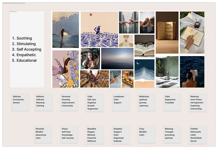
The results from the moodboard testing validated our concept of the direction of the branding we wanted to go with. We picked up colors from the moodboard and asked ourselves the meaning and connection behind those colors and our app Become. We also considered accessibility while choosing the colors.
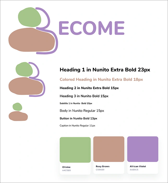
Beginning of Style Tile Become
Olivine as our primary color symbolizes the humans mind, Rosy Brown the heart and spirit and the African Violet the love to ourselves. We chose a variable font named Nunito as our typography of choice and chose it because of its rounded edges, that gives a friendly and welcoming look that matches with the Logo I created.
The story behind the Logo is simple yet significant. It symbolizes, as in the color choice explanation already mentioned, the humans mind, spirit, and hug from us. It`s imperfect shapes, presents the imperfection of all.
I also found, while creating the High-Fi´s with these assets, the joy in components. Our style tile grew quickly.
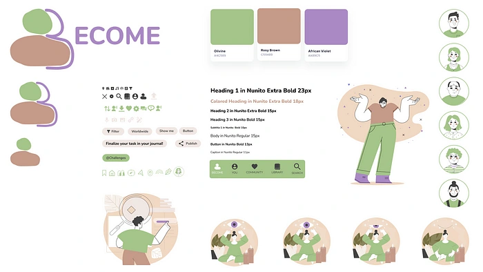
Complete Style Tile Become
And so did our components collection as well!
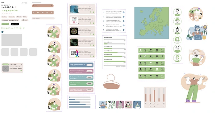
Complete Components Collection Become
Besides of the color accessibility for people with different color blindness and autism (not too overstimulating), we took the reading text out loud option into our High-Fi´s.
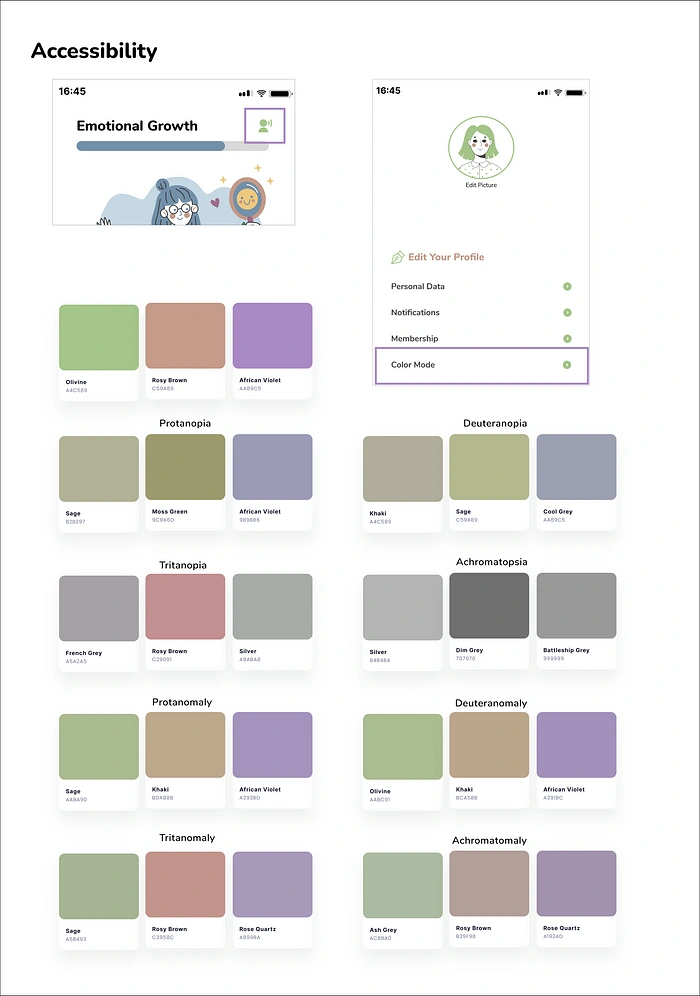
Accesibility chart of color blindness and reading out loud option
And here goes our High-Fidelity Prototype of Become, a personal growth app — unlock your potential!
Iterations and Learnings 💭
In the further process of our app:
● We`d enrich the app with more levels and tasks and introduce a stress button for immediate support with stress reducing practices
● Gathering customer feedback with a rating system after completing 25 tasks of each level would help us in our future UX journey to implement the users’ needs.
● Another option we´d like to implement is to enable users to download challenges for offline access.
Unfortunately, we couldn´t finish our presentation as we ran out of our given time. Efficient time management, in a two-week sprint, in a team of two people, with a big scope such as this one, was the biggest challenge we faced and we take it as a huge learning, with this unfortunate experience, at our presentation day.
Besides of that it was a pleasure for me to work on an app that underlines my brand of ArtsyAleksDesigns and bring more purpose into my designs!
Like this project
Posted Jul 28, 2023
Personal Growth and Self Improvement App - MVP, Logo Design, Branding, High-Fi Prototype and Stakeholder Presentation
Likes
0
Views
8
Clients
Ironhack
