UI — Hungergames, Redesign Lieferando App
Study Case about Ironhack’s fourth Project of the UX/UI-Design Bootcamp
Welcome to the User-Interface Hunger Games of Ironhack! This project is solely a UI Redesign Challenge, with a time limitation of 8 hours. Access to the
files, aka our Arena, was only open during those 8 hours. And yes, you read that right, it was a shared file within the class of 28 people with different sections for each team of two — it was brutal! You want to know why? Let me take you on a quick journey!
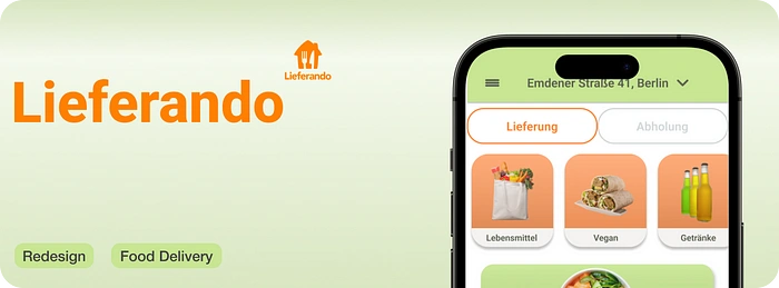
Sneak Peak Redesign Lieferando
Overview 📢
Assignment: UI Redesign of native app
Project overview: Redesign 4 screens of well known native app of our choice within 8 hours in access and time limited Figma file. Pre-designed UI kits prohibited!
Roles: UI Designer
Duration: 8hours
Team: Hanna Kravets
Methods & Materials: Market Research, VCA, High — Fidelity Prototyping, Branding, Figma, Zoom, Slack,
We chose to venture into the food delivery niche due to the abundant selection and the opportunity to make valuable comparisons for the VCA. During the visual competitive analysis, we realized quickly which app we are going to redesign: Lieferando.
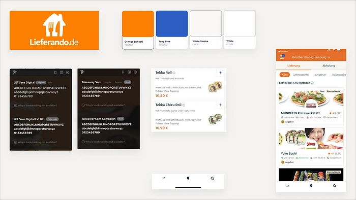
VCA Lieferando
Lieferando’s current colors are based on a bright Orange, Tango Blue, White Smoke, and plain white. The color combination might be harmonious in the color wheel since the orange and the blue have a complementary relationship. However, the hierarchy and usage of the colors do not make sense in the app. We also noticed that the food delivery app uses different typefaces with different fonts within the app, which is not recommended for an interface design on a small device like a mobile phone.

VCA Uber Eats & Wolt
While the biggest competitors of Lieferando here in Berlin, Wolt, and Uber Eats, are doing an interesting and user-engaging job with the usage of colors, typefaces, iconography, whitespace, simplicity and Human Interface Guidelines — let’s just assume Lieferando was usually built for Android users, and Wolt and Uber for iOS. 👀
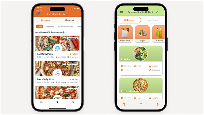
Old vs. New — Homescreen
We decided to keep Lieferando’s primary color as Orange and adjust it to a decent Pumpkin Color, since a redesign doesn’t necessarily mean inventing the whole wheel anew. Current users who have built a relationship with the app would still recognize it and wouldn’t be forced to get used to something new — since we all know humans are creatures of habit and don’t like changes. We added a fresh, appetizing Spring Bud Green to the new color palette and a Lilac Purple as an accent, which we later decided not to use at all — since we naturally realized in the creative process that it might be too much for the user. Our approach in the redesign was to simplify and modernize the whole app, including its colors, pictures, typography, and iconography.
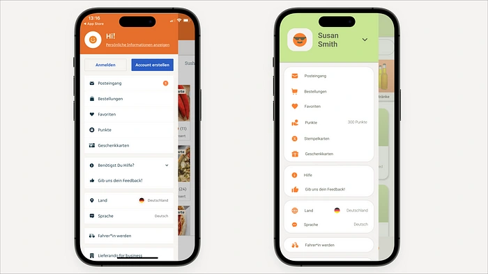
Old vs. New — Profile Menu
Our preferred typeface was Roboto, a variable typeface with various fonts. This choice allowed us to use different styles while maintaining a cohesive design.
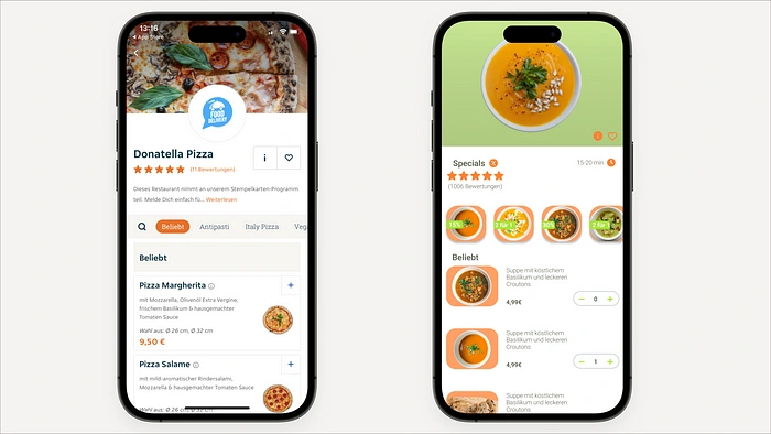
Old vs. New — Restaurant Overview
For the iconography, we chose to go for simple filled vectors that minimize outlines throughout the entire UI, giving the app a slimmer and more streamlined look.
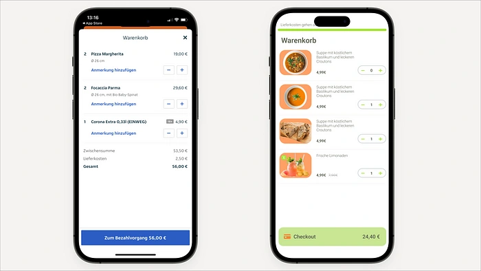
Old vs. New — Checkout Page
Overall, we opted for rounded cards to integrate a touch of the Human Interface Guidelines and update the app gradually. As for the photos, we embraced the concept of “Steal Like An Artist” (Austin Kleon), drawing inspiration from Wolt’s product photography. We carefully selected bird’s-eye view photos and replaced their background with the secondary color.
After the 8 hours of designing, creating components, and removing foreign rulers from other teams in our section, we were allowed to present our redesign in a 20-minute design critique, along with our prototype featuring small microinteractions. We received overall positive feedback for our fresh choice of colors, variable typeface, and especially our new photos!
However, something unexpected happened — when I tried to show our prototype, everything was gone! The screens were there, but all the small microinteractions and the prototype had disappeared. And to make matters worse, our work was not the only one missing them. Slowly, one team after another messaged our class in Slack, instructing everyone to press command+Z to undo whatever had happened. 🫠
And this was the moment we all learned about the action of removing all prototype settings with just a right-click…
Figma, why is such an action even possible? What is it meant for?

Luckily, our teacher, Ayesha Mutiara, managed to find a version that was 20 minutes younger than the one we had finished — we were already done by the time this happened. It was truly a real Hunger Games experience!
Like this project
Posted Aug 6, 2023
UI Challenge, Redesign of Native App Lieferando within 8 hours

