Enhancing the UX.Report Platform
Daniela Hristova
Project Overview
UX.Report is a digital tool designed to help businesses and professionals by performing AI-powered automated analysis and providing insightful feedback, which can be used when redesigning or starting a new project.
Designer: Daniela Hristova
Role: Product Designer
Tools: Figma
Date: December 2024
The Challenge
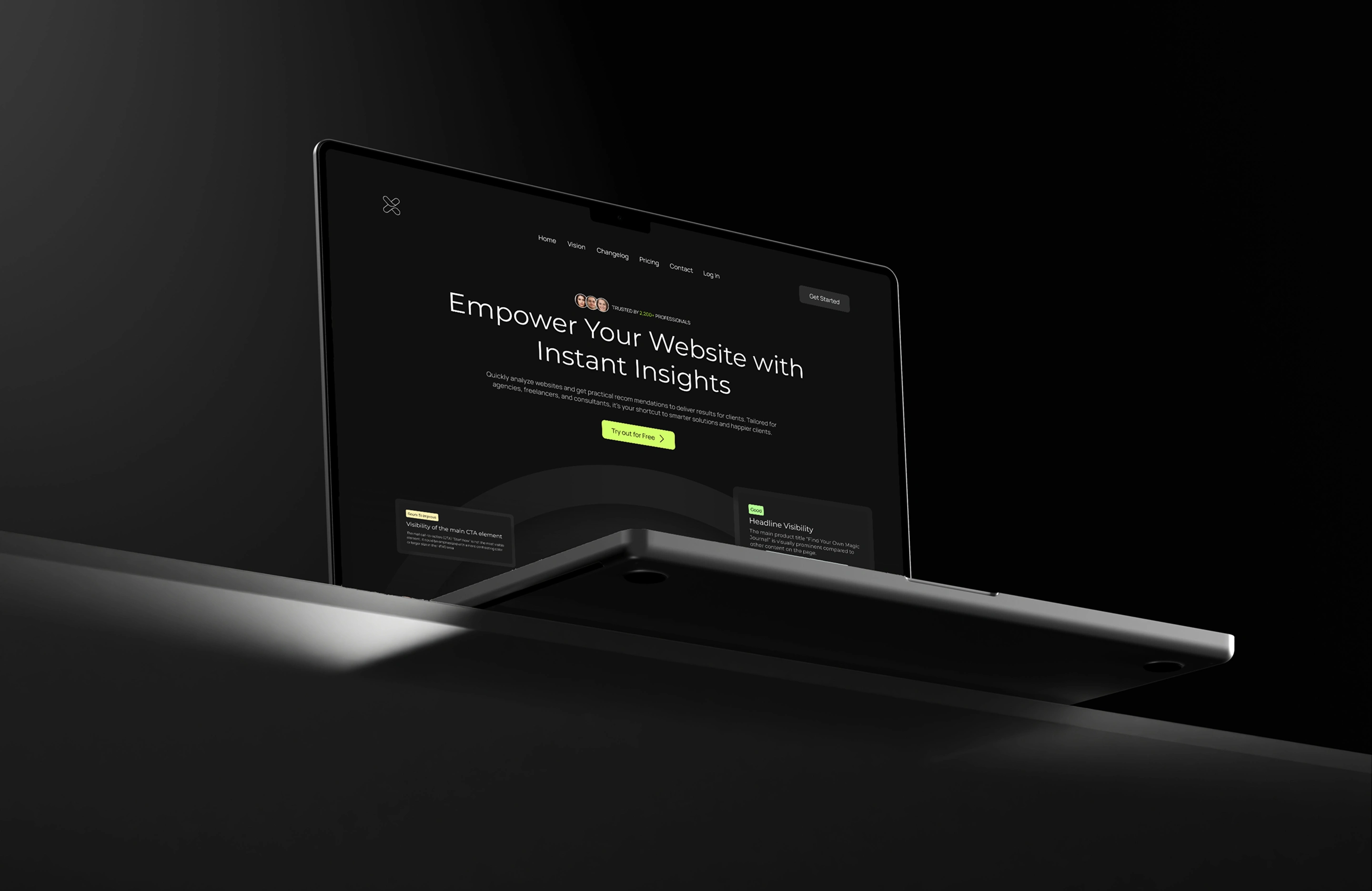
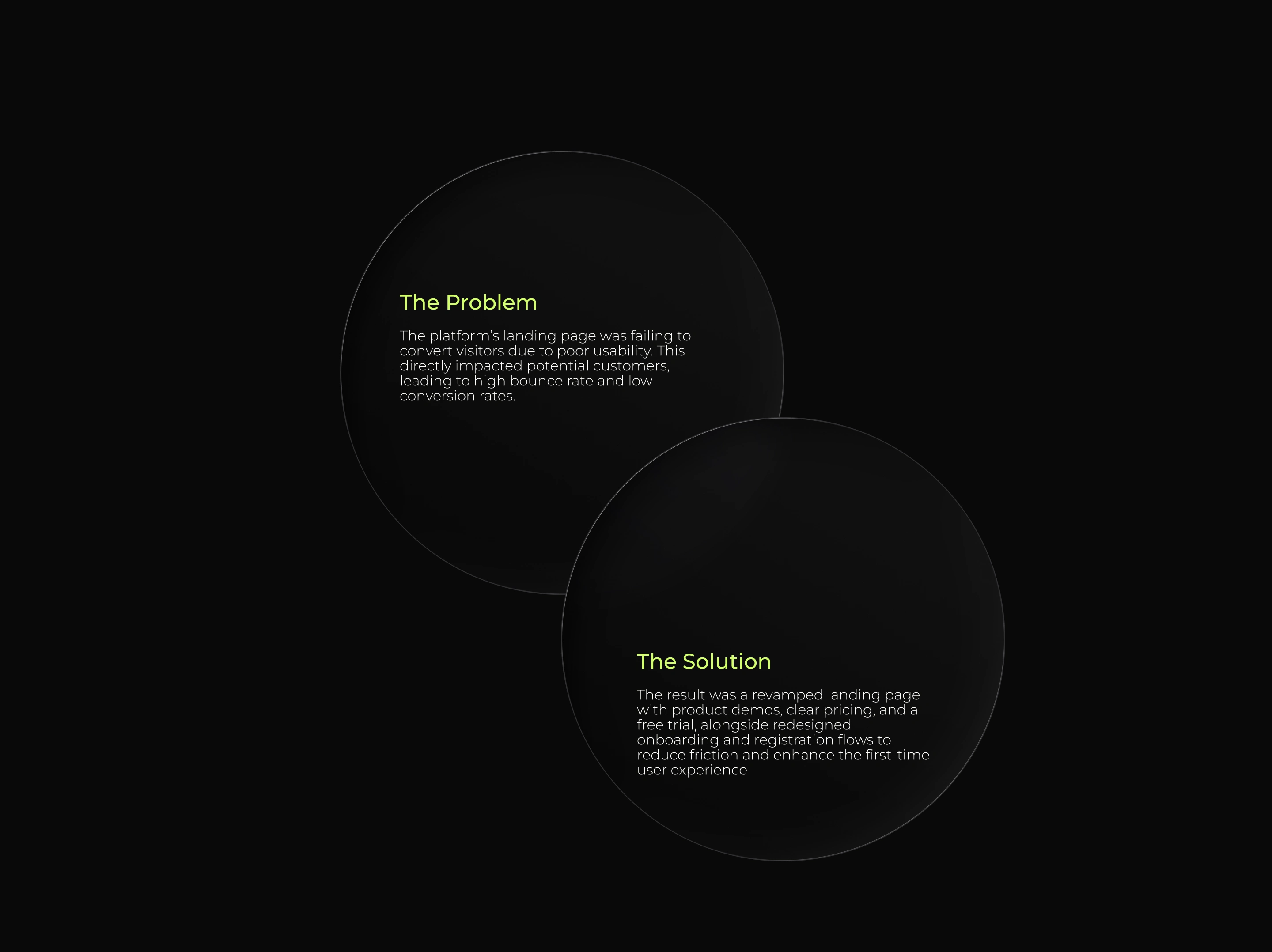
UX.Report landing page’s poor usability - lacking demos, clear pricing, and strong onboarding - led to high bounce and low conversion rates, making improvements critical for boosting leads, trials, and revenue.
Design Process
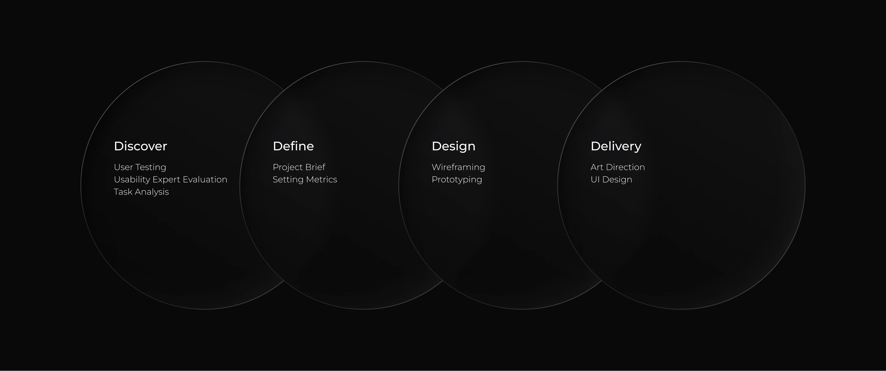
Double Diamond
The Solution
Typography
Color Palette
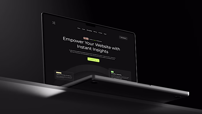
Landing Page
Redesign
Registration Screen Redesign
I redesigned the registration form to add multiple sign-in options and improve accessibility, creating a cleaner, more familiar experience that builds trust and streamlines account creation.
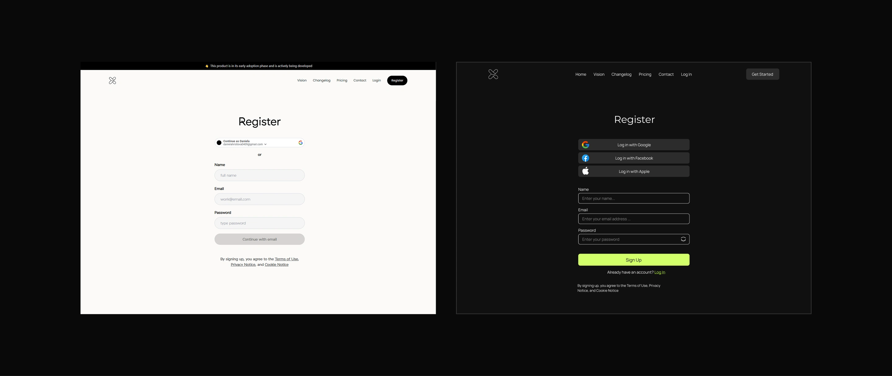
Registration Screen Redesign
Welcome Screen
After registration, users see a welcome screen that introduces UX.Report’s purpose and value, setting a positive tone, and reducing early abandonment by clarifying what to expect next.
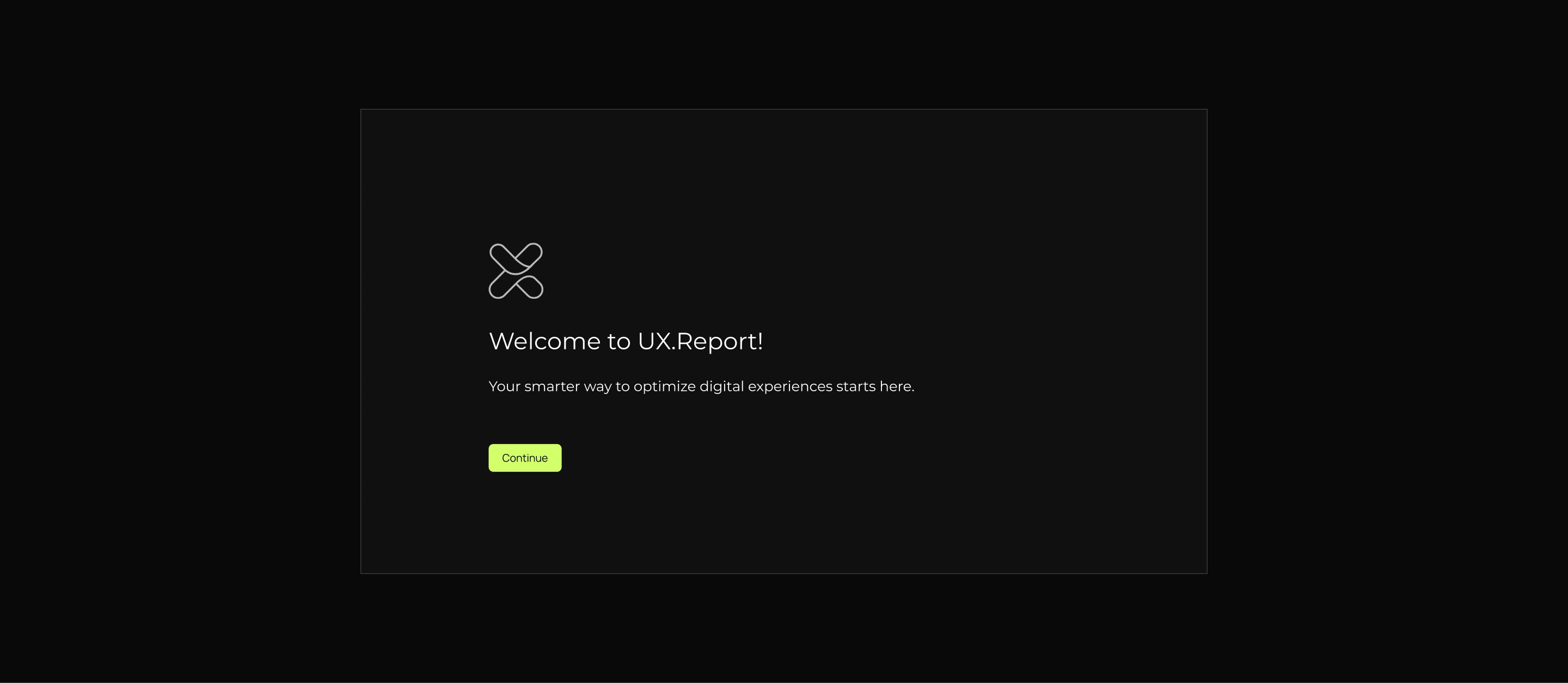
Welcome Screen
Onboarding Questions
To reduce frustration with mandatory onboarding questions, I added a screen explaining their purpose and offering “Okay, let’s go” and “Skip for now” options, balancing user control with data collection by re-prompting only when starting a project.
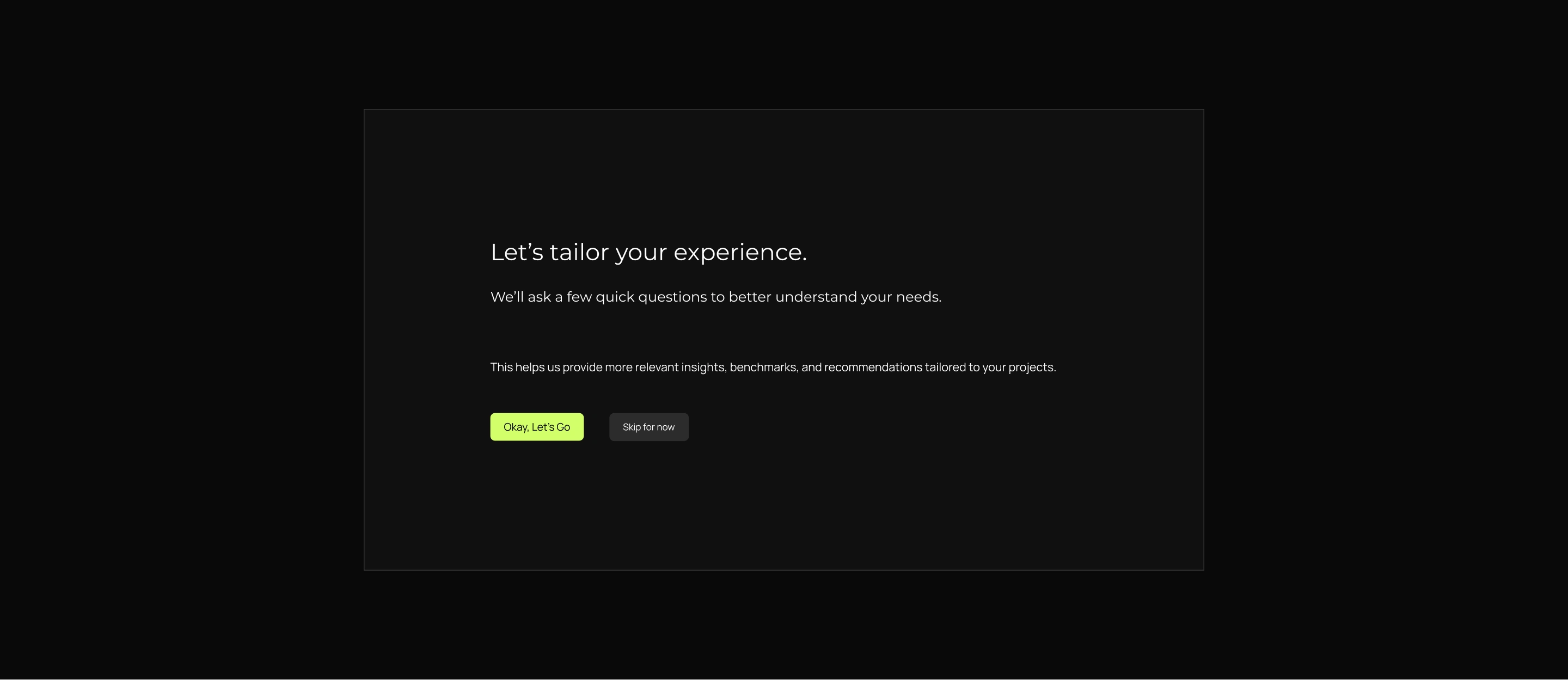
Onboarding
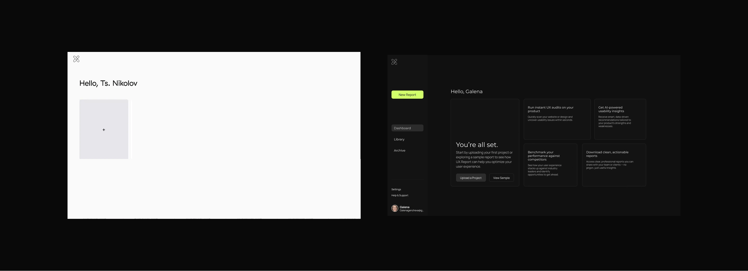
Dashboard Redesign
I redesigned the unfocused original dashboard into a bento grid layout that clearly communicates UX.Report’s value and guides users to upload a project or explore a sample, boosting early engagement and reducing drop-offs.
Like this project
Posted Nov 17, 2025
Redesigned UX.Report's landing page to improve usability and boost engagement.
Likes
0
Views
4
Timeline
Dec 1, 2024 - Dec 31, 2024