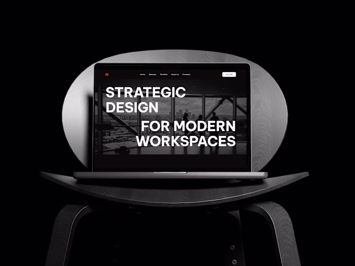
ECHO Brand Exploration Tried something different with this o...
Daniela Hristova
ECHO Brand Exploration
Tried something different with this one - mixing a bold, techy vibe with a clean, professional look.
The whole direction revolves around amplification. I pulled repeating shapes from the “E” and used them everywhere - corner cuts, backgrounds, buttons - to keep everything in the same rhythm.
The color palette is simple: lime green, black, and white. Has that neon energy without feeling too futuristic.
Full Project Here
Like this project
Posted Dec 11, 2025
ECHO Brand Exploration Tried something different with this one - mixing a bold, techy vibe with a clean, professional look. The whole direction revolves arou...
Likes
0
Views
2