Here’s the strategy behind BLENDMODE - a brand built on bold...
Daniela Hristova
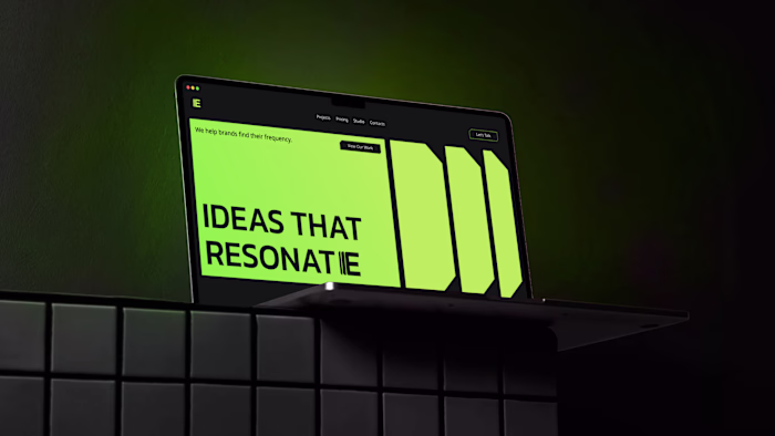
Here’s the strategy behind BLENDMODE - a brand built on boldness, clarity, and structure.
I shaped the identity around a monochrome base with one strong accent to keep it sharp and architectural.
→ Headings: bold, uppercase, unapologetic.
→ Body: refined and clean to balance the energy.
→ Logo: the “N” subtly merges two shapes - a nod to how the brand blends creativity with precision.
→ Brand element: two structured squares coming together, reinforcing connection and form.
Once the system was tight, I translated everything into a website with strong type, confident layouts, and interactions that match the brand’s personality.
In the end, BLENDMODE stands as a consistent, intentional identity - bold expression supported by structure and clarity.
Like this project
Posted Nov 28, 2025
Here’s the strategy behind BLENDMODE - a brand built on boldness, clarity, and structure. I shaped the identity around a monochrome base with one strong acce...
Likes
0
Views
4