Daniela Hristova
Designer • Building across Web3, Fintech & AI


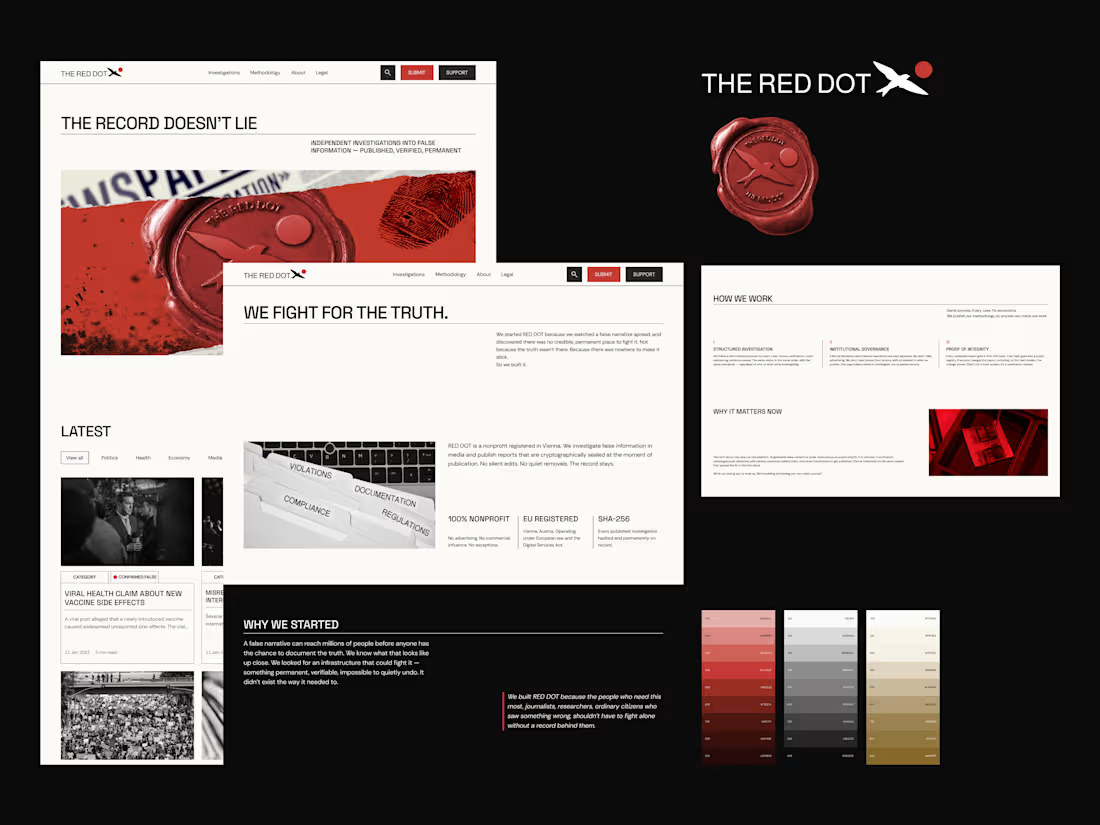
Facts don’t disappear. We make sure of it.
A project with a mission - fighting disinformation at a structural level.
From the visual identity to the digital experience, every decision was shaped around making complex information feel clear.
The moment @Nikolay Byutyunev presented the brand identity, the direction became undeniable. It gave us a foundation and a visual language we could carry through every touchpoint.
Once the direction was defined, the focus shifted to shaping how people experience it on the web.
That's where I came in,
From analyzing competitors and mapping the flow to the final UI component and deployment.
We challenged the brief, iterated rapidly, shifted, and adjusted where needed.
Red Dot is finally live, and I can't wait to share the small design decisions behind the scenes that made the final experience what it is.
2
4
125
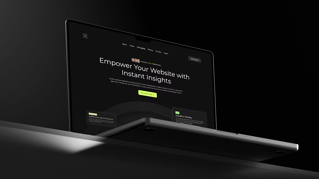
So excited to bring here one of my favorite projects, UXReport
Problem:
Landing page wasn’t converting - no demos, unclear pricing, limited sign-up, messy onboarding.
Solution:
Added demos, transparent pricing, free trial, and streamlined onboarding.
Result:
A cleaner, more intuitive landing page built to convert.
→ Full Project (https://www.behance.net/gallery/204702895/Enhancing-the-UXReport-Platform)
9
23
255
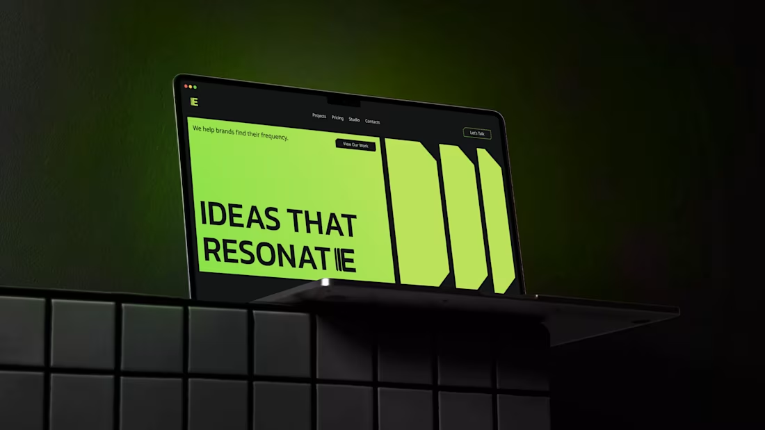
ECHO Brand Exploration
Tried something different with this one - mixing a bold, techy vibe with a clean, professional look.
The whole direction revolves around amplification. I pulled repeating shapes from the “E” and used them everywhere - corner cuts, backgrounds, buttons - to keep everything in the same rhythm.
The color palette is simple: lime green, black, and white. Has that neon energy without feeling too futuristic.
Full Project Here (https://www.behance.net/gallery/204860883/Studio-ECHO-Website-Brand-Identity)
14
34
400
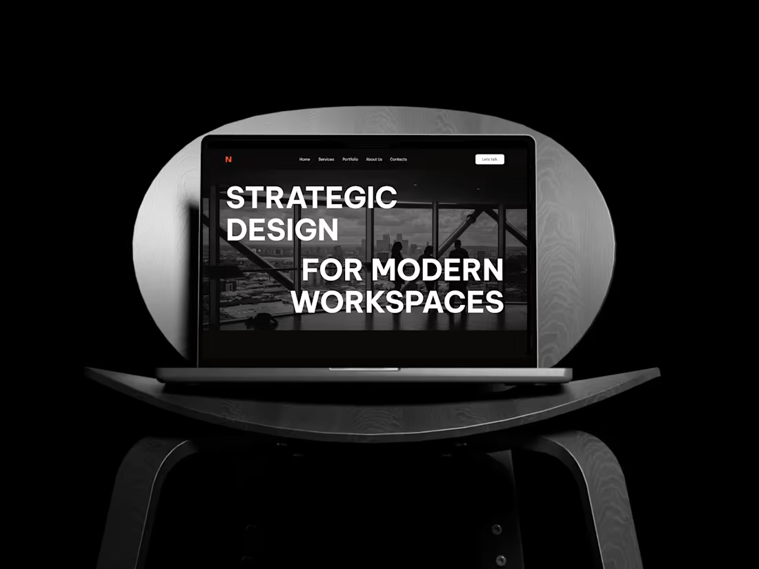
Here’s the strategy behind BLENDMODE - a brand built on boldness, clarity, and structure.
I shaped the identity around a monochrome base with one strong accent to keep it sharp and architectural.
→ Headings: bold, uppercase, unapologetic.
→ Body: refined and clean to balance the energy.
→ Logo: the “N” subtly merges two shapes - a nod to how the brand blends creativity with precision.
→ Brand element: two structured squares coming together, reinforcing connection and form.
Once the system was tight, I translated everything into a website with strong type, confident layouts, and interactions that match the brand’s personality.
In the end, BLENDMODE stands as a consistent, intentional identity - bold expression supported by structure and clarity.
2
24
309