
Daniela Hristova
Product designer • MVP & strategy
Ready for work
Daniela is ready for their next project!
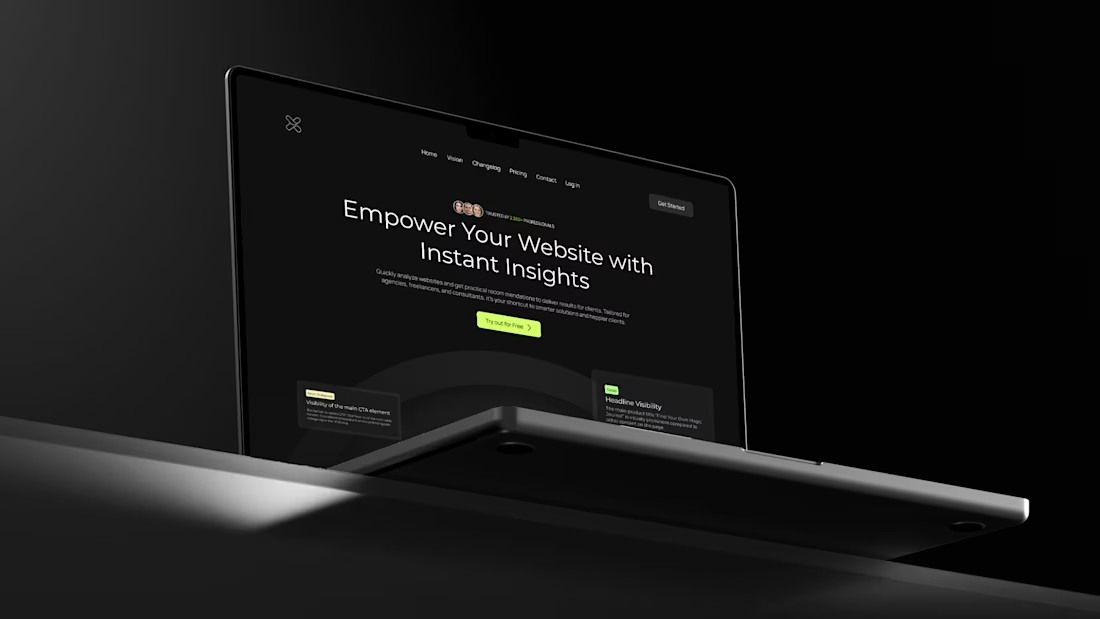
So excited to bring here one of my favorite projects, UXReport
Problem:
Landing page wasn’t converting - no demos, unclear pricing, limited sign-up, messy onboarding.
Solution:
Added demos, transparent pricing, free trial, and streamlined onboarding.
Result:
A cleaner, more intuitive landing page built to convert.
→ Full Project (https://www.behance.net/gallery/204702895/Enhancing-the-UXReport-Platform)
9
22
137
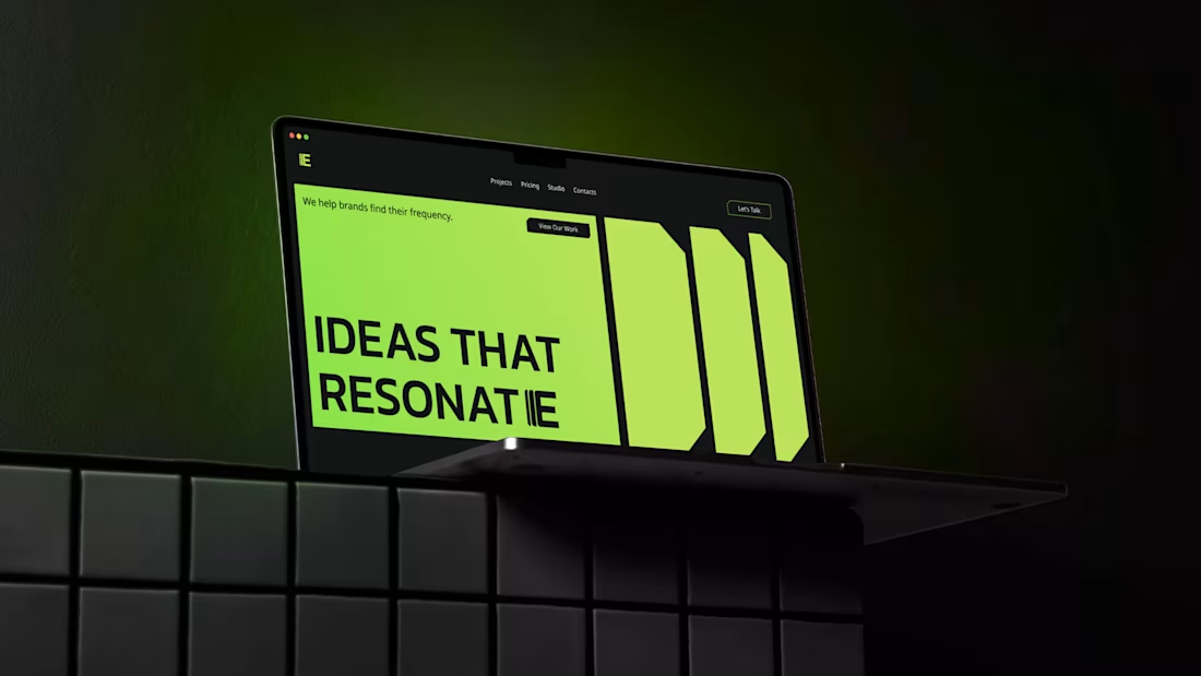
ECHO Brand Exploration
Tried something different with this one - mixing a bold, techy vibe with a clean, professional look.
The whole direction revolves around amplification. I pulled repeating shapes from the “E” and used them everywhere - corner cuts, backgrounds, buttons - to keep everything in the same rhythm.
The color palette is simple: lime green, black, and white. Has that neon energy without feeling too futuristic.
Full Project Here (https://www.behance.net/gallery/204860883/Studio-ECHO-Website-Brand-Identity)
14
34
282
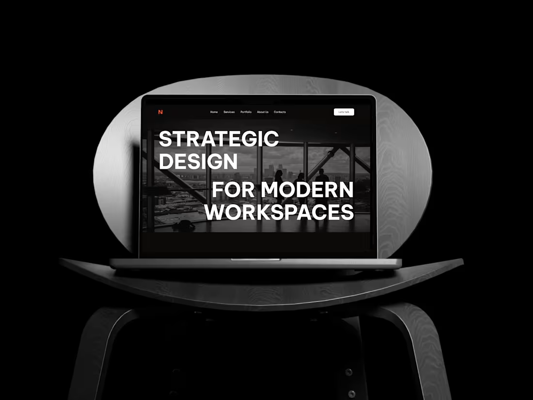
Here’s the strategy behind BLENDMODE - a brand built on boldness, clarity, and structure.
I shaped the identity around a monochrome base with one strong accent to keep it sharp and architectural.
→ Headings: bold, uppercase, unapologetic.
→ Body: refined and clean to balance the energy.
→ Logo: the “N” subtly merges two shapes - a nod to how the brand blends creativity with precision.
→ Brand element: two structured squares coming together, reinforcing connection and form.
Once the system was tight, I translated everything into a website with strong type, confident layouts, and interactions that match the brand’s personality.
In the end, BLENDMODE stands as a consistent, intentional identity - bold expression supported by structure and clarity.
2
24
237
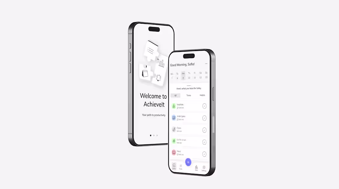
AchieveIt - Productivity App Design
0
7
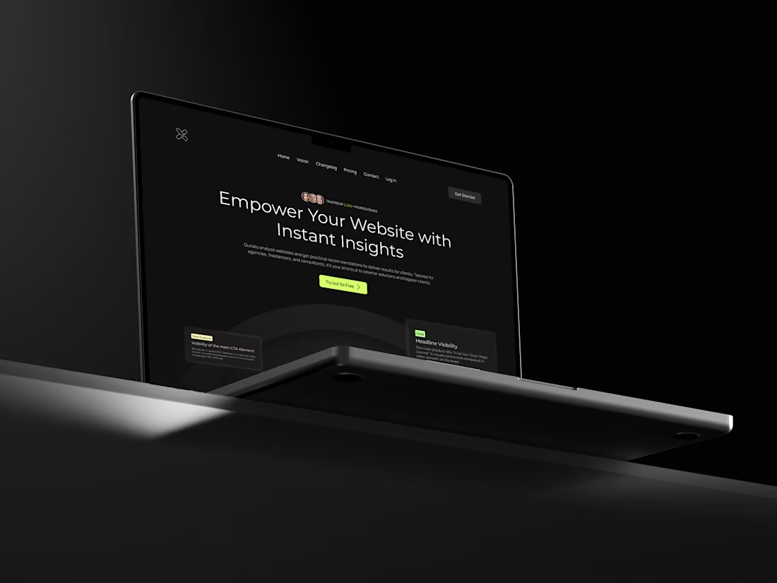
Enhancing the UX.Report Platform
0
4