Volunteer marketplace plus the admin product behind it

Zach Smyth

Overview
BetterGood builds software for the social-impact sector. I designed PublicGood, their volunteer marketplace — both halves of it. The public side is where someone finds something to do this weekend. The organization side is a back-office product in its own right: posting an opportunity, publishing it, managing registrations, and running the account the whole nonprofit logs into.
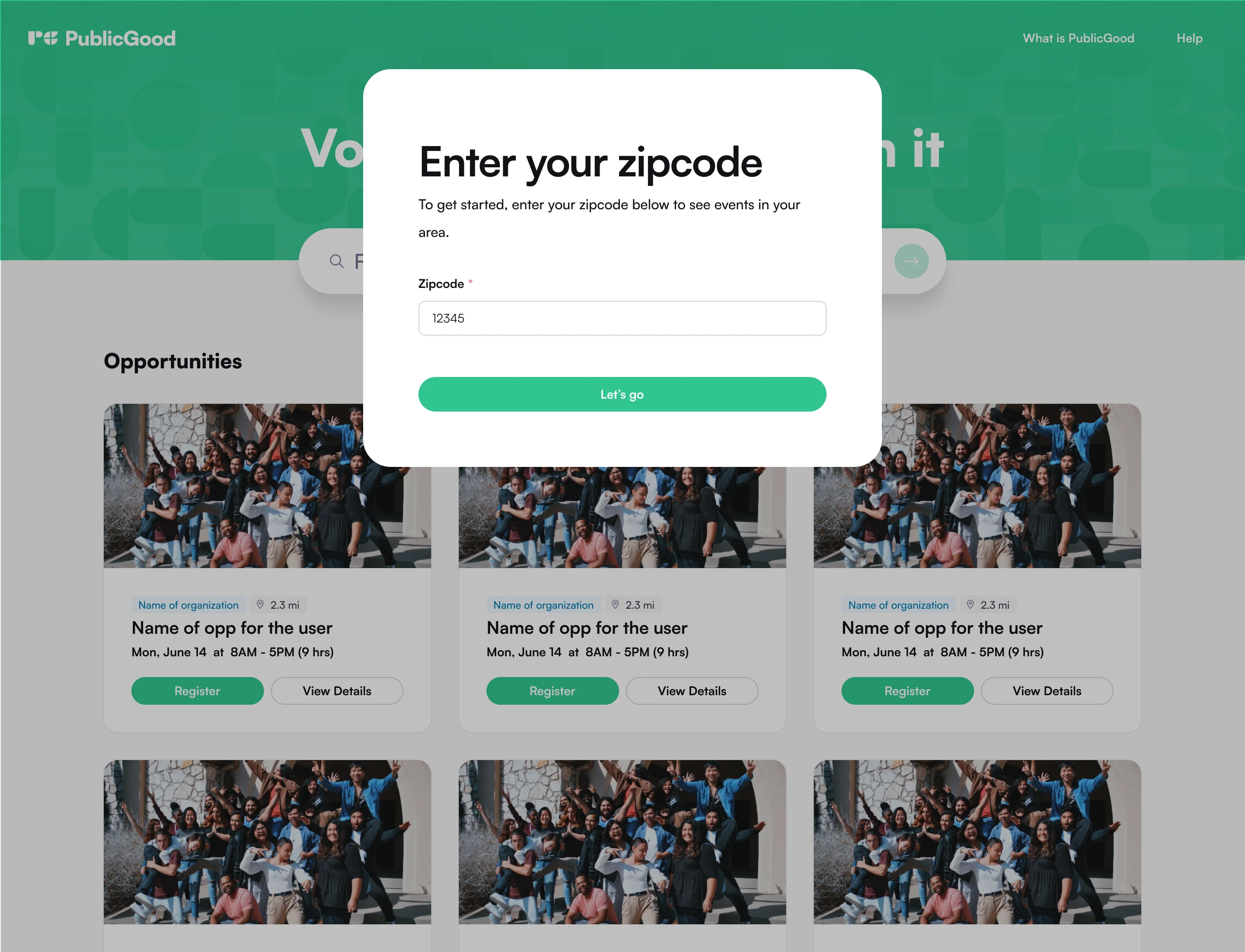
The public side — the zip code is the first move, and answering it returns real opportunities rather than a filter panel
The challenge
Volunteering is a local act, so nothing on the public side means anything until the product knows where you are — but asking for a zip code before showing a single thing is exactly the kind of gate that loses people. The admin side is the harder design problem and the easier one to under-serve: the people posting these opportunities are small teams without an ops department, they use the tool maybe once a month, and every session has to survive that gap. It also has to be a real multi-user product — organization accounts, roles, two-factor, password recovery — for teams that have none of the IT support those features usually assume.
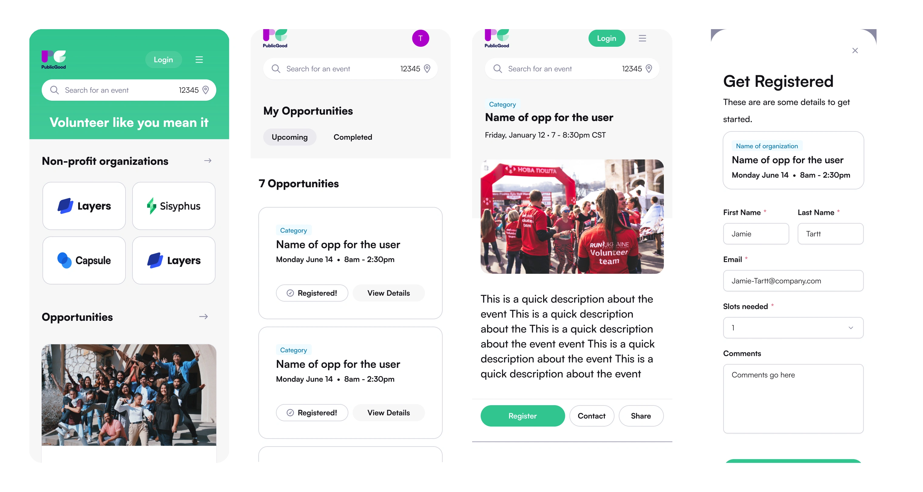
The same journey on mobile — home, the opportunities you've signed up for, an opportunity in full, and registering for it
Approach
Made location the first move rather than a filter — the browse experience asks for a zip code up front and then shows real opportunities, so the gate immediately buys the visitor something.
Designed the opportunity detail around the practical questions — when, where on a map, how long, who to contact, and who's running it — instead of leading with a description nobody reads.
Built the organization dashboard around registrations, not listings: each opportunity shows registered against spots remaining as a progress bar, with View Registrations one click away — so the answer to 'who is actually coming' is on the first screen rather than two clicks in.
Designed the create-and-publish flow as one uninterrupted form with an explicit Publish toggle, so a team that posts once a month can see the difference between drafting and going live without learning a workflow.
Designed the organization account surfaces a real deployment needs and most marketplace work skips: organization-specific login, signup, forgot-password and reset, two-factor, and organization profile settings.
Designed the failure cases as real screens — no results for a zip code, and a server error — in the product's own voice rather than leaving them to development.
Designed the whole product for mobile as its own layout rather than a narrowed desktop — browse, opportunity detail, registration, the account hub, two-factor and organization management all have a phone design.
Designed sign-in to carry an organization's own brand, so a nonprofit can bring its volunteers in under its own identity without leaving the platform.
Carried one design language across both halves, so the nonprofit posting the opportunity and the volunteer finding it are recognizably in the same product.
The solution
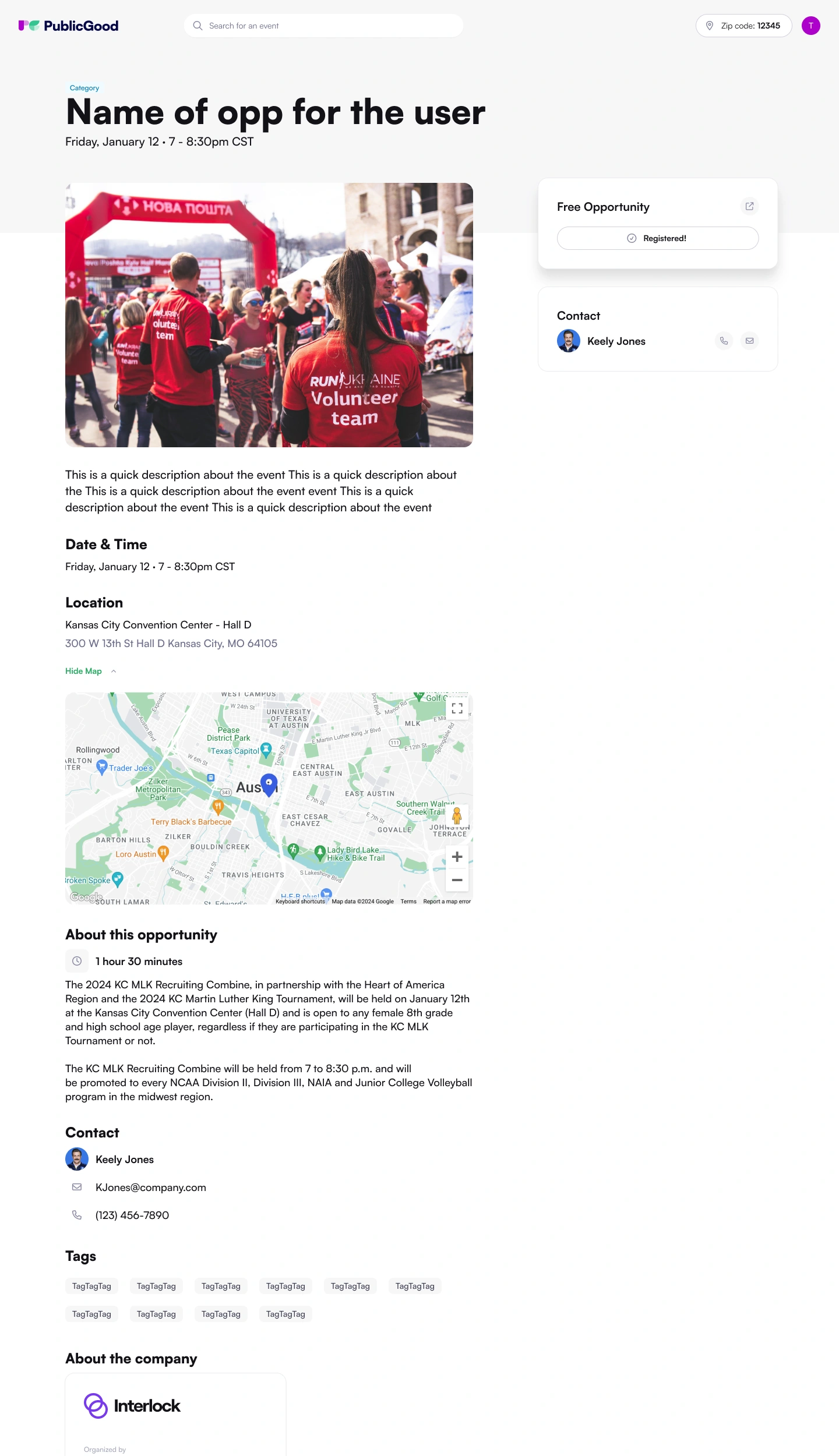
Opportunity detail — when, where on the map, how long, who to contact, and who's running it
One product, designed honestly for both sides. Volunteers get a location-first browse, opportunity detail that answers the practical questions, and empty and error states written in the same voice as the rest of the product. Organizations get a genuine back-office: a dashboard that leads with registrations rather than listings, a create-and-publish flow simple enough for a team that uses it monthly, and the full set of organization, account and security flows a real deployment needs — built to the same standard as the public side rather than treated as the part nobody sees.
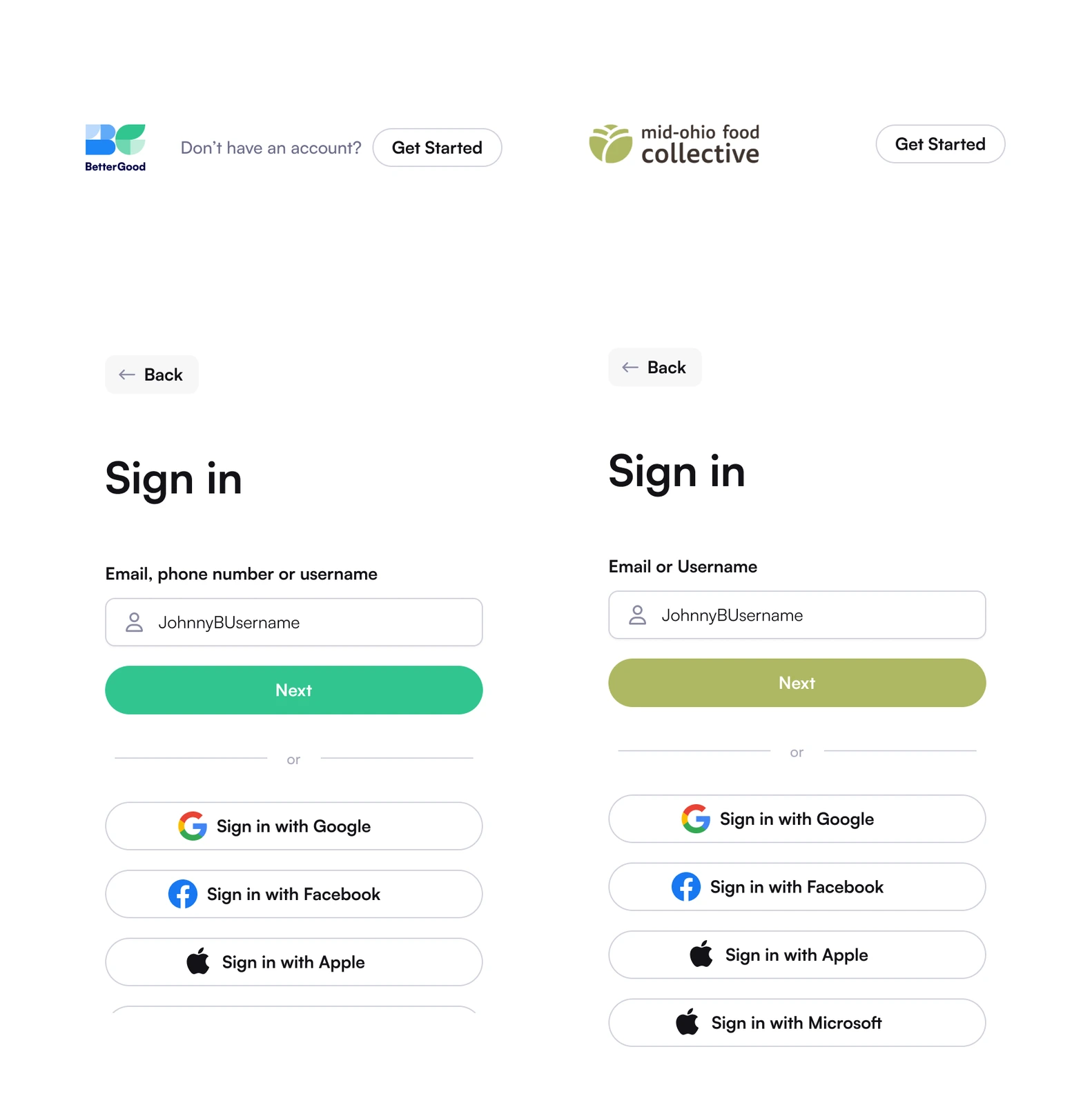
One sign-in, two identities — the same flow carries an organization's own brand when they bring their volunteers in themselves
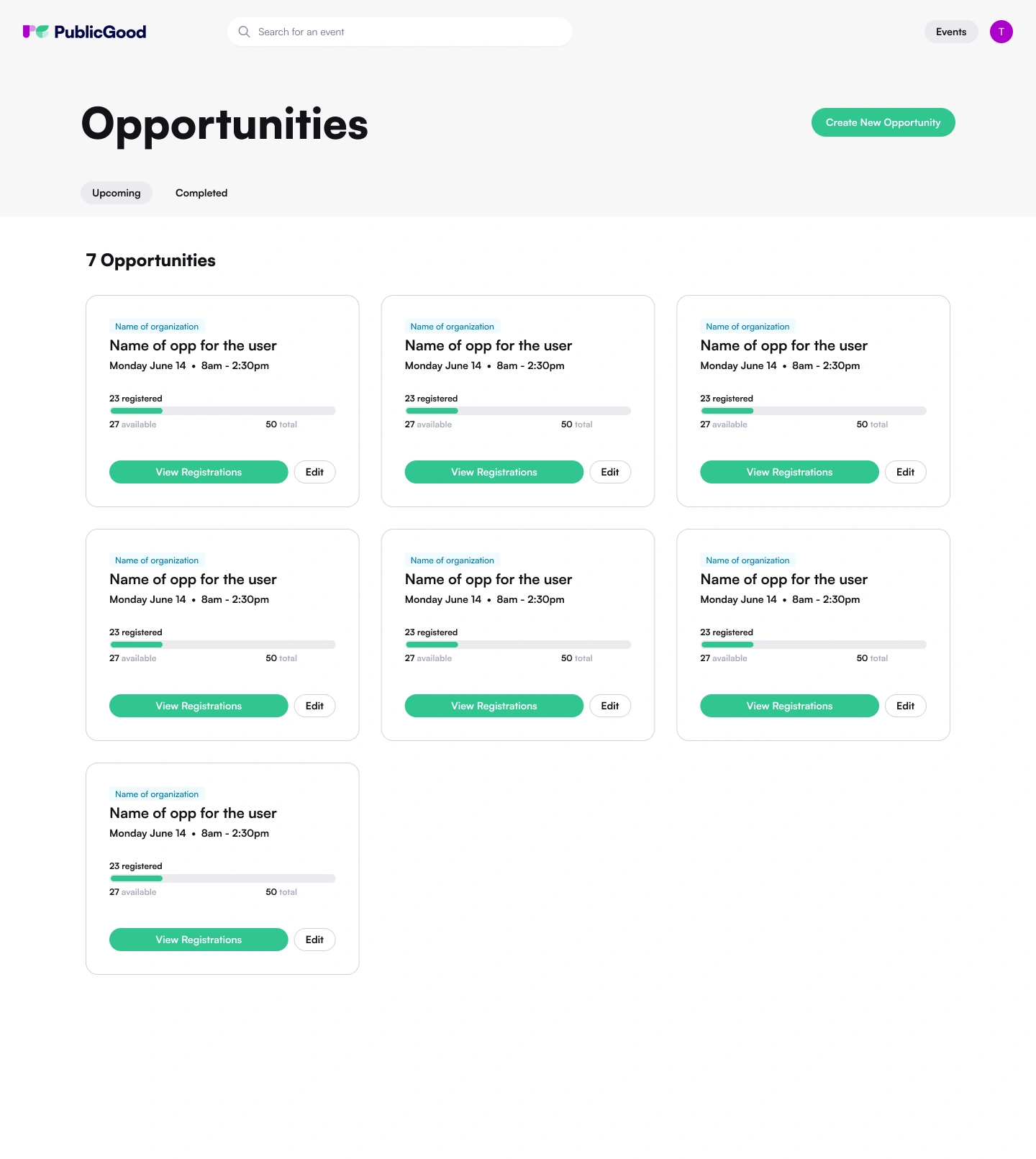
The organization dashboard — registered against spots remaining on every opportunity, with registrations one click away
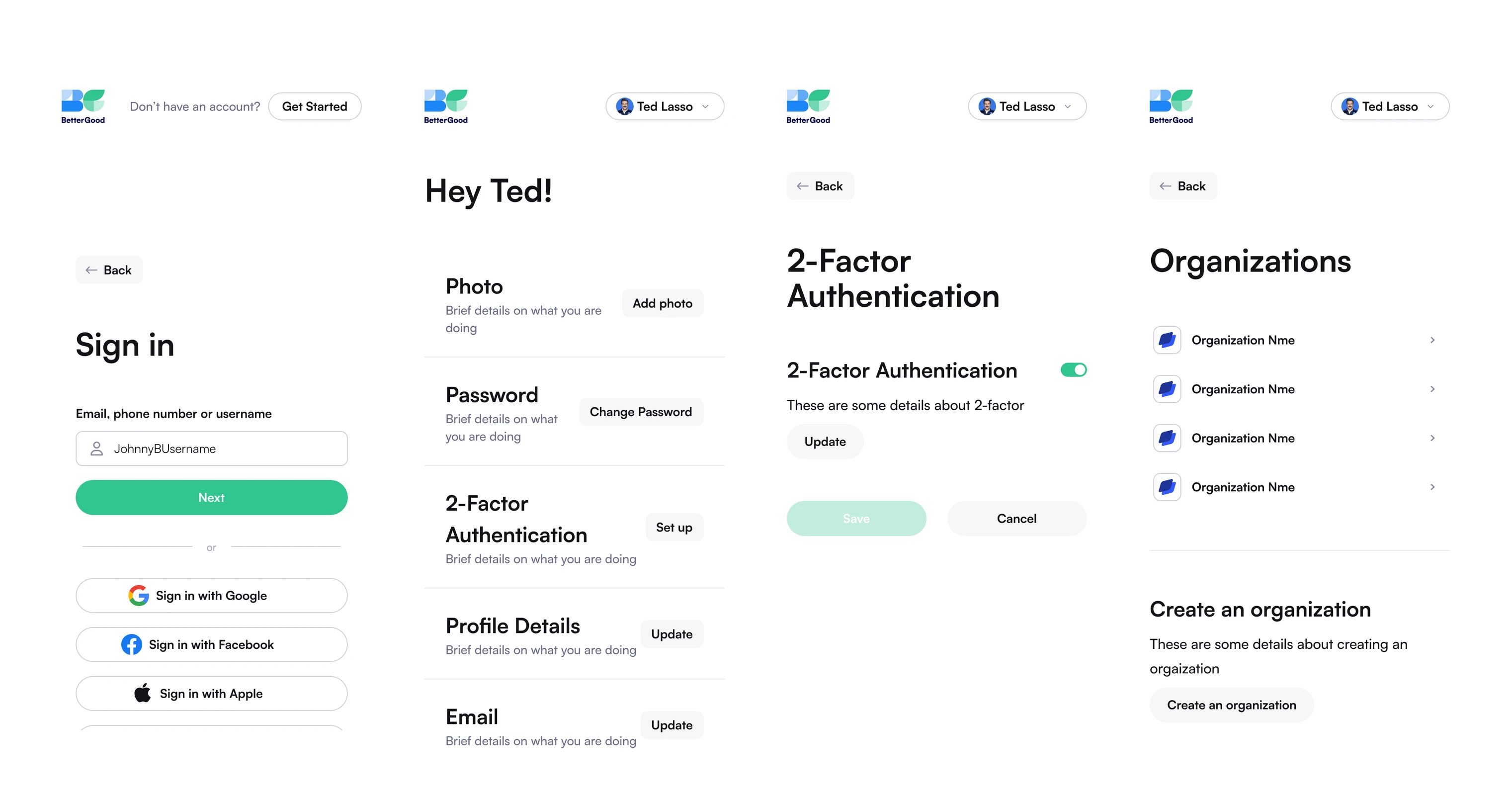
Account and organization on mobile — sign in, the account hub, two-factor, and the organizations you belong to
Like this project
Posted Sep 28, 2026
Designed both sides: a browse experience that opens with a zip code, and the full back-office nonprofits run — events, volunteers, orgs and accounts.
Likes
0
Views
1
Clients
BetterGood