iOS App Design for Kindbridge Behavioral Health

Zach Smyth


Overview
Kindbridge provides behavioral health care — mental health alongside gambling, video gaming, sexual behavior and anger. I designed the iOS app: the first-run and screening flow, booking a clinician by subject, appointments and video sessions, mood journaling, messages and resources — plus website work alongside it.
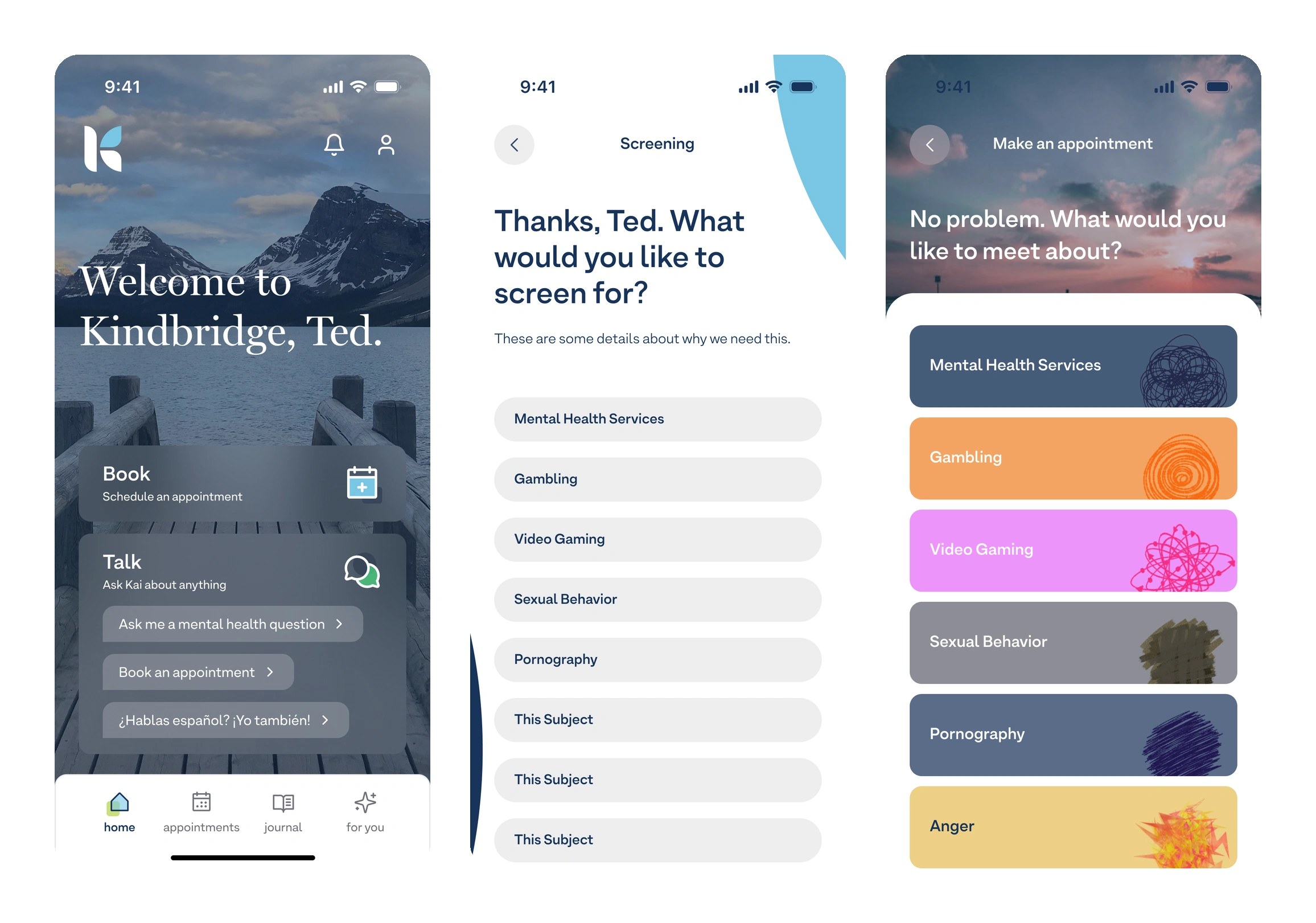
Home, the screening question, and booking by subject — each subject given its own colour and mark rather than a clinical list
The challenge
The hardest screen in this product is the one that asks what you need help with. Naming gambling or pornography on a list of buttons is a moment most people are one tap away from abandoning, and a clinical intake form is exactly the wrong tone for it. The app also has to hold two different kinds of use in one place — the appointment you booked weeks ago, and the Tuesday night when you just need to say how you're doing.
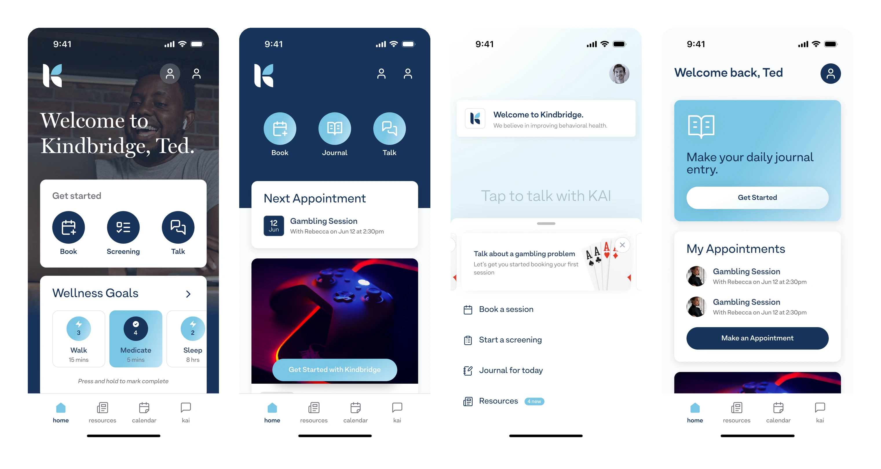
Four visual directions for the home screen — so the tone of the product was chosen deliberately, not inherited
Approach
Wrote the intake as a conversation rather than a form — it uses the person's name, says why it's asking before it asks, and takes one decision per screen.
Gave every subject its own colour and hand-drawn mark, so the list reads as a considered set of options rather than a clinical checklist of problems.
Designed a home screen around the two real entry points — Book for the scheduled path, Talk for the immediate one — with a Spanish-language route surfaced at the same level rather than buried in settings.
Kept the video session screen almost empty: the appointment, who it's with, and Join. Nothing to read or decide at the moment someone is about to start a session.
Designed journaling as tappable statements in plain first-person language instead of a 1–10 scale, so checking in takes one tap and still returns something a clinician can use.
Explored four distinct visual directions before committing — photographic and warm, navy and icon-led, light and conversational, and a journal-prompt home — so the tone of the product was a decision the team made deliberately rather than inherited from the first comp.
Built the surrounding app — appointments, messages, resources, profile and onboarding — on one component system so nothing feels bolted on.
Carried the work onto the website, including homepage options that introduce Kai, their AI assistant, without displacing the book-an-appointment path the page already earns its keep with.
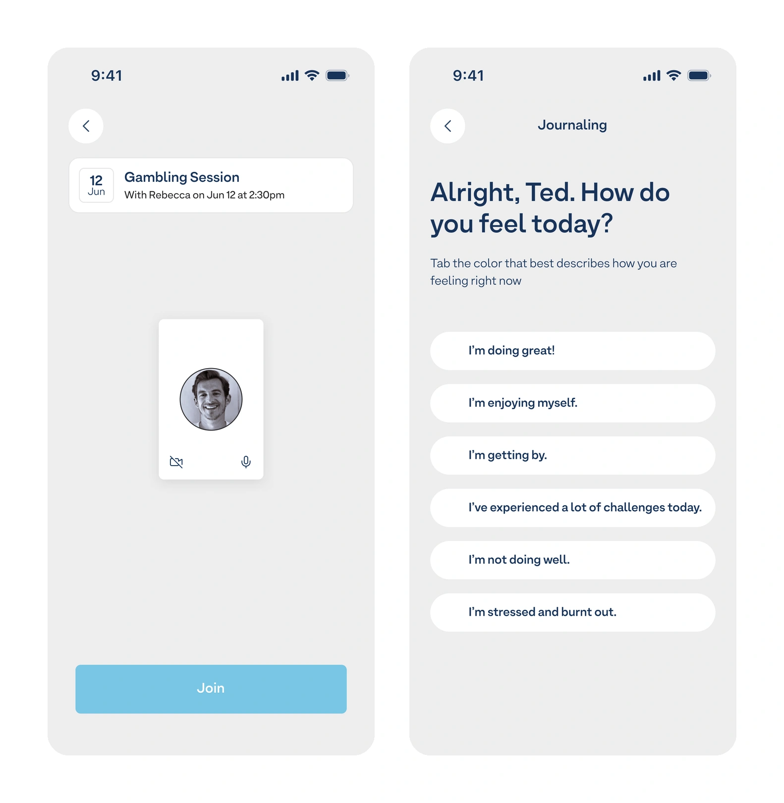
The video session, stripped to who and when and Join — and journaling as one tap on a plain first-person statement
The solution
An app that lowers the cost of the first honest answer. The intake is conversational and one decision deep; the subjects are treated as a designed set rather than a symptom list; and the two ways people actually use behavioral health care — the booked session and the unscheduled moment — are both reachable from the home screen. Around them sit booking, appointments, video sessions, journaling, messages and resources, all built from a shared system.
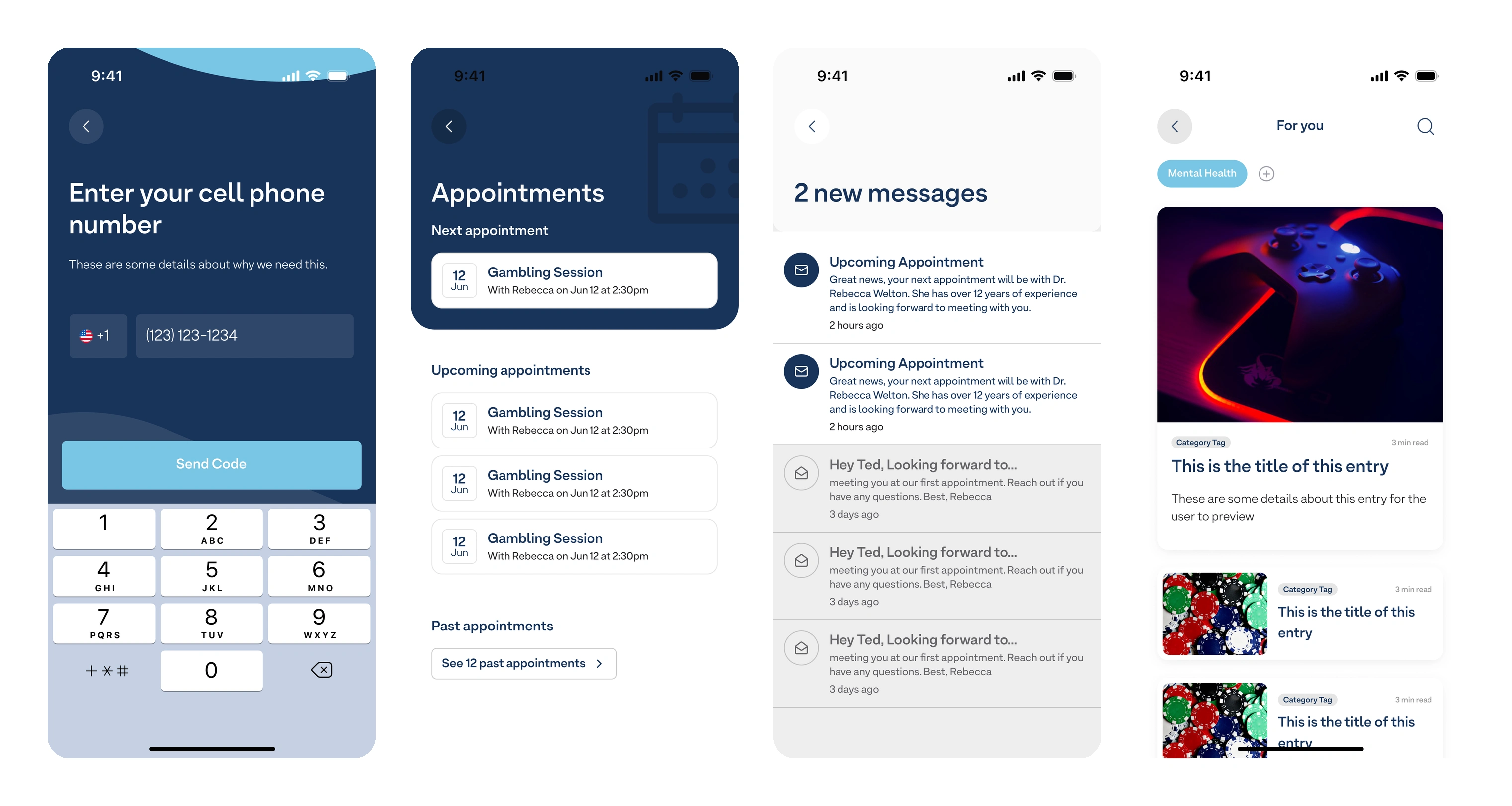
Getting started, appointments, messages and resources — the rest of the app on one shared component system
Like this project
Posted Sep 28, 2026
Designed Kindbridge's iOS app focusing on intuitive, user-friendly mental health support.
Likes
0
Views
1