Stock trading and order flow for a values-aligned brokerage

Zach Smyth

Overview
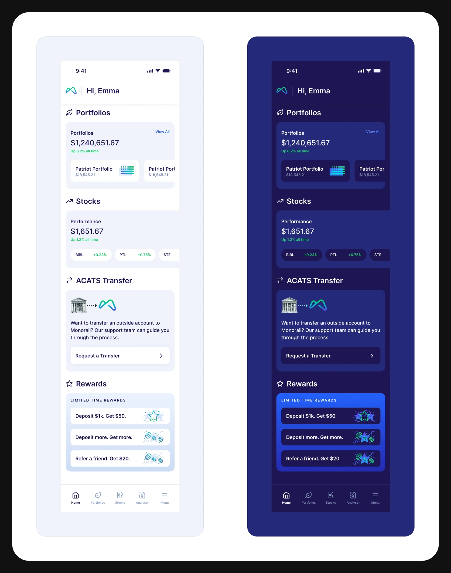
Monorail is an investing app for people who want their money aligned with their stated values. It runs managed Patriot Portfolio accounts alongside self-directed stock trading. I designed the trading side: the stocks home and its holdings, the individual stock page with its values score, the buy and sell order flow, and the money states behind them — buying power, queued orders, unsettled sells, deposits and withdrawals — in light and dark.
The challenge
A values-aligned brokerage has a harder job than a values-aligned fund: the promise has to survive contact with an order ticket. Somewhere on a screen full of open, volume, market cap and P/E ratio, the reason this person chose this app has to be present without turning the page into a manifesto. And the audience makes the second problem — many are placing their first ever trade, so they think in dollars rather than shares, they do not know what buying power is, and the single most common thing a new brokerage app does to them is refuse an order without explaining why.
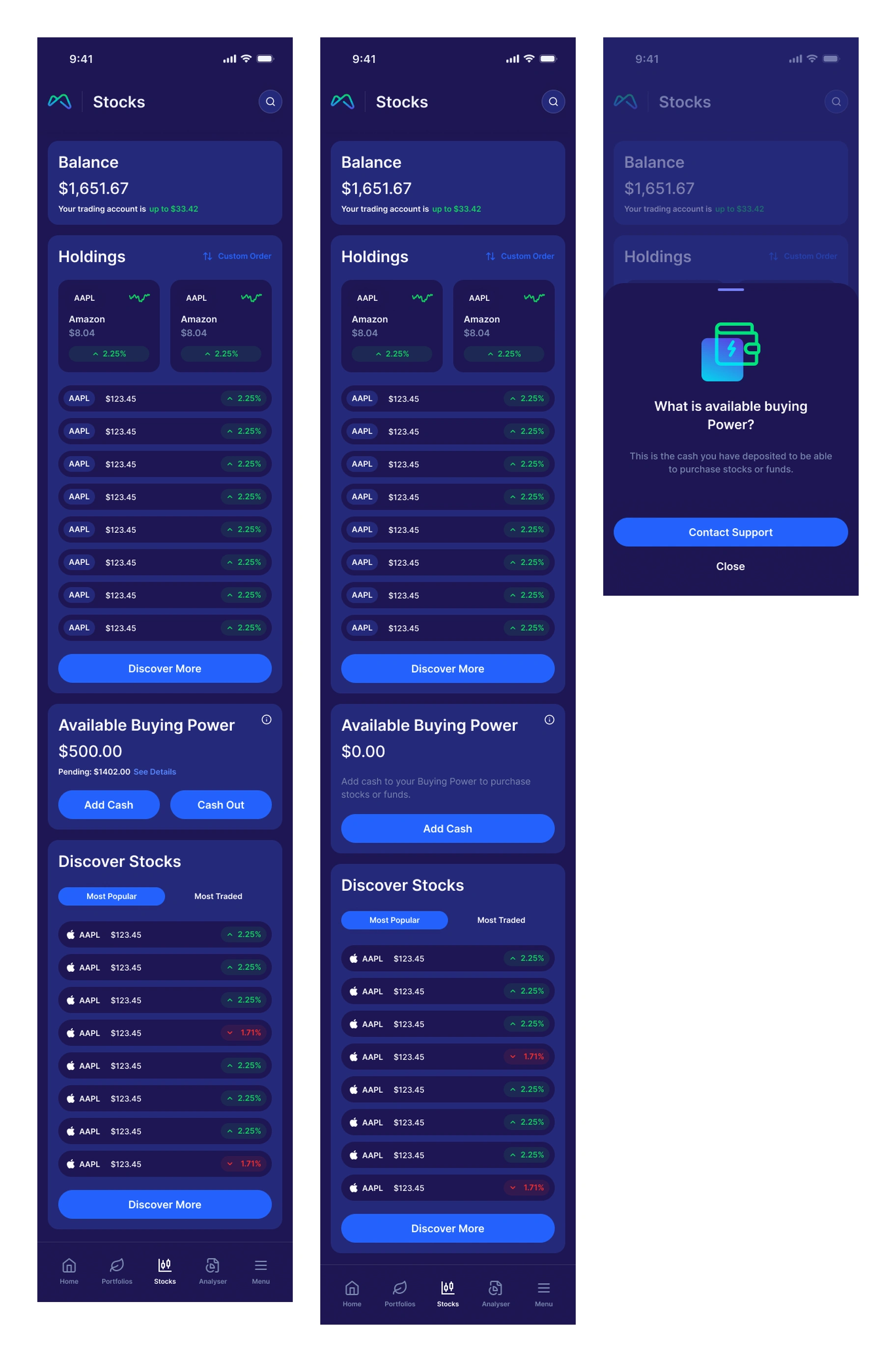
The stocks home, the zero-buying-power state, and the explainer attached to the figure that decides whether you can trade
Approach
Put the values score on the stock page itself, in the same column as the financials — a number with a count of positives beside it, opening into a category-by-category breakdown, so conviction sits next to P/E ratio rather than in a separate part of the app.
Built the stock page as one continuous read — brand and chart, then My Position, then Statistics, then order history — so a holder, a watcher and a first-time buyer all get what they came for from the same screen in the order each needs it.
Designed the order ticket around dollars rather than shares: the amount is what you type, the share count is derived beneath it in real time, and the buying power you have is on screen the whole time with an Add button already attached.
Kept the review step honest instead of reassuring — it states plainly that the order fills as soon as possible, that the share price and estimated share count are based on the last sale price, and that the actual order price may differ.
Named every money state the app can be in rather than blocking silently. Available buying power is a figure with an explainer attached; pending shows its own total; unsettled sell orders and pending deposits get their own lines with dates, so 'why can't I buy right now' always has an answer on screen.
Designed the zero states as first-class screens — zero buying power, zero holdings, a brand-new trading account still activating — because a new brokerage user meets those before they ever see a populated portfolio.
Gave the stock page its own live states: a banner when queued orders mean the position shown is out of date, and a recoverable error banner for a partial data load, rather than letting stale numbers pass as current.
Ran deposits and withdrawals on the same pattern as the order ticket — amount first, the constraint above it, and a confirmation that tells you when the money actually lands rather than only that it was submitted.
Also designed the account-opening flow that gets someone this far: fifty-plus screens of regulated intake, one decision per screen, with each ask justified where it is made.
Built every screen in light and dark from the start, so the dark theme is a designed surface rather than a color inversion applied afterwards.
The solution
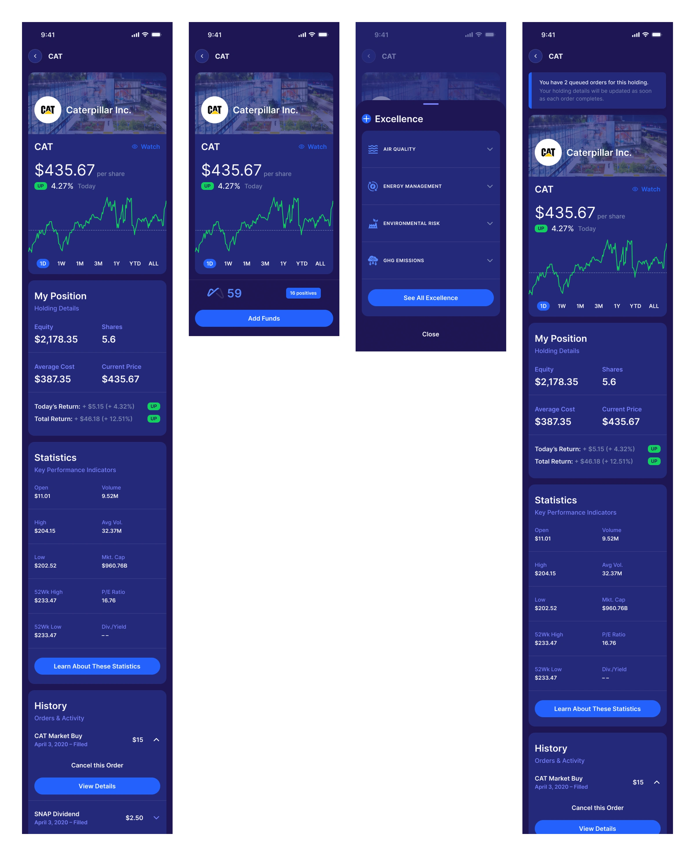
The stock page — price, position, statistics and order history — with a values score and its category breakdown
A trading experience where the values case and the financial case are on the same page, and where the mechanics of money are stated rather than hidden. The stock page carries price, position, statistics, order history and an impact score with a category breakdown. The order ticket takes a dollar amount, derives the shares, keeps buying power in view and says what it cannot promise. Behind them sit the states that actually govern whether a trade can happen — queued orders, unsettled sells, pending deposits, cash in and cash out — each one named, dated and explained. All of it designed twice, light and dark.
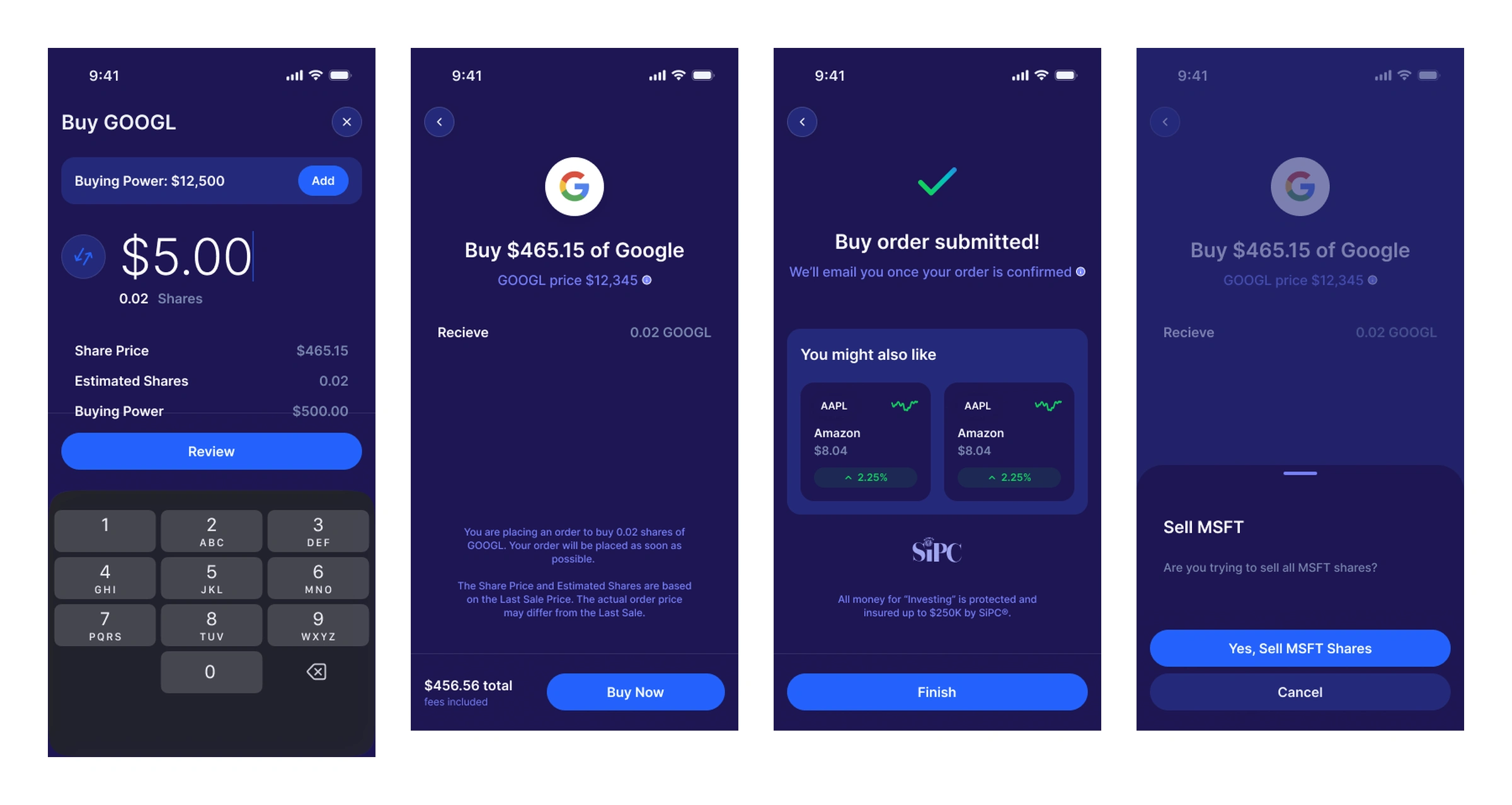
The order ticket takes dollars and derives shares, says what it can't promise, then confirms — and the sell side matches
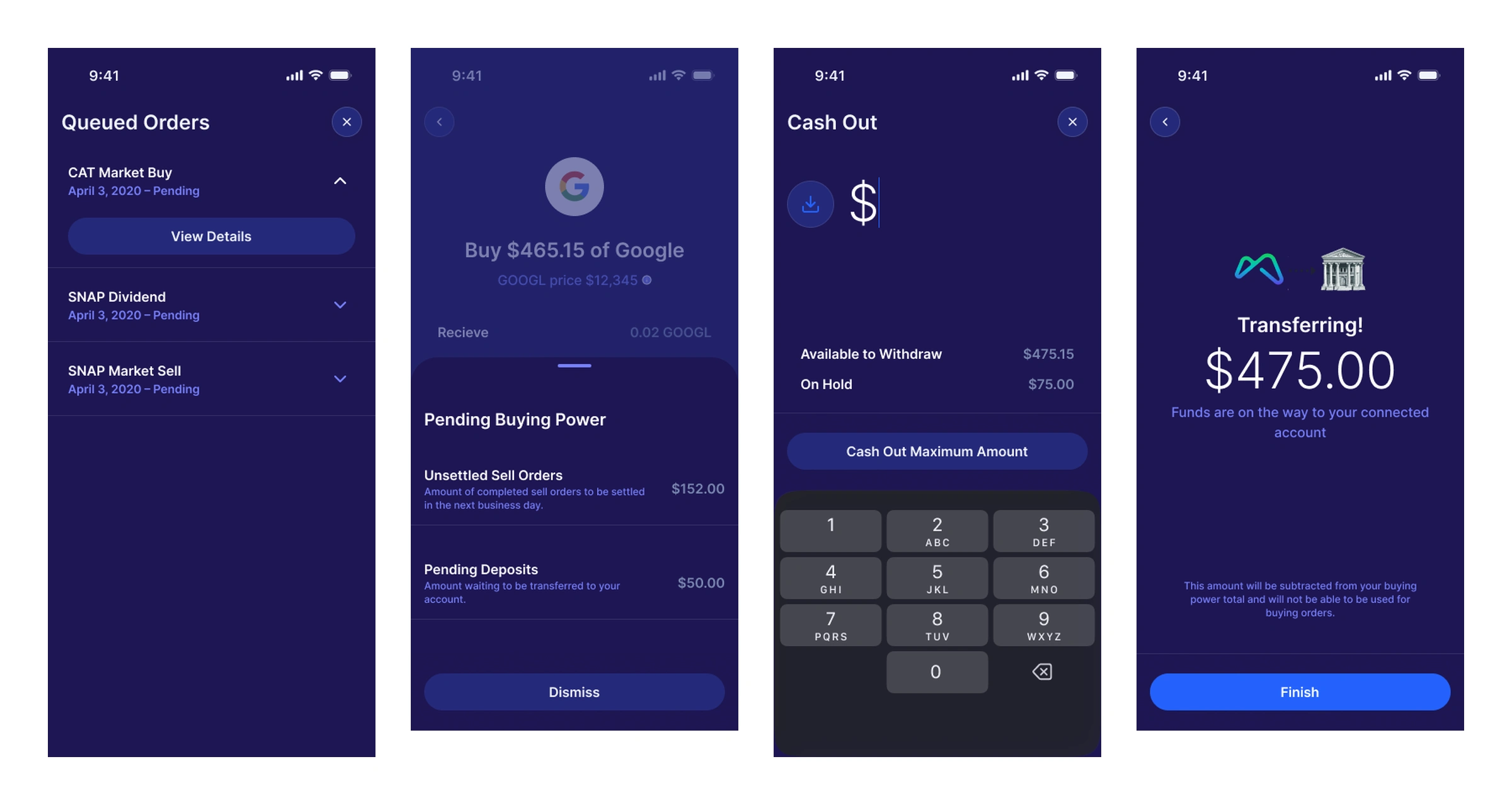
The money states — queued orders, unsettled sells and pending deposits, cash out, and a transfer that names its landing date
Like this project
Posted Sep 28, 2026
Designed the stock page, a dollar-based order ticket, and every money state behind it — buying power, queued orders, unsettled sells — light and dark.
Likes
0
Views
1
Clients
Monorail