Beaverbooks | Keeping in the loupe
The historic British Jewellers, Beaverbooks worked with us to develop a new offering alongside its well-respected high street brand. Loupe, was a new concept piece, a sister brand that should feel meaningfully different from it’s competitors.
The work was a mix of UXR, competitor research and creative discovery around how the brand could be translated into a digital experience.
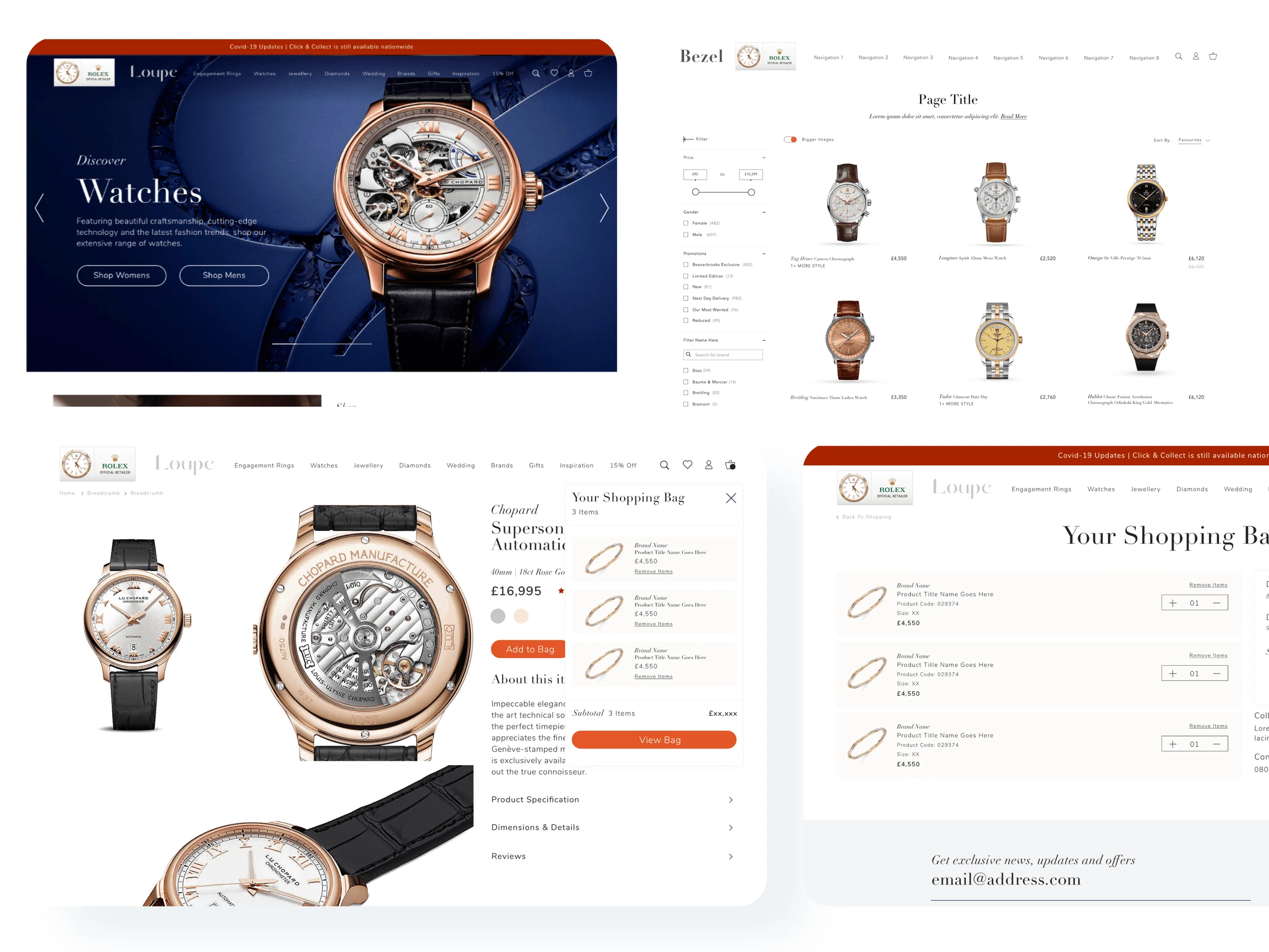
This work was heavily concept and discovery driven. Working with TAG Studio i produced a number of routes of how we could translate and develop the early brand work online. Working across the key pages for an e-commerce site, The product details, product listing page and the homepage to help showcase what could be done with the brand. I created low and high fidelity wireframes to show how we would engage and convert customers across these pages.
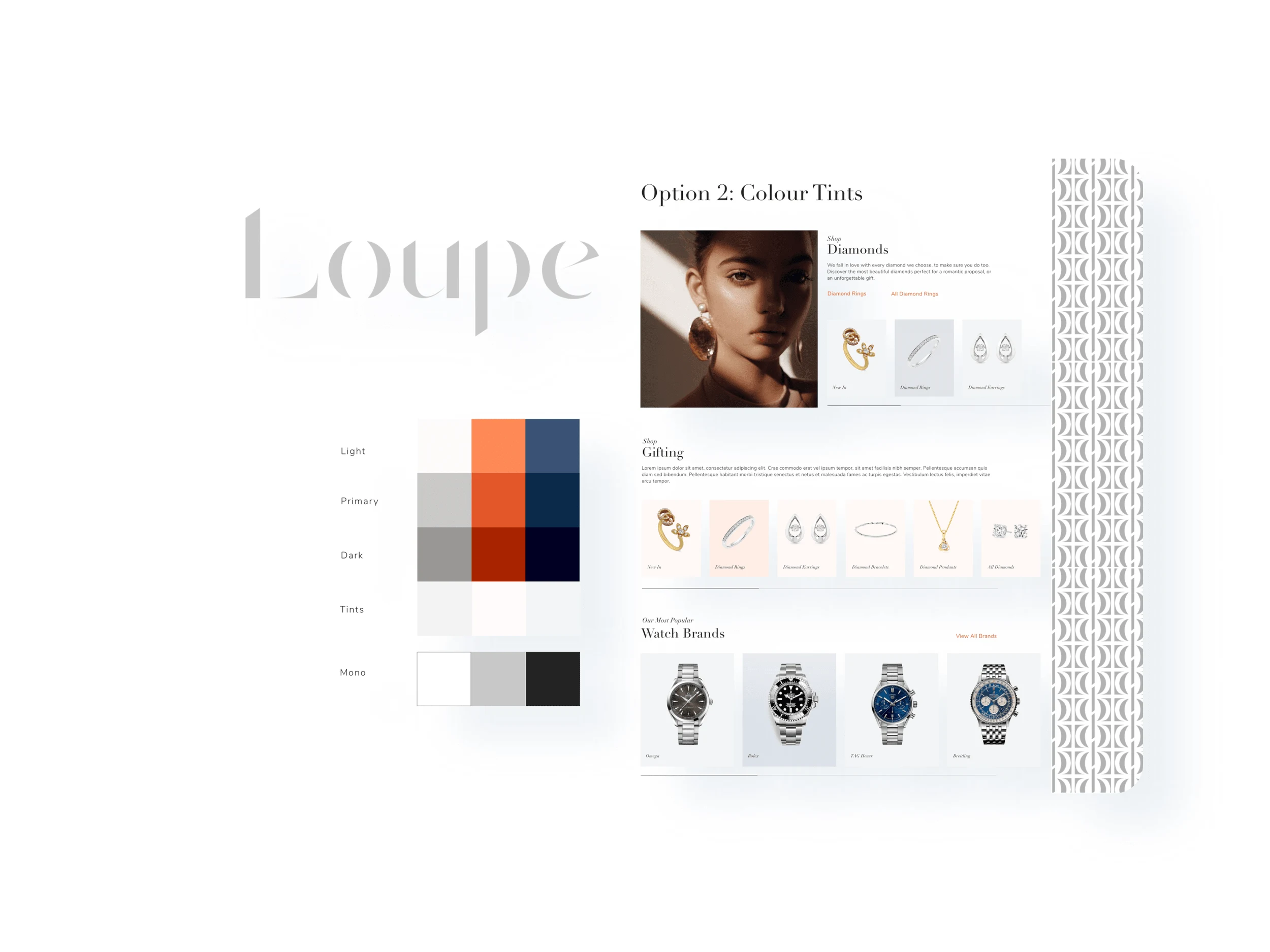
Brand palette and logo concepts
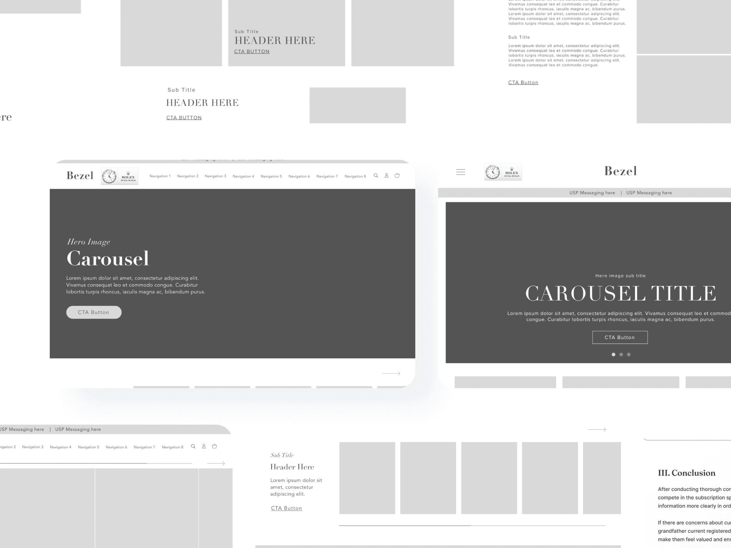
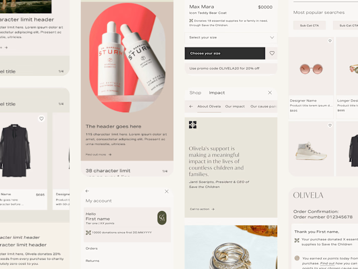
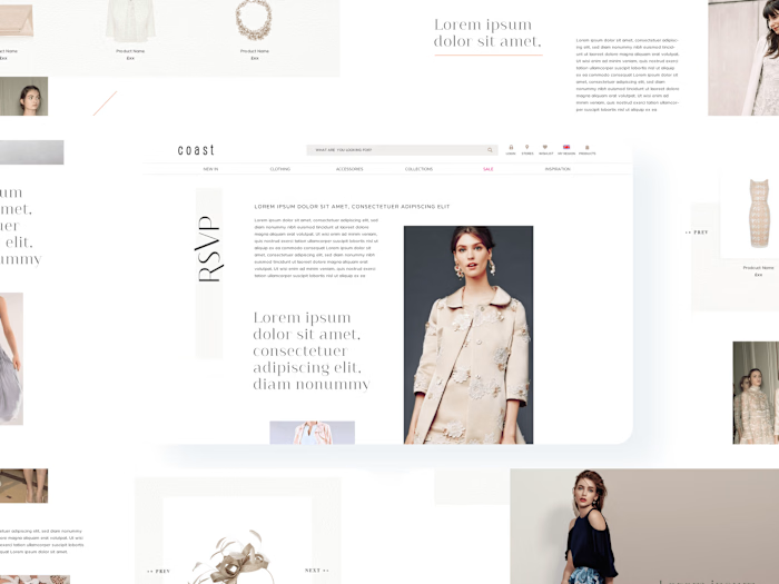
Hi-fidelity wireframe examples
We developed a few palettes based around the key brand colours to bring hierarchy and strong brand visuals to the design concepts. Considering accessibility at all times.Ultimately we went for shades of burnt orange as the key highlight colour but kept everything else quite muted to allow for the luxurious brand photography shine and act as those story telling features.
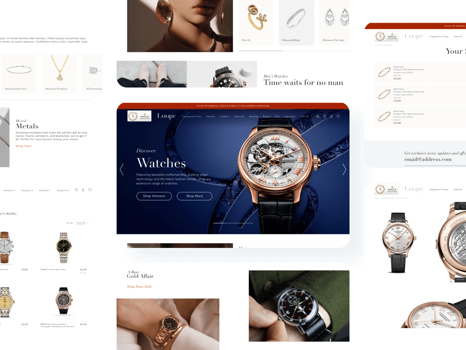
Final route
Agency: TAG Studio
Director: Thomas Marrows
Product and Creative design: Jenna Patrick
Like this project
Posted Sep 14, 2023
Role: Design lead // Outcomes: UXR, UX/UI Design & Identity, Art Direction
