Hype+ | Brand Identity, Packaging & WordPress Website
Muhammad Asad Khan
Hype+ spans two adjacent product lines, energy pouches and nicotine pouches, and the brief was clear from the start: most of the category leans loud, busy, and disposable-feeling. This brand wanted to feel like the opposite, premium, restrained, and confident enough that it didn't need to shout to stand out.
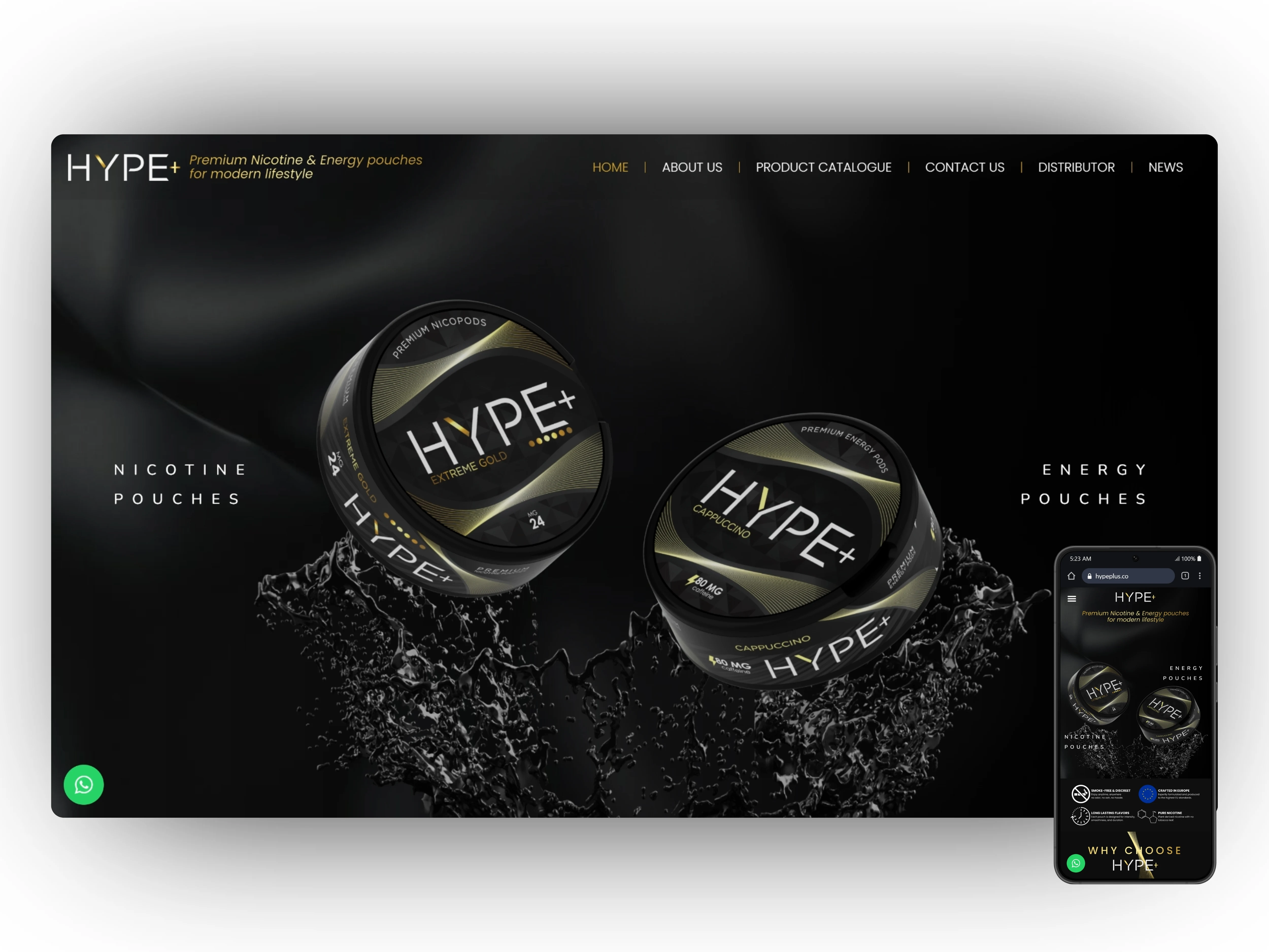
I built the full identity from the ground up, logo, color, typography, and a visual language dark and minimal enough to feel deliberate rather than decorative. That identity then had to carry across more touchpoints than most projects, packaging for both product lines, business stationery for the company itself, and a custom WordPress website.
3D mockups were essential here, getting the tin's finish, embossing, and label placement right before committing to physical production meant catching small inconsistencies that would have been expensive to fix after the fact.
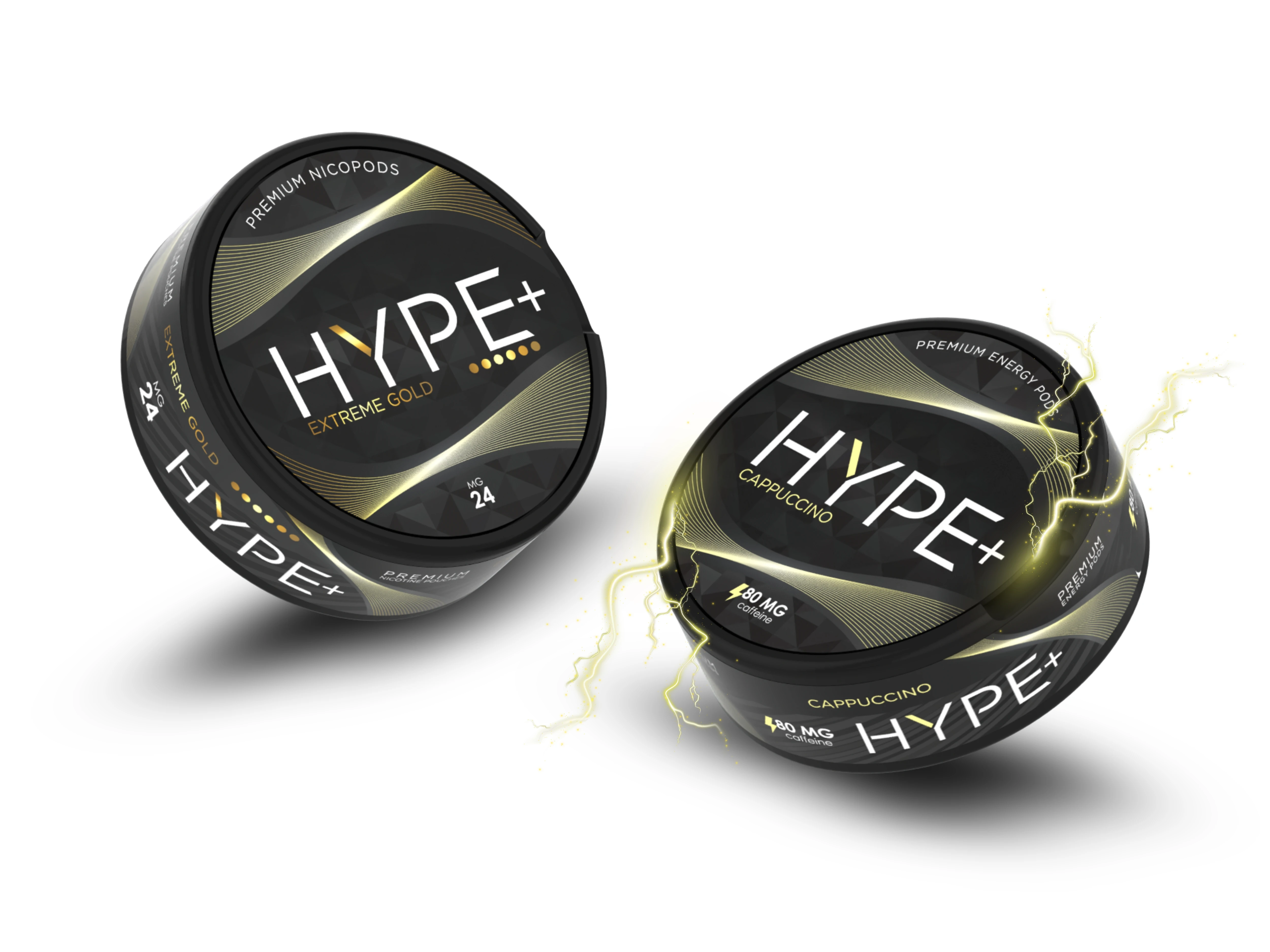
Hype Nicotine and Energy
The website needed to feel like a natural extension of the packaging rather than a separate marketing exercise, same dark palette, same restraint, same confident typography, so that someone landing on the site after seeing the product in person wouldn't feel like they'd arrived somewhere else.
Ongoing Partnership
The initial brand build wrapped in November 2025, but the client continues to work with me on new SKUs, packaging updates, and website maintenance as the product range expands. This is a repeat engagement, not a one-off project.
Like this project
Posted Jun 25, 2026
Full brand build for a nicotine pouch company: logo, packaging, business stationery, 3D mockups, and a custom WordPress website.
Likes
5
Views
9
Clients
Hype Distribution OÜ