Laniche Parfum | Full Brand Identity to Custom Shopify Store

Muhammad Asad Khan


Laniche Parfum came to me as a UK fragrance brand with nothing yet built, no identity, no packaging, no online presence. The brief was to treat it as one connected system from the start rather than handing different pieces to different people along the way.
I began with the brand identity itself, an elegant serif wordmark that needed to feel premium without leaning into anything overdone, the kind of mark that works just as well stamped on a box as it does on a perfume bottle cap. From there, the packaging system followed the same visual language across multiple product lines, bottle labels, outer boxes, and gift packaging, all sharing one consistent identity.
3D mockups played a real role here, not just for presentation, but for catching problems early. Proportion issues, finish inconsistencies, and label placement errors are far cheaper to fix on screen than after a print run.
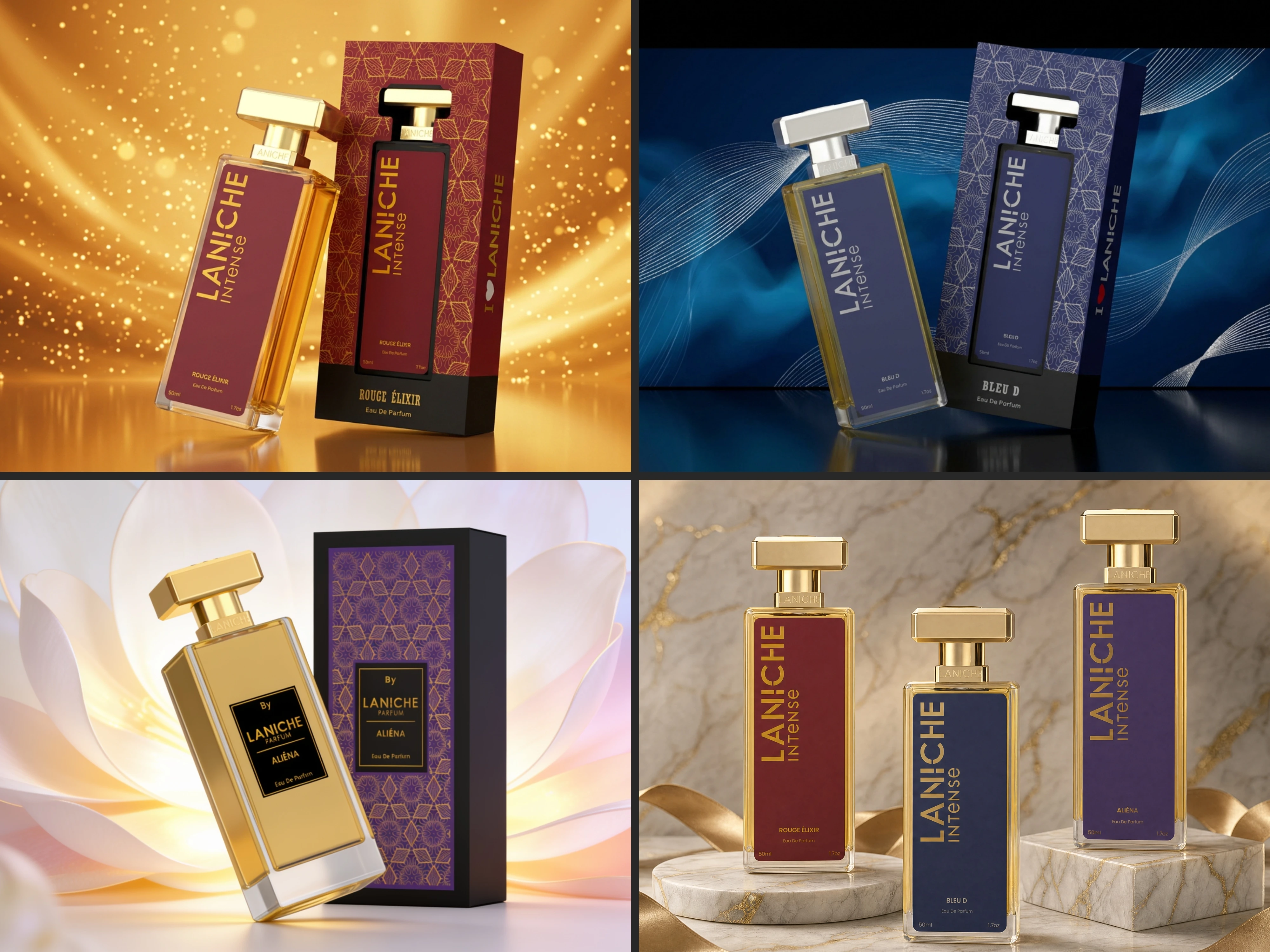
Laniche Perfumes
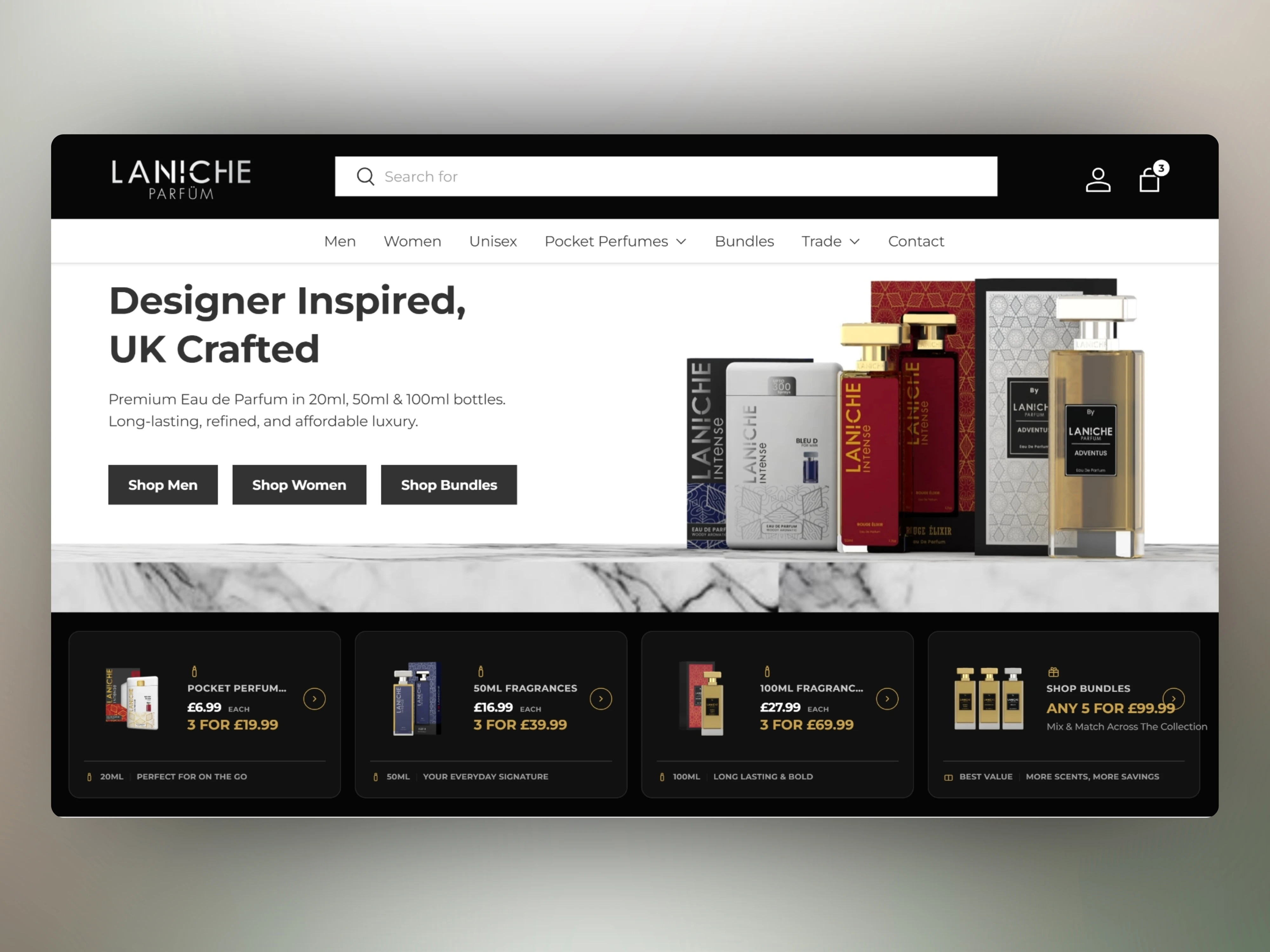
For the store, a stock Shopify theme wasn't going to cut it. I built a custom theme using metafields to handle pricing logic Shopify doesn't support natively, size-specific variant pricing, separate trade and wholesale tiers from retail customers, and bundle offers with their own custom pricing rules rather than simple discount codes.
The result is a brand that reads the same whether someone's holding the box, browsing the site, or buying in bulk as a trade customer.
Ongoing Partnership
Laniche continues to work with me as their design and development partner. New fragrance launches, packaging for seasonal collections, and Shopify store updates are handled on an ongoing basis. The relationship has grown from the initial brand build into a retained creative partnership.
Like this project
Posted Jun 25, 2026
Full pipeline for a UK fragrance brand: logo, identity, packaging, 3D mockups, and a custom Shopify store with metafield pricing, trade tiers and bundles.