Crispy Nature — Brand Identity, Packaging & Shopify Store
Muhammad Asad Khan
1 collaborator
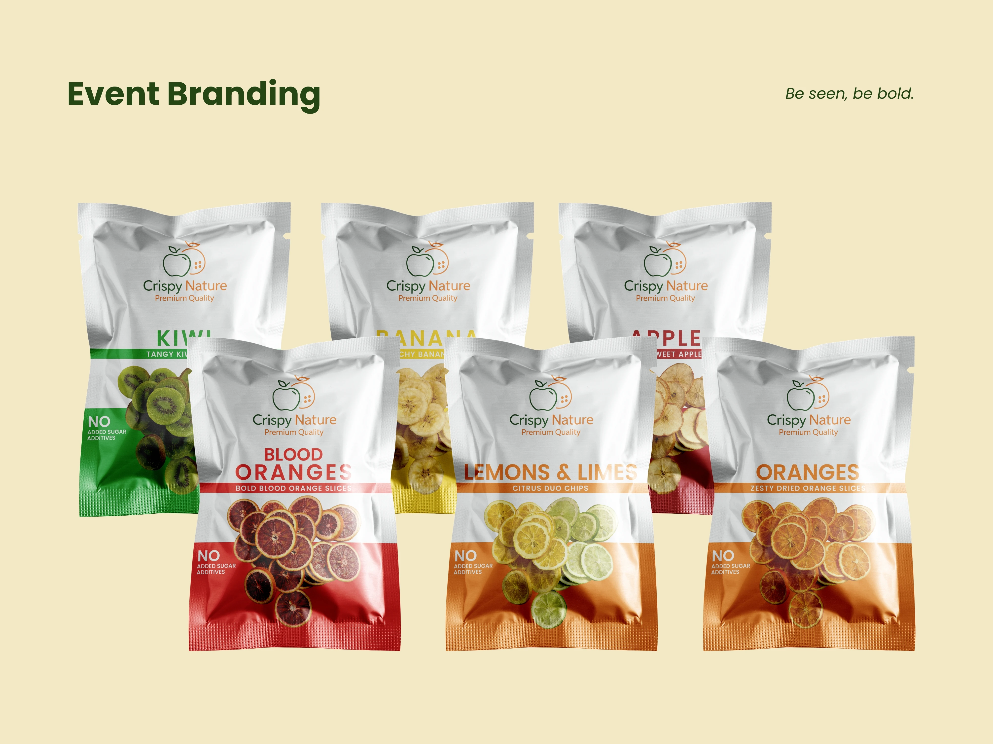
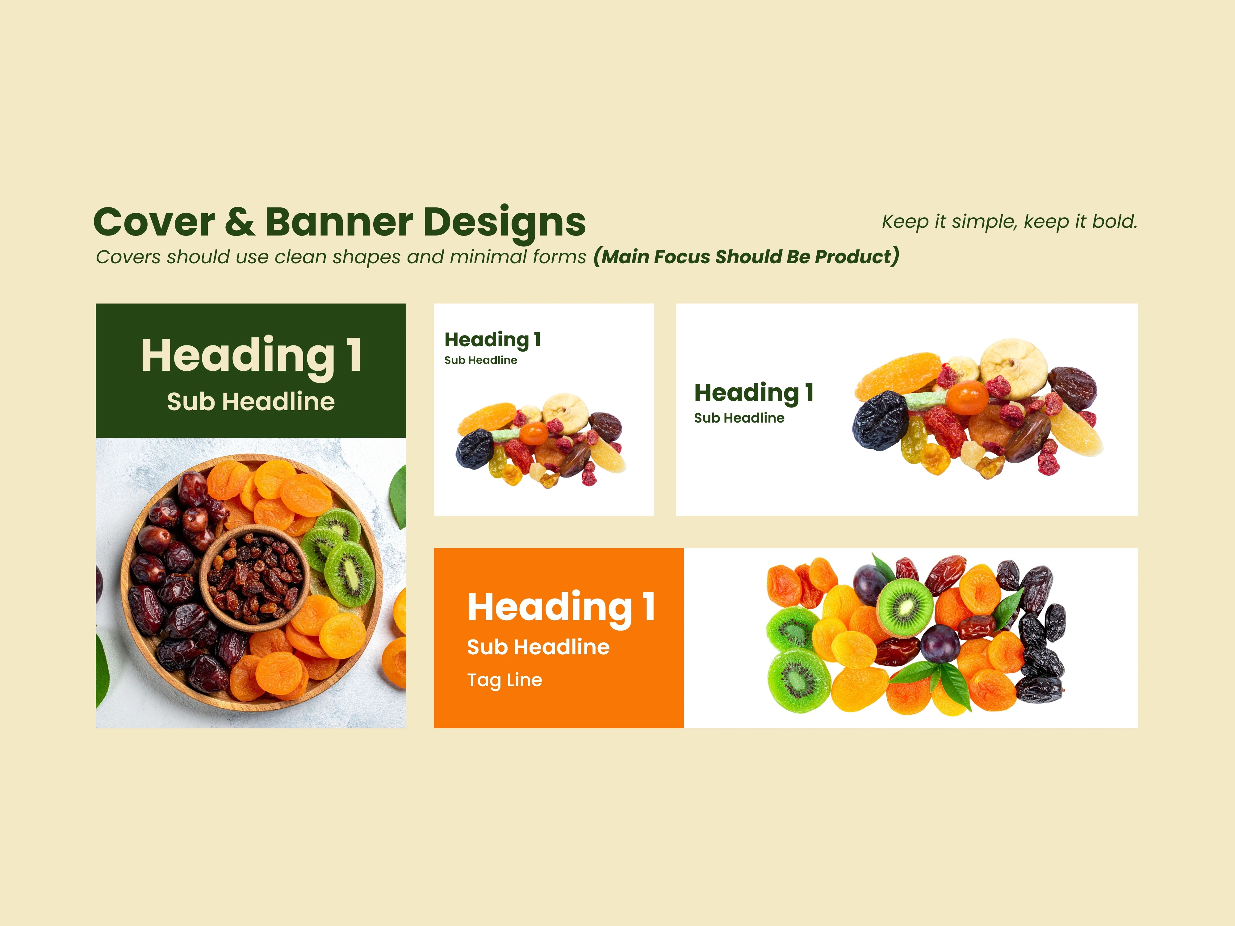
Crispy Nature is a dried fruit snack company that needed packaging covering six different flavors, kiwi, blood oranges, bananas, lemons and limes, apples, and oranges, each one distinct enough to grab attention on its own, while still reading clearly as part of the same brand family when they all sit together on a shelf.
That tension is most of the actual work in packaging design. Too much consistency and every flavor looks interchangeable, nobody can tell them apart at a glance. Too little, and the brand falls apart, it stops feeling like one company.
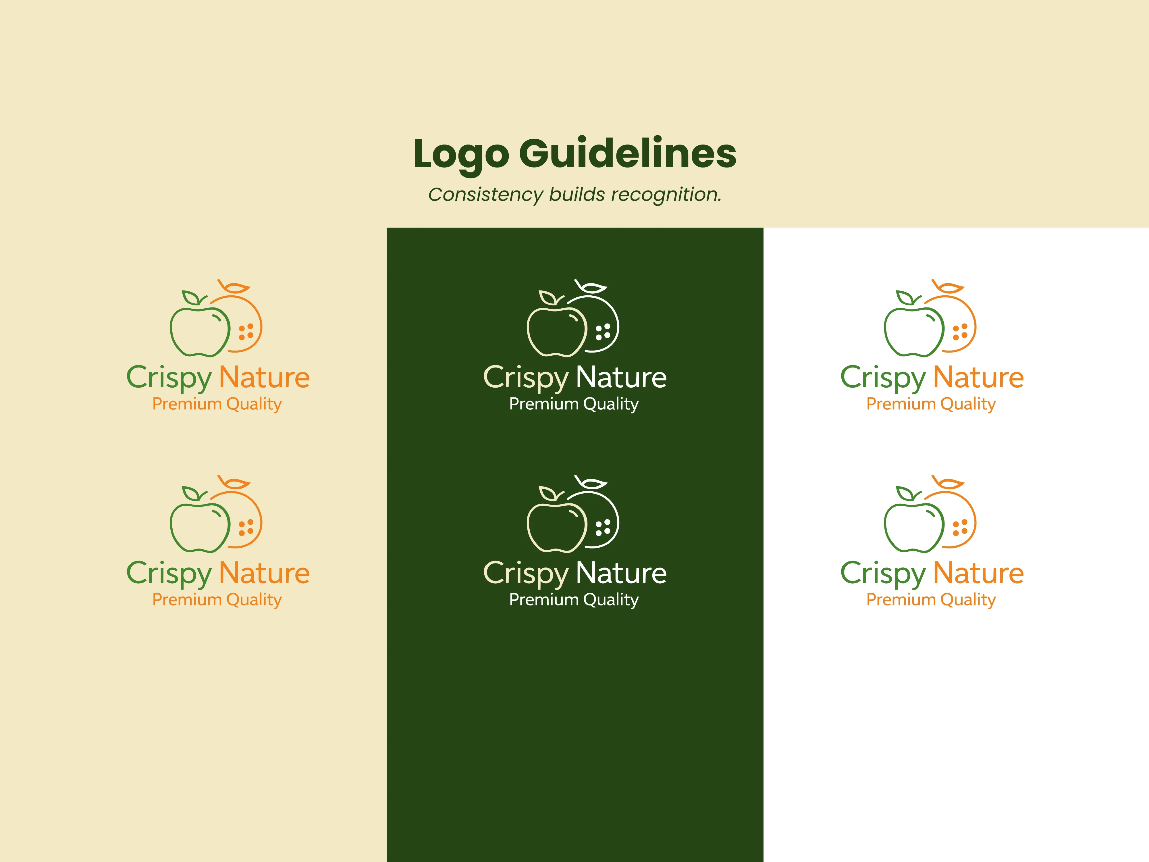
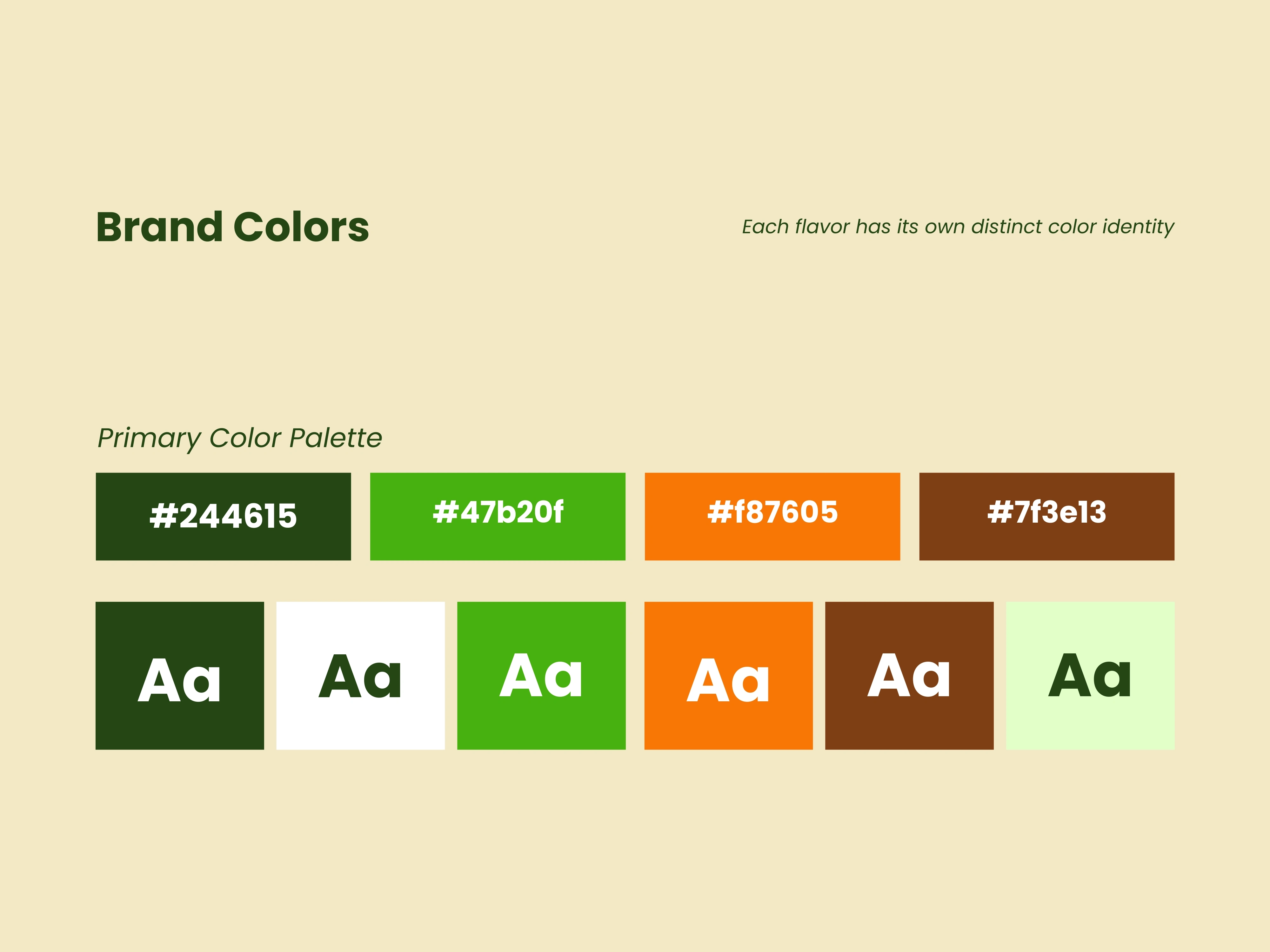
I started with the identity itself, a clean mark built around an organic apple-and-citrus icon, paired with simple, confident typography that signals "natural" without leaning on the usual clichés of leaf icons and earthy browns. From there, the packaging system carried that mark across all six flavors, with color and fruit imagery doing the work of differentiation while the logo, layout structure, and "No Added Sugar" badge stayed identical across every pouch.
Once the identity and packaging were locked, I built a custom Shopify store to match, clean, product-forward, and built to let the packaging photography do most of the talking rather than competing with it.
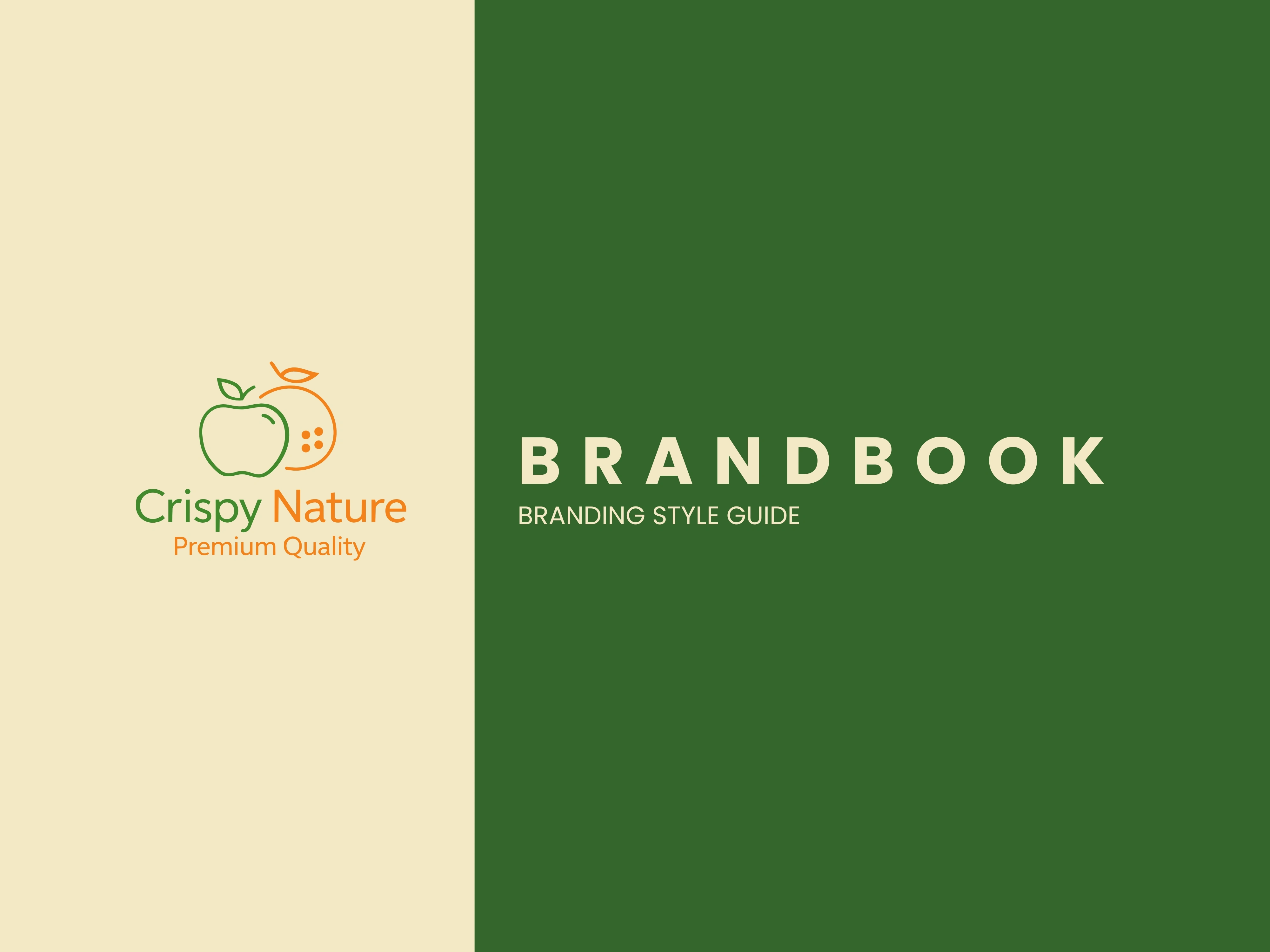
Crispy Nature
Crispy Nature
Crispy Nature
Crispy Nature
Crispy Nature
Crispy Nature
Crispy Nature
Ongoing Partnership
The client continues to work with me on new flavor launches, packaging refinements, and Shopify store updates. What started as a six-flavor launch has grown into an ongoing design relationship as the product line expands.
Like this project
Posted Jun 25, 2026
Full brand build for a dried fruit snack company: logo, packaging across six flavors, and a custom Shopify store designed to match the brand.
Likes
4
Views
7
Clients
Crispy Nature LTD
Collaborators