Development of Hirecode Platform
Chirag Mahajan

HIRECODE
The coding assessment platform built for the age of AI developers.
ROLE: Sole UI/UX Designer
PLATFORM: Desktop
STATUS: Designed & Shipped
The Problem
Everyone can build with AI today. Very few actually understand what they are building.
This has created a quiet hiring crisis. Candidates practice the same 200 problems on HackerRank, crack the test, get hired, and fall apart in production. Companies think they found a great engineer. Six months later, they find out they did not.
The tools used to evaluate talent were not built for this world. They still run on recycled question banks. Memorise the library, pass the test. That is not a skill assessment. That is a memory test.
I felt this personally while trying to hire a developer for my own startup. Finding someone who truly understands what they are building, not just someone who can Google through a test, was genuinely hard. That frustration became the foundation of Hirecode.
Research
I mapped the journey of two completely different users before I touched Figma.
The HR who needs to create a test fast, with zero technical knowledge. And the developer who needs to take one, already stressed, already being judged.
Both have different goals. Both have different anxiety levels in that moment. The design had to work for both simultaneously.
I spoke to HRs in my network to understand where existing platforms were losing them. The answer was almost always identical. Too many steps, too many configuration options, too much time wasted on setup before even getting to the actual assessment. I took that insight and made simplicity the entire design brief.
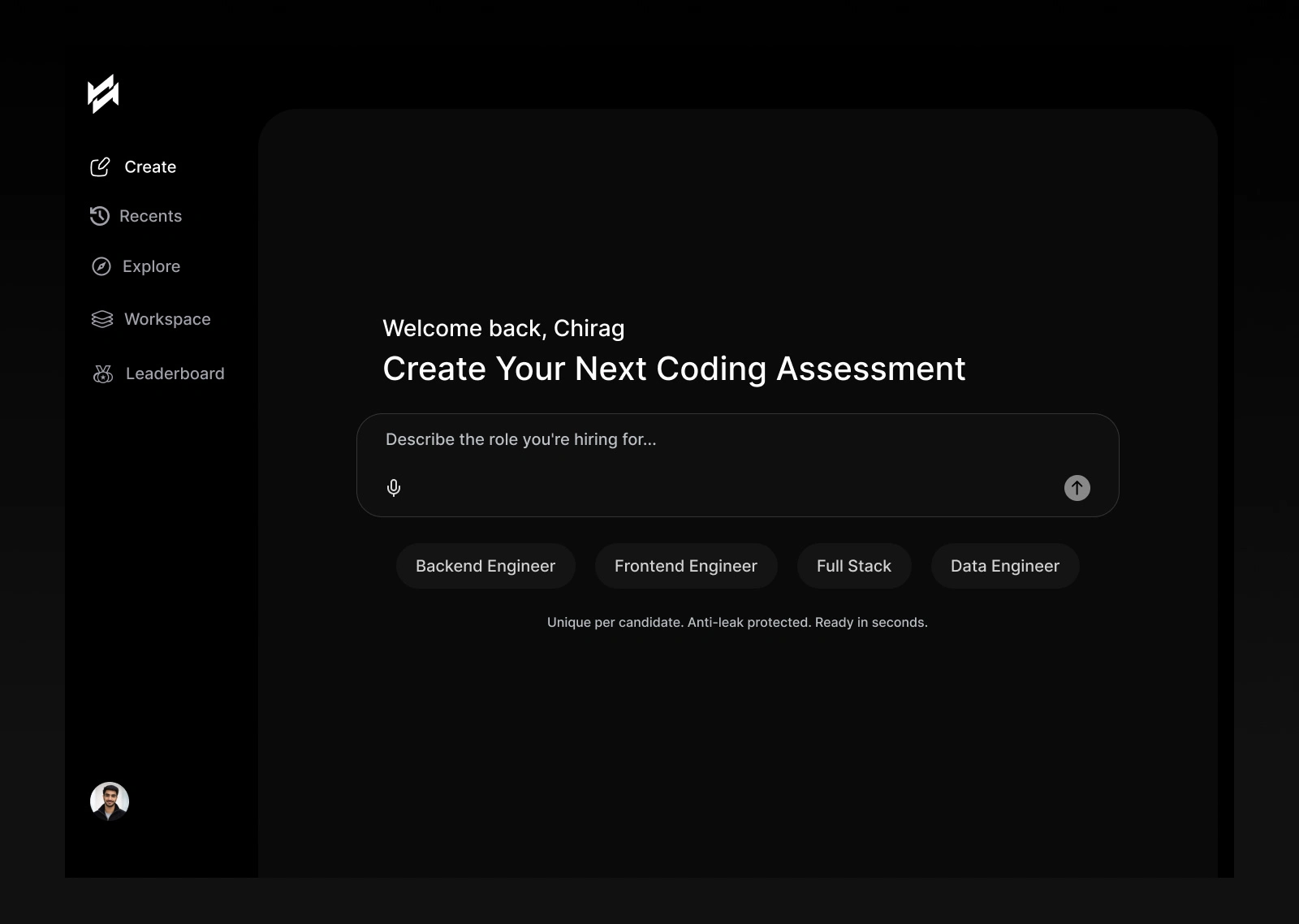
Create Assessment
The first screen an HR sees after logging in is one input field and four quick role tags. That is it.
No forms. No dropdowns. No configuration. You describe the role, hit send, and a unique assessment is generated in seconds.
The line under the input field says: "Unique per candidate. Anti leak protected. Ready in seconds."
Every word there was chosen deliberately. Companies are not just worried about finding good talent. They are also worried about test leaks. That one line addresses both fears without making a big deal out of either. I stripped every distraction from this screen because the action itself is powerful. Anything else would have competed with that moment.
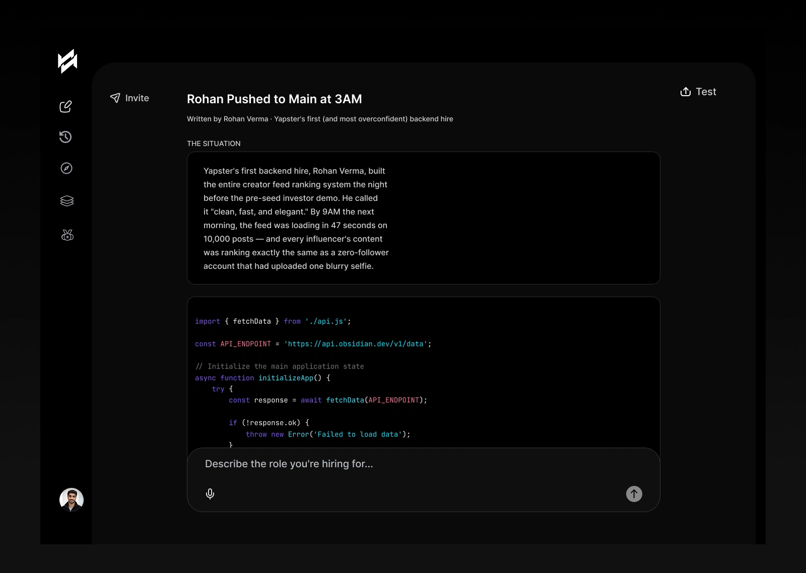
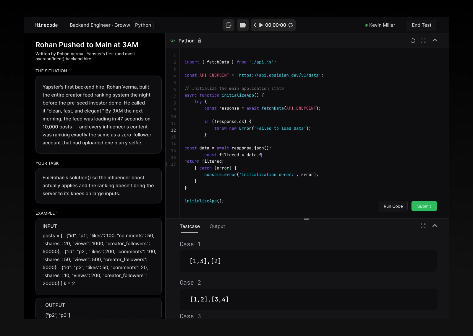
The Test Panel
Split screen. Problem statement on the left. Code editor on the right. Nothing else.
The problem itself is written like a real world scenario, not a textbook question. A backend engineer pushed bad code to production the night before an investor demo. Fix it. That is the test.
This was a deliberate product decision. Real engineering is not about solving abstract puzzles. It is about understanding context, debugging under pressure, and making the right call fast. The problem format reflects that reality completely.
When the environment is focused, the thinking becomes focused. That was the psychology behind removing everything that was not the problem or the editor.
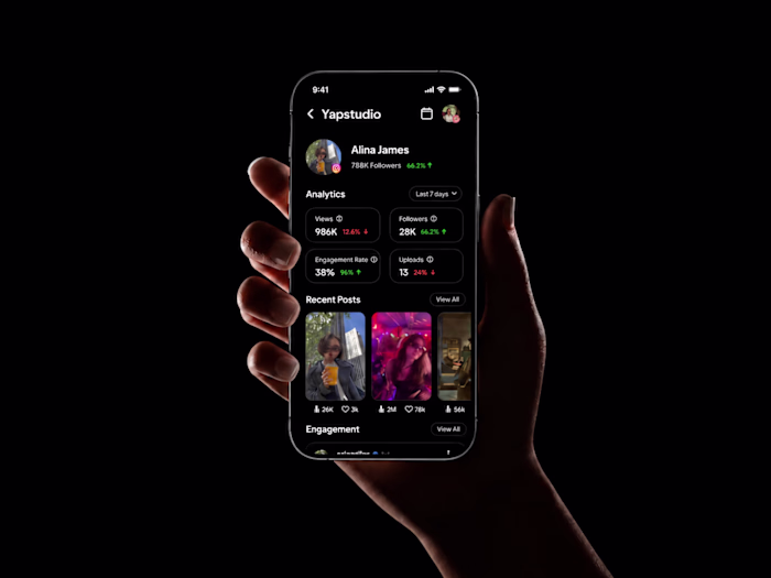
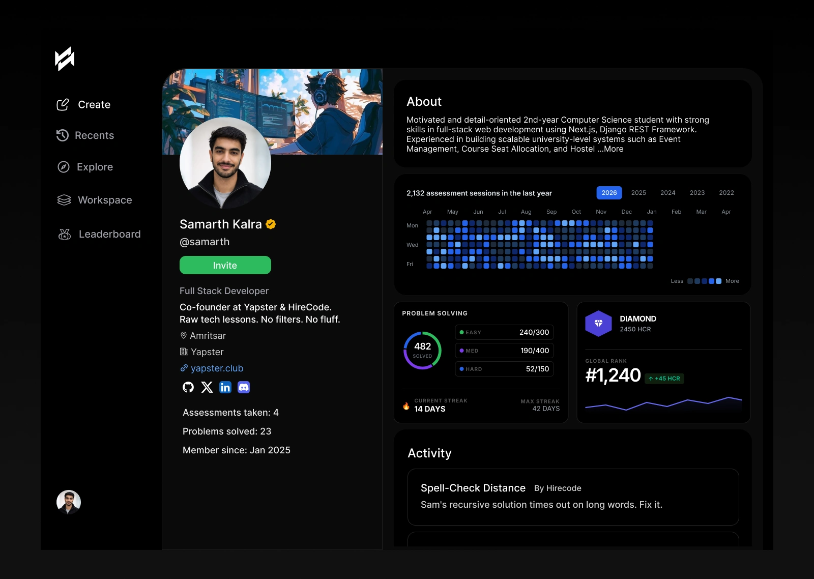
Coder Profile
GitHub shows your commits. LinkedIn shows your job titles. Neither tells a company what kind of coder you actually are.
The Hirecode profile fixes that. Assessment activity over time, problems solved by difficulty, current streak, global rank, all visible at one glance. It works like a coding portfolio, not just a score card.
The design was inspired by how GitHub contribution graphs work because that pattern is already trusted and understood by developers. I took it further by layering in ranking, streaks, and difficulty breakdowns to make it feel competitive and personal at the same time.
The goal was simple. Give every coder a profile they are proud to share. Give every company a profile they can actually trust.
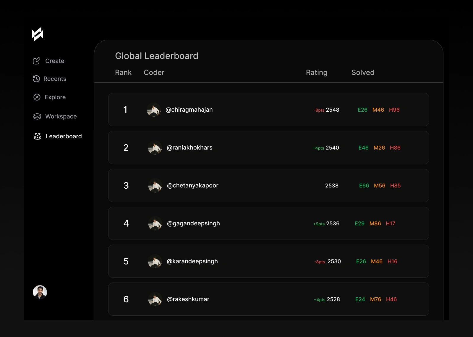
Global Leaderboard
Taking a coding assessment should feel like playing chess, not sitting an exam.
Every user has a rating. Every solved problem changes that rating. You can see your global rank, how many Easy, Medium, and Hard problems you have solved, and whether your rating moved up or down. It creates a pull that makes people return to the platform even without an active assessment waiting for them.
The layout is deliberately table-based because leaderboards need clarity above everything else. Rank, name, rating, solved count. In one glance. No decoration. Just the data that matters.
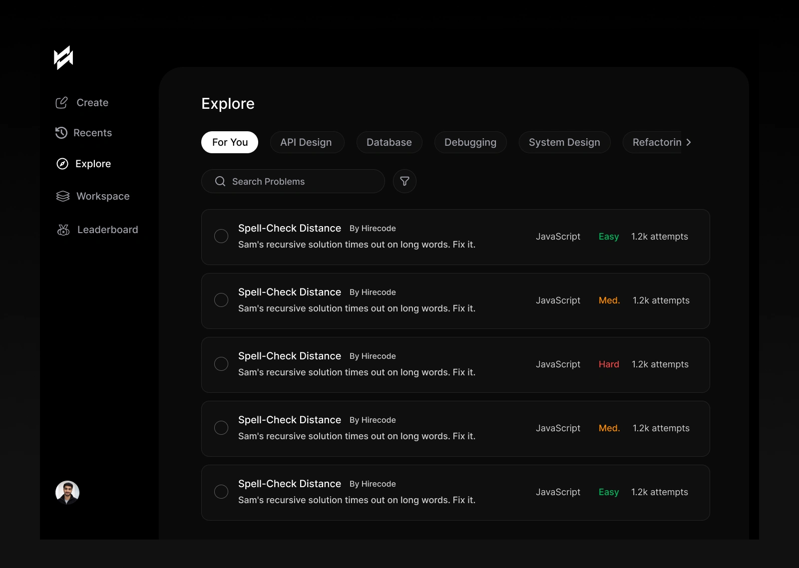
Explore Library
Not every company wants to generate a fresh question every time. Some want to browse, filter by topic, and pick from a curated set. The Explore screen handles that.
Filter by category. API Design, Debugging, System Design, Database. Each problem shows language, difficulty, and number of attempts. The layout is list-based because when you are scanning for the right problem, you need speed, not visual cards slowing you down.
This screen also gives candidates a place to practice independently, which builds the habit of returning to the platform even between assessments.
Process
I mapped two user journeys before I designed a single screen. The HR creating a test and the developer taking one. Both completely different stress levels, completely different goals.
I worked entirely in Figma. I used AI tools to explore visual directions quickly and test information layouts before going into high fidelity. At every step I asked myself one question: will someone who has never seen this before know exactly what to do in under ten seconds?
The Create screen and the Test Panel got the most iterations because those two screens carry the entire product promise. If they feel off, nothing else matters.
The dark theme was not just aesthetic. Coding environments are almost always dark. It reduces eye strain during long sessions and makes the code editor feel native to the experience, not dropped into it.
What I Learned
In AI products, the design job is to make the AI invisible.
The HR should never think about how the question got generated. They should just think: this is exactly what I needed. The gap between what the technology does and what the user feels is where the design lives.
And once again, designing for a problem I personally faced made every decision sharper. I was not guessing what an HR needs. I lived that frustration. That made every choice easier to make and easier to defend.
Hirecode. Built for the hiring problem nobody was solving.
Like this project
Posted May 10, 2026
Designed a user-centric coding platform simplifying HR assessments.
Likes
0
Views
1
Timeline
Apr 27, 2026 - Ongoing
Clients
Hirecode