Freelancers using StitchFreelancers using StitchBayen AI — an AI shopping agent, designed end-to-end with Google Stitch
I'm launching Bayen AI before it's finished — the realtime UX and agentic animations I built with Google Stitch were too fun not to share, and I'd rather show a real, in-progress build than a polished demo.
The story. I found Stitch ~3 months ago and finally built the front end I'd been stuck on. I'm building Bayen solo — infrastructure, backend, matching layer, all of it — so the UI kept slipping. Stitch is what unblocked me.
What Bayen is. An AI shopping agent: you prompt it, it matches and finds the right products across sources — AliExpress, Amazon, Alibaba, and more — so you can find, track, and buy in one place through the sources' official APIs. People first; businesses later. This is a product I'm actually shipping, not a challenge demo — just an early phase.
🛠️ What I built
A complete, on-brand frontend, generated with Stitch during the challenge:
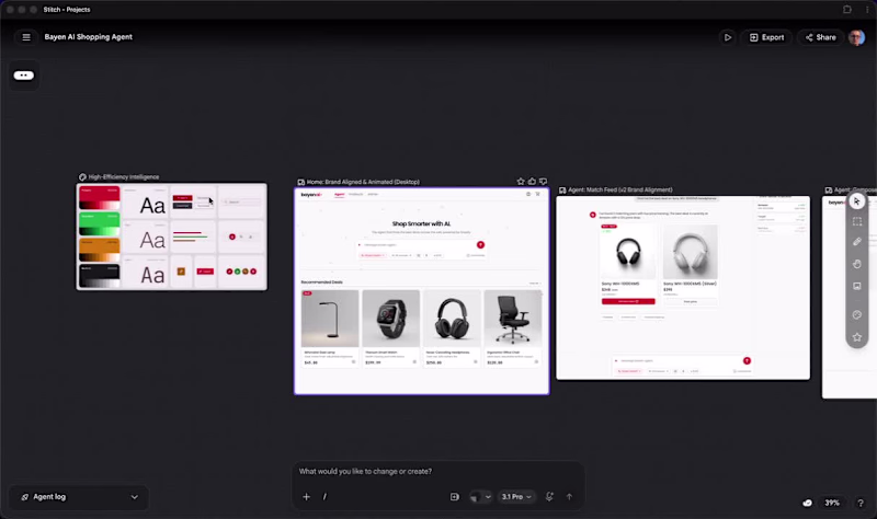
Personalized home — auto-matches to signals (location, currency/language, browsing) with a "matched for you" feed.
The agent — an animated prompt composer: Smart / Deep Smart modes, voice, camera (shop-by-photo), a multi-source toggle, and a / skill palette of source "portals" the agent can call — aliexpress_portal, alibaba_portal, amazon_search, /compare, /track, /under.
Realtime PDP — live price + drop indicator, 30-day sparkline, USD/EUR/MAD switcher, and a Compare Offers table flagging the best live source.
Payment handoff — routes the buyer to the source's official checkout (e.g., Amazon) with affiliate disclosure, plus a Track price popup.
Admin — dashboard, orders, returns.
Design: monochrome zinc + one confident red accent, Poppins (JetBrains Mono for prices), an animated lowercase bayen ai wordmark, full light/dark + responsive.
🔗 Link
https://stitch.withgoogle.com/projects/6579973469378019461
(https://stitch.withgoogle.com/projects/6579973469378019461)✨ How I used Stitch
Stitch generated my entire frontend, not just mockups — via its 2026 Vibe Design workflow:
Multi-screen generation — I described each route in natural language; Stitch produced the whole connected flow (home, agent, PDP, payment, admin).
Design system as text — I fed it a structured spec (tokens, type ramp, components) in the spirit of Stitch's DESIGN.md format, so every screen stayed in the same zinc + red + Poppins language.
Streaming design agent — refining by prompt/voice with live render let me pivot the whole system (flat monochrome → Poppins + red, then rebuild the composer and admin sidebar) in minutes.
Newly launched feature showcased: Vibe Design + multi-screen generation, plus the streaming design agent.
🎞️ Motion, interaction & dynamic UI
Send → generation — the prompt rises into a bubble, the agent streams its "thinking", the reply types in, then product cards stagger in with deal badges popping and prices counting up.
Dynamic composer — sliding Smart/Deep Smart toggle, source dropdown with a number-pop, voice waveform + timer, and a / palette that filters as you type.
Realtime feel — a Live Deal Tracker with pulsing "live" dots and price deltas, plus a price-confirming state in the payment handoff.
🔌 External integrations (in progress)
Headless: a Shopify backend for owned catalog/orders, and official source APIs (AliExpress, Amazon, Alibaba) for matching, live pricing, and the buy handoff — with multi-currency FX.
💬 My feedback on Stitch
Loved: the speed (idea → real screens) that finally unblocked my front end; natural-language multi-screen generation that kept the flow coherent; design-system-as-text (DESIGN.md-style) that made a brand pivot ripple across every screen; real, buildable structure, not just pictures.
Would love next: finer motion-timing/prototype-link control so animated states export as a playable flow; deterministic tokens (lock a hex/spacing scale); better real image fills and reusable components.
Net: Stitch went from "fun to try" to the core of my workflow.
🖼️ Screenshots / recording
Agent match feed, PDP with Compare Offers, personalized home, Admin dashboard — plus a recording of the animated prompt → results flow.
🎥 Walkthrough (bonus)
Video attached, and on Loom (https://www.loom.com/share/85be2bf6a40c41c5aceca35ff8f44c01).
Note: brand names (Amazon, AliExpress, Alibaba) are referenced as planned official-API integrations; product imagery is placeholder/generated. ✈️ AI Travel App Concept for the Stitch Challenge
For this Stitch Challenge, I decided to test what AI can do in my strongest zone - mobile app design.
My agency and I have created 350+ mobile apps across AI, hospitality, wellness, hotel platforms, marketplaces, and travel-related products. So instead of creating just a nice UI shot, I wanted to test Stitch on something closer to a real product.
The concept:
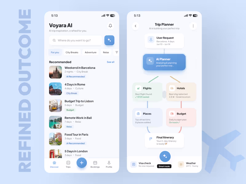
An AI Trip Planner App that helps users discover trips, generate a personalized travel plan, optimize the budget, and turn everything into a ready itinerary.The main UX idea was to show how an AI travel agent can guide the user from curiosity to action:
→ Discover trip ideas
→ Generate a plan
→ Build a route
→ Optimize budget
→ Show savings
→ Push the user toward booking
I used:
a product specification
a Claude-generated visual reference
the same prompt direction in Stitch
then Figma polishing to improve spacing, hierarchy, consistency, and final presentation
Claude gave me a strong visual reference.
Stitch gave me the first working structure.
The biggest advantage of Stitch for me was iteration speed. With the free / Gemini access, I could generate and test more without constantly thinking about tokens. Claude is paid in my workflow, so for fast visual exploration Stitch was actually useful.
After Stitch generated the first version, I refined it in Figma and turned it into a cleaner, more premium mobile concept.
Final outcome:
AI Travel mobile app concept
Trip discovery experience
AI trip planning flow
Budget and savings logic
Smart recommendations
This challenge was not only about “can AI generate screens?”
🟢For me, the real question was:
Can AI help a senior mobile designer move faster from reference and prompt to a product idea that actually feels usable, structured, and business-focused?
My answer: yes - but the depth still comes from UX strategy, product thinking, visual direction, and final design judgment.
Live Link:
https://stitch.withgoogle.com/preview/3633210786682110568?node-id=6fcf2b2aafa9411b8a6f7e377f220b81
If your mobile app looks good but users still don’t activate, return, or convert - I can help you find the leak.
Book a Mobile App Diagnostic Call:
https://calendly.com/asol_design/book-diagnostic-call-linkedin-clone
#stitchchallenge #stitch #mobileappdesign #uidesign #uxdesign #productdesign #aitravel #figma #growthdesign #mobileux I'm jumping headfirst into this challenge and sharing a project that will reimagine the health industry and showcase the full capabilities of Google Stitch. Everything that came out of this project exceeded all expectations. Nothing else could do what Stitch did.
In this video, you'll see with your own eyes and fully realize that the time of AI has arrived. Big changes await us. Whoever is first to show this to the world will be the conductor of the future cyberpunk 2089.
The project is called SomaOS Pulse. It's a wellness intelligence dashboard concept that integrates sleep, HRV, glucose, stress, activity, and nutrition signals into a single, vibrant interface. Stitch was used to generate the design system, screens, prototype, and animations, and then the project was polished into an interactive web prototype.
I'm sharing my thoughts on the project. Follow the links: Google Stitch, prototype, interactive web version, my social media. Be sure to watch the video.
Links
Stitch prototype: https://stitch.withgoogle.com/preview/15691040717386817?node-id=f575de351f2d47719ea3f175cdbf726a
Stitch: https://stitch.withgoogle.com/projects/15691040717386817
(https://stitch.withgoogle.com/projects/15691040717386817)Social Media
X: https://x.com/den_turbin/status/2062278635923669285
Linkedin: https://www.linkedin.com/posts/denis-turbin_i-built-a-unified-live-ai-interface-that-ugcPost-7468044445842649090-QHnY/?utm_source=share&utm_medium=member_desktop&rcm=ACoAAEYVHPYB02O3S94UQCKAOJsgErYsJovzstc
Threads: https://www.threads.com/@den_turbin/post/DZI1hm9kc5d
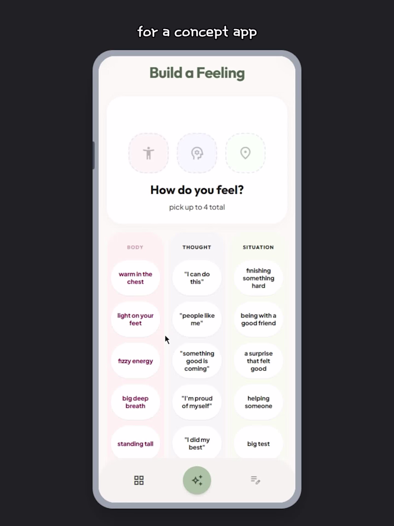
Kisses and greetings to everyone. Let's cook this challenge! My submission for the Google Stitch Challenge is an UI experience in a concept app I called Build a Feeling. 😊
Link to project: click here
(https://stitch.withgoogle.com/preview/17121082665788458271?node-id=8132fa1568f147f4828adc7feee02636)Some if not most kids usually have harder times opening up to adults about their emotions, especially if they don't know what they are feeling themselves.
This app helps a child understand some of the more complex emotions they may be feeling, but don't know the words for just yet.
Describe an experience by taping text bubbles.
Can be as low as 1 or as many as 4.
The app tells you which emotions they may have felt, description, and validation, making them heard.
The user can log their emotion(s) for the session and have them stored on a separate page with dates and all the other important information.
For this project I used Gemini 3, Gemini 3.1 Pro, and Redesign with Nano Banana in Google Stitch.
This is just a concept design, but can be tuned up with more features, animations, statistics, etc.
I actually loved using Stitch by Google, especially with absolutely zero coding experience prior.
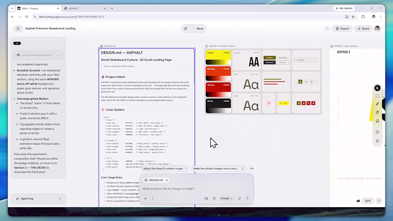
ASPHALT is a landing page for a street skateboard brand — one long scroll with six sections: hero, the drop, the boards, the numbers, the culture, and a final call to action.
Live: https://asphalt-skate-culture.netlify.app/
The look is raw and bold: paper background, big chunky type, yellow and orange accents, 3D boards in the space. Almost everything moves : a spinning skate-wheel cursor, text that jumps up on scroll, a board that tilts to your mouse, a trick-name ticker, a counting year, and sparks on the last button.
How I used Stitch
https://stitch.withgoogle.com/projects/768150956399471213
I started with a design system. I wrote a DESIGN.md with the colors, type scale, spacing, and motion rules, then imported that into Stitch as the source of truth. From there Stitch generated each section straight onto the canvas, and because everything ran off the same system, the sections actually matched instead of drifting. The output was HTML-native too, so the motion and hover states were already in there.
Once the sections looked right, I exported the code and used Claude to merge them into one page: combining the duplicated cursor, consolidating the Tailwind config, and wiring up the scroll behavior between sections. Then I shipped it on Netlify.
Platform feedback
Starting from a design system was the best part the DESIGN.md kept all six sections consistent, which is usually the hard bit when you build piece by piece. Fast too, and the motion came baked in.
The one pain point was joining sections. Each exports on its own, so making one page meant cleaning up duplicates by hand. A "merge boards into one page" export would fix that. Project title
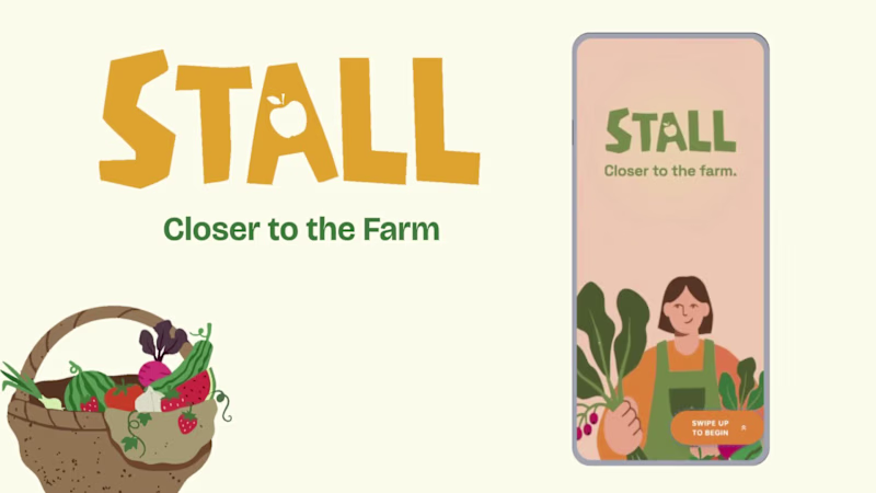
STALL — Your farmers market, alive.
A swipe-to-shop farmers market companion that connects local vendors with regulars before Saturday ever arrives.
The problem
Every Saturday, the same thing happens.
You show up to the farmers market at 10am. The ramp vendor you wanted is sold out by 9. You forgot cash. You walk past a honey stall three times because you can't remember if you already bought some. And that new mushroom farm you heard about? Gone before you spotted them.
On the vendor side, it's just as frustrating. Small farmers wake up at 4am, load the truck, drive an hour, and have no lightweight way to tell their regulars — the people who actually want what they grow — "I have asparagus this Saturday. Come find me."
STALL fixes both sides of that problem.
What STALL does
STALL is a two-sided farmers market app built around one weekly ritual: Saturday morning.
For shoppers:
Follow vendors at your local market
Swipe through a weekly produce deck — right to add to your list, left to skip — exactly like Bumble, but for ramps and sourdough
Get a Friday evening digest: what your vendors have this week, your auto-built shopping list, and where each stall is on the map
Pre-reserve high-demand seasonal items before you leave the house
Discover first-of-season arrivals with a "what's new this week" spotlight
For vendors:
Post a weekly inventory update in 3 taps — what you're bringing, quantities, price
Reach your regulars directly before market day
Manage pre-reservations without a complicated system
The app celebrates the seasonal nature of farmers markets — ramps in April, strawberries in June, squash in October. Every week feels like something worth showing up for.
How I built this with Google Stitch
STALL was designed and prototyped entirely using Google Stitch as the primary build tool, with Figma used only for initial wireframing.
The workflow:
Day 1 — Brand and wireframes
I started by defining the brand: the name, palette (Pumpkin Spice Forest — a warm amber, fern green, mauve, and cream system), and illustration direction. I wireframed the three core flows — swipe deck, Friday digest, and vendor post — before touching Stitch.
Day 2 — Into Stitch
I imported my Figma file directly into Stitch using the .fig import feature. From there I used streaming generation to build each screen live on the canvas — watching the splash screen, onboarding flow, and homepage assemble in real time was genuinely remarkable. The HTML-native canvas meant every animation I added — card tilt on swipe, drawer slide-up, bento tile stagger — rendered exactly as it would in production.
Key Stitch prompts used:
"Add a swipe gesture to the produce card stack — right swipe shows a green Added overlay with 5° card tilt, left swipe shows a mauve Skipped overlay with -5° tilt"
"Make the shopping list items stream in one by one with 120ms stagger on page load"
"Add a bottom drawer that slides up from the vendor card with spring easing — show the farm bio, full inventory list, and two action buttons"
"Build the Friday digest screen — vendor items animate in sequentially, the seasonal spotlight card pulses gently"
"Export web assets and deploy to Netlify"
In-place edits I used:
Swapped the swipe overlay color from red to mauve to match brand
Adjusted the bento grid gap from 8px to 6px after seeing it render on canvas
Changed the CTA button from outlined to filled after in-place visual comparison
Rewrote the seasonal spotlight copy directly on the canvas without regenerating
What Stitch made possible that nothing else could:
The swipe gesture interaction, the drawer spring animation, and the staggered list streaming — all three of these would have taken days to hand-code. In Stitch, they were prompt-driven and live on the canvas within minutes. The gap between "designed" and "interactive prototype" collapsed entirely.
Screens delivered
Splash screen — farmer illustration, full-bleed cream background
Onboarding screen 1 — market basket illustration, "Your market, every Saturday"
Onboarding screen 2 — swipe mechanic explainer with card UI
Onboarding screen 3 — Friday digest bento preview
Homepage — bento grid with market header, seasonal spotlight, list, map preview, swipe deck, streak tracker
Swipe deck — card front, vendor expand drawer, swipe right (added), swipe left (skipped)
Friday digest — streaming vendor list, seasonal spotlight, auto-built shopping list
Market day map — vendor stall grid, spot numbers, live confirmation states
Vendor post flow — 3-tap inventory update screen
Design decisions worth noting
The swipe mechanic — Borrowing the Bumble swipe pattern for produce discovery was the conceptual breakthrough. It transforms a passive browse into an active, satisfying decision. Every right swipe builds your list. Every left swipe still shows you where the vendor is on the market map — skipping is never permanent.
The Friday digest as the hero feature — Most apps make you come to them. The Friday evening push notification with a personalised market brief is the one moment where STALL comes to you. It changes Saturday morning from reactive to intentional.
Bento homepage — Instead of a scrolling feed, the homepage gives you everything at a glance: your market, your list, the seasonal moment, your vendors. Seven tiles, seven pieces of information, zero scrolling.
The color system — Pumpkin (#E8872A), Fern (#728040), Mauve (#B07090), Cream (#FDFAF6), and Moss (#4A5228). Every color has one job. Pumpkin is interactive. Fern is seasonal and confirmed. Mauve is reserved and streaks. Cream is every surface. Nothing competes.
What I learned
Stitch genuinely changes the prototyping workflow. The moment I stopped thinking of it as a design tool and started thinking of it as a build tool — one where the canvas is the product, not a picture of the product — everything accelerated. The in-place edit feature is the one I'll keep coming back to: being able to change a color, rewrite copy, or swap a component without regenerating the whole screen is the difference between iteration and rework.
STALL started as a hackathon idea. After building it in Stitch, it feels like something real.
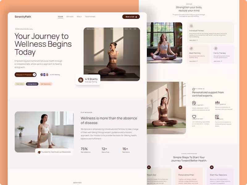
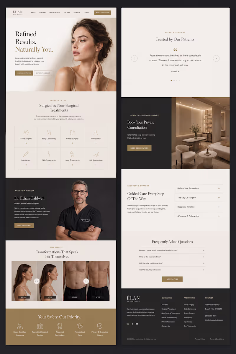
Live Prototype: https://stitch.withgoogle.com/preview/8229547464152593644?node-id=e53124995cda49808685283be978dc8c SerenityPath — Luxury Health & Wellness Platform
A complete, high-end digital experience designed from scratch for a modern Health & Wellness platform.
The core goal of this project was to move away from typical, cluttered medical layouts and focus entirely on a calm, sophisticated, and premium aesthetic. By leveraging warm earth tones, generous whitespace, and precise editorial typography, the interface builds immediate trust and connection with users.
Key Highlights:
Premium Editorial UI: A carefully curated typography hierarchy that maintains an elegant, high-end feel across the entire layout.
Warm Minimalist Aesthetic: Balancing whitespace with rich, clean imagery to convey a sense of calm and well-being.
Conversion-Driven Architecture: Seamlessly blending structured service grids, client testimonials, and intuitive CTAs to drive natural appointment bookings.
Designed end-to-end in Figma with a fully component-driven workflow.
Tolls: Figma, Lummi Your product launch, visualized like a NASA mission.
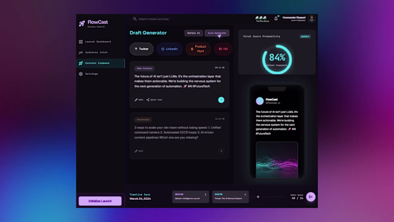
FlowCast is an AI-powered product launch command center built entirely with Google Stitch — designed for founders, growth operators, and startup teams who need real-time launch intelligence in one place.
5 fully animated, interactive pages:
Launch Dashboard — live metrics, animated score ring, momentum feed
Launch Countdown — cinematic timer with GO LIVE trigger
Audience Intel — world heatmap, persona breakdown, sentiment arc
Content Command — AI draft generator with viral score probability
Settings — profile, integrations, notification toggles
🔗 Live Prototype: https://flowcast-mission-control-507808598152.europe-west2.run.app/
How I used Stitch:
Started from a blank canvas. Used streaming generation to build all 5 pages, in-place AI edits to fix and animate components without breaking existing layouts, and native HTML canvas motion for all animations — arcs, count-ups, pulsing maps, ghost cursor, and ripple effects. Exported directly to a live deployment link.
What makes it different:
Every metric moves. Every number counts up. Every page breathes. FlowCast doesn't just show you launch data — it makes you feel the momentum. Built a complete multi-page digital experience using Google Stitch.
For this project, I designed and prototyped Eternal Maven, a modern AI and technology agency website focused on communicating technical expertise, credibility, and premium brand positioning.
What I created:
• Homepage with a bold, future-focused visual identity
• AI Development, Web Development, and Solutions pages
• Case Study section featuring project outcomes and impact metrics
• Industry-specific expertise showcase
• Technology Stack page highlighting modern tools and platforms
• Portfolio gallery for featured work
• Blog & Insights hub for thought leadership content
• Contact and conversion-focused lead generation experience
How I used Google Stitch:
I leveraged Stitch to rapidly generate, refine, and prototype high-fidelity screens while maintaining a consistent design system across the entire experience. The platform made it easy to explore ideas, iterate quickly, and build a cohesive multi-page user journey.
Design Direction:
Dark immersive UI, electric blue accents, glassmorphic elements, modern typography, and premium visual storytelling designed for a 2026-ready digital presence.
Prototype: https://stitch.withgoogle.com/preview/10522833652304720789?node-id=98d3602ef68e4bcb88b235a2ac03a4d0
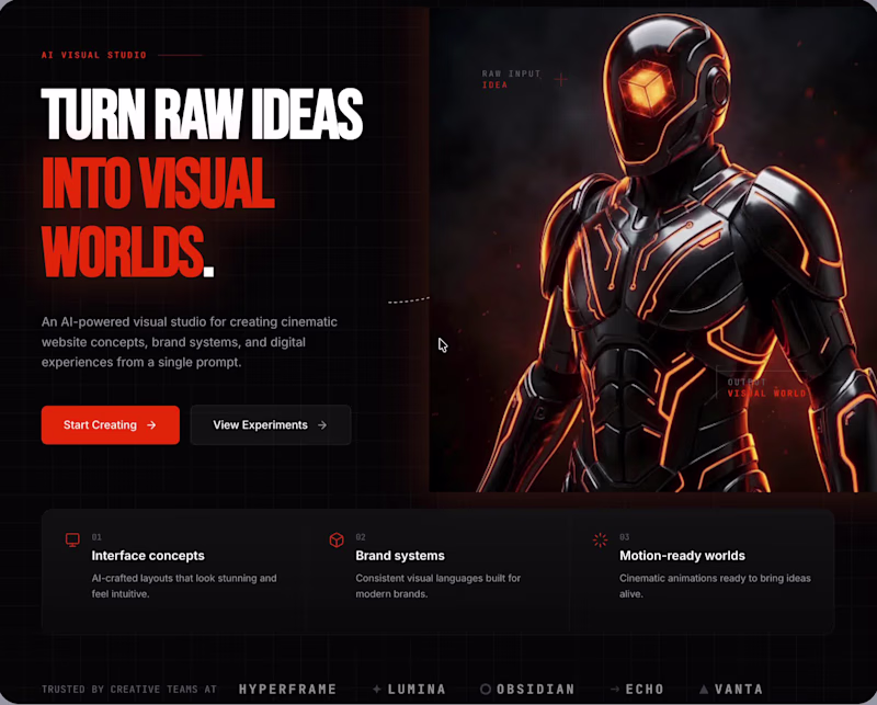
#GoogleStitch #WebDesign #UIDesign #UXDesign #AI #ProductDesign #Prototype #DigitalExperience #Contra AFTERCUBE — AI Visual Worlds From Raw Ideas
For the Google Stitch Challenge, I created AFTERCUBE — a dark cinematic AI visual studio that turns raw ideas into website concepts, brand systems, motion direction, and immersive digital worlds.
The idea was simple:
What if one rough prompt could become a complete visual direction?
Not just a layout.
Not just a dashboard.
A full world.
AFTERCUBE is designed as a premium creative engine where users can start with a raw idea and generate cinematic website concepts, visual identity direction, interface systems, brand atmospheres, featured world concepts, and motion-ready digital experiences.
The final landing page tells a clear story:
Raw idea → visual engine → generated worlds → start creating
Process
I spent around [add hours here] hours exploring, designing, breaking, rebuilding, and refining this concept.
This was not a one-shot design. I went through 20+ iterations before finding the final direction.
Some early versions felt too much like generic SaaS dashboards. Some sections looked like separate websites instead of one continuous experience. A few visual directions were too cluttered, too flat, or not premium enough.
So I kept stripping things back and rebuilding around one stronger visual language:
dark cinematic background
burnt-orange energy
oversized editorial typography
3D character and engine visuals
subtle grid texture
premium Framer-style spacing
animated interactions
strong section rhythm
The biggest challenge was keeping the page consistent while moving from hero to product explanation to showcase sections. I wanted the whole page to feel like one visual world, not random screens stitched together.
How I used Stitch
I used Stitch to rapidly explore different layouts, test visual directions, refine the brand system, and push the final landing page into a more polished prototype direction.
The workflow included:
Exploring multiple concepts and brand names
Testing different dark visual systems
Locking the final direction around AFTERCUBE
Building the cinematic hero section
Creating the Visual Engine section
Adding Featured Worlds as generated concept examples
Creating a final prompt-driven CTA
Adding motion ideas, hover states, glow interactions, and scroll animation direction
What I focused on
My goal was not to create another generic AI landing page.
I focused on:
strong first impression
cinematic art direction
bold typography
premium dark UI
orange energy system
clear product storytelling
interactive motion
visual consistency
a page that feels like a real creative AI product
Future direction
If I had more time, I would expand AFTERCUBE into a deeper product prototype with:
a full AI generation flow
additional inner product pages
more generated world examples
more custom 3D elements
animated world-building states
a detailed brand system page
export screens for Framer, Figma, and campaign assets
interactive prompt-to-world transitions
This version focuses on the core brand, landing page, and product story first. The next step would be turning it into a fuller interactive product experience.
Feedback on Stitch
Stitch was useful for fast ideation and visual exploration. It helped me test multiple directions quickly and move from rough concept to polished landing page much faster than starting from a blank canvas.
The hardest part was maintaining consistency across sections. Some outputs looked like separate pages, so I had to keep refining prompts around continuity, layout rhythm, spacing, and brand discipline.
Overall, Stitch was powerful for exploration, but the best results came from treating it like a creative partner — testing, correcting, refining, and pushing the design direction intentionally.
Final concept
AFTERCUBE is an AI visual studio for turning rough creative thoughts into cinematic digital worlds.
One prompt.
One engine.
A complete visual world.
Prototype: https://stitch.withgoogle.com/preview/2647123046716225432?node-id=7b022a8e6ba245dd9a77627c3cc9e5ee