pro
Rasel Alam Jubayed
UI/UX Designer | Figma to Framer & Elementor
- 5.00
- Rating
- 115
- Followers
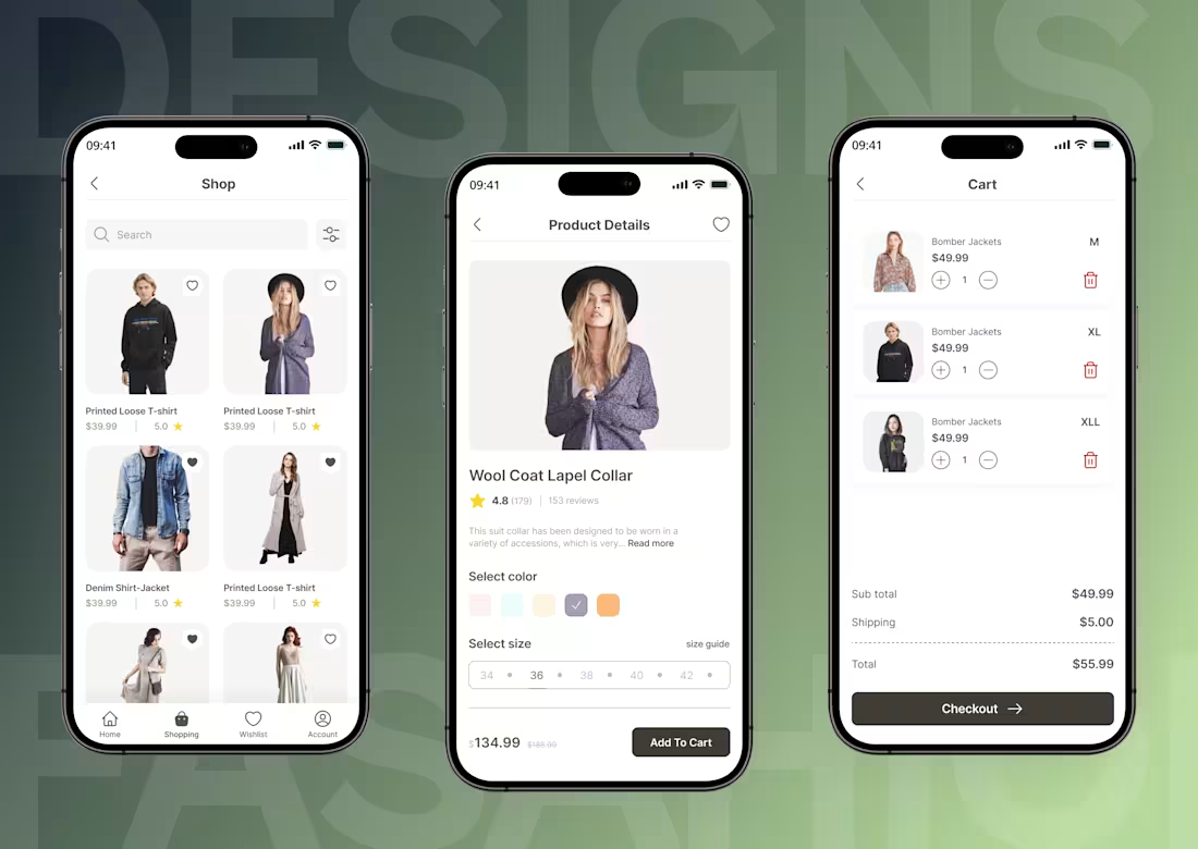
E-Commerce Fashion App — Full Shopping Experience
Description:
Designed a complete e-commerce mobile app for a fashion brand — covering the full user journey from product discovery to checkout.
The Problem:
Most fashion apps overwhelm users with cluttered layouts, making it hard to browse, compare, and buy quickly.
The Solution:
Designed a clean, minimal UI focused on product imagery and frictionless flow. Key screens include:
Shop feed with filter controls and wishlist
Product detail page with color/size selection
Cart with quantity controls and clear pricing breakdown
The Result:
A shopping experience that feels intuitive and premium — reducing decision fatigue and guiding users naturally toward checkout.
Tools: Figma,
1
37
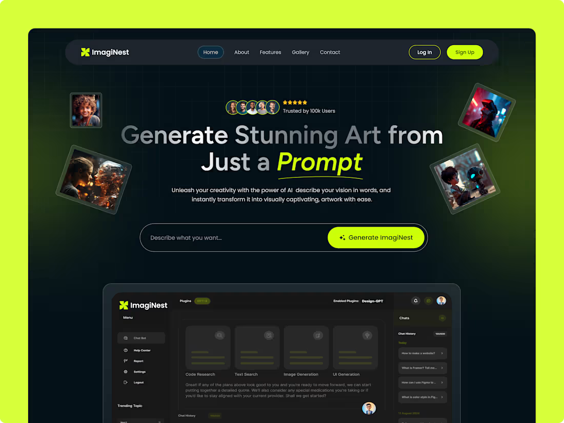
AI Image Generator SaaS Landing Page & Dashboard Design
Project Description:
ImagiNest is a cutting-edge SaaS platform designed to bridge the gap between imagination and digital art. The goal of this project was to create a visually striking, high-converting landing page paired with a functional, data-driven dashboard for seamless AI asset generation.
I focused on a "Future-Dark" aesthetic, utilizing deep tones and vibrant neon accents to resonate with the creative tech community. The design ensures that while the visuals are "stunning," the user experience remains simple and intuitive.
Key Design Highlights:
Conversion-Optimized Hero Section: A bold, prompt-focused interface that encourages immediate user interaction and "activation."
Advanced Dashboard UI: Designed a clean, dark-themed workspace with a structured layout for prompt history, plugin management (GPT-4), and multi-category generation (Code, Text, Image, UI).
Dynamic Visual Hierarchy: Used glowing elements and grid patterns to create depth, ensuring the "AI vibe" feels premium and modern.
Component-Based Architecture: Built with a fully scalable design system in Figma, making it ready for high-quality developer handoff.
4
4
236
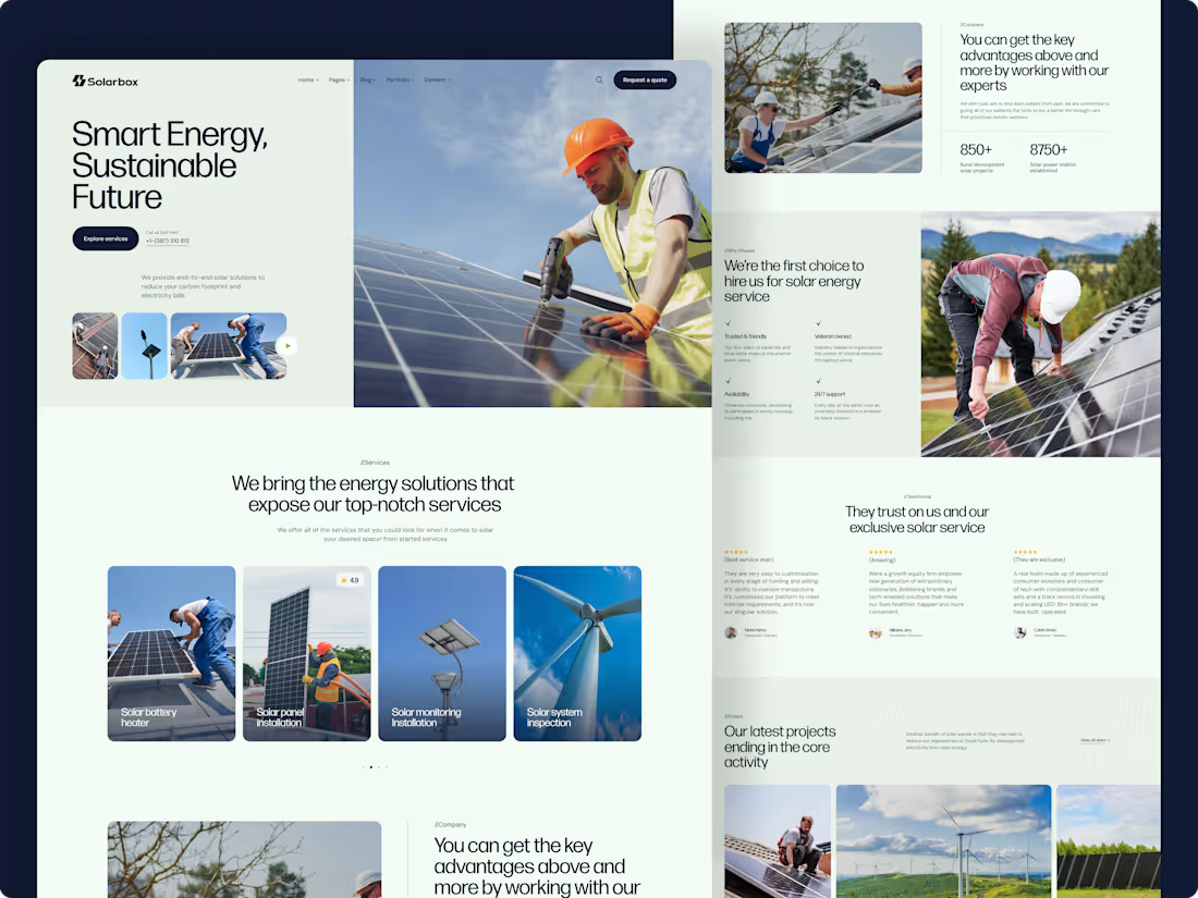
Premium & High-Converting Landing Page for Solar Energy Services
The Challenge:
The primary challenge for this project was to simplify complex technical information about solar energy and present it in a way that builds trust with potential homeowners and businesses. The goal was to move away from cluttered, data-heavy sites and create a modern experience that highlights the environmental and financial benefits of switching to solar.
The Solution & Strategy:
I focused on a clean, minimalist design language that allows the visuals and key statistics to breathe. By using a strategic layout, I ensured that the user is guided from the core value proposition to specific service offerings, and finally to a clear call-to-action (CTA).
Key Highlights of the Project:
Strategic Visual Hierarchy: Designed with a clean, grid-based layout to highlight core energy solutions and value propositions.
Trust & Social Proof: Integrated sections for "Key Advantages" and data-driven stats (850+ Projects) to establish authority in the solar sector.
Lead Generation Focused: Strategically placed "Request a Quote" CTAs and a structured "Our Services" section to guide users toward inquiries.
Real-World Content: Used meaningful, industry-specific copy throughout the design to ensure it is 100% development-ready.
Mobile-First UX: Fully responsive design, ensuring a high-end experience across all devices.
3
5
300
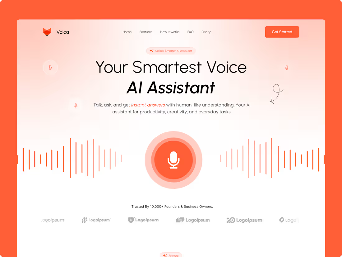
Voica - Premium Voice AI Assistant Landing Page Concept
Project Description:
This project focuses on the visual storytelling and user engagement of a Hero Section for an AI-driven voice assistant. The design intent was to capture the user's attention within the first 3 seconds by combining a minimalist aesthetic with high-impact visual metaphors.
Design Breakdown (Why it works):
The Hero Visual: Instead of a complex dashboard, I used organic sound waves to represent "Voice AI" in a way that feels fluid and responsive.
Trust Building: Placed the "Trusted by 10,000+ Founders" section directly under the main CTA to ensure immediate social proof.
Color Psychology: The warm orange tones were chosen to make the AI feel "Human" and "Friendly," moving away from the typical cold blue AI stereotypes.
Micro-interaction Concept: The pulsing microphone icon is designed to guide the user's eye directly to the core action of the platform.
2
315
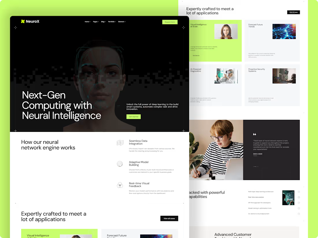
NeuroX — Premium AI & Neural SaaS Landing Page
The Vision:
In the era of AI dominance, a brand’s digital presence must scream "Innovation." With NeuroX, I aimed to redefine the traditional SaaS layout by blending high-performance visuals with a conversion-focused user journey. This isn’t just a landing page; it’s a portal to the future of computing.
Key Highlights of the Design:
Futuristic Visual Language: A sophisticated dark-mode interface with neon accents that establish immediate authority in the AI/Tech space.
Structured Information Architecture: Complex neural network processes broken down into digestible, interactive-style sections (How it Works & Solutions).
Precision UX: Every pixel is calculated to guide the user toward the "Get Started" call-to-action, ensuring zero friction.
Full-Responsive Stack: Engineered for a flawless experience across ultra-wide monitors and mobile devices.
What I Delivered:
High-fidelity UI/UX Design in Figma.
Custom asset creation for AI visualizations.
Conversion-optimized layout strategy for SaaS startups.
2
7
472
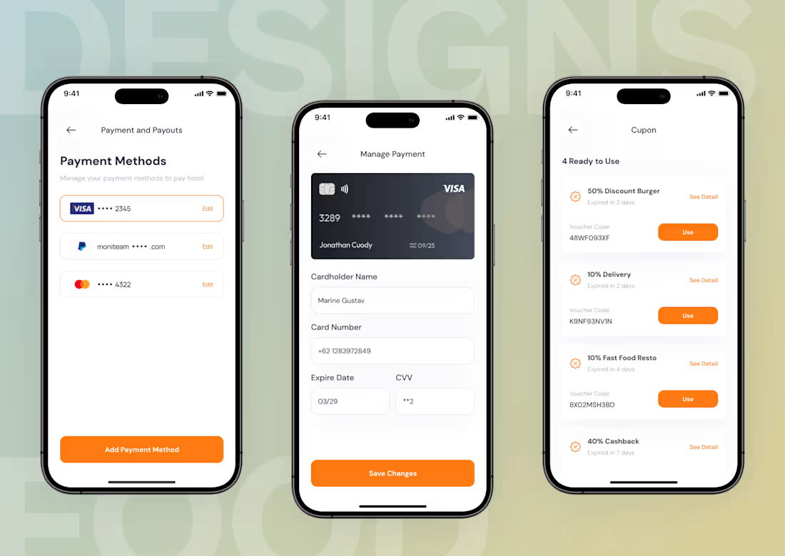
Mobile Payment & Offer Flow Design | Improving E-commerce Conversions
As a Product Designer, my goal was to enhance user retention and reduce cart abandonment for a food delivery platform by optimizing the critical checkout journey. I focused on two core areas: payment management and offer application.
✅ The Problem:
Users often face friction during the final steps of ordering, leading to abandoned carts due to complicated payment method management and hidden or hard-to-apply coupon codes.
✅ The Solution (Visual Showcase):
1. Centralized Payment Management:
I designed a unified dashboard where users can quickly view, edit, or add multiple Payment Methods (Credit Cards, PayPal, Bank Transfers). This reduces cognitive load at the final checkout step.
2. Secure Manage Payment Flow:
A clean, secure form for adding or updating card details, with a real-time card visualizer to boost user trust during data input.
3. Effortless Offer Application (Coupon Screen):
I created a dedicated "Ready to Use" coupon hub that automatically lists available offers. Users can apply discounts with a single "Use" tap, removing the need to memorize or paste complicated codes.
📂 Looking to build a secure and intuitive user journey for your Product? Let’s collaborate to turn complex flows into seamless experiences that drive conversion. View my full portfolio and let’s connect.
7
538
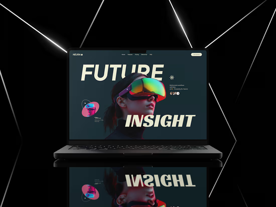
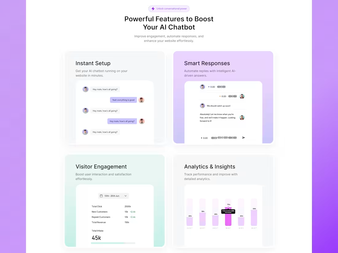
Scaling SaaS Experiences with Intelligent Design 🚀
The Goal: Transforming complex AI features into a high-end, intuitive user experience.
Key Highlights:
Hero Experience: Cinematic Dark Mode for instant brand authority.
Feature Grid: Modular "Smart Response" & "Instant Setup" cards to reduce friction.
Data-First UX: Custom analytics focused on ROI (70% conversion boost).
Aesthetics: Minimalist "Apple-style" visuals for SaaS & Fintech brands.
The Result: A scalable interface designed to sell your product’s value. 📈
2
5
608
SaaS AI Featured Section: Converting Complexity into Clarity 🚀
The Content:
Can your users understand your product's value in under 5 seconds? 🧠
I designed this modular Grid-Card layout to simplify complex AI features through visual storytelling.
Design Strategy:
✅ Visual Anchoring: Soft lavender gradients for a clean, clutter-free UI.
✅ Micro-Interactions: Showcasing "Instant Setup" and "Smart Responses" flows.
✅ Data-Driven UX: Dedicated analytics cards to prove real-world ROI (70% conversion boost).
✅ High-Contrast Typography: Optimized for quick scanning by busy decision-makers.
The Goal: Turning complex "Features" into clear "Benefits."
Building a SaaS or AI platform? Let’s design a high-converting interface together. 📈
4
634
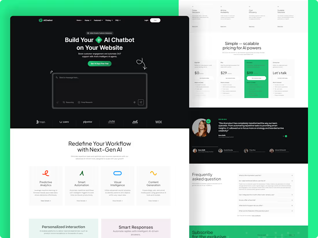
AI Chatbot Landing Page optimized for 2.5X Conversion 🤖
Design is more than just visuals; it's about eliminating business friction. For this project, I focused on:
✅ Conversion-Led Layout: Strategic placement of CTAs to drive user action.
✅ Modern SaaS Aesthetic: A clean, dark interface with vibrant neon accents.
✅ Information Architecture: Simplifying complex AI features into digestible sections.
Ready to automate your support with a premium AI design? Let’s talk.
2
4
710
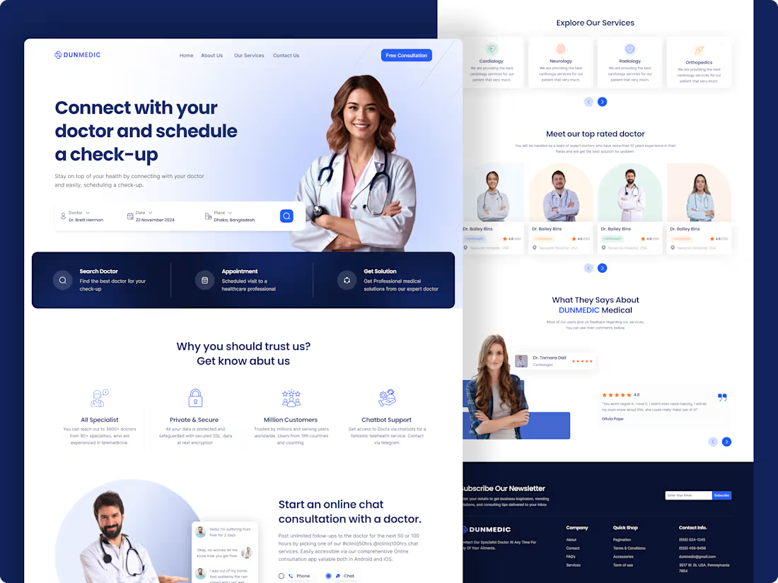
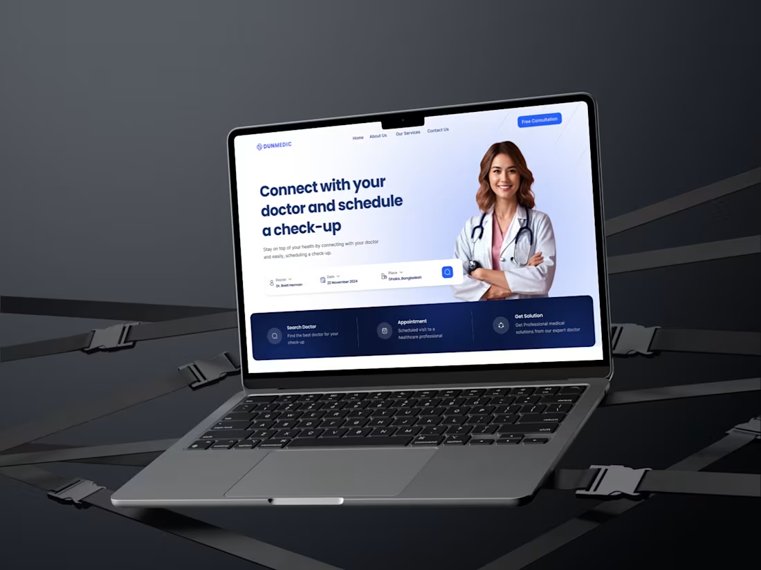
High-Converting Healthcare SaaS Landing Page UI/UX
The Challenge:
To design a healthcare landing page that balances professional trust with an intuitive, friction-free booking experience for patients.
The Solution:
Visual Trust: Established medical authority using a clinical blue-white palette and high-fidelity imagery.
UX Strategy: Implemented a 3-step conversion path: Search Doctor → Select Speciality → Book Consultation.
Engagement: Strategically integrated social proof and detailed provider profiles to minimize bounce rates and reinforce user confidence.
The Result:
A conversion-optimized, responsive design that bridges the gap between patient needs and healthcare services.
1
4
752
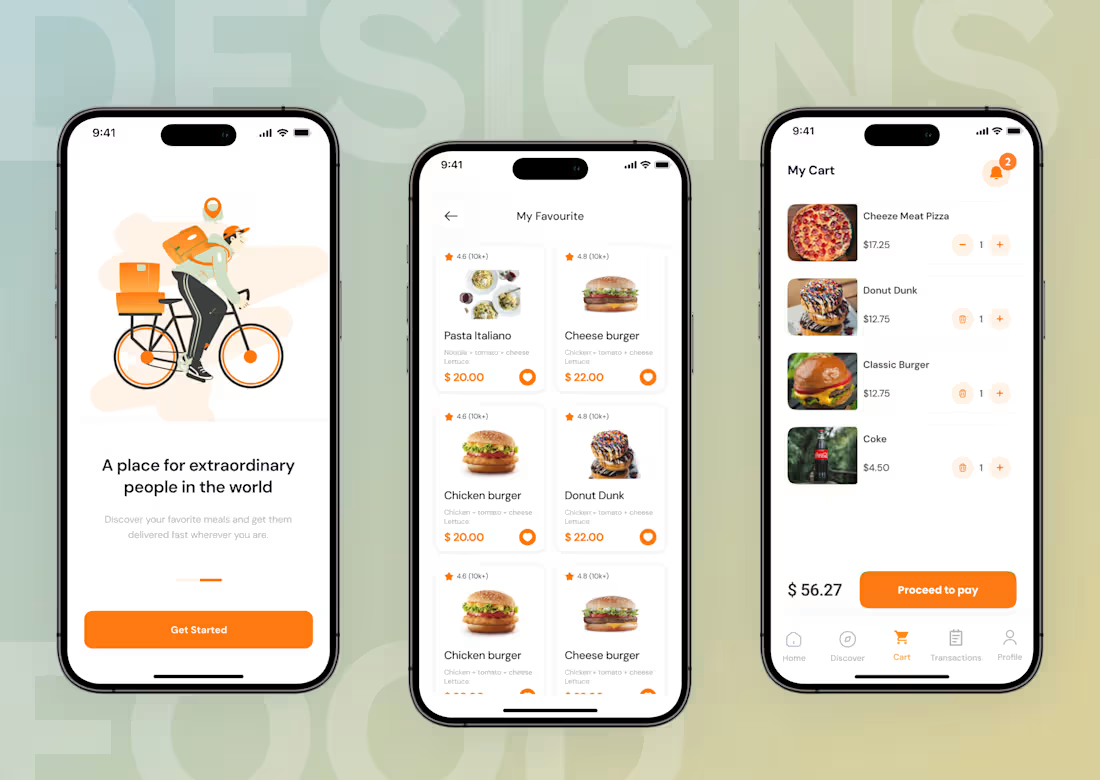
Reducing Cart Abandonment through Conversion-First UX
The Problem:
High cart abandonment due to cluttered interfaces and complex checkout flows in traditional food apps.
The Solution:
I redesigned the user journey to minimize "Decision Fatigue" and maximize conversion through:
Streamlined Discovery: A clean grid layout allowing users to find meals in under 3 seconds.
Frictionless Cart: A transparent "My Cart" experience to reduce drop-offs at the final stage.
Conversion-First UI: Strategic use of high-contrast CTAs and clear visual hierarchy for faster checkouts.
The Result:
A developer-ready mobile interface focused on User Retention and Business Growth.
🚀 Ready to scale your SaaS or E-commerce conversion?
Open for 1-2 projects this month. DM me on Contra to discuss your next big move! 📩
4
5
832
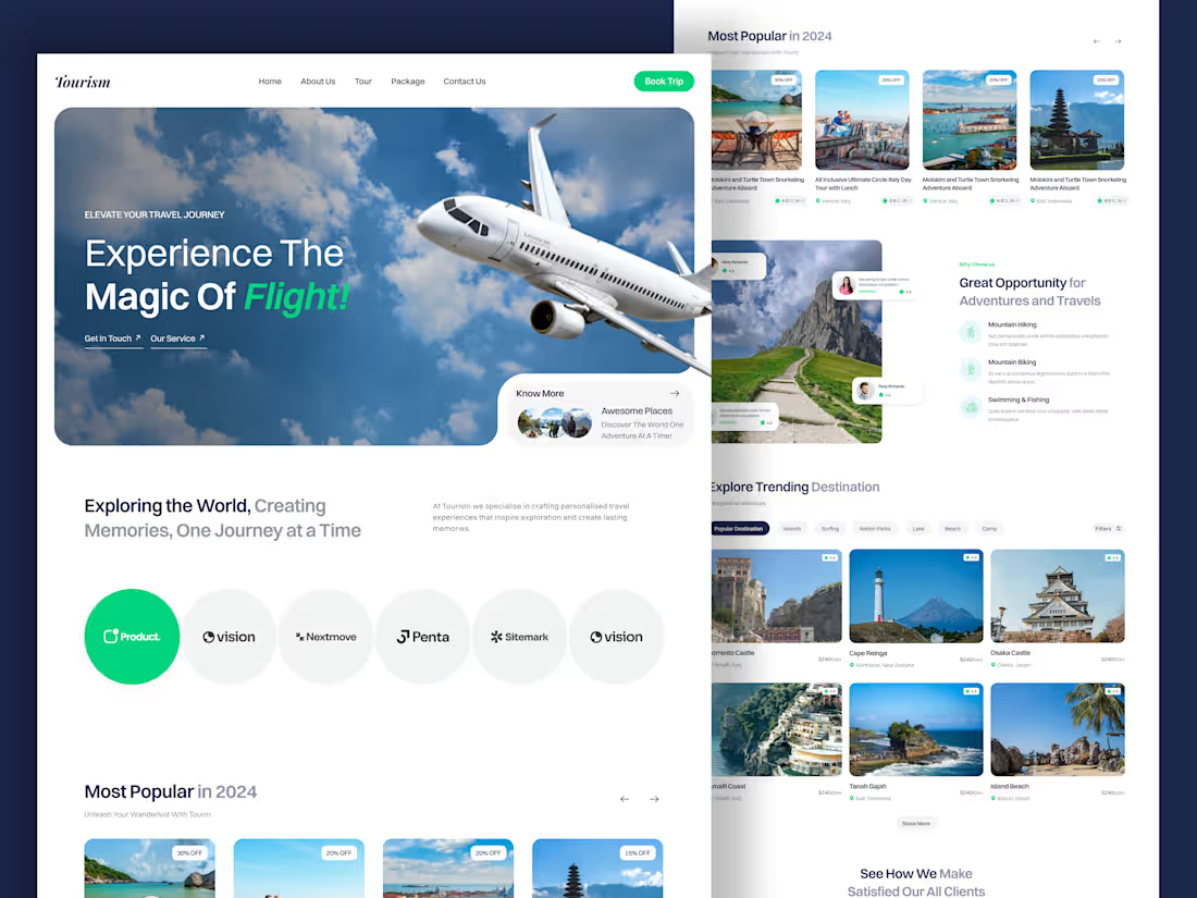
Tourism – Premium Travel & Booking UI
Overview:
A modern, high-conversion landing page designed to inspire travelers and simplify trip planning through a seamless, visually-driven experience.
Key Features:
Immersive Hero Section: Engaging visuals paired with a clear "Book Trip" call-to-action to drive immediate conversions.
Smart Destination Grid: Clean, card-based layouts showcasing trending locations, pricing, and ratings for quick user decision-making.
Social Proof: Integrated testimonial sections to build credibility and trust with potential travelers.
Modern Aesthetic: A vibrant, airy design language that balances breathtaking imagery with essential booking details.
Results:
A streamlined, mobile-responsive interface that transforms destination discovery into an effortless booking journey.
2
8
871
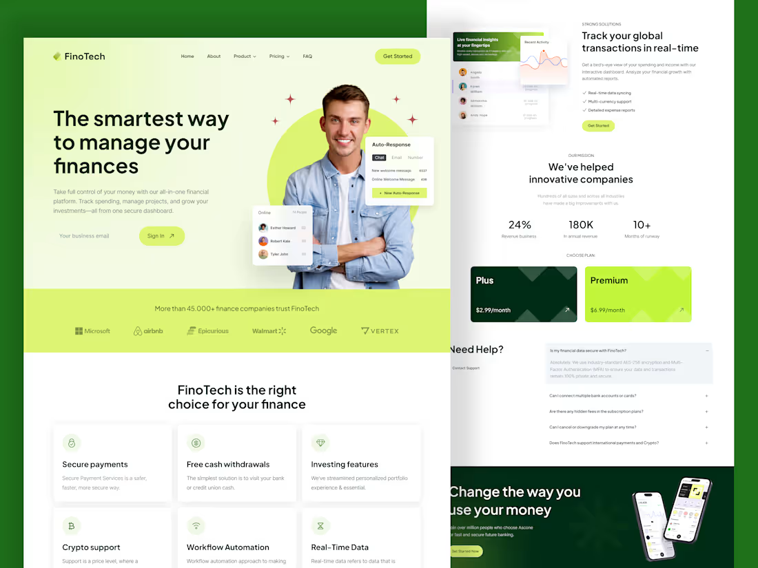
FinoTech | SaaS & Fintech High-Conversion Landing Page Design
Overview: Designed a data-driven landing page for FinoTech, simplifying complex financial tracking for high-growth teams.
UX Challenge: Fintech platforms often suffer from "Cognitive Overload," where dense data leads to high bounce rates and user frustration.
UX Solution:
Information Architecture: Used a clean, white-themed layout to enhance readability and reduce visual noise.
Intuitive Hierarchy: Strategically placed Financial Analysis cards to present key data at a glance.
Trust Design: Integrated "Trusted by" sections (Google, Airbnb) and clear Pricing Tiers to build instant credibility.
Conversion Focus: High-contrast CTAs and a simplified user flow to accelerate sign-ups.
Need a high-converting SaaS landing page? 📩 DM me or check my $250 Landing Page Service!
3
8
1K
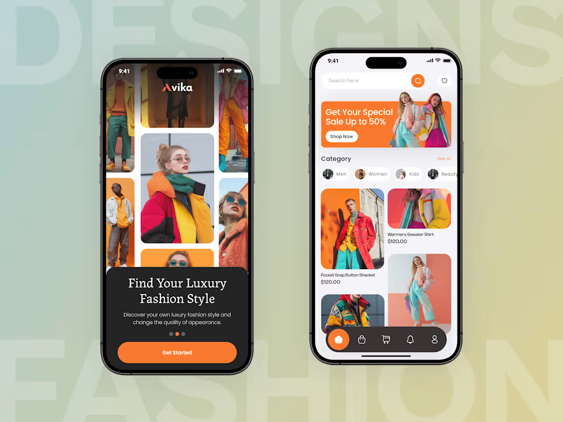
High-Converting Luxury Fashion App UI/UX
Overview:
Designed a high-end mobile experience to bridge the gap between premium aesthetics and sales performance.
The Problem:
Cluttered UI and confusing navigation were causing high bounce rates and distracting users from purchasing.
The Solution:
Minimalist UI: Clean typography and high-quality imagery to reduce cognitive load.
Intuitive UX: Thumb-friendly bottom navigation for faster product discovery.
Conversion Focus: Strategic CTA placement to maximize "Shop Now" clicks.
Luxury Branding: Established trust through premium visual hierarchy.
Business Impact:
Optimized user journey to increase conversion rates, reduce drop-offs, and elevate brand authority.
7
10
1.1K
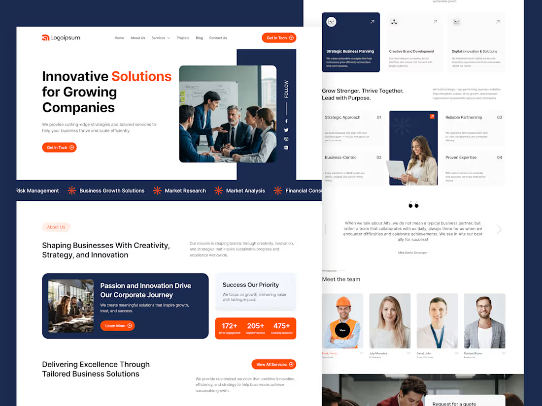
High-Converting Corporate Landing Page UI/UX for Business Growth
Project Overview:
In the corporate world, a website is the first point of contact for high-ticket clients. I designed this landing page for a Digital Solutions & Strategy Firm to balance aesthetic authority with lead-generation logic.
🔴 The Problem:
Most corporate websites are cluttered and fail to communicate value within 5 seconds, leading to high bounce rates and lost revenue.
🟢 The Solution
Hero Section Optimization: Crafted a bold headline to immediately address user needs and reduce bounce rates.
Visual Authority: Used a premium layout to establish trust with high-value clients
Conversion Logic: Designed a seamless flow that guides visitors toward the primary (CTA)
Ready to grow your business? 📩 DM me or check my $250 Landing Page Service below to start!
4
8
1.1K
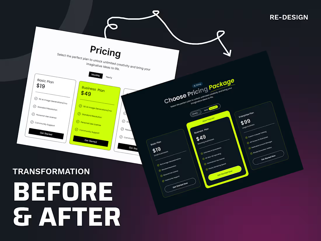
SaaS Pricing Redesign: Conversion-Focused UX
The Problem: Poor visual hierarchy and cluttered data caused decision fatigue, leading to low engagement and lost conversions.
The Solution:
Visual Focus: Switched to a Premium Dark UI to eliminate distractions and improve contrast.
Cognitive Ease: Simplified feature lists with scannable icons to reduce mental effort.
Smart Nudging: Used a High-Contrast Lime Green accent to highlight the "Business Plan" as the top choice.
Frictionless CTA: Redesigned "Get Started Now" buttons for maximum visibility and quicker checkouts.
Need a high-conversion redesign? Message me now.
4
10
1.2K
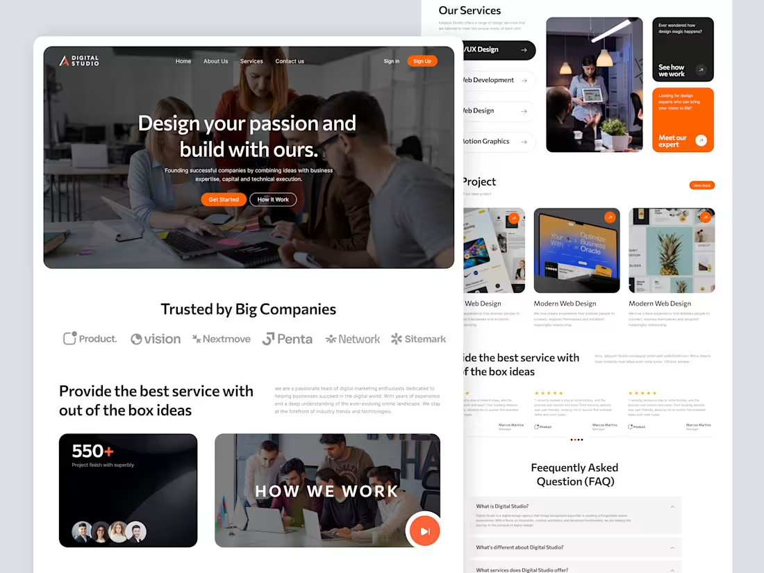
High-Conversion Landing Page for Creative Agencies
The Goal
To design a high-converting, professional landing page for creative agencies that balances vibrant aesthetics with a clear information hierarchy.
Key Highlights
High-Impact Hero: Bold headlines and strategic CTAs to drive immediate user action.
Smart Service Layout: Interactive accordion design to showcase offerings without cluttering the UI.
Trust & Credibility: Integrated sections for "Big Company" logos, client testimonials, and an FAQ to build instant authority.
Visual Identity: A premium dark theme paired with energetic orange accents for a modern, creative vibe.
The Result
A sleek, scannable, and conversion-ready interface that elevates an agency's digital presence.
9
14
1.3K
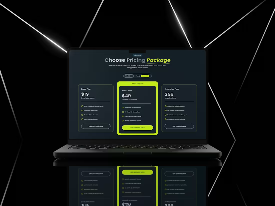
Reimagining Pricing UI for High Conversions 🚀
The Challenge
Most pricing pages fail because they overwhelm users with too much text or lack a clear "hero" plan. My goal was to design a pricing layout for an AI platform that is sleek, professional, and drives users toward the most profitable plan.
Design Strategy:
Visual Dominance: I used a vibrant Neon Green accent for the "Most Popular" plan. This creates a psychological anchor, instantly grabbing the user’s attention.
Structured Hierarchy: Clear separation between features using checkmarks ensures users can compare plans in under 5 seconds.
Modern Dark UI: Used a deep dark palette to give it a premium, futuristic "AI-tool" vibe that resonates with tech audiences.
CTA Placement: Clean, rounded buttons with high contrast to ensure the "Get Started" path is frictionless.
9
1.2K
Stress-Free Medical Booking
The Problem: Healthcare sites are often cluttered, causing high bounce rates and user frustration during medical emergencies.
The Solution (User-First Design):
Z-Pattern Layout: Guides the eye directly to the "Doctor Search" to eliminate confusion instantly.
Trust Signals: Integrated verified ratings and doctor specialties into cards to answer user doubts immediately.
Low Cognitive Load: Replaced long forms with a 3-step "Search-to-Booking" flow to prevent user drop-offs.
Business Impact:
Higher Conversions: Trust-driven UI removes the "fear factor," increasing consultation bookings.
Retention: A frictionless experience turns first-time visitors into loyal patients.
Premium Brand: Clean, modern aesthetics position your business as a digital health leader.
5
10
1.1K
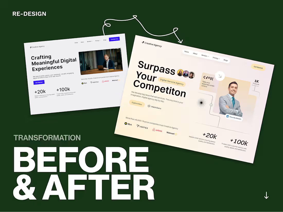
Strategic UI/UX Redesign — High-Impact Agency Landing Page
Description:
This project showcases a complete visual and structural overhaul of a Creative Agency landing page। My goal was to move from a standard layout to a premium, high-authority digital experience।
What I improved:
Visual Hierarchy: Replaced a cluttered layout with a clean, light-themed aesthetic that guides the user's eye।
Trust Building: Highlighted success metrics and partner logos for instant credibility।
Engagement: Modernized the Hero section with dynamic typography and intuitive CTAs।
As a Lummi Expert, I specialize in these types of transformations to help brands outshine their competition।
2
6
1.1K
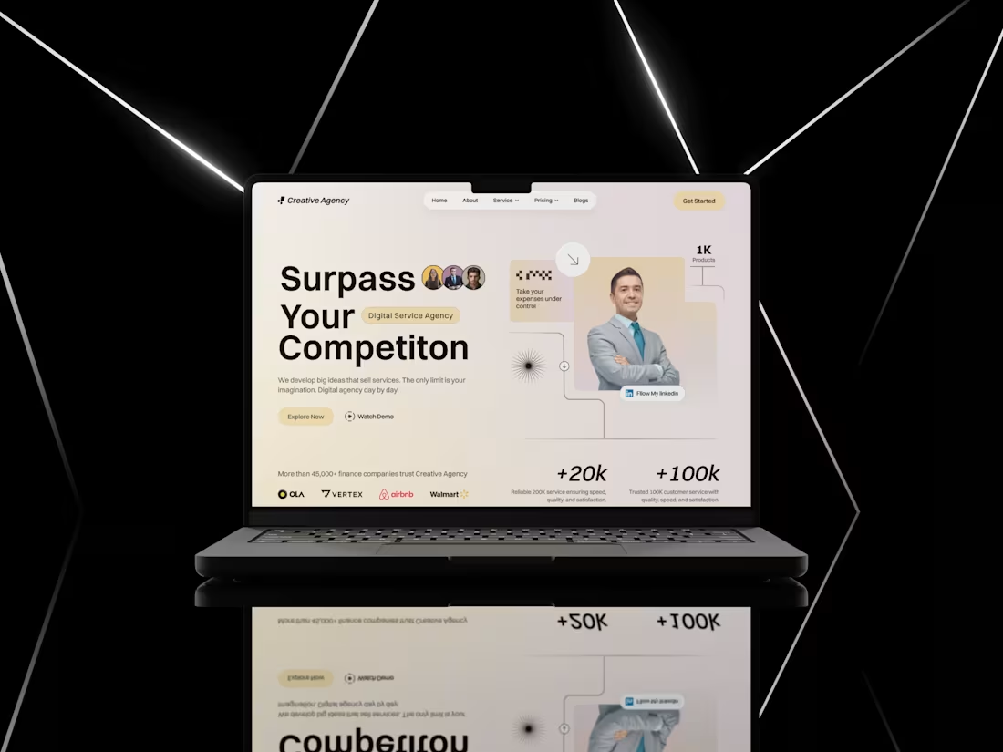
High-Converting Hero Section for Creative Agencies
2
5
1.1K
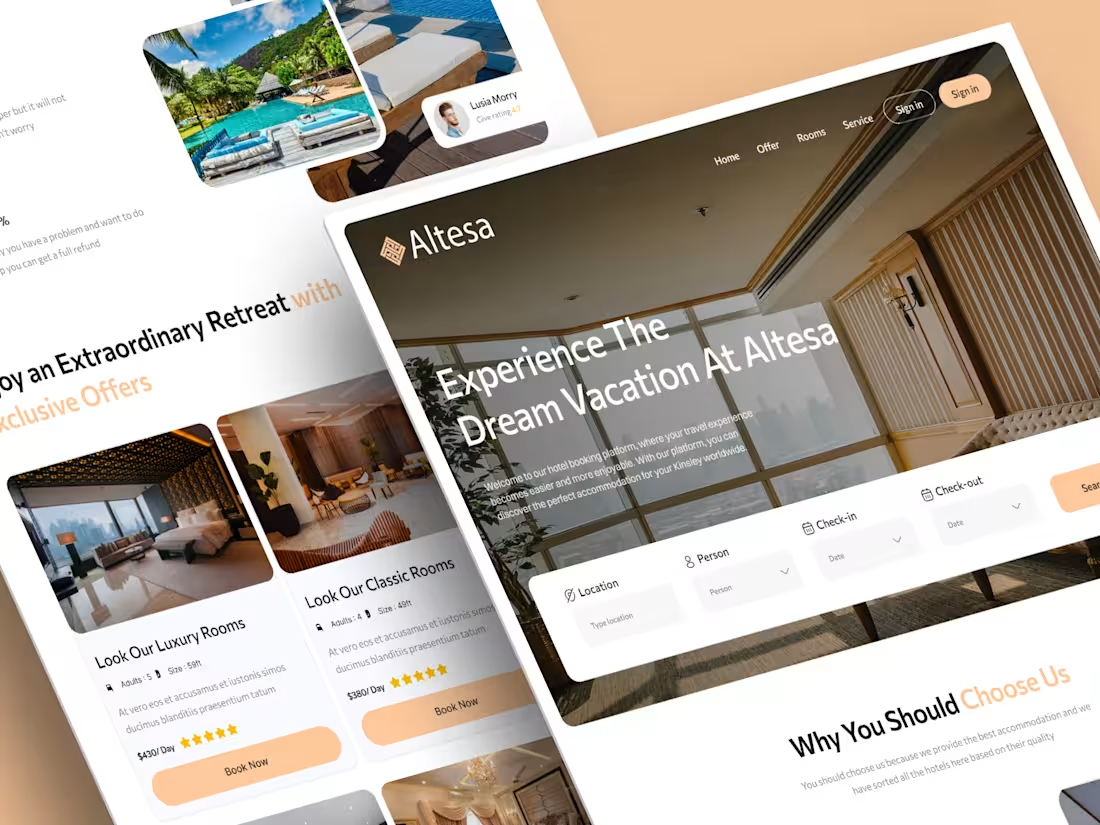
A Seamless Luxury Hotel Booking Experience
3
5
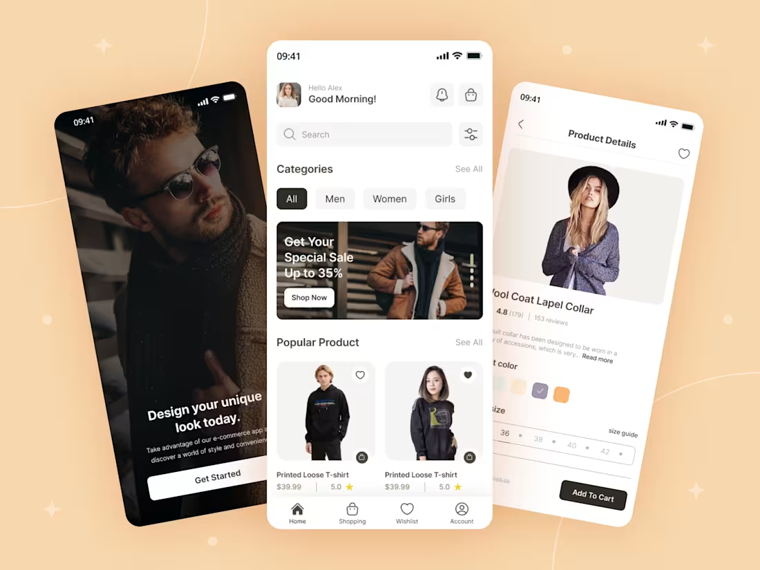
Conversion-Driven UI/UX Design for UrbanStyle Fashion App
Overview
A premium e-commerce UI bridging the gap between inspiration and purchase. Focused on a visually-driven, seamless journey for fashion enthusiasts via intuitive, frictionless navigation.
The Problem
Bridging fashion inspiration & purchase. Solved cluttered navigation & decision fatigue with a minimalist, intuitive UI.
The Solution
I focused on a minimalist, high-contrast design to make products stand out.
Immersive Onboarding: A bold "Get Started" screen to set the brand tone.
Smart Categorization: Simple chip-style filters (Men, Women, Girls) for quick navigation.
Clean Product Layout: Utilizing card-based layouts with clear pricing, ratings, and one-tap "Add to Cart" functionality to reduce friction.
4
3
1.1K
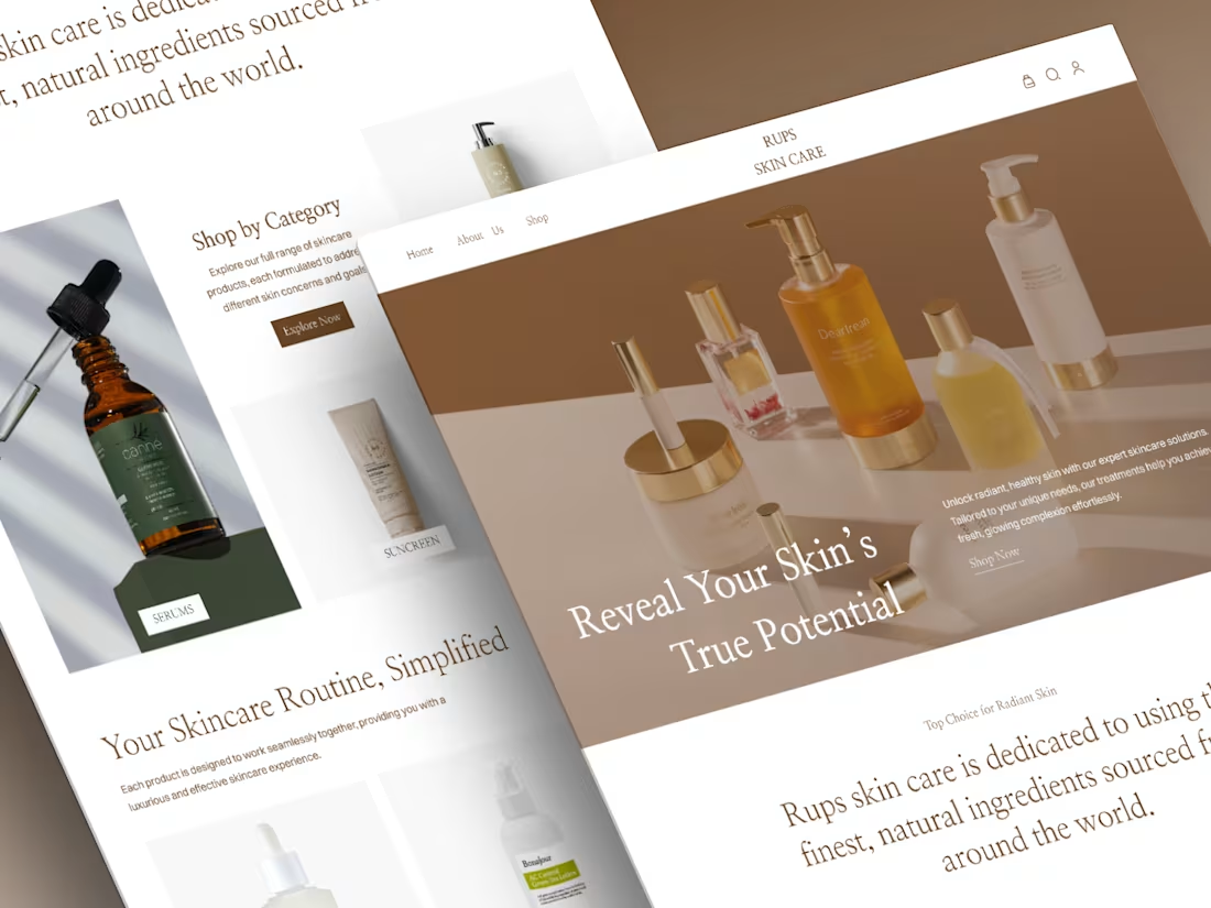
High-Converting UX/UI Design for Premium Beauty & Skincare Store
UX Focus Summary:
Goal: To design a seamless, high-conversion shopping experience for a luxury skincare brand.
UX Strategy:
Visual Hierarchy: Clean, spacious layout to reduce cognitive load and keep the focus on products.
Intuitive Navigation: Category-based browsing to help users find their routine in seconds.
Trust Building: Integrated social proof and minimalist aesthetics to establish brand authority and reliability.
4
8
1.1K
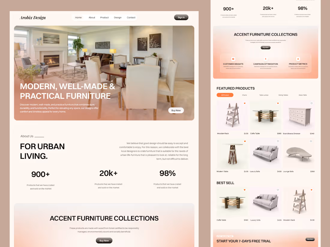
High-Converting E-commerce UI for Luxury Furniture Brand
6
1.2K
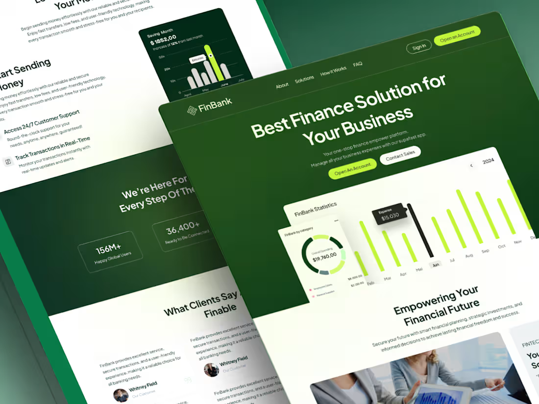
FinBank: High-Converting FinTech Landing Page for Modern Businesses
2
4
1.2K
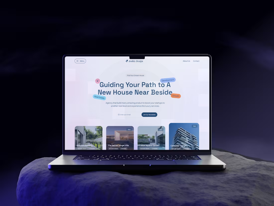
Real Estate Landing Page Hero Section UI Design
🔹 Short Description
A modern hero and featured section design concept for a real estate landing page, focused on a strong first impression, clarity, and conversion.
🔹 Project Overview
This project showcases the hero and featured property sections of a real estate landing page.
The focus was on creating a premium visual experience that quickly communicates trust, value, and usability within the first few seconds.
🔥 Looking for a modern, conversion-focused real estate website? Let’s build something impactful together.
2
5
1.2K
