Designing the "You Matched" Moment
Most dating apps stop at "It's a Match!"
A nice animation.
Two profile pictures.
A button to start chatting.
Instead of giving users only one action, Butter offers two:
π§ Start with an ice breaker.
π¬ Chat right away.
Good UX isn't choosing for users.
Different users have different comfort levels, especially when they're meeting someone new.
Small interaction.
Big emotional moment.
That's the kind of product thinking I enjoy.
#productdesign #uxdesign
2
42
A burger is never just a burger in advertising.
Designing experiences people can almost taste.
#BrandDesign #VisualDesign #FoodBranding #CreativeDirection #GraphicDesign
0
16
Just wrapped up an investor pitch deck for an established spirits company.
The challenge wasn't creating hype. It was creating clarity.
The business already generates over $1.6M in annual revenue with multiple revenue streams, real financials, and a clear growth strategy. My job was to translate complex financial data into a presentation that investors could understand in seconds.
A good investor deck isn't about making a company look bigger than it is.
It's about presenting the opportunity, risks, numbers, and strategy with confidence and credibility.
For this project, I focused on:
β’ Financial storytelling
β’ Revenue visualization
β’ Investor-focused slide hierarchy
β’ Clean PowerPoint design
β’ Private equity-style presentation structure
Every slide was designed to answer one question:
"Would I feel comfortable putting capital into this business?"
Another reminder that great design isn't decorationβit's communication.
#PitchDeckDesign #PresentationDesign #InvestorDeck #FinancialDesign #PowerPointDesign #UIUXDesigner #BusinessDesign #InformationDesign
Wellness Pantry Website Section. Making healthy living accessible with a strong brand presence.
2
71
UI design screens for greater padel. Book sessions for padel games via the Greater padel app. Find people to play match , host a match and schedule your court before someone else.
What if you could find a venue to play or practice padel sport, and before completing your booking you get suggestions on coaches who could train you, supervise and teach you padel sports. These are the screens i designed for such scenarios so that players can find themselves, book a court session,play games and hire a coach
I had so much fun working on these.
0
63
User profile screen UI design for players who want to see their overview of performance metrics, match history, and achievements to keep players motivated. Mobile app
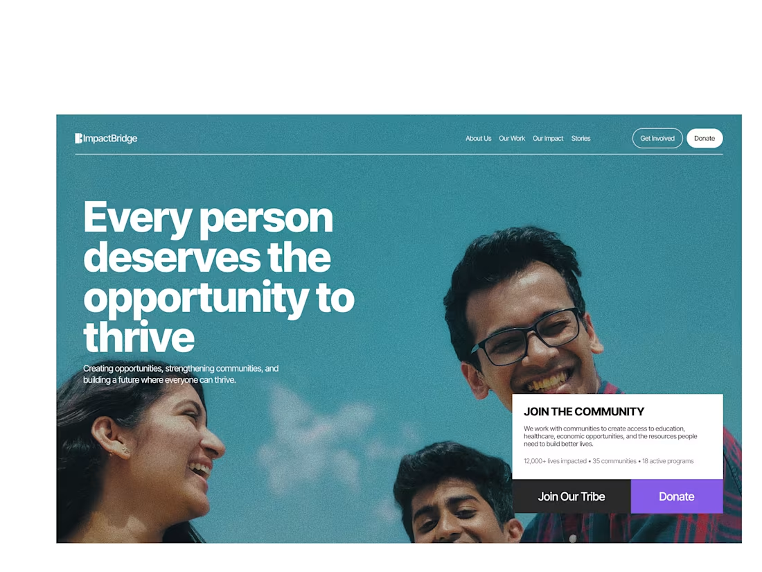
I design conversion-focused web experiences for brands like Toough Roofs, from UX strategy to polished UI that makes it easy for customers to trust and book.
#uiuxdesigner #productdesigner #webdesign #roofingwebsite #toughroofs
0
56
Designed a Meditation App for wellness and personal improvement.
0
39
You want a designer with 7+ years of experience , someone who has seen patterns, understands users, and knows what works.
Then you silence that same experience.
You reduce their role to decoration. Push pixels. βMake it pop.β
Thatβs the problem.
Design is not about making things look βfancy.β
Itβs about behavior.
β’Why a user clicks
β’Why they hesitate
β’Why they leave
β’Why they come back
Good design reduces friction.
It guides decisions.
It makes complex things feel obvious.
But when you override experienced designers, you donβt just kill creativity, you break outcomes. It will cost you, you may not have measured it or noticed.
You get:
β’Pretty interfaces ( in your own eyes) people donβt use
β’Flows that confuse instead of guide
β’Features nobody understands
β’Products people abandon
An experienced designer is not there to decorate your ideas.
Theyβre there to challenge them.
Because users donβt care about aesthetics first.
They care about clarity, ease, and getting what they came for fast.
If you hire for experience, let that experience shape the product.
Otherwise, you donβt need a designer.
You need a pair of hands.
0
47
Elementor becomes powerful when you:
Use containers (flexbox)
Add custom CSS
Treat it like Figma β not WordPress
Plugins wonβt make your design betterβyour structure will.
Social Media Graphics Designs and Brand Identity for Rokplacedigital.
0
51
Hvac website design
1
60
WordPress only looks boring in the hands of people who donβt understand design or development. Templates are a shortcut, not a limitation. The difference between average and exceptional WordPress sites is UI/UX thinking and technical depth.
Please Note that I can design in Figma, Build in wordpress, framer and webflow.
www.peterumeh.com (https://www.peterumeh.com)
1
68
Most websites fail at one thing: explaining the business.
Designed this for BigBerry to fix thatβ
Clear messaging. Structured UX. Conversion-focused flow.
Not just clean. It works.
Need the same? DM.
1
84
I do not have to wait for. afinal design to share how much of a fantastic designer i am
1
64
Been working on the dashboards for Nesta for a while now. Nesta matters to women because it signals safety, clarity, and control from the first second. The hero sets that tone. It communicates trust before features. It answers βIs this for me?β without words. I spent days refining the hero, but I have spent weeks on the dashboards. That is intentional. The hero attracts attention. The dashboards ( not completed yet) earns long-term trust. If the core experience fails, the hero becomes decoration. Good UX is not rushing screens. It is knowing which ones deserve patience.
Designed a professional and user-friendly website for Jennifer Nelson, a certified Life & Mindset Coach dedicated to empowering women. The goal was to create a visually engaging and conversion-focused platform that highlights Jennifer's services, builds trust, and facilitates easy user interaction.