Email Template Design System — Fintech

Peter Umeh

A fintech company needed a complete email template system that could handle every stage of the customer lifecycle: from the moment someone signs up, through their first transaction, to re-engagement and referrals. The existing emails were inconsistent, hard to scan on mobile, and didn't feel like they belonged to the same brand.
I designed 8 production-ready email templates in Figma, built on a shared modular design system that keeps every send visually cohesive while letting each email type serve its specific purpose.
The Problem
Financial services emails carry a unique tension. They need to feel trustworthy and institutional enough that people trust them with money, but approachable enough that users actually read them instead of archiving on sight.
The company's existing emails had three issues:
No visual consistency across email types. The welcome email looked nothing like the transaction alerts.
Poor mobile readability. Dense information blocks that required pinching and scrolling on phones, where most users opened.
Weak CTAs. Multiple competing actions per email with no clear hierarchy, leading to decision paralysis.
The Design System
Rather than designing 8 isolated templates, I built a component-based system in Figma that all templates share:
Modular header and footer blocks that lock in brand recognition across every email
A flexible content grid with single-column mobile-first structure that scales to desktop without breaking
A CTA component library with primary, secondary, and tertiary button styles so every email has one unmistakable next action
Typography and spacing tokens that maintain readability whether the email is 3 lines (password reset) or a full scroll (onboarding)
This means the company can spin up new email types in the future without starting from scratch. The system scales.
Template Breakdown
Welcome Email
The first thing a new user sees after signing up. The goal: make them feel like they made the right choice. Warm tone, clear next step, zero overwhelm.
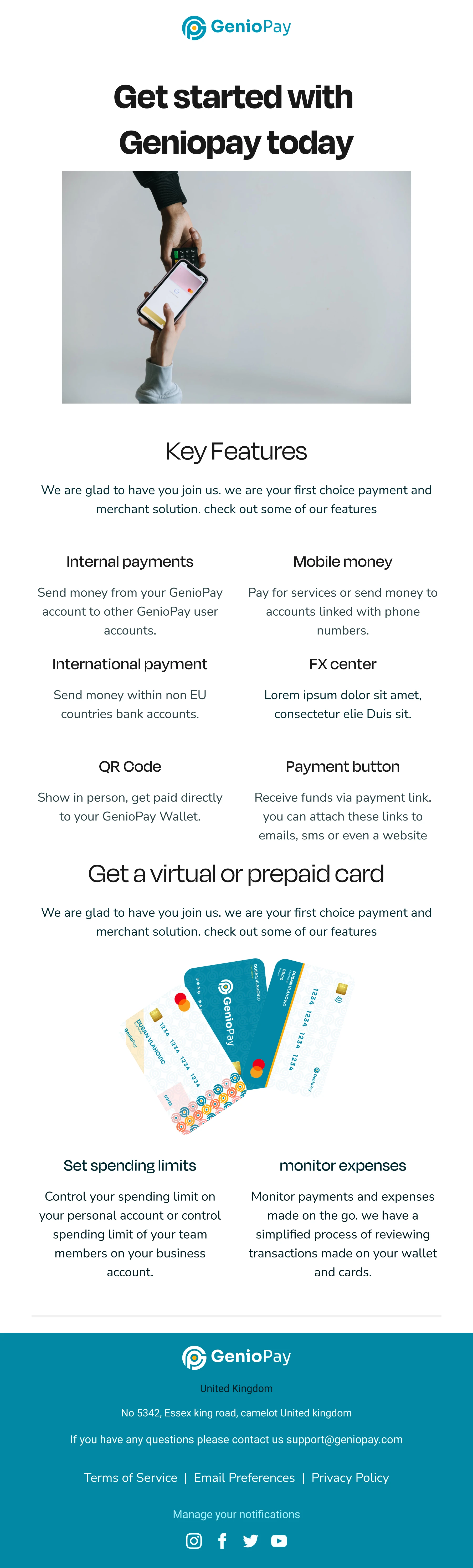
Welcome Email
Onboarding Flow
A multi-step activation sequence that walks users through account setup. Each step is visually numbered with progress indicators so users know exactly where they are and what's left. The pacing is deliberate: one action per email, no cognitive overload.
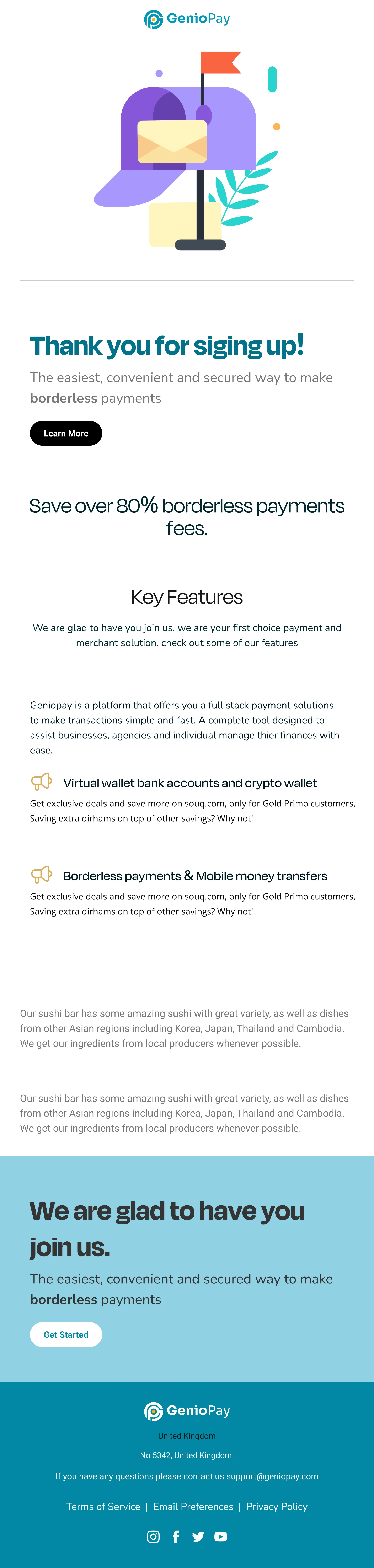
Onboarding
Card Notification
Transaction alerts that need to communicate status instantly. I used color-coded status indicators and a scannable layout so users can confirm a transaction in under 3 seconds without reading a paragraph. The hierarchy: amount first, merchant second, status third.
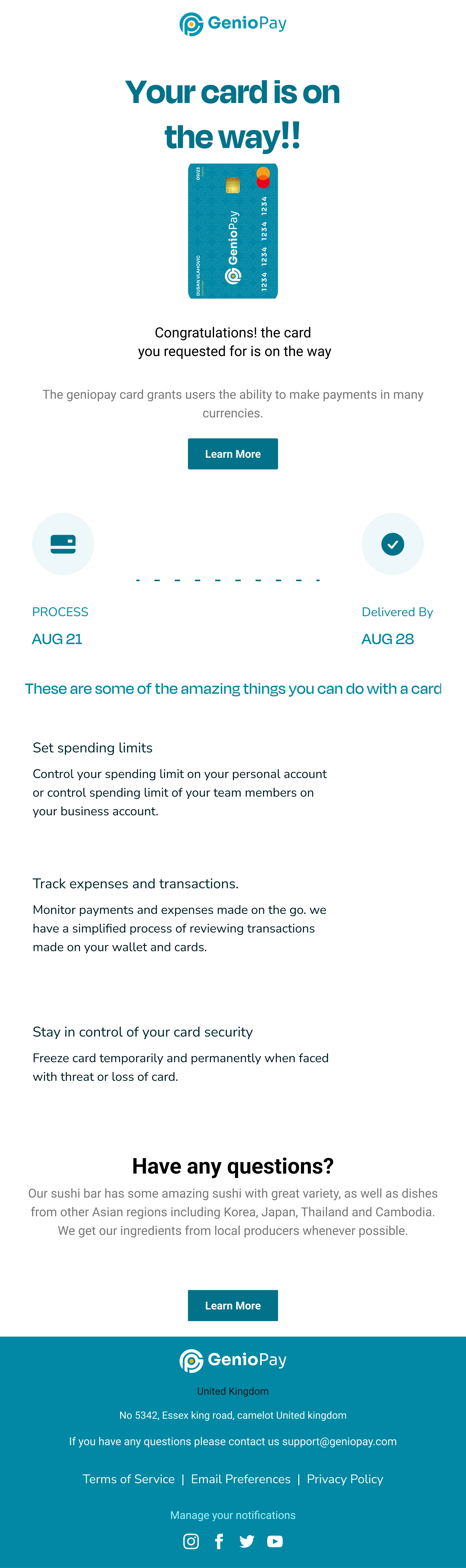
Card Notification
Referral Campaign
Two variations designed to drive sharing behavior. The first leans into the reward (what you get), the second leans into social proof (who's already using it). Both use prominent share CTAs and clear reward breakdowns so the value proposition hits immediately.
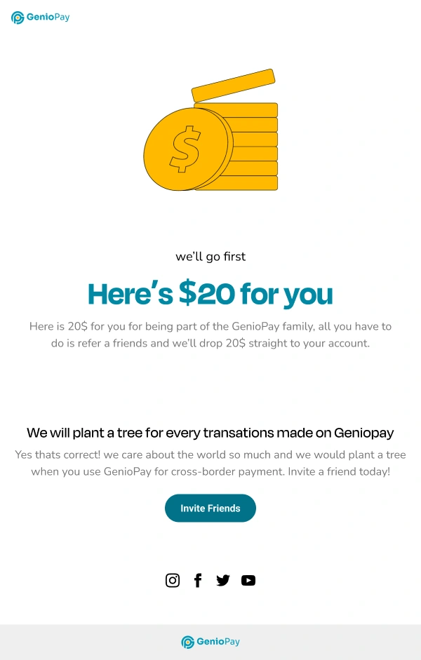
Referral Template
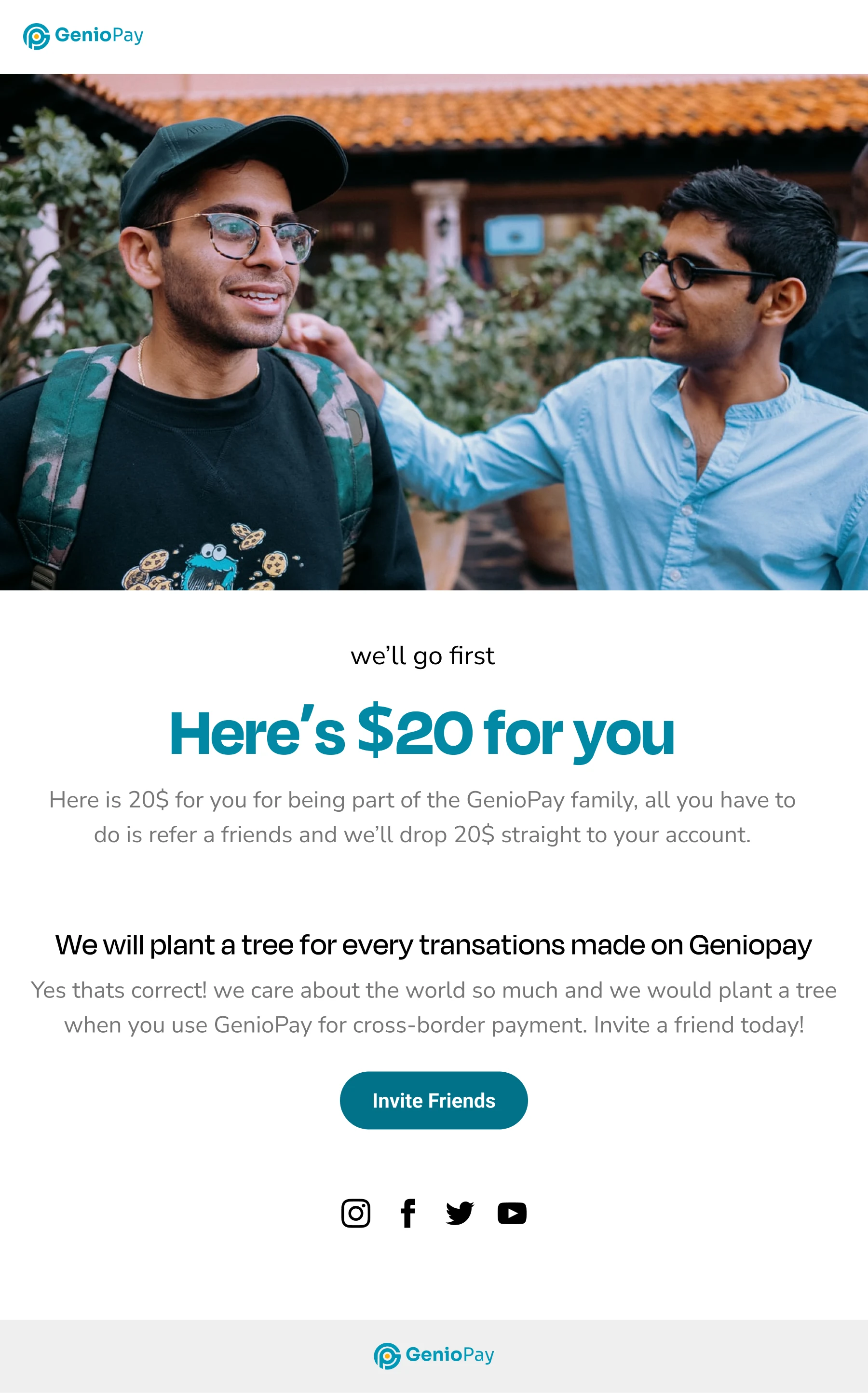
Referral Template 2
Password Reset
Security-sensitive emails need to feel safe and frictionless. Minimal layout, single CTA, clear expiration notice. No distractions, no upsells, no footer links competing for attention. The user should reset their password and move on in under 30 seconds.
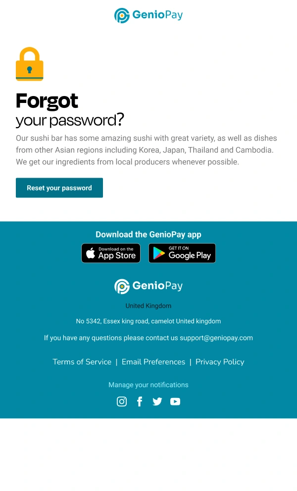
Password Reset
Transactional Templates
Confirmation and receipt designs that handle the post-action communication: purchase confirmations, account updates, billing receipts. Clean data presentation with clear line items, totals, and next-step CTAs.
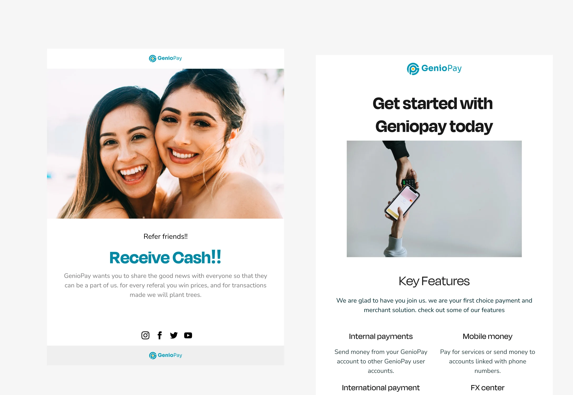
Email Template
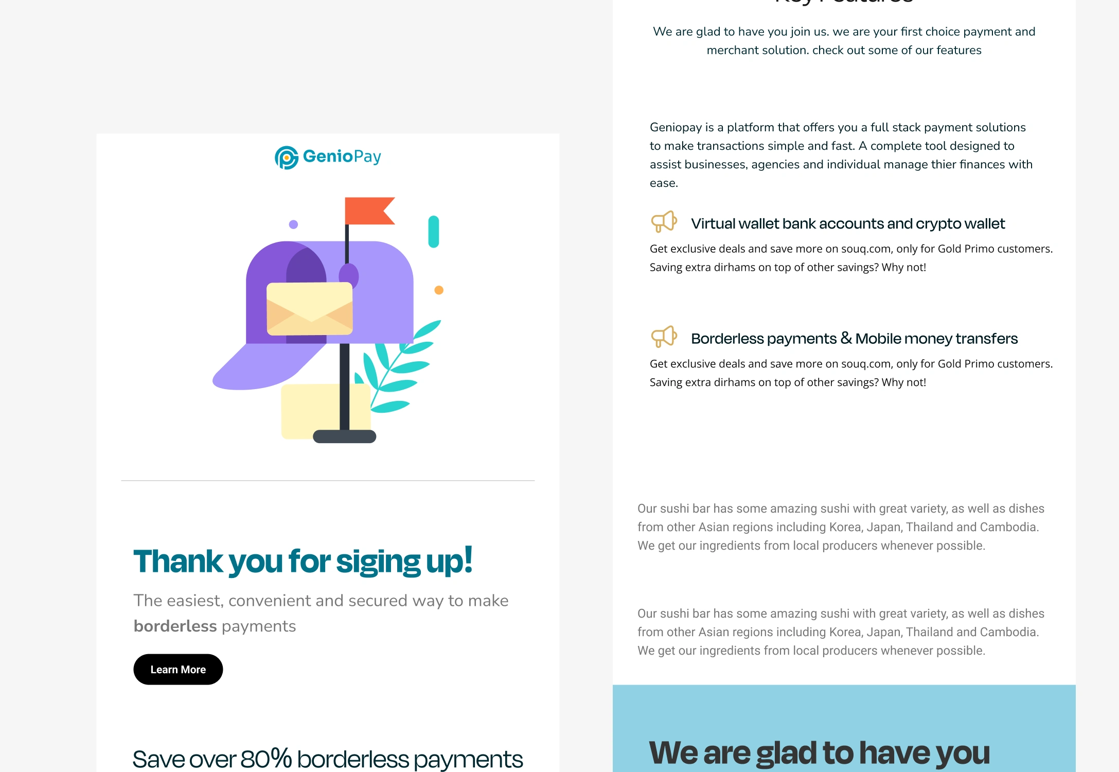
Email Template 2
What Made This Work
Every template uses real, context-driven copy instead of Lorem Ipsum. Stakeholders could evaluate the full user experience during review, not just the visual layout. This cut revision cycles significantly because feedback was about real content in real context, not abstract placeholder text.
The modular system means the company now has a scalable email design language. New campaign types, seasonal promotions, or product updates can be built from existing components in hours instead of days.
Like this project
Posted Jul 29, 2026
Designed a modular email template system for a fintech company: welcome flows, card notifications, referral campaigns, password resets, and transactional emails. Mobile-first, brand-consistent, built in Figma.
Likes
0
Views
5