Clarté: Mental Wellness App Concept

Peter Umeh

Clarté is a concept mental wellness app designed around one principle: the interface should feel like sunrise after a difficult night.
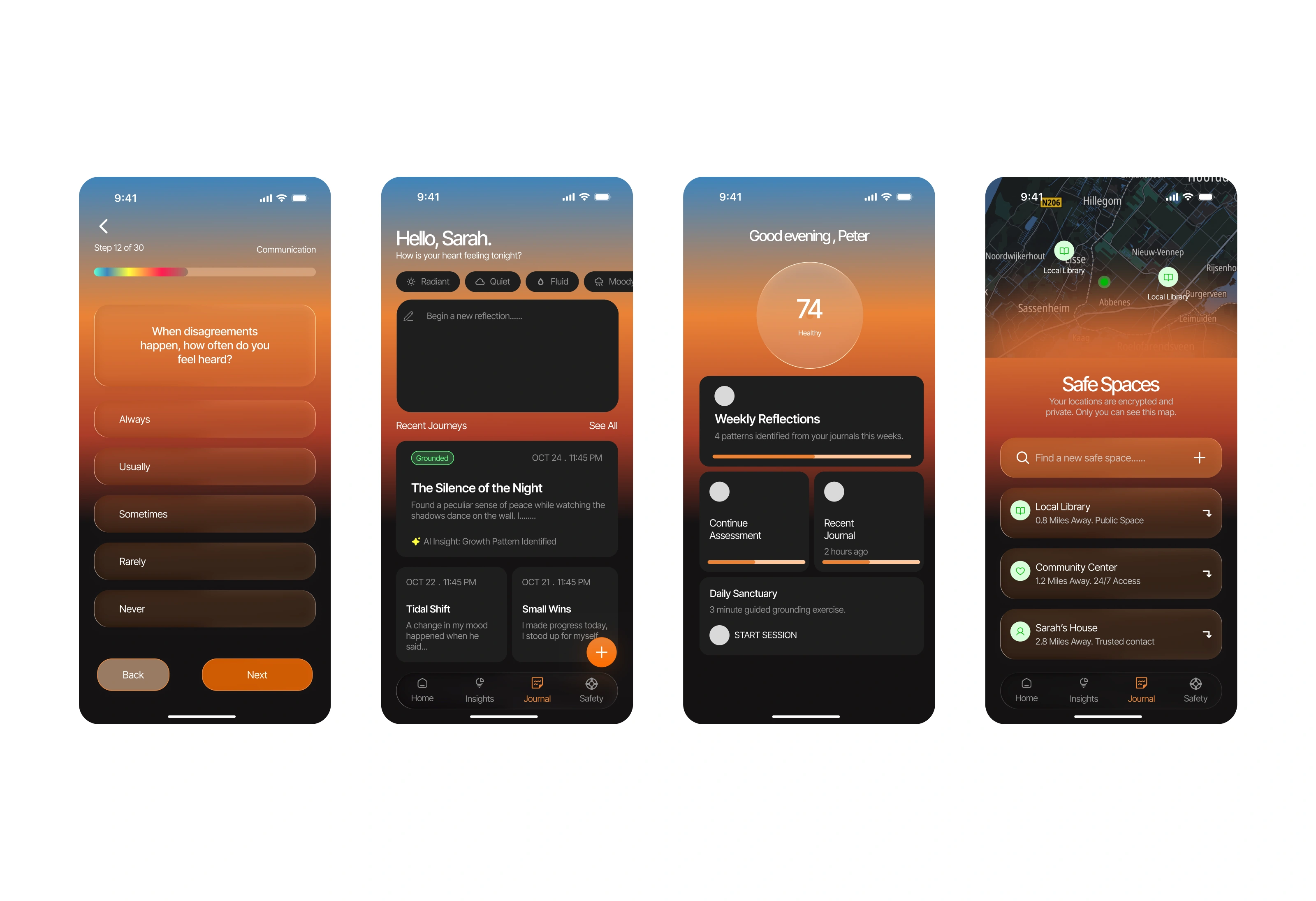
Most wellness apps default to clinical dashboards, warning colors, and sterile layouts. They treat mental health like a spreadsheet. Clarté takes the opposite approach: atmospheric gradients, glassmorphism, calm typography, emotional data visualization, and generous breathing room. The goal is to reduce anxiety before asking difficult questions.
This is a spec project. I designed the full UI/UX from scratch after studying wellness and mental health apps on the App Store.
Research
I studied Calm, Headspace, BetterHelp, Woebot, and several smaller mental health tools. The pattern: apps either lean too clinical (therapy platforms that feel like medical software) or too playful (meditation apps that don't address real crisis moments). Almost none of them handle the space in between, where someone needs genuine support but isn't in active crisis.
The opportunity was designing an app that feels like a sanctuary. Somewhere users can check in with themselves, track their emotional state, and reach their support network without the interface adding to their stress.
Visual Language
Every design decision in Clarté serves emotional regulation:
Atmospheric gradients — deep, warm tones that shift subtly across screens, creating a sense of time and presence rather than static utility
Glassmorphism — frosted card layers that feel soft and dimensional, reducing the harshness of flat UI
Calm typography — clean, rounded type set at generous sizes with plenty of line height
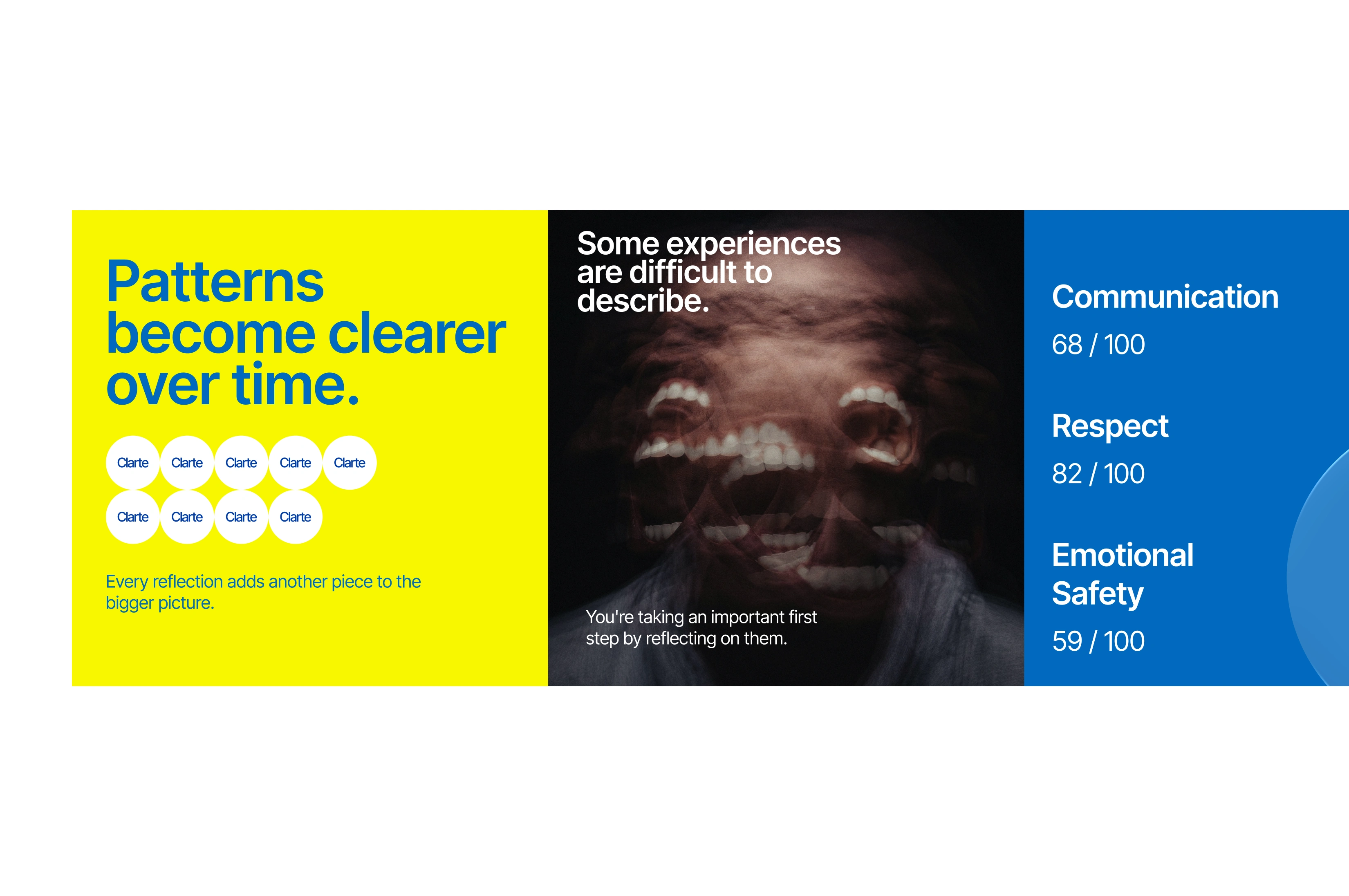
Emotional data visualization — mood tracking and wellness metrics rendered as organic shapes and gentle curves, not bar charts
Breathing room — deliberate whitespace (or rather, dark space) between elements so nothing feels crowded or urgent
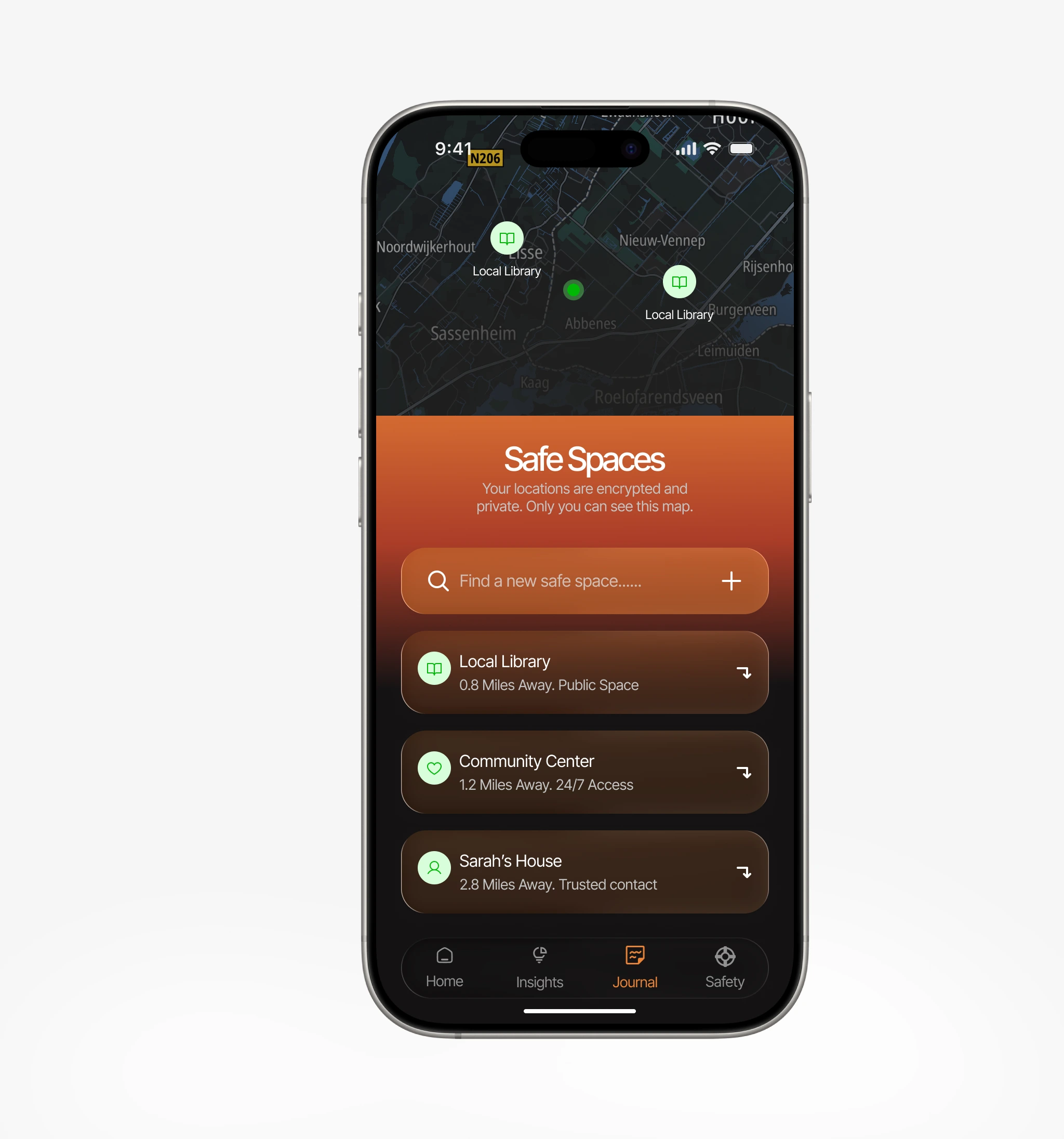
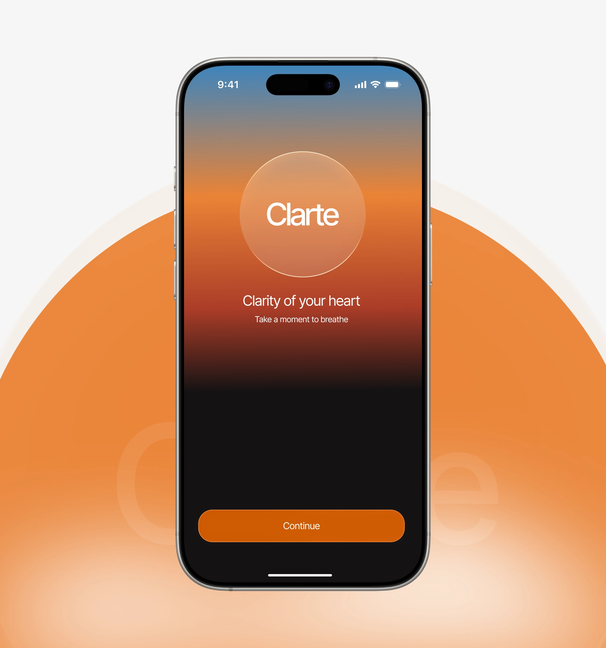
Safe Contacts
This is the safety backbone of the app. The Safe Contacts screen provides immediate, reliable access to a user's support network while maintaining the sanctuary aesthetic. In high-stress moments, every extra tap is a barrier, so the design eliminates friction wherever possible.
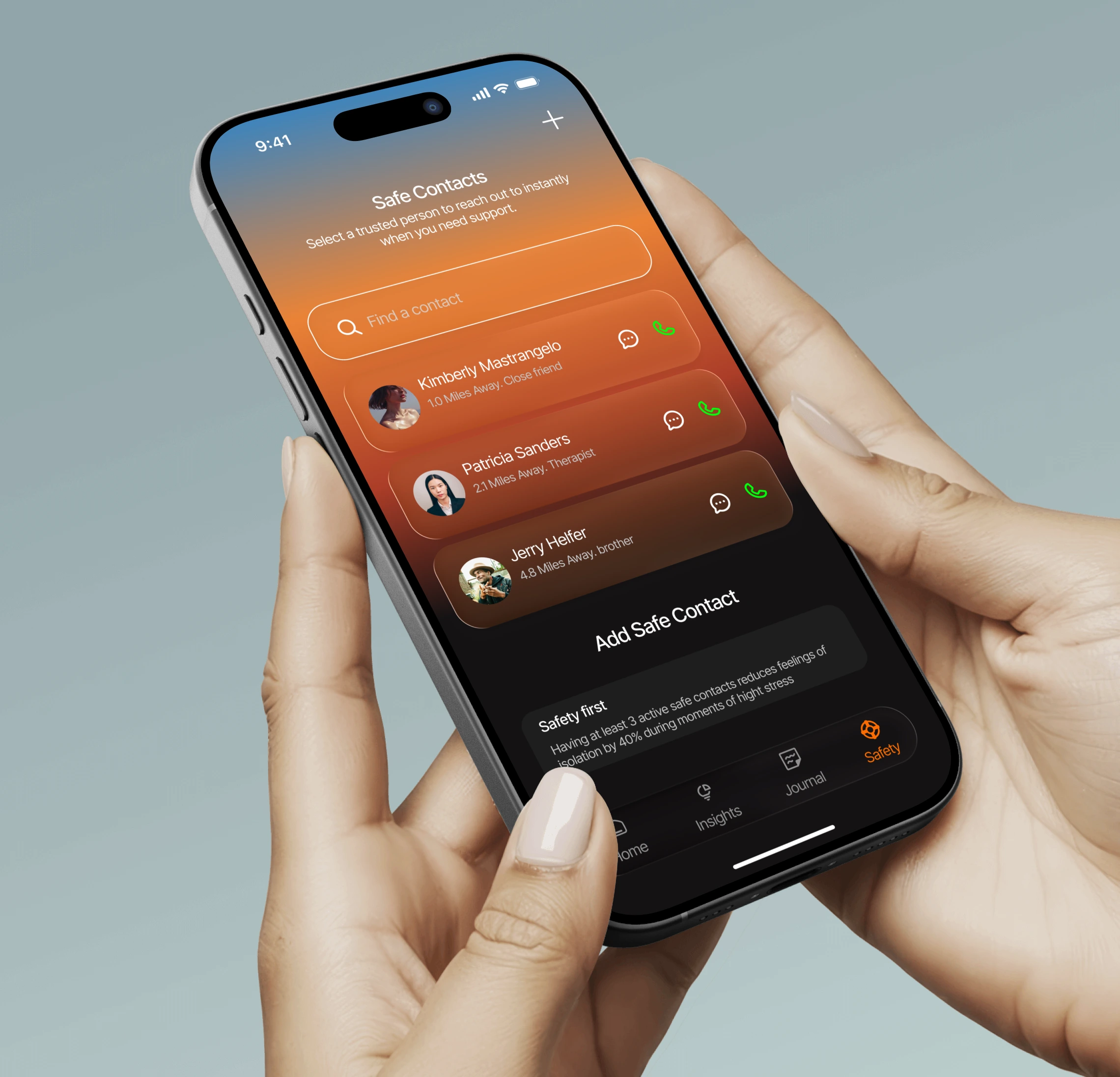
Key design decisions:
Tactical quick actions — every contact is paired with high-visibility Call and Message icons for one-tap access. In a crisis, reducing steps to reach support is critical.
Relationship context — each contact includes a subtitle ("Trusted Sister," "Professional Support") so users can quickly identify the right person for the specific type of help they need without thinking.
Presence indicators — subtle green/offline status dots provide immediate feedback on who might be available for an instant response, reducing the anxiety of waiting for a reply.
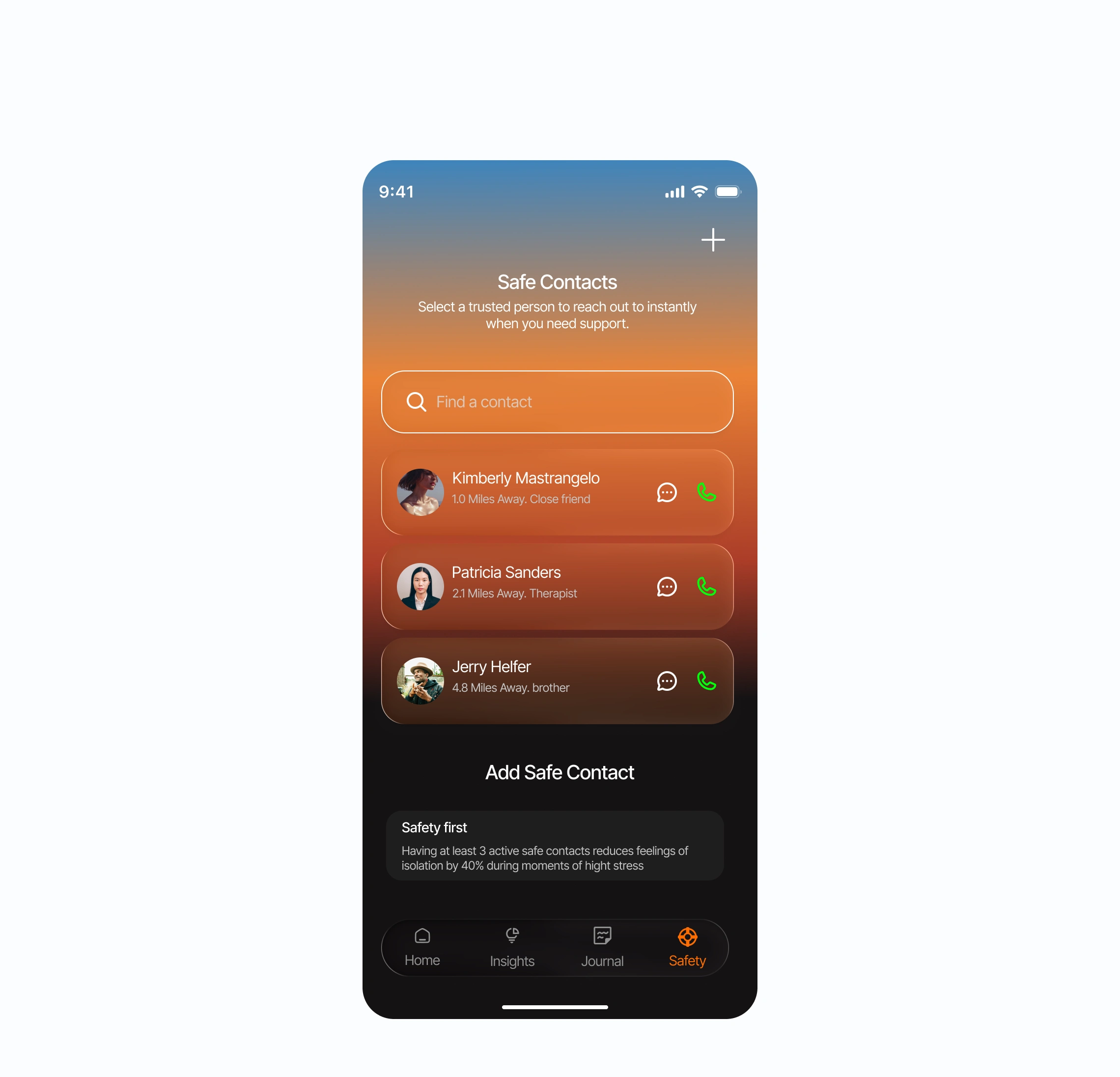
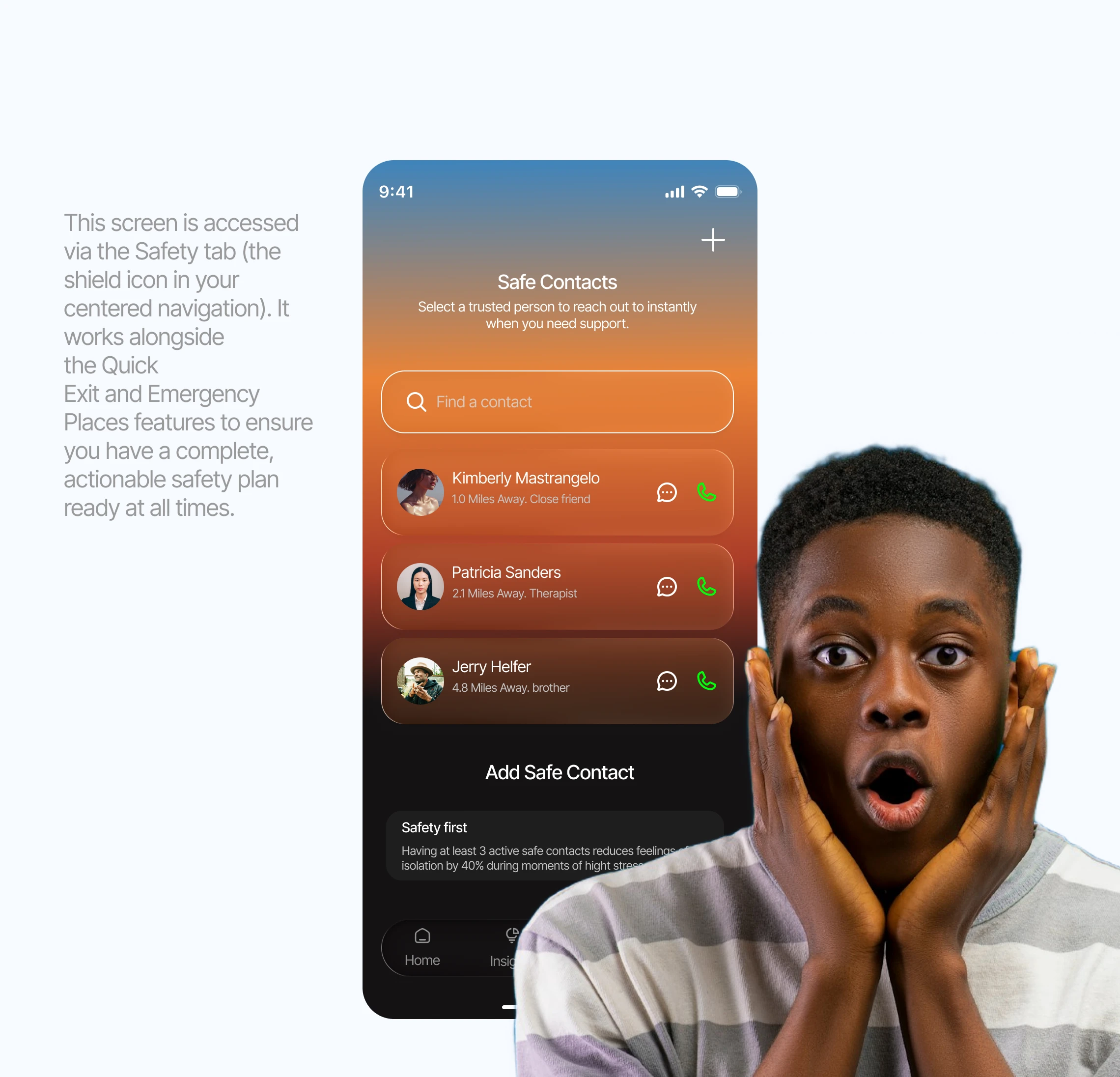
Safety education — a dedicated card at the bottom explains that having at least three active safe contacts significantly reduces isolation during moments of high stress. This turns a feature into a gentle nudge toward building a stronger support network.
Visual sanctuary — deep blurs and glassmorphic cards against a grounded dark background keep the interface calm and focused, even when the user may be feeling overwhelmed.
Integrated search — a streamlined search bar at the top ensures that as the support network grows, finding a specific person remains effortless.
Evidence Vault
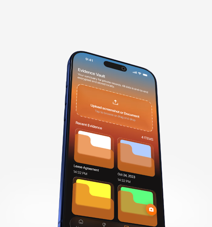
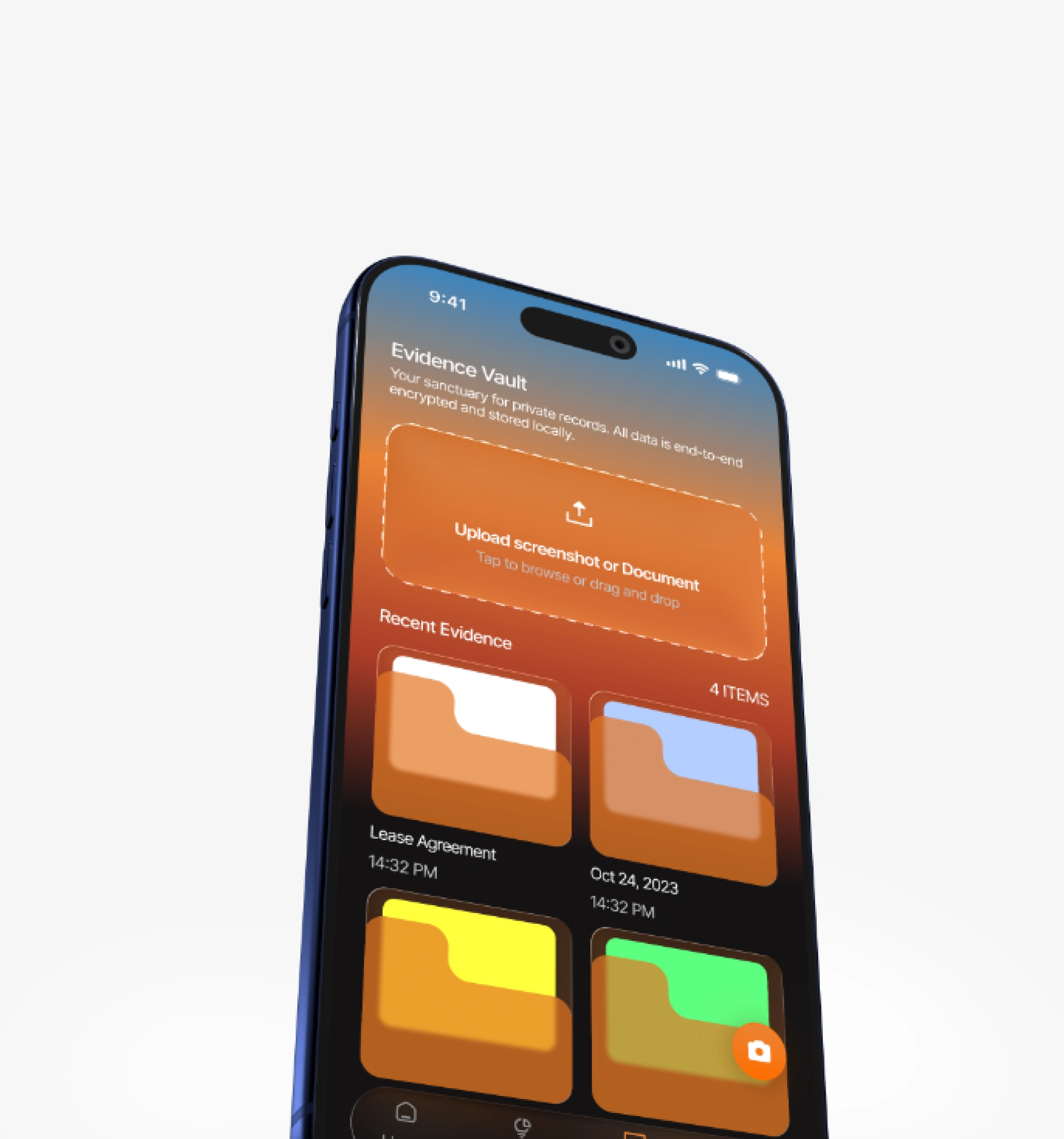
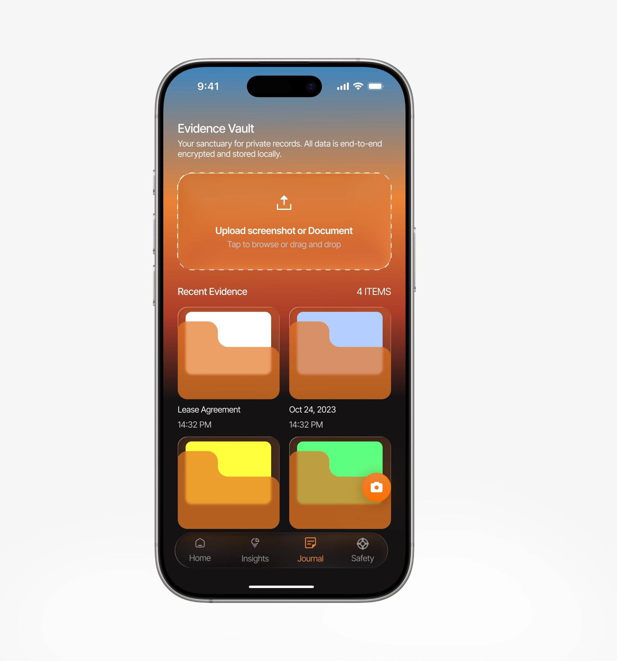
The Evidence Vault is designed for users who need to document patterns, whether for therapy sessions, legal situations, or personal clarity. The interface treats sensitive data with the gravity it deserves while keeping the interaction simple and non-intimidating.
Emotional Check-ins
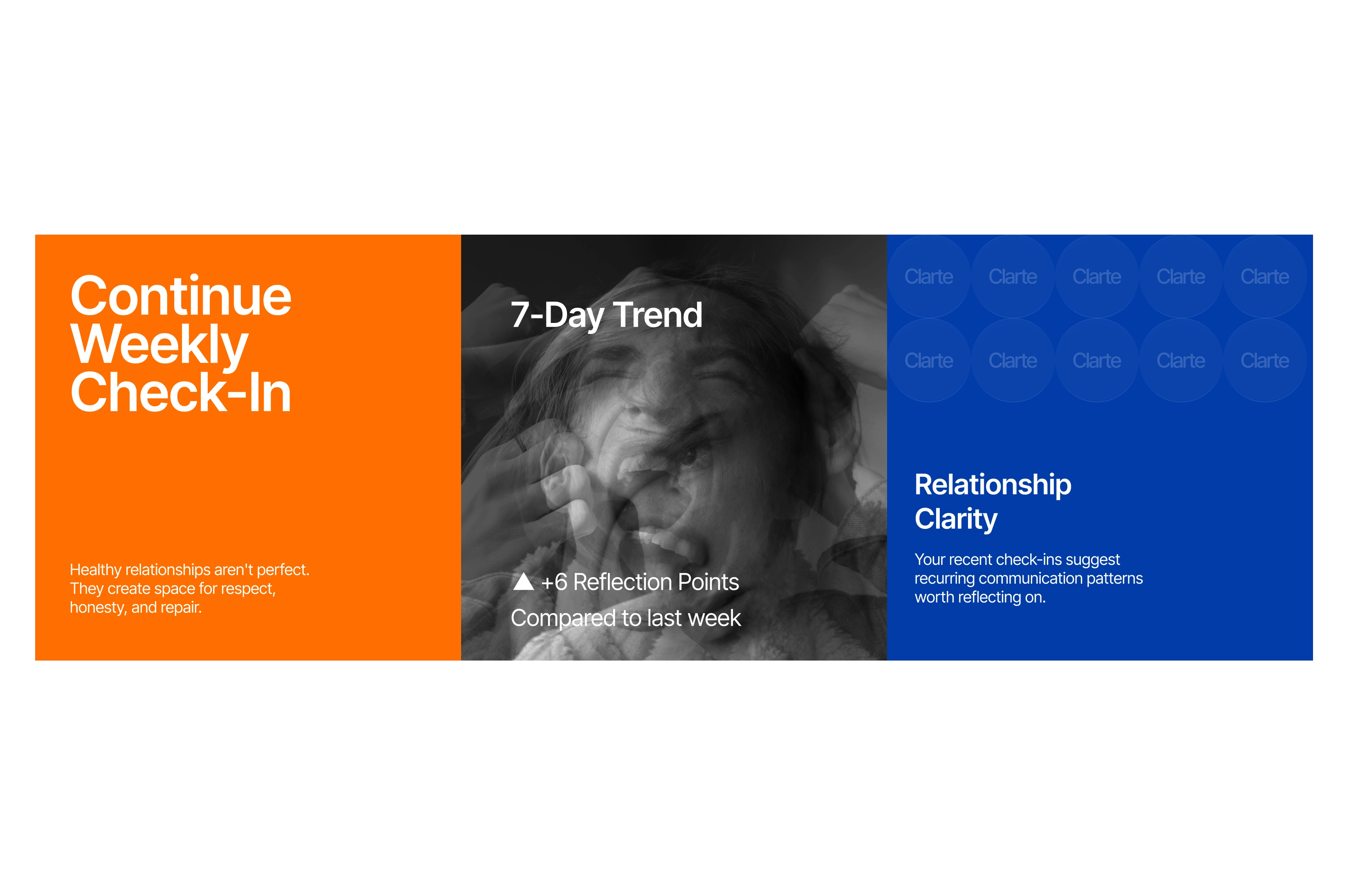
Rather than asking users to rate their mood on a 1–10 scale, Clarté uses visual and contextual prompts that feel more like a conversation than a form. The data feeds into gentle trend visualizations that help users notice patterns over time without turning self-reflection into a performance metric.
Design System
The full design was built in Figma with a scalable component system. The color palette centers on deep navy and charcoal backgrounds with warm amber and soft violet accents. Glassmorphic cards use consistent blur values and border opacity across all screens. Typography is set in a single clean sans-serif at three weight levels, keeping the hierarchy clear without visual noise.
Icons and illustrations from Icons8 are customized to match the app's soft, rounded aesthetic. Photography from Unsplash is used sparingly and always with a warm color treatment to maintain tonal consistency.
Outcome
Clarté demonstrates that mental wellness apps don't have to choose between being clinically useful and emotionally supportive. By treating the interface itself as a form of care, the concept shows how design decisions (color, motion, spacing, language) can actively reduce user anxiety rather than just presenting information. The safety features, particularly Safe Contacts and the Evidence Vault, prove that sensitive functionality can be both powerful and gentle.
Like this project
Posted Jul 25, 2026
Concept mobile app design for Clarté, a mental wellness platform that replaces clinical dashboards with atmospheric, sanctuary-like interfaces designed to reduce anxiety before asking difficult questions.