Butter — Personality-First Dating App

Peter Umeh

Overview
Modern dating apps have become incredibly efficient at helping people meet — but surprisingly ineffective at helping people connect.
Most platforms optimise for engagement metrics like swipe volume, daily active users, and session length. As a result, users often spend hours browsing profiles without forming meaningful relationships.
Butter explores a different approach.
Instead of matching people primarily through appearance, Butter prioritises personality compatibility, communication styles, shared interests, and emotional chemistry while still maintaining the familiar swipe experience users already understand.
The result is an experience designed to encourage better conversations — not just more matches.
Butter app showcase
The Problem
Dating apps have become products people use every day, yet many users describe the experience as emotionally exhausting.
Common frustrations include:
Endless swiping
Shallow profile information
Repetitive conversations
Awkward first messages
Ghosting
Poor compatibility
Decision fatigue
The biggest insight was simple: Matching isn't the hardest part anymore. Starting meaningful conversations is.
The Opportunity
Instead of redesigning how people discover matches, what if we redesigned everything that happens before and after the swipe?
Butter focuses on helping users:
Discover compatible personalities
Understand why someone is a good match
Reduce anxiety around first conversations
Encourage authentic introductions
Goals
Design an experience that:
Feels familiar enough to learn instantly
Makes personality visible before appearance
Reduces awkward first interactions
Increases conversation quality
Creates memorable emotional moments
Design Principles
Personality over appearance — Profiles communicate personality before aesthetics.
Familiar interactions — Users shouldn't have to learn a completely new dating app. Existing mental models like swiping remain.
Every interaction should reduce anxiety — The app should remove friction instead of creating it.
Playful but mature — The visual language feels optimistic without becoming childish.
User Journey
Download → Create account → Complete personality assessment → Receive personality profile → Discover compatible users → Swipe → Match ("You're Buttered!") → Ice breaker → Conversation → Plan a date → Relationship grows
Research Insights
After reviewing common user complaints about dating apps, four themes consistently appeared.
People hate small talk — Users struggle with opening conversations.
Everyone looks the same — Profiles communicate hobbies but rarely personalities.
Matching feels meaningless — Many matches never become conversations.
Dating apps become addictive — Users spend more time swiping than connecting.
Solution
Butter introduces personality into every stage of the experience.
Instead of asking "Do I find this person attractive?" users also ask "Would we actually get along?"
Instagram visual
Feature 01: Personality Onboarding
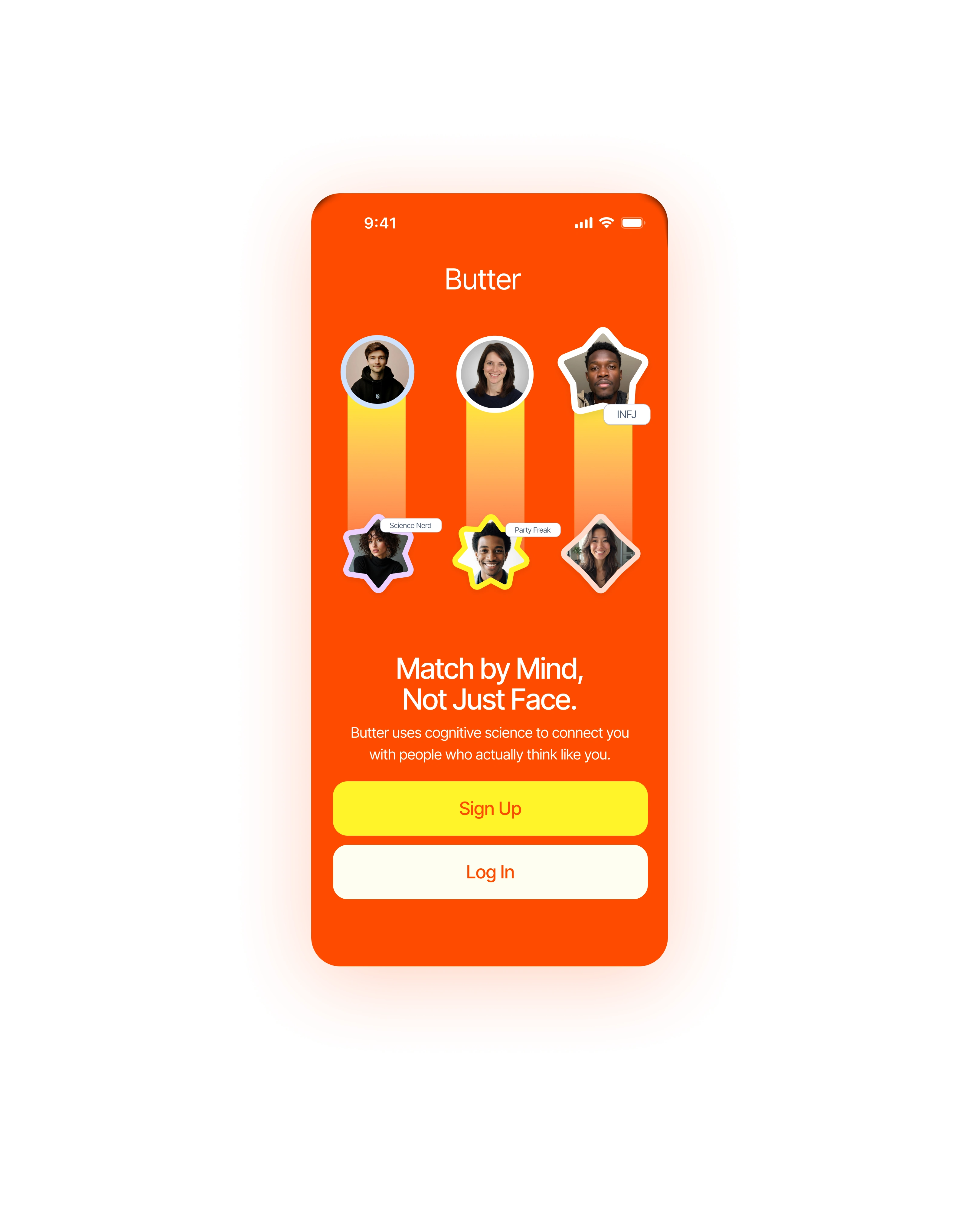
Every user completes a personality assessment during onboarding.
The assessment explores communication, values, decision making, social behaviour, and relationship expectations.
Each user receives a personality profile similar to MBTI categories (e.g. INFJ — Advocate, ENFP — Campaigner, INTP — Logician).
This profile becomes part of every match.
Voice prompt screen
Feature 02: Compatibility Score
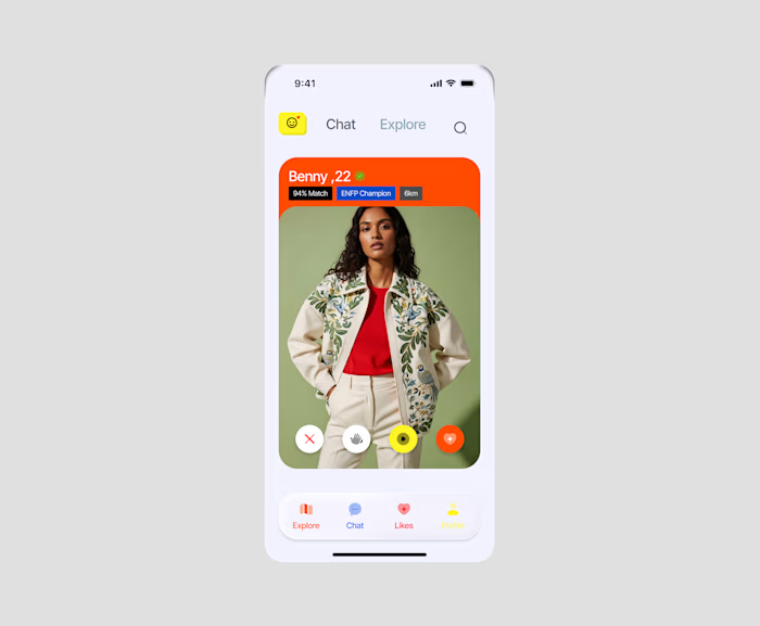
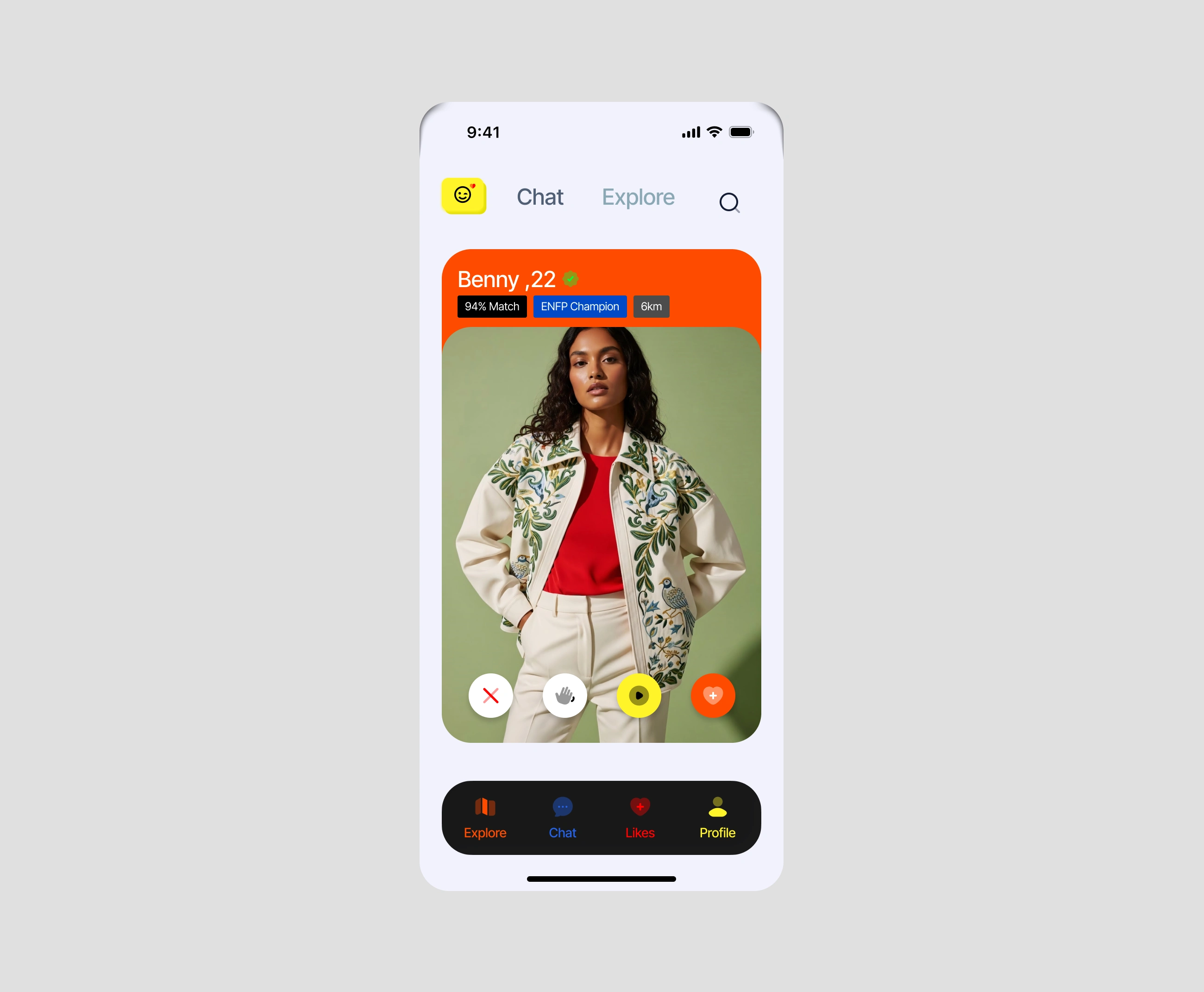
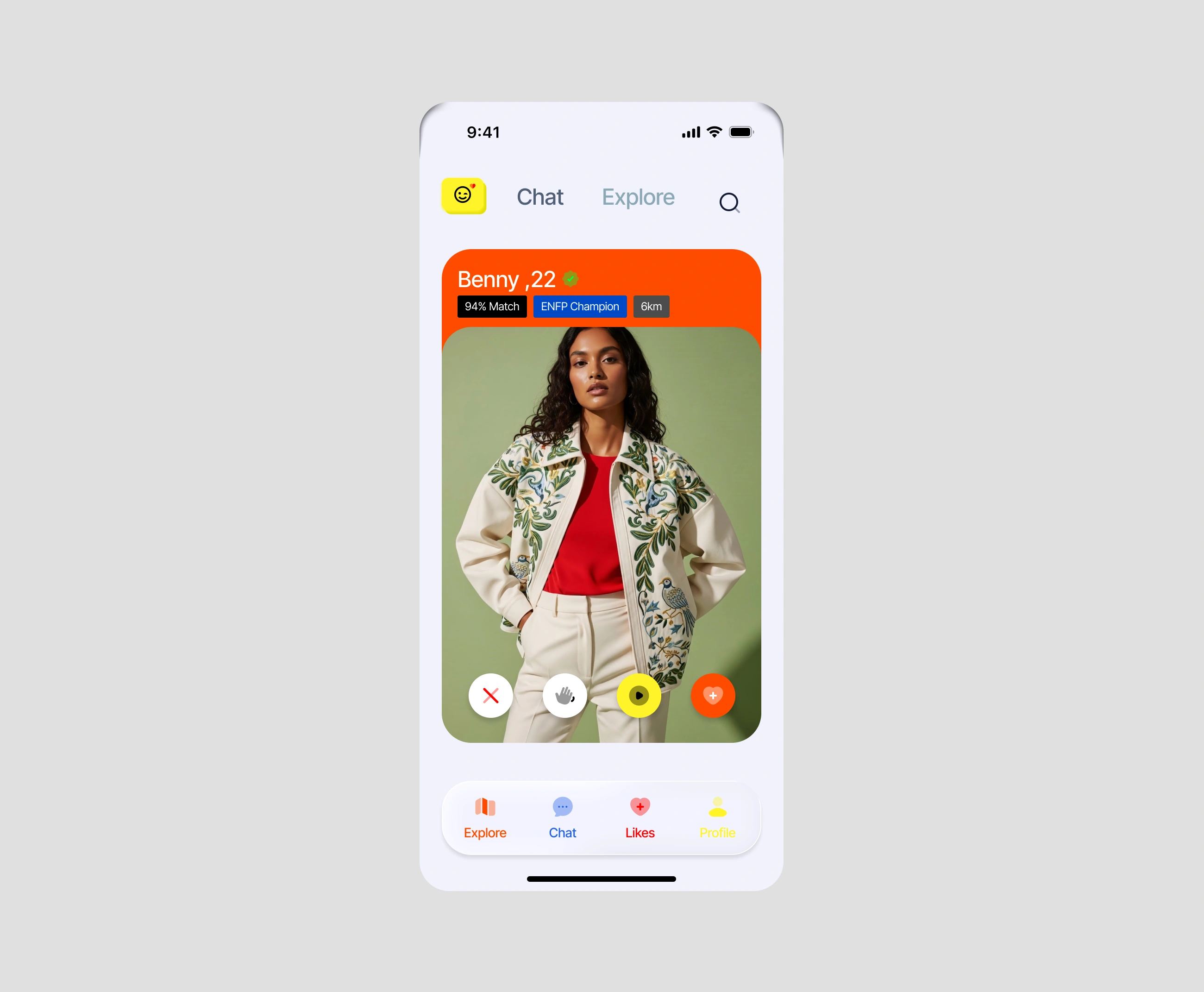
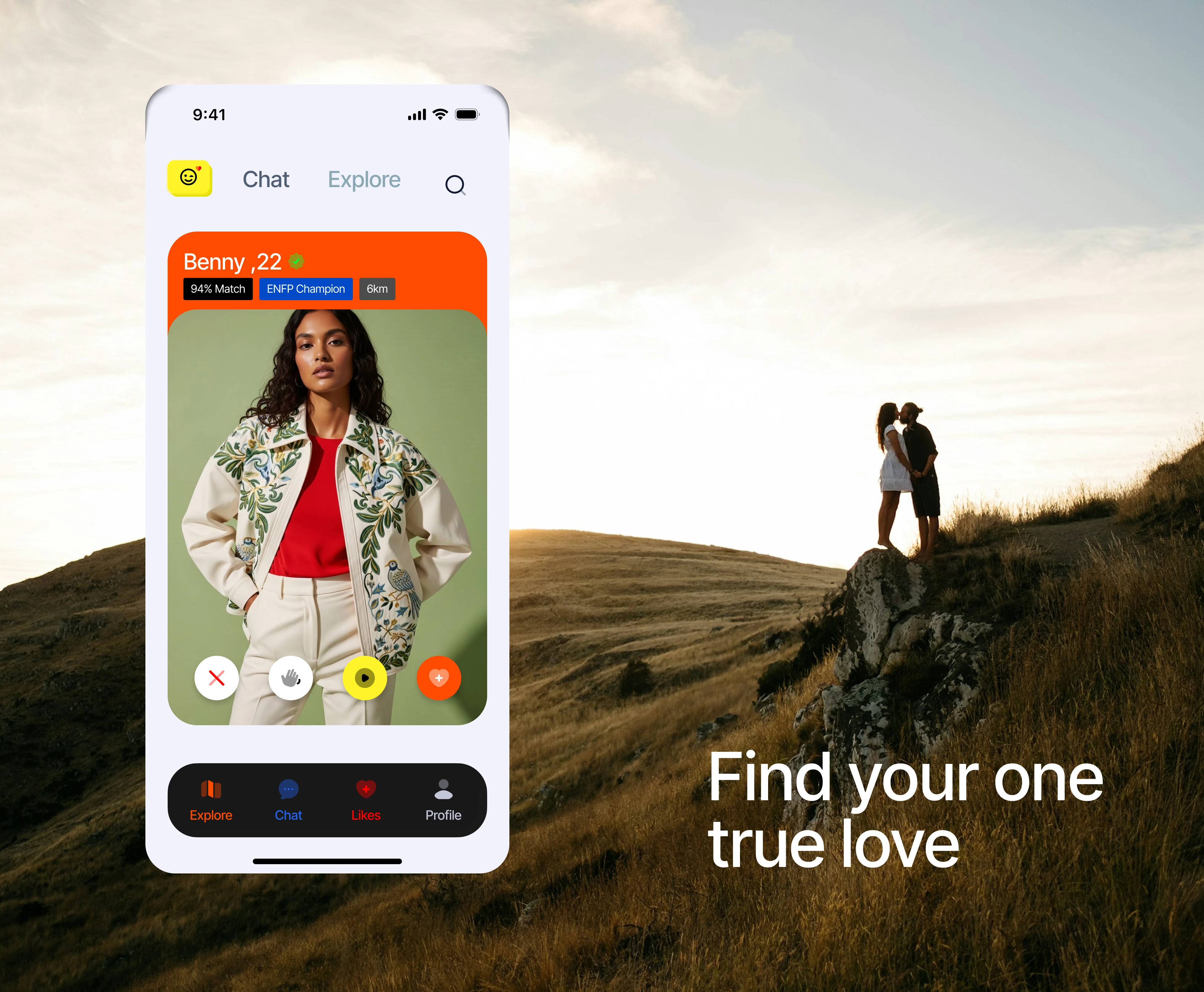
Every profile displays compatibility percentage, personality pairing, distance, and shared interests.
Instead of guessing compatibility, users understand why a match exists.
Feature 03: Swipe Experience
The familiar swipe mechanic remains. However every decision includes richer context.
Instead of only seeing a photo and age, users also see compatibility, personality, distance, and a voice introduction.
This creates more informed decisions.
Couple screen variant 1
Couple screen variant 2
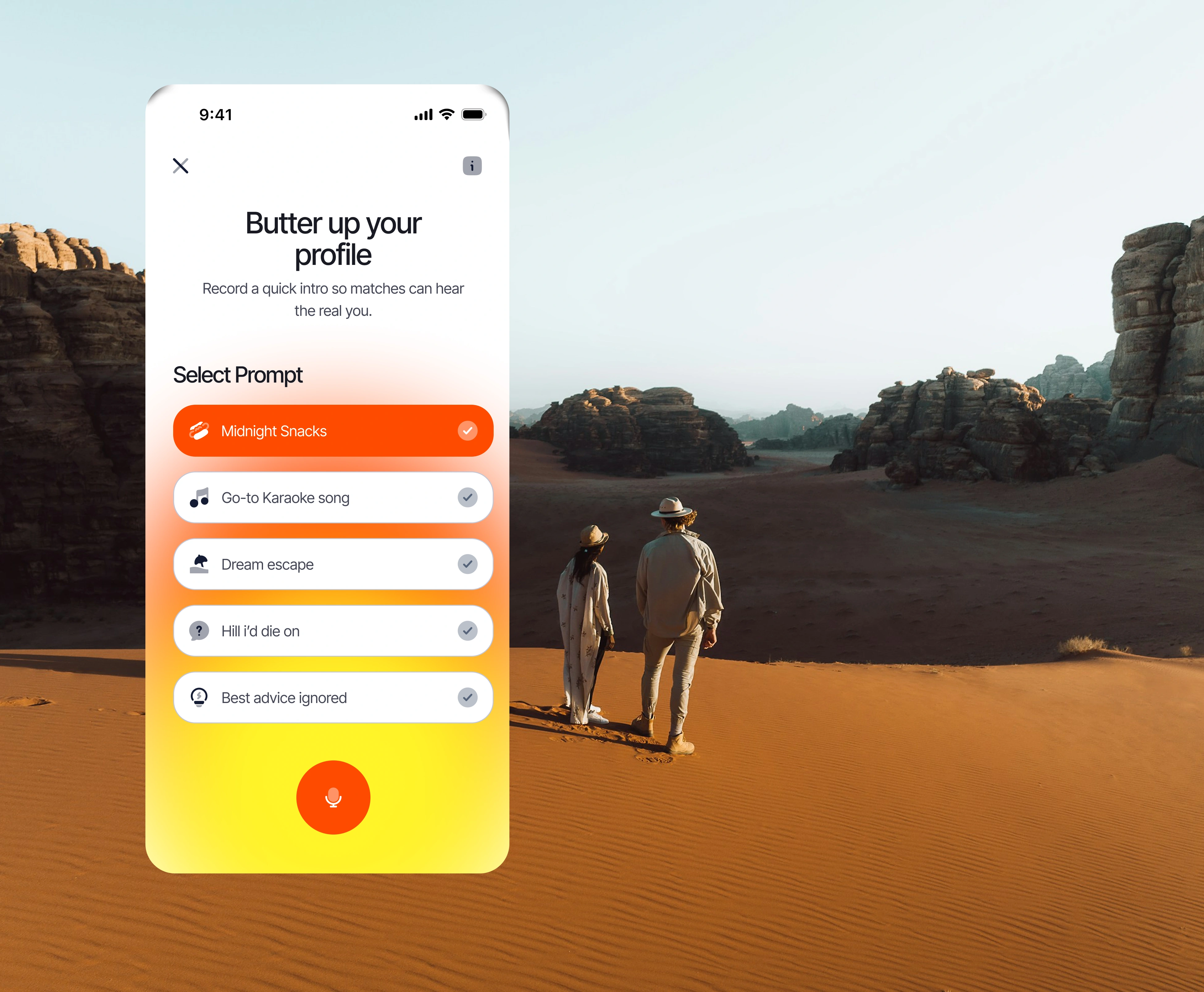
Feature 04: Voice Introductions
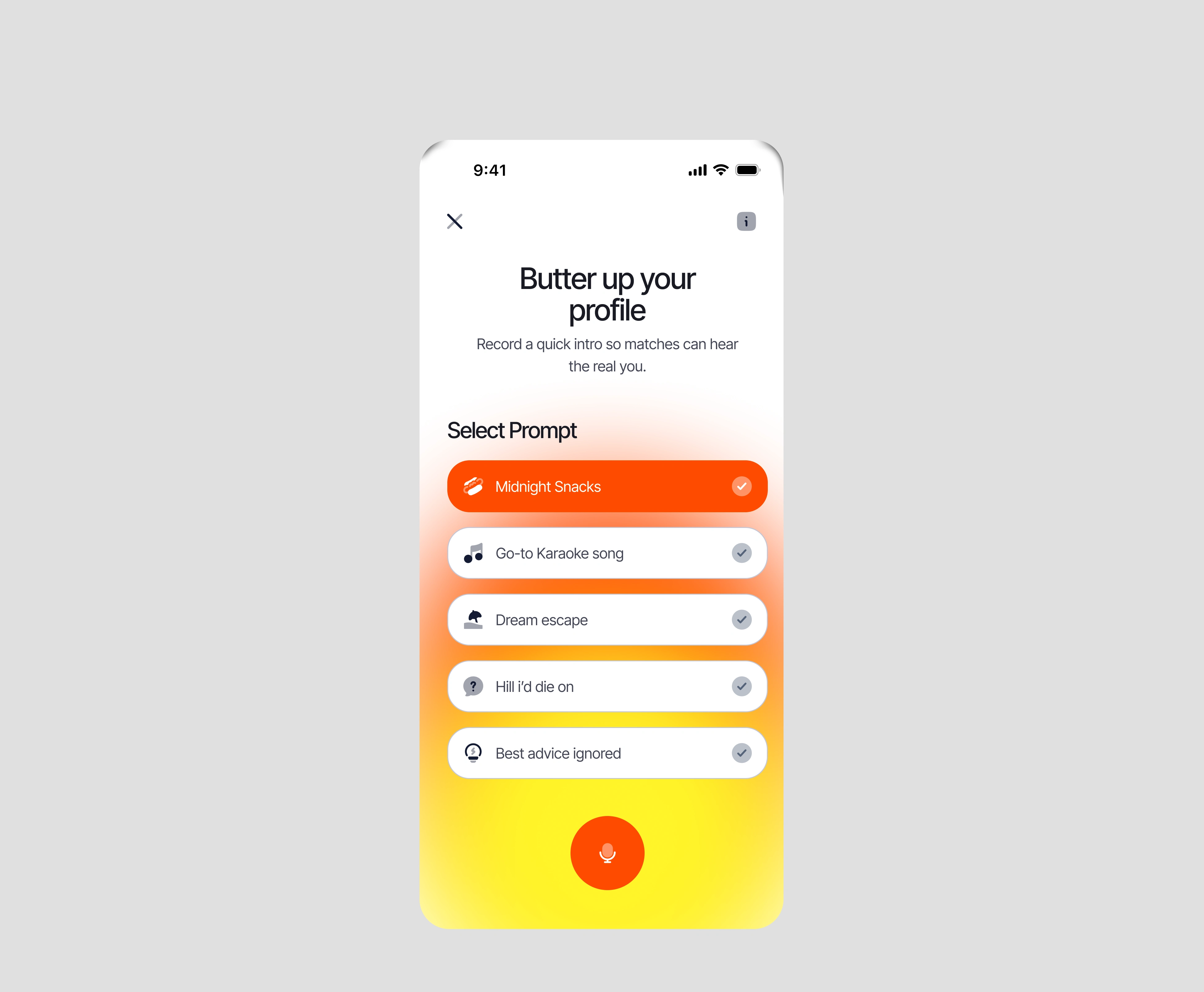
Text bios often fail to communicate personality. Butter lets users record a short introduction.
Hearing someone's voice immediately communicates confidence, humour, energy, emotion, and authenticity.
Feature 05: Explore Map
Rather than browsing endless cards, users can explore compatibility geographically.
The map visualises nearby matches, personality clusters, compatibility hotspots, and best nearby connections.
This transforms discovery into exploration.
Feature 06: The Buttered Moment
The highest emotional point in the experience isn't finding someone. It's matching.
Instead of displaying another generic "It's a Match," Butter celebrates users with a playful interaction: You're Buttered.
The screen encourages immediate action — start with a personality-based ice breaker or chat immediately. This removes the anxiety of sending the first message.

Buttered up celebration
Feature 07: Date Suggestions
Butter doesn't stop after messaging. Users can suggest activities directly inside the app.
The experience includes location, date, compatibility score, and personalised conversation advice.
Example: "Maya values thoughtful conversations. Try asking about her favourite travel experience."
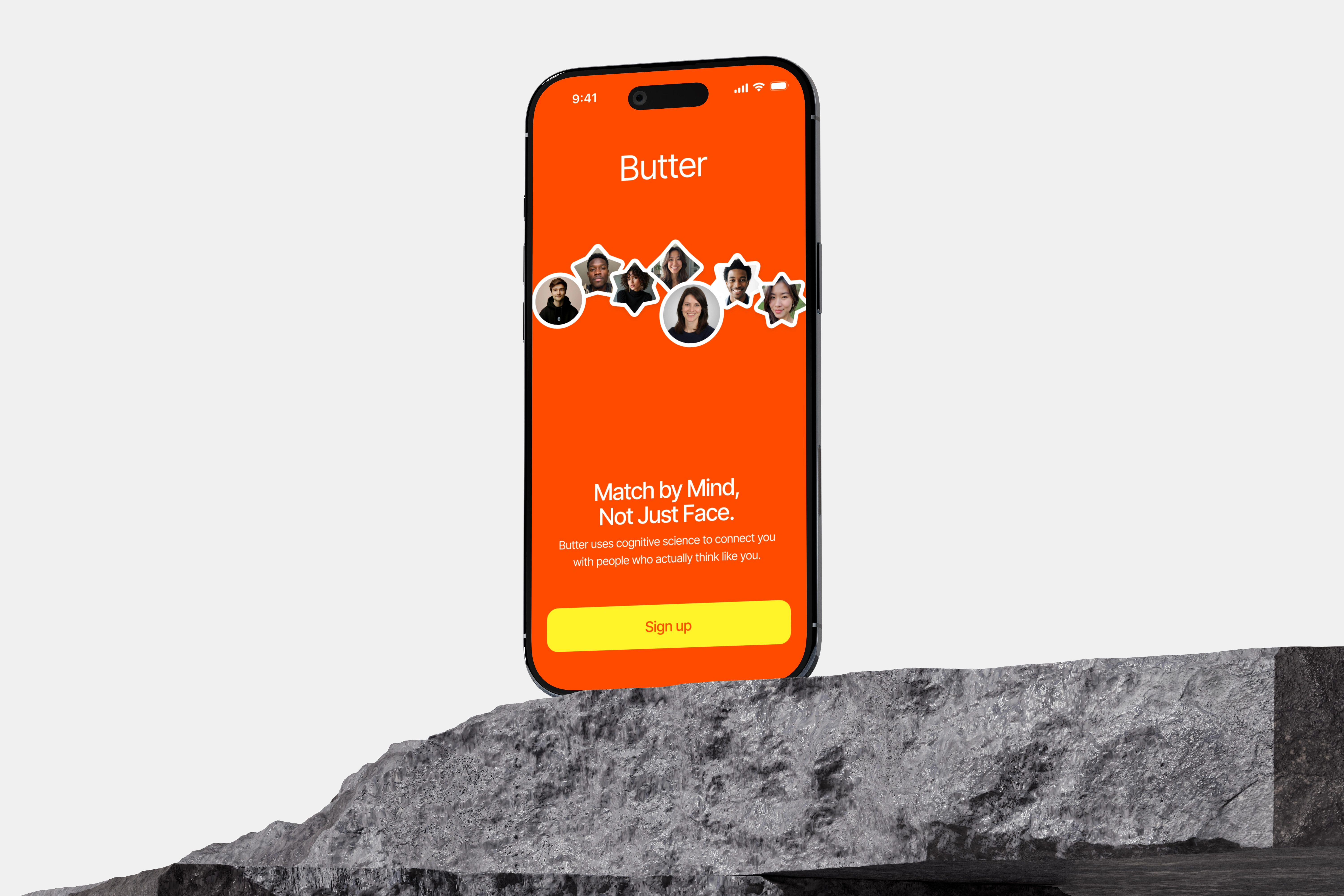
iPhone mockup on rock
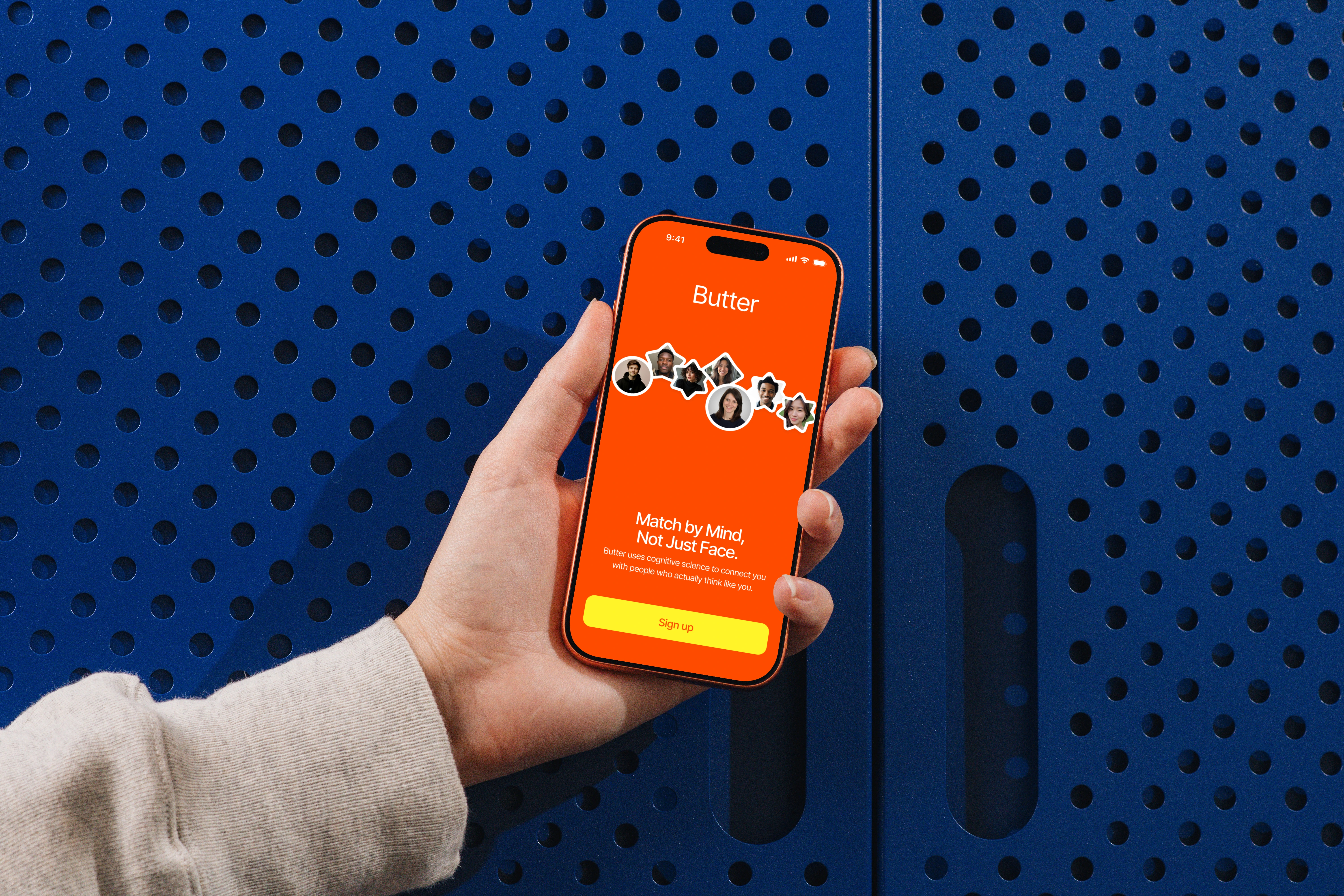
iPhone 17 Pro mockup in hand
Design System
Built using reusable components including buttons, cards, profile modules, compatibility badges, voice player, navigation, bottom sheets, tags, filter chips, modals, and typography.
Everything was designed as scalable components and variants before high-fidelity screens.
Visual Direction
Inspired by modern iOS applications. The interface combines large rounded corners, soft shadows, minimal layouts, high contrast typography, warm yellow accents, orange highlights, clean spacing, Inter Tight typography, and Phosphor icons.
The overall feeling is playful, optimistic and approachable.
Accessibility
The project explored both dark mode and glassmorphism. While the glass concept looked visually interesting, it reduced contrast and readability. The final direction prioritised accessibility over visual trends.
Challenges
The biggest challenge was balancing familiarity with innovation. Changing too much risks confusing users. Changing too little creates another Tinder clone.
Butter attempts to innovate around compatibility while keeping interaction patterns users already understand.
Outcome
Butter demonstrates how personality, conversation design and thoughtful interaction patterns can create a dating experience focused on meaningful relationships rather than endless engagement.
Although this is a conceptual project, it explores real UX problems using realistic product thinking and production-ready interface design.
What I Learned
This project reinforced an idea I believe applies to every digital product.
People rarely remember interfaces. They remember how those interfaces made them feel.
Designing delightful moments isn't about animations or gradients. It's about identifying moments of uncertainty and replacing them with confidence.
Butter wasn't designed to help people swipe more. It was designed to help people connect better.
Like this project
Posted Jul 28, 2026
Personality-first dating for a generation tired of endless swiping. A 3-week concept project exploring how compatibility, voice introductions, and thoughtful interaction design can create meaningful connections.
Likes
0
Views
25