Built a complete multi-page digital experience using Google Stitch.
For this project, I designed and prototyped Eternal Maven, a modern AI and technology agency website focused on communicating technical expertise, credibility, and premium brand positioning.
What I created:
• Homepage with a bold, future-focused visual identity
• AI Development, Web Development, and Solutions pages
• Case Study section featuring project outcomes and impact metrics
• Industry-specific expertise showcase
• Technology Stack page highlighting modern tools and platforms
• Portfolio gallery for featured work
• Blog & Insights hub for thought leadership content
• Contact and conversion-focused lead generation experience
How I used Google Stitch:
I leveraged Stitch to rapidly generate, refine, and prototype high-fidelity screens while maintaining a consistent design system across the entire experience. The platform made it easy to explore ideas, iterate quickly, and build a cohesive multi-page user journey.
Design Direction:
Dark immersive UI, electric blue accents, glassmorphic elements, modern typography, and premium visual storytelling designed for a 2026-ready digital presence.
Prototype: https://stitch.withgoogle.com/preview/10522833652304720789?node-id=98d3602ef68e4bcb88b235a2ac03a4d0
#GoogleStitch #WebDesign #UIDesign #UXDesign #AI #ProductDesign #Prototype #DigitalExperience #Contra
11
11
902
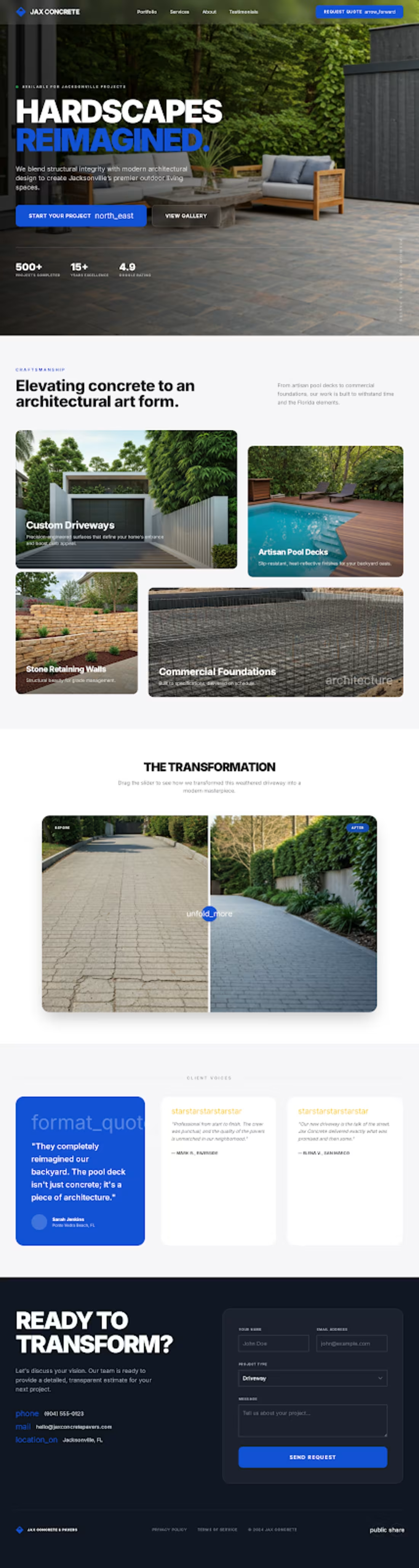
I redesigned the website with a modern, premium, and conversion-focused layout.
• Homepage: Full-width hero background with clear messaging and CTAs for a strong first impression
• Services: Clean, card-based layout for easy browsing and better UX
• Driveways Page: Interactive visuals (carousels / before-after) to showcase work quality
• Request a Quote: Streamlined, premium form design to boost completions
Built to improve user experience, elevate brand perception, and drive more inbound leads.
4
11
711
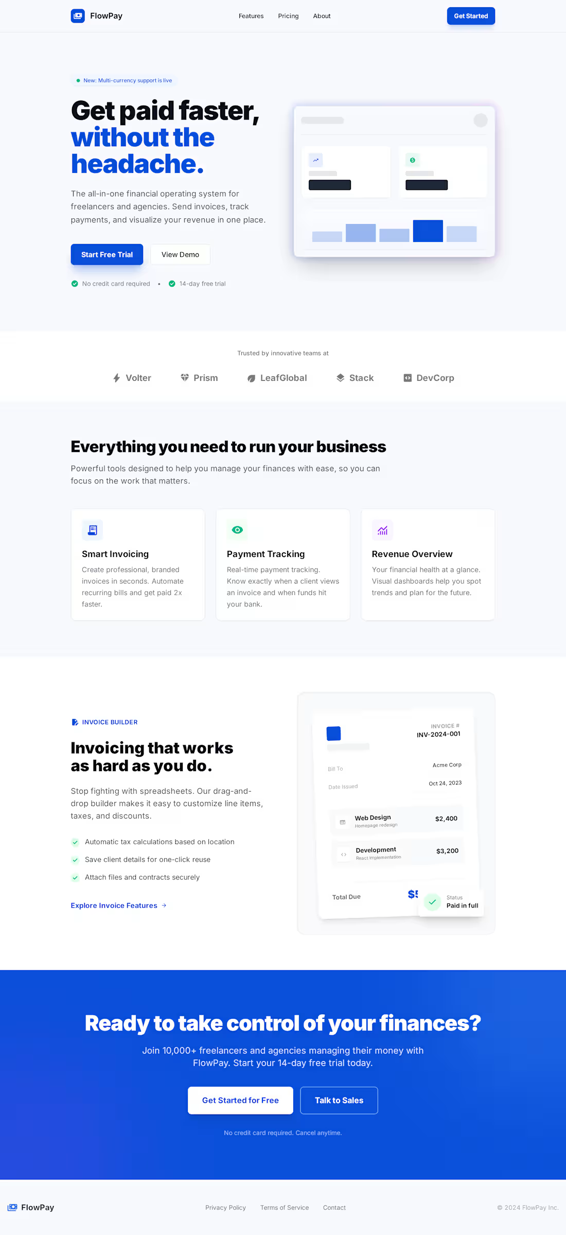
SaaS & Fintech Web App:
Design clean, modern, and conversion-focused web apps for SaaS and fintech startups.
- High-converting landing page
- Simple revenue & payments dashboard
- Easy invoice creation flow
- Clear payments tracking screen
Built to be user-friendly, fast, and ready to scale.
Launching an MVP or improving your SaaS product?
4
6
503
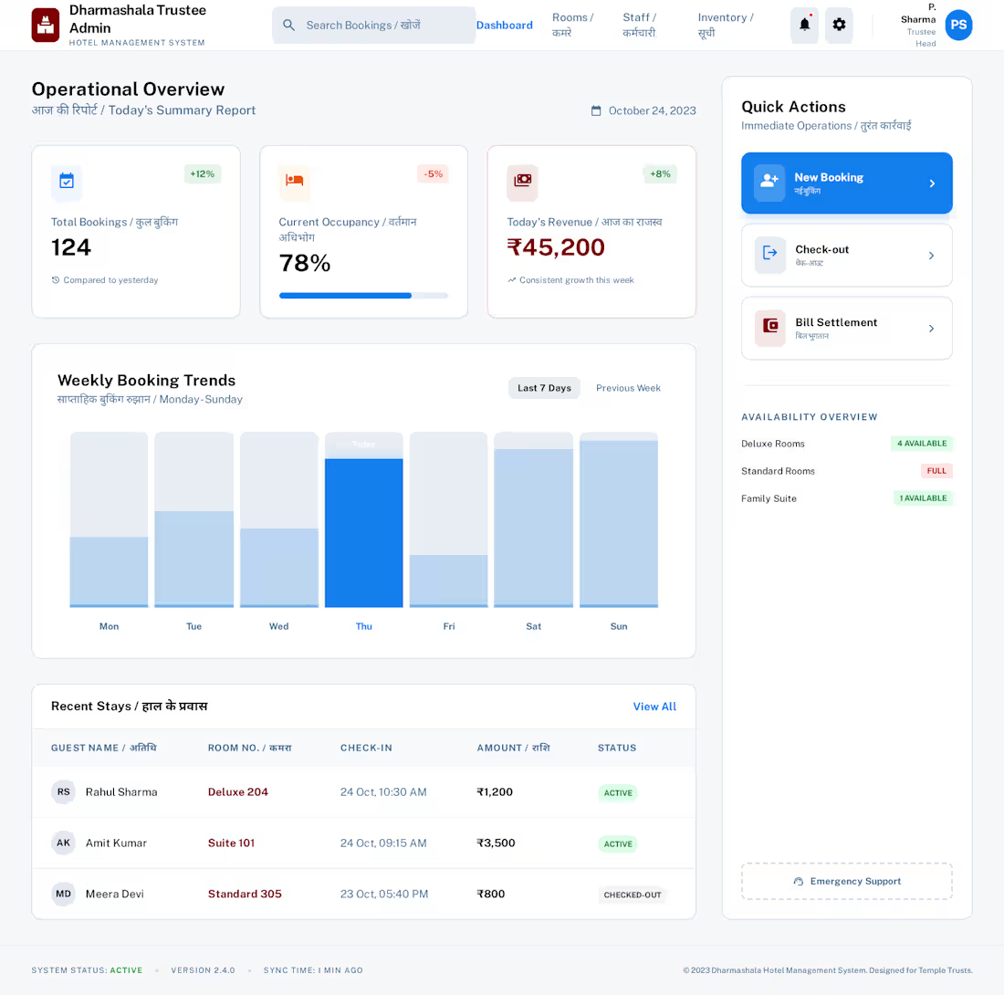
Dharmashala Management System - Smart, Fast & Easy to Use
We have created the first design for the Dharmashala Management System with focus on speed, clarity, and smooth daily work.
🔹 Trustee Admin Dashboard
🔹 Room Status Grid View
🔹 Fast Counter Booking System
This system is built to improve operations, reduce errors, and increase efficiency for Dharmashala and hostel management.
4
5
470
Abstract Intelligence & Connectivity
This video explores how complex IT and AI concepts can be explained visually without overwhelming the viewer.
Instead of literal screens or UI demos, this piece uses an Abstract Explainer (Hybrid Style) blending structured motion design with AI-generated visuals to represent intelligence, data flow, and connectivity.
The result is a video that feels intelligent, not overwhelming.
4
460
Healthcare Website Should Save Time - Not Confuse Patients
When someone is sick, they don’t want to struggle with small buttons and confusing booking steps.
I design simple, clear, and easy-to-use healthcare websites that help patients:
✅ Find doctors fast
✅ Read reviews easily
✅ Book appointments in seconds
✅ Trust your platform instantly
More clarity = More bookings.
Clinic, healthcare startup, or medical platform and need a website that actually converts…
3
455
Qatar Community Portal Design & Development
Designed the core screens for Qatar Community Portal.
I recommend WordPress with a custom theme and Elementor or Bricks for easy management, fast performance, and strong SEO/AEO visibility on Google and search platforms.
Designed Screens:
➡️ Home (Professional Portal Layout)
➡️ Modern Card-Based Home (Directory Focused)
➡️ User Dashboard (Simple Member Control)
➡️ Admin Panel (Easy Content & User Management)
Would you like this design!?
3
408
Immersive Portal & Business Directory Design:
Design modern, premium, and interactive platforms that attract users and increase inbound inquiries.
Dark mode bento layout with glowing cards
Smooth category expansion with smart interactions
Cinematic visuals for high-end user experience
Hero-style business cards with quick view
Map-integrated directory for easy navigation
Want a unique, high-converting website that stands out?
4
406
Done mock up design of product page for this 31st
This kind of designs will attract client to buy the products for parties...!!!
Is this design also increase the sale?
1
3
381
E-commerce: The "Frictionless Flow" Concept
Style: High-Energy Traditional UI Animation
The Narrative: The speed from "Discovery" to "Delivery."
The Visuals (0–30s):
0-10s: Fast-paced, rhythmic shots of a thumb scrolling through a beautifully designed mobile shop.
10-20s: Zoom into the screen where the product (a sneaker) bursts into a 360-degree 3D spin.
20-30s: A satisfying "Success" animation a green checkmark that morphs into a delivery truck driving off-screen.
The Hook: "We design interfaces that turn 'browsing' into 'buying' in seconds.
4
375
LexFlow - Legal Platform Design
Designed a smart and easy-to-use legal platform called LexFlow that helps users complete legal work step by step.
Here’s what I created:
✅ LexFlow Landing Page: It clearly explains what the platform does, shows a simple 3-step process, and helps users start quickly without confusion.
✅ Interactive Legal Intake System: It shows progress, gives helpful tips, and makes the process simple and stress-free.
✅ User Compliance Dashboard: A smart dashboard where users can track their filing status, download documents, and follow a clear checklist to stay compliant.
Need SaaS, dashboard, or high-converting landing page design?
1
354
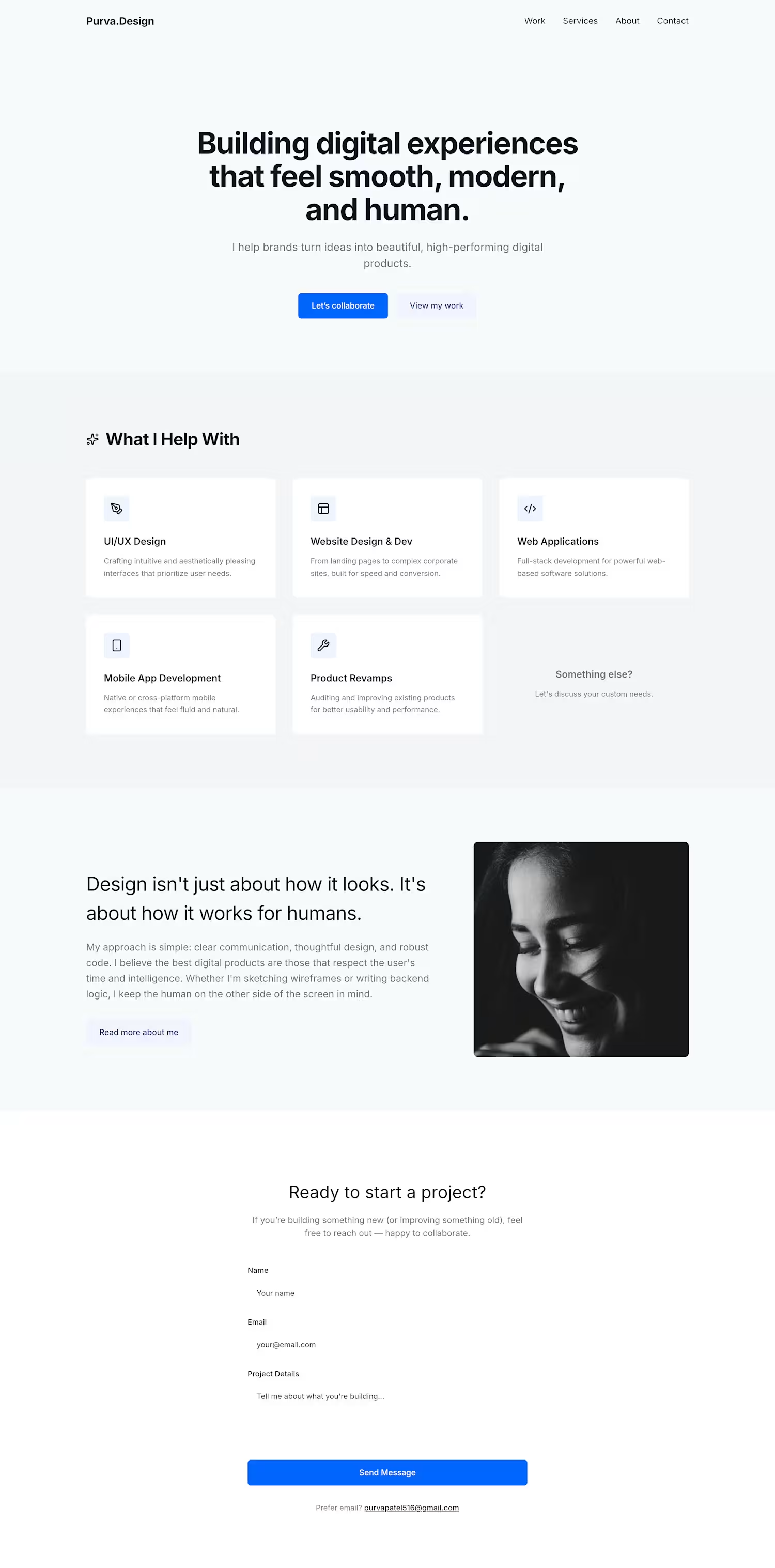
Building digital experiences that feel smooth, modern, and human.
I helps brands turn ideas into beautiful, high-performing digital products.
✨ What I Help With:
UI/UX Design
Website Design & Development
Web Application Development
Mobile App Development
Product Revamps & Fixes
If you’re building something new (or improving something old), feel free to reach out — happy to collaborate.
1
352
Website Redesign (Mock Project)
- Project: Modern Website Redesign for a D2C
- Skincare Brand Service: UI/UX + Website Development
- Mockups: Homepage hero, product page, mobile view
Just completed a clean, conversion-focused redesign for a mock D2C skincare brand.
What I worked on:
• Rebuilt their entire homepage structure for better storytelling
• Designed a calm, minimal UI with soft neutrals
• Added high-contrast CTAs to increase add-to-cart clicks
• Created responsive mobile layouts
• Optimized product page UX for faster decisions
1
340
This project showcases a modern corporate landing page designed to help businesses present their services clearly and professionally. The focus was on creating a clean layout that communicates value quickly while maintaining a strong, trustworthy brand presence.
How's it guys?
2
2
330
Mobile App UX Concept (Mock Project)
- Project: Fitness Habit Tracker App (Concept)
- Service: UI/UX + Prototype
- Mockups: Dashboard, progress tracker, habit cards
Working on a fresh mobile app concept that focuses on building simple habits through clean UX.
✨ Key UX elements:
• Daily dashboard with progress rings
• Habit cards with swipeable interaction
• Motivational streak system
• Clean blue-white color system
• Dark mode preview
Make habit building easy, fun, and minimal without overwhelming the user.
1
315
Hi, I’m Purva Patel. I’ve recently joined this amazing platform to take my independent career to the next level.
I don’t just bring a strategy, I bring a complete execution team.
My #ContraQuest: To prove that "Independent" doesn't have to mean "Solo." I lead a team of Designers and Developers
I help clients skip the stress of managing multiple freelancers by providing a one-stop shop for:
- Strategy & Lead Gen
- UI/UX Design
- Full-Stack Development
I believe the best results happen when business logic and creative execution live under one roof.
Let’s connect! If you’re a looking to build website or app, check out my portfolio: contra.com/purva_sanepara (https://contra.com/purva_sanepara/work?r=purva_sanepara)
3
314
I’ve taken UI design to the next level by applying a Futuristic Glassmorphism theme across an entire suite think premium, high-tech, and ultra-modern interfaces. Here’s what’s inside:
- Glassmorphic Tech Dashboard
- Frosted Identity Console
- Refractive Threat Map
- Glass Flow Architect
This Glassmorphism UI style is trending in cutting-edge SaaS, fintech, AI dashboards, and web apps, giving products a luxury, high-tech aesthetic that captivates users.
💡 Want our SaaS or dashboard to look this futuristic and premium?
2
3
309
Web App Dashboard (Mock Project for SaaS)
Project: Analytics Dashboard for a SaaS Startup (Mock)
Service: UI/UX + Dashboard UI System
Mockups: Metric cards, charts, sidebar navigation
Sharing a new dashboard UI I designed for a mock SaaS analytics platform.
1
301
Try something with webflow's AI site builder for finance and tax industry.
2
298
Hey Guys, is this design attract visitors....!?
1
298
⚡ Designed to stop the scroll.
Built this dark, futuristic media website UI for brands driven by trends, culture, and engagement.
• Bold dark UI + neon accents
• Scroll-first layout
• Made for content & clicks
Is this works and Perfect for media, tech, and startup brands?
1
292
Try something new and unique design for Pumping Industry.
Let's connect if we can try something new designs as well...
2
282
Redesigned the mobile app for a concrete and pavers company with a modern, unique, and aesthetic built to impress clients and boost engagement. Here's what’s new:
Home Dashboard
Services Overview
Driveways Service Section
Contact & Inquiry Forms
All screens are fast, responsive, and styled to match the brand colors, with clear CTAs that guide users effortlessly.
1
280
Burning down is not the end; it’s the requirement.
Most people fear the fire. They fear the moments when their "old self," their old career, or their old certainties go up in flames.
But look at the landscape in this video. Without the fire, there is no room for the New Beginning.
- Radical Authenticity: Stop pretending the old way still works.
- Uncharted Territory: The path forward isn't on your old map.
- Sovereignty: You own your recovery.
You don't just survive the heat you become the flame. 🔥
2
275
Most health apps feel like a chore. I built one that feels like a breath of fresh air.
Want to share Wellnest, a health and habit tracker designed and under developed from the ground up.
This focuses on the human side of wellness balancing habit tracking.
Handling the full lifecycle of this product from the initial UI/UX strategy in Figma to the final responsive deployment. Focused on soft gradients and clean "glassmorphism" to ensure the interface stays out of the user’s way.
#fullstack #UIUX #BuildInPublic
2
269
I updated the designs to match the new brand name Apex Ventures.
What I worked on:
Homepage: Improved the 3D globe and visuals to feel more unique and premium.
Core Activities: Updated animated cards and 3D effects to look clean and custom.
About Us: Refined text style and small interactions to tell the brand story better.
Global Presence: Enhanced maps and 3D views to clearly show countries and reach.
My goal was simple:
Make the design clear, modern, and not generic.
Next step is choosing a strong color theme that fits Apex Ventures’ personality.
How's it guys!? Please share your reviews and anything to change...
2
262
I made the website in a new and different style.
It does not look like a normal WordPress website.
It looks like a big digital magazine.
The first page feels like a movie about Boston homes.
It has big text, full-screen images, and a fun layout.
The gallery is dark and stylish.
Places look like floating cards that you can explore.
This design is bold and creative.
Do you like this new and modern idea?
1
248
Project Idea: Neo-Brutalist Travel Website Design
This design is very different from normal WordPress websites. It looks bold, modern, and creative, which makes it perfect for a special travel website.
I have designed the main pages with a strong magazine-style look:
Home Page: A bold landing page with big bright green text, dark colors, and a side menu. It feels like a digital magazine.
Itinerary Page: A timeline page that shows daily travel plans using boxes, lines, and clear fonts, just like a magazine spread.
Gallery Page: A fun photo grid where images overlap. Location names move when you interact with them.
The design uses dark colors, strong borders, and shadows to look unique and modern.
Do you think we should also add a Packing List or Travel Details page in the same style?
1
237
StayEase UI Redesign – Papercut Concept
A premium StayEase website redesign using a layered papercut UI style. Features include a 3D textured homepage, framed property listings, stacked detail sections, and a tactile booking flow with pressed-paper effects. This concept creates a unique, high-end visual identity beyond standard booking platforms.
1
229
The Prism of Transformation: Utilizes a geometric prism that refracts light into a vibrant spectrum, symbolizing the "rejuvenation" of companies through a Gen-Z lens.
1
217
I made a clean and simple website for your Boston 2026 family trip. It is easy to use and easy to change.
The home page shows a big Boston picture. It has a warm welcome message and basic trip details. The design looks classic and neat.
I created a simple day-by-day plan page. You can easily edit times, places, and activities. You can also copy a day if you want to add more plans.
There is a photo gallery with favorite places. Each place has a Google Maps link so everyone can find locations easily.
1
217
Meticulous Wear Manufacturing
Designed to position the brand as a trusted apparel manufacturing partner for global businesses.
What I Built
✅ Modern corporate website with a premium "Executive Thread" design system
✅ Professional navy & white visual identity focused on trust, quality, and manufacturing excellence
✅ Fully responsive design optimized for desktop, tablet, and mobile
Key Features
🔹 High-converting homepage with strong brand positioning, manufacturing capabilities, and trust-building metrics
🔹 Product showcase featuring apparel categories, technical specifications, and B2B-focused presentation
🔹 Manufacturing process section highlighting quality control, ethical production standards, and sustainable practices
🔹 Professional inquiry system with contact form, email integration, and WhatsApp Business connectivity
Focus Areas
• Corporate Website Design
• Manufacturing Industry Websites
• Apparel & Garment Manufacturing
• B2B Lead Generation
• Conversion-Focused UI/UX
• Responsive Web Design
• Brand Positioning
• Modern Website Development
This project demonstrates how strategic website design can help manufacturers build credibility, attract international buyers, and generate qualified business inquiries.
If you're a manufacturing company, apparel brand, D2C business, or industrial supplier looking to modernize your online presence and generate more leads, I'd love to connect.
#WebDesign #ManufacturingWebsite #CorporateWebsite #B2BMarketing #UIUXDesign #ResponsiveDesign #GarmentManufacturing #ApparelIndustry #LeadGeneration #WebsiteDevelopment #BusinessGrowth #DigitalMarketing
4
4
126
The Adaptive Archive - A Living Website Made with Figma Make
It is a digital museum that changes its layout based on where users move their cursor. Figma Make helped me turn a simple idea into a live working prototype.
With my design taste and creativity, I did not just make a website. I made a living interface that changes based on user attention.
Using Figma Make, I created:
- Dynamic Auto Layout that grows and shrinks
- Smooth 600ms soft animations
- Color that appears when users show interest
- Heat bars that show engagement
This project shows how design can reflect what people care about. Instead of a static layout, the website evolves with users.
Live Site: https://rise-studio-67126202.figma.site
This is how creativity + Figma Make can shape culture - by making attention visible and turning interaction into meaning.
2
2
149
Transforming a Commercial Kitchen Brand into a Premium Digital Experience
The objective was simple: move beyond a traditional industrial-looking website and create a premium digital experience that speaks directly to restaurant owners, hospitality entrepreneurs, café founders, and food business decision-makers.
Focus Areas
• UI/UX Design
• Website Redesign
• Conversion Rate Optimization (CRO)
• Brand Strategy
• Visual Identity Design
• User Journey Optimization
• SEO-Friendly Information Architecture
• AEO (Answer Engine Optimization)
• GEO (Generative Engine Optimization)
• Responsive Web Design
The result is a premium, conversion-focused website experience designed to increase engagement, build trust, and attract higher-value commercial clients.
#WebDesign #UIDesign #UXDesign #BrandStrategy #WebsiteRedesign #SEO #AEO #GEO #CRO #ContraCreator
2
149
The "AeroGlow" AR Contact Lens / Sleek Smart Glasses
The Product: A ultra-minimalist pair of smart glasses made of a single piece of polished dark titanium and smart glass, or a macro view of a futuristic bio-tech contact lens.
Visual Style: High-contrast studio lighting, deep blacks, metallic reflections, and sharp, glowing cyan or amber technical UI lines.
1
135
Healthcare: The "Precision & Trust" Concept
Style: Hybrid (30% AI / 70% Traditional 3D)
The Narrative: Focus on the transition from data to human impact.
The Visuals (0–30s):
0-10s: Clean, 3D medical icons (DNA strands or heart rate monitors) pulsing in a minimalist white/blue space.
10-20s: Use AI-generated transitions to morph these technical icons into "real-life" cinematic scenes of a patient smiling or a doctor using a tablet.
20-30s: Smooth UI animation showing how the app/software manages this data seamlessly.
The Hook: "We turn complex health data into human-centric experiences."
4
120
4
101
StayEase Web Platform UI Designs
Initial desktop UI designs for StayEase including a premium homepage with an enhanced search experience, image-first property listings with filters and map view, detailed property pages with booking calendar, a secure multi-step booking flow, and an intuitive host dashboard for listings, earnings, and messages.
How do these designs look? Should we refine anything?
1
92
The "Prism" Translucent Quantum Device
The Product: A pocket-sized, completely transparent glass-slab device with visible, shifting photonic circuits inside.
Visual Style: Prismatic light refractions, studio caustics, architectural minimalism, and sharp white or silver UI overlays.
2
2
80
I’ve moved away from standard layouts and created two concepts:
LUMI: Luxury skincare reimagined
SYNAPSE: Futuristic AI wearable
🔥 Which vibe speaks to you: luxury or futuristic?
2
2
75
FinTech: The "Secure Wealth" Concept
Style: Isometric 3D Motion Graphics
The Narrative: Visualizing security and growth.
The Visuals (0–30s):
0-15s: Abstract 3D blocks stacking on top of each other to represent a "digital vault." The lighting is metallic and premium.
15-25s: Data visualizations (graphs/charts) "growing" like neon plants out of the vault, showing wealth accumulation.
25-30s: A quick, sleek UI transition to the user's dashboard.
The Hook: "Making complex financial security feel intuitive and elegant.
2
74
The "Monolith" Mag-Lev Modular Neural Core
The Product: A high-end desktop quantum computer or data drive shaped like a flawless, obsidian monolithic tower. It operates using zero-gravity magnetic levitation to separate its components when processing data.
Visual Style: Monolithic sci-fi luxury, perfect mirror reflections, intricate internal mechanics, and intense golden particle simulations.
1
69
The "Pulse" Holographic Wearable Ring
The Product: A sleek, matte obsidian smart ring that projects a floating holographic interface.
Visual Style: Premium textures (brushed metal, polished stone), soft moody backlighting, and fluid, floating light elements.
1
67
The "Aether" Travertine Ambient Hub
The Product: A smart home assistant that breaks away from plastic and fabric, designed as a brutalist, raw travertine stone sculpture with a floating, compressed orb of pure light at its center.
Visual Style: Wabi-sabi minimalism, rough organic textures vs. flawless digital light, dramatic soft god-rays, and slow architectural camera panning.
2
61
1
26
The "FerroChron" Liquid-Metal Chronograph
The Product: A luxury smartwatch where the interface isn't a digital screen, but a dynamic, programmable ferrofluid (magnetic liquid) trapped under a dome of sapphire crystal.
Visual Style: Ultra-glossy textures, deep fluid blacks, stark white laboratory lighting mixed with premium dark chrome, and tactile organic movement.