The network for creativity
Join 1.25M professional creatives like you
Connect with clients, get discovered, and run your business 100% commission-free
Creatives on Contra have earned over $150M and we are just getting started
Back to feedPost

Built a complete multi-page digital experience using Google Stitch.
For this project, I designed and prototyped Eternal Maven, a modern AI and technology agency website focused on communicating technical expertise, credibility, and premium brand positioning.
What I created:
• Homepage with a bold, future-focused visual identity
• AI Development, Web Development, and Solutions pages
• Case Study section featuring project outcomes and impact metrics
• Industry-specific expertise showcase
• Technology Stack page highlighting modern tools and platforms
• Portfolio gallery for featured work
• Blog & Insights hub for thought leadership content
• Contact and conversion-focused lead generation experience
How I used Google Stitch:
I leveraged Stitch to rapidly generate, refine, and prototype high-fidelity screens while maintaining a consistent design system across the entire experience. The platform made it easy to explore ideas, iterate quickly, and build a cohesive multi-page user journey.
Design Direction:
Dark immersive UI, electric blue accents, glassmorphic elements, modern typography, and premium visual storytelling designed for a 2026-ready digital presence.
#GoogleStitch #WebDesign #UIDesign #UXDesign #AI #ProductDesign #Prototype #DigitalExperience #Contra


looking cool!
Thank You...
Welcome

Great expertise showcase.
Thank you for the compliment...

How is this not at the top of every feed right now?
Haha, that's a great question! 😄
I'm just happy it's reaching people who appreciate good design. Thanks for the kind words and support!... ❤️
The network for creativity
Join 1.25M professional creatives like you
Connect with clients, get discovered, and run your business 100% commission-free
Creatives on Contra have earned over $150M and we are just getting started
Related posts


I felt something was off with my own website.
Too plain. Not how I envisioned the brand.
So I added more creative touches and built a real story into it. Now everything makes sense.
It finally feels like Outredge 🚀
https://outredge.com/


That big bold wordmark with the corner brackets gives it so much more character. "A marketing site as good as your product" is a strong line too, says exactly what you do.


What happens when one website has to talk to two different people?
A client of ours teaches two audiences at once: expecting mothers who want a calm pregnancy, and women who want to become doulas. One brand, one site, two very different reasons to visit.
The usual fix is a hero that speaks to "everyone" and lands with no one. We designed it as a fork in the road instead:
1. Two doors in the hero. "I'm pregnant" and "I'm training to be a doula", side by side, equal weight. The visitor picks a path in one click, and the headline above them stays about the shared value.
2. One voice, two tones. The mothers' path is softer: fewer words, more room, gentle photos. The doula path is more structured: modules, certification, dates. Same fonts, same colors, different rhythm.
One proof section, split in two. Testimonials from mothers on the left, from doulas on the right. Each visitor sees people like them before the price.
Writing for everyone is writing for no one. Give each reader a door.
Have you ever designed a page for two audiences at once? How did you split it?

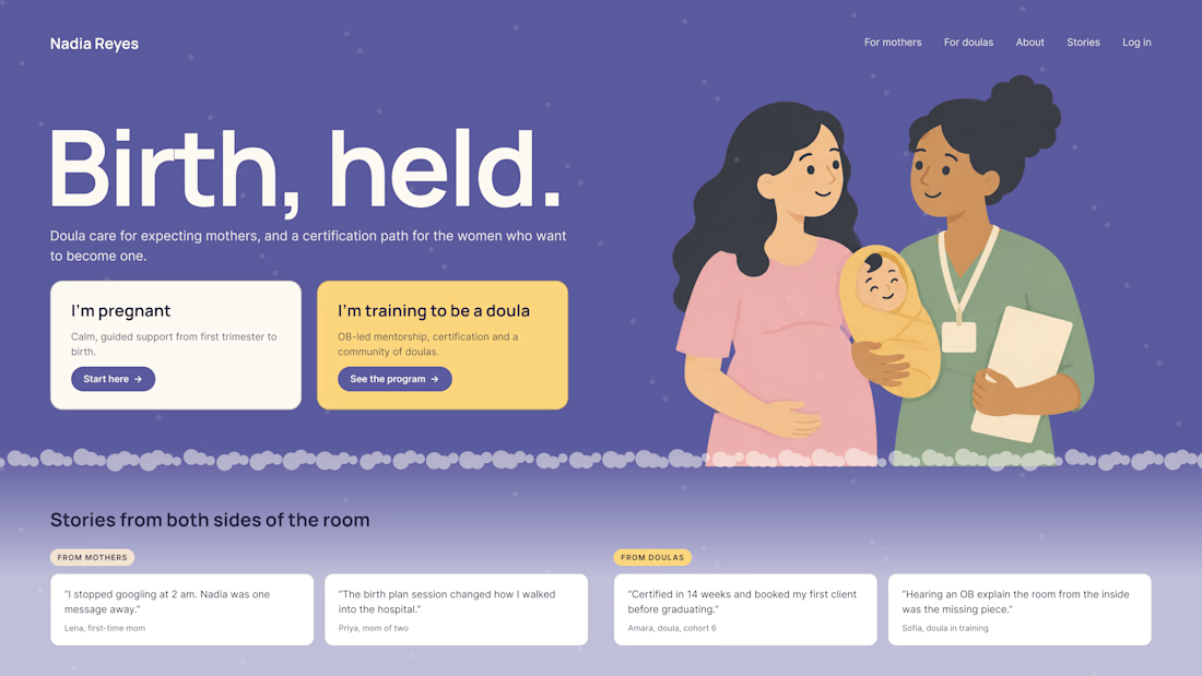

Love that purple hero with the two cards right up top.

The contact page is usually the last page anyone designs.
We made it one of the best
Recent client work: a contact section UI design for a company with offices across cities. Globe in the back, every location up front, and small interactions that make the whole web design feel alive.


Impressive work