The network for creativity
Join 1.25M professional creatives like you
Connect with clients, get discovered, and run your business 100% commission-free
Creatives on Contra have earned over $150M and we are just getting started
Back to feedPost


What happens when one website has to talk to two different people?
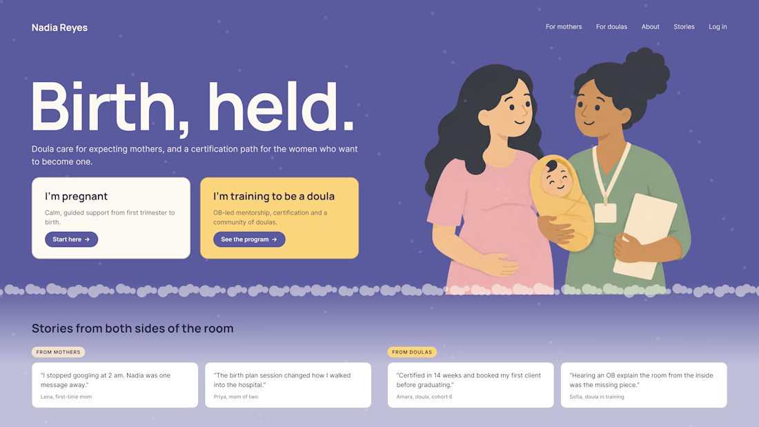
A client of ours teaches two audiences at once: expecting mothers who want a calm pregnancy, and women who want to become doulas. One brand, one site, two very different reasons to visit.
The usual fix is a hero that speaks to "everyone" and lands with no one. We designed it as a fork in the road instead:
1. Two doors in the hero. "I'm pregnant" and "I'm training to be a doula", side by side, equal weight. The visitor picks a path in one click, and the headline above them stays about the shared value.
2. One voice, two tones. The mothers' path is softer: fewer words, more room, gentle photos. The doula path is more structured: modules, certification, dates. Same fonts, same colors, different rhythm.
One proof section, split in two. Testimonials from mothers on the left, from doulas on the right. Each visitor sees people like them before the price.
Writing for everyone is writing for no one. Give each reader a door.
Have you ever designed a page for two audiences at once? How did you split it?


Really great point! Designing for two distinct audiences under one brand is always a challenge. Excited to see your approach to solving it.

Splitting the proof section is the smartest part. Did you also split the header CTA, or does the nav still send both groups to one contact form?

Love the split testimonials idea. Seeing people like you before the price is such a simple trust builder. I did something similar for a B2B and B2C audience once and two clear doors in the hero worked way better than one generic headline.

Love the feel of this, Serge!

Great work

Two audiences on one site is a tricky one. Splitting the paths early instead of mixing both messages in the hero is the right call, Serge.


Really like the thinking behind this approach. Giving each audience a clear path from the start is much more effective than trying to communicate two different messages at once. It's all about understanding why people visit in the first place.

Great job Serge

love this .amazing work

This is a useful perspective. Understanding the audience changes how we approach the solution.

Love that purple hero with the two cards right up top.

Clever when you put the testimonials on the hero for building the trust

Really nice work here

Splitting the hero into two clear paths right away is so smart. When a visitor chooses a path, does the whole page change style?

The shared headline with two clear paths is a really nice UX solution
The network for creativity
Join 1.25M professional creatives like you
Connect with clients, get discovered, and run your business 100% commission-free
Creatives on Contra have earned over $150M and we are just getting started



Related posts
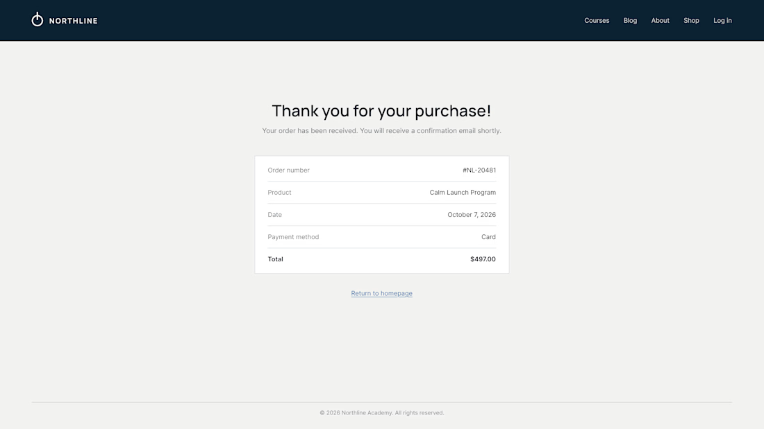
What does your customer see 3 seconds after paying?
On most Kajabi sites it's a plain "Thank you for your purchase" and a receipt. It's the moment of highest trust, and the page offers nowhere to go.
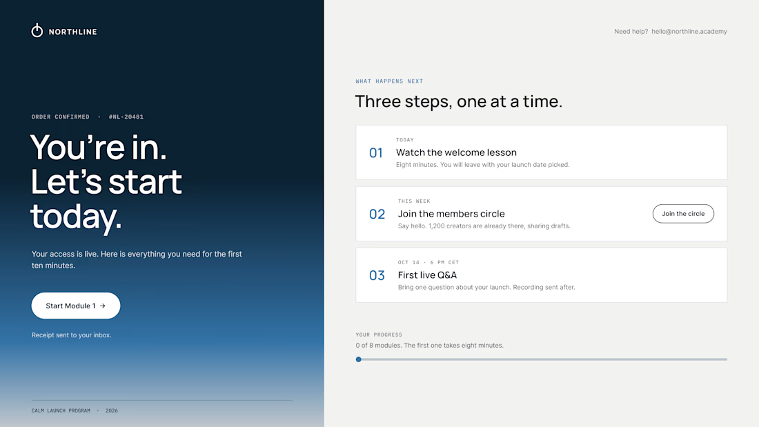
So we design the thank-you page as the first page of the course:
01 – One clear first step. "Start Module 1" sits above everything else. Momentum beats confirmation.
02 – A visible "what happens next". Today, this week, the first live call, with a calendar button. Clear dates calm the doubts that come right after paying.
03 – Proof they're in the right place. A link to the community, a human email they can reply to, progress at 0 of 8.
The receipt still lives in the inbox. It just isn't the headline.
Same brand, same colors. The only difference is where the page leads.
What did the last thank-you page you saw actually ask you to do?

Love the focus on making the experience feel simple for users.


Our new site is live. Apollo Studio is a design partner for product teams. The site leads with our work, shows everything we can help with, from products and design systems to websites, motion and pitch decks, and introduces the team. You can book a call from any page.
Huge congrats Alex! Leading with work is such a smart move - shows confidence. The book-a-call from any page is a great conversion hack too. Going to check apollostudio.design now! 🚀

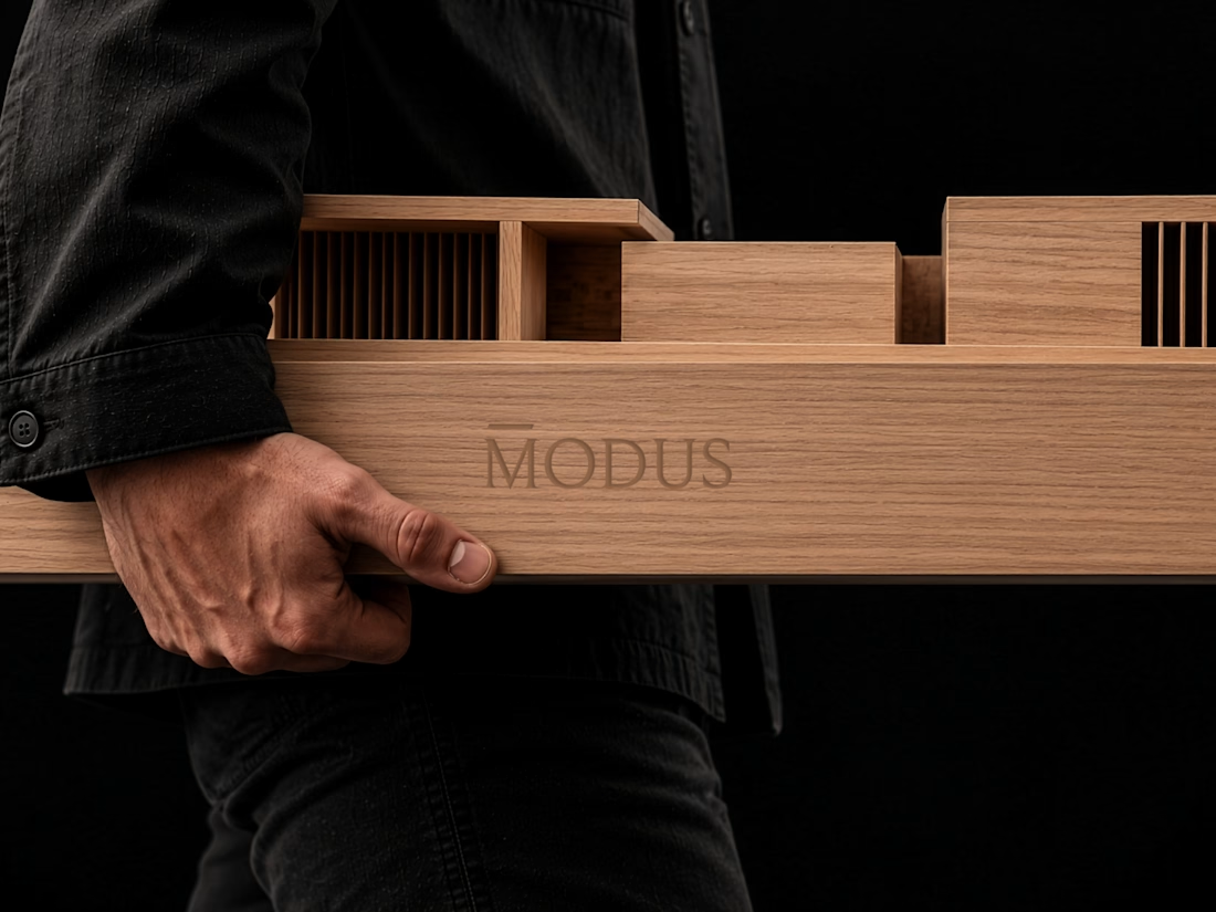
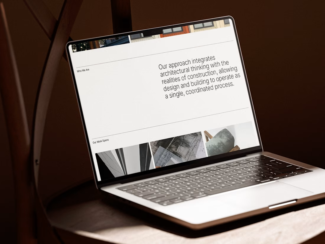
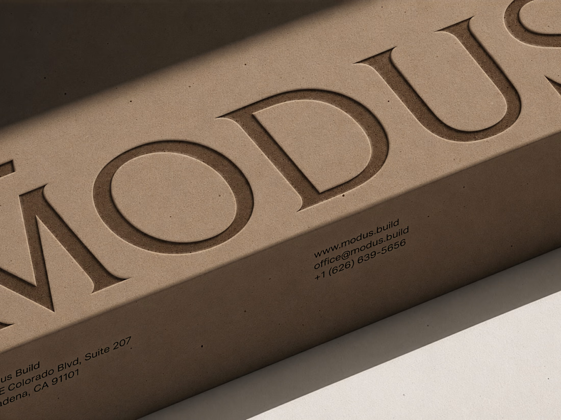
MODUS Build - Brand Identity & Web Design
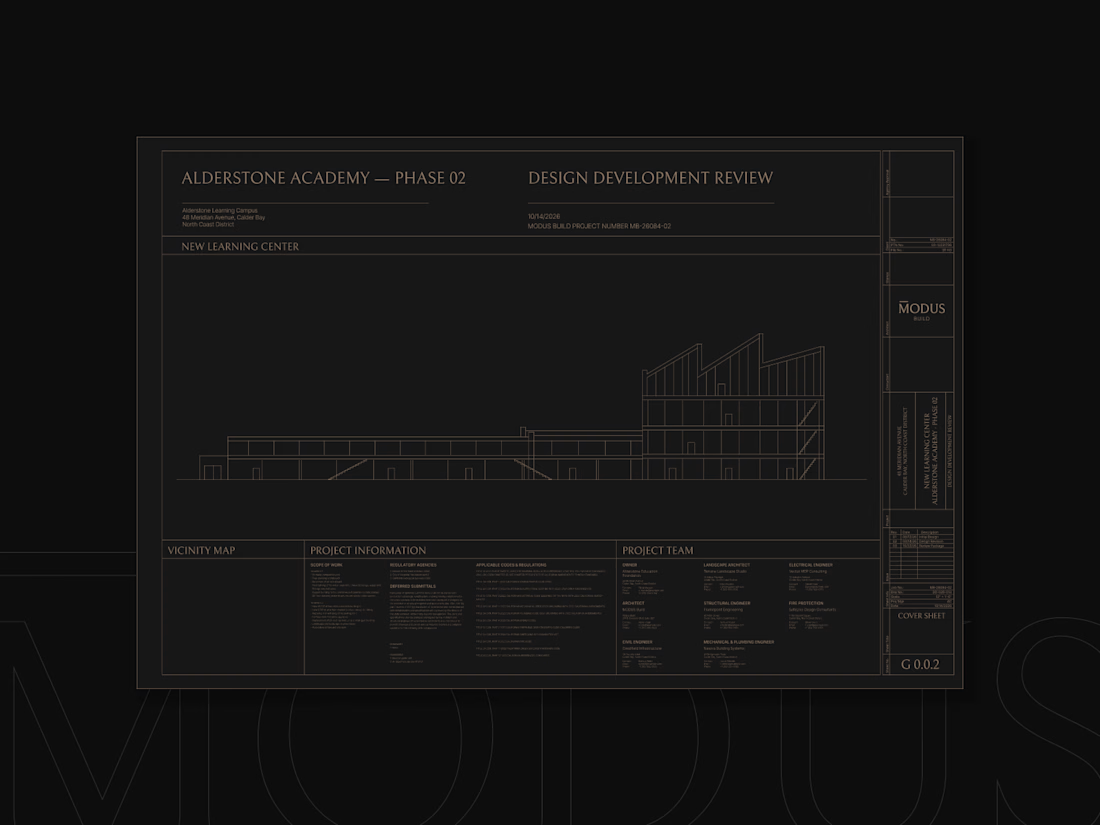
Coming from an architectural background, I approached MODUS Build with a particular appreciation for precision, proportion, and thoughtful design.
The challenge was to create a distinctive identity that communicates these values without relying on conventional construction imagery.
The concept was built around a simple typography idea: “The Measure of Good Building.” A small detail above the letter M represents a reference measure - a fixed length against which other dimensions can be measured. This subtle intervention gives the logo its meaning and connects it directly to the brand's philosophy.
I carried this idea into a cohesive visual system, bringing together typography, graphic patterns, brand applications, and website design.
For me, the most rewarding part was creating something visually refined yet purposeful, where even the smallest detail has a reason to exist, keeping the same principle as in architecture.
#branding #logodesign #webdesign


Great brand design Alexandar wooden style is so premium🔥🔥