The network for creativity
Join 1.25M professional creatives like you
Connect with clients, get discovered, and run your business 100% commission-free
Creatives on Contra have earned over $150M and we are just getting started
Back to feedPost


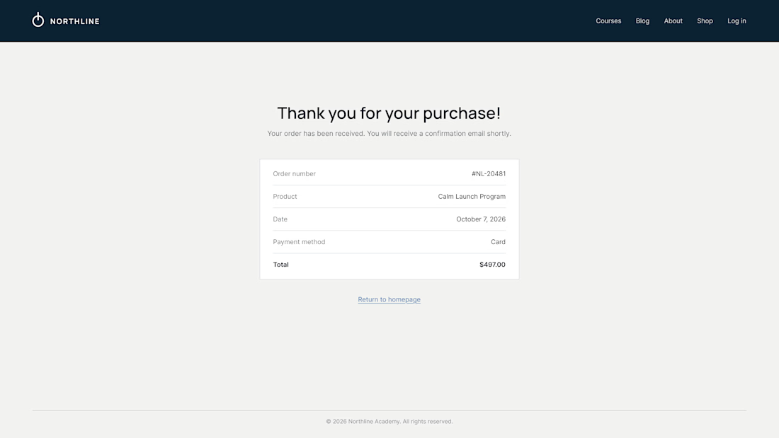
What does your customer see 3 seconds after paying?
On most Kajabi sites it's a plain "Thank you for your purchase" and a receipt. It's the moment of highest trust, and the page offers nowhere to go.
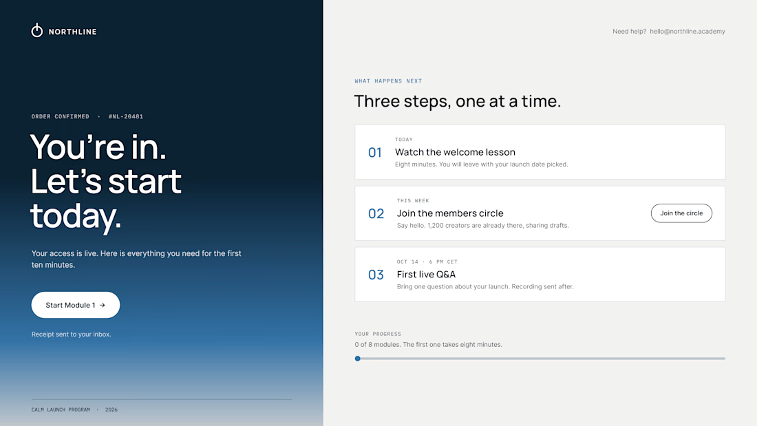
So we design the thank-you page as the first page of the course:
01 – One clear first step. "Start Module 1" sits above everything else. Momentum beats confirmation.
02 – A visible "what happens next". Today, this week, the first live call, with a calendar button. Clear dates calm the doubts that come right after paying.
03 – Proof they're in the right place. A link to the community, a human email they can reply to, progress at 0 of 8.
The receipt still lives in the inbox. It just isn't the headline.
Same brand, same colors. The only difference is where the page leads.
What did the last thank-you page you saw actually ask you to do?


Love the focus on making the experience feel simple for users.

This is the kind of thinking that separates good checkout design from great product design. The thank-you page really is the highest trust moment, and leaving it as a dead receipt is such a missed opportunity. Do clients usually buy into the extra design work for this page, or do you have to sell them on it first?

Honestly, mine just said thanks and showed a receipt. Putting the first step above everything makes sense.
The network for creativity
Join 1.25M professional creatives like you
Connect with clients, get discovered, and run your business 100% commission-free
Creatives on Contra have earned over $150M and we are just getting started








Related posts


new work is live. quite proud of this one!


I like this


End of an era.
After 3 good years on Framer, we moved
@designme to our own stack.
Framer got us far, and I'd still recommend it for a lot of teams.
But the more we grew, the more we needed control: over the code, structure and speed of testing and shipping new things.
So, we rebuilt everything from scratch in Astro.
It's the same setup we now build for our clients (which is exactly why we had to run our own site on it first).
Really proud of the team and how fast we're moving now.
DesignMe 2.0 is live ↓


Big move! Framer is great for speed, but having full control over the stack opens up so many possibilities.


Fresh case study 🚀🚀🚀
Brand identity for Peak, an all-in-one website builder for WordPress that I design and build. A four-letter mark, a warm paper-and-ember palette and one system that runs from the favicon to the packaging.


A four-letter mark that has to hold from favicon to packaging is a tough constraint. Did you draw one letterform first and build the other three from it, or design them together as a set from the start?


