The network for creativity
Join 1.25M professional creatives like you
Connect with clients, get discovered, and run your business 100% commission-free
Creatives on Contra have earned over $150M and we are just getting started
Back to feedPost
MODUS Build - Brand Identity & Web Design
Coming from an architectural background, I approached MODUS Build with a particular appreciation for precision, proportion, and thoughtful design.
The challenge was to create a distinctive identity that communicates these values without relying on conventional construction imagery.
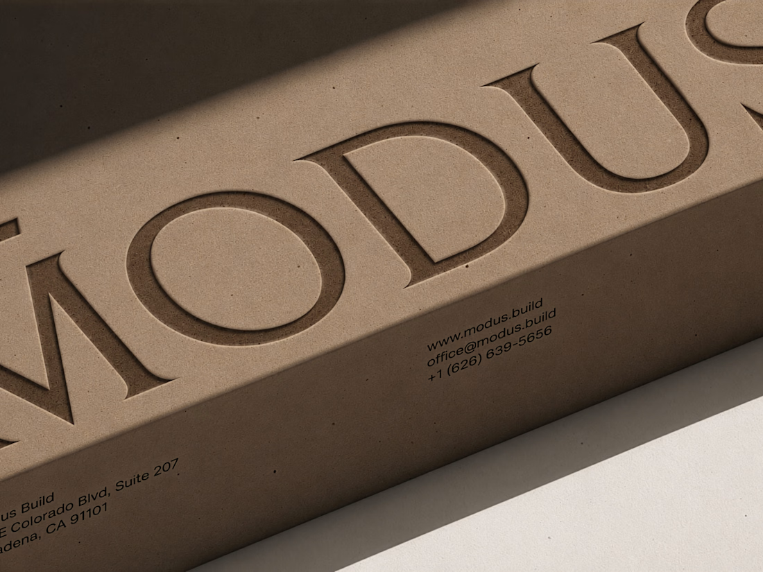
The concept was built around a simple typography idea: “The Measure of Good Building.” A small detail above the letter M represents a reference measure - a fixed length against which other dimensions can be measured. This subtle intervention gives the logo its meaning and connects it directly to the brand's philosophy.
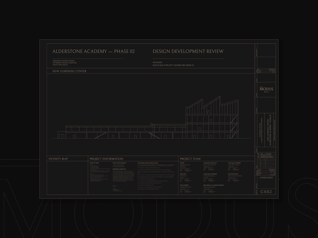
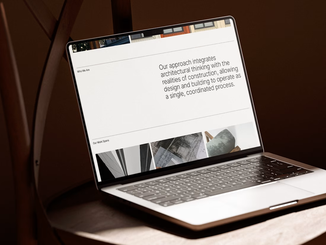
I carried this idea into a cohesive visual system, bringing together typography, graphic patterns, brand applications, and website design.
For me, the most rewarding part was creating something visually refined yet purposeful, where even the smallest detail has a reason to exist, keeping the same principle as in architecture.
#branding #logodesign #webdesign



Incredible work!

Thank you so much Bella😊

Thanks Alaa 🙌

The architectural precision really comes through, especially in how the identity carries over into the web design.
Hvala Senade 🙌

That reference measure detail above the M is such a smart move. It gives the logo a story without leaning on tired construction imagery, which is exactly what the brief called for. You can feel the architectural thinking in how disciplined the system is. Did that small detail...
Thanks, Timothy! We thought about that during the process and covered it in the brand guidelines. We defined minimum sizes for both digital and physical use, so the full mark with the line above the M works down to a certain size. For smaller applications, we can simplify it to...

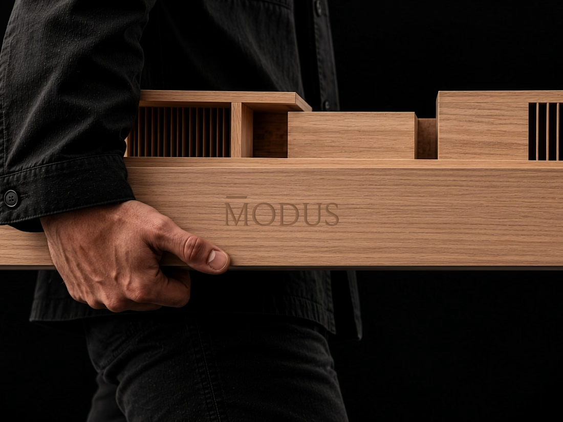
Great brand design Alexandar wooden style is so premium🔥🔥
Thank you Mostafa 🙌

amazing brand design work
Thanks Akinkunmi!

wonderful branding work
Thank you!
You are most welcome

The detail above the M is the whole thing for me — a reference measure that actually means something, instead of construction imagery for the sake of it. And you carried it through the typography, patterns and the site without it ever feeling forced. That's the discipline...
Thanks, really appreciate you noticing that! I guess my architectural background still plays a big part in how I think about design. I like when every little detail has a reason to be there.

Great work💯
Thank you!

Gorgeous 😍
Thank you Amrina 🙌

I think this is a unique creative direction for architecture brands and one worthy of emulation.
Well done!
Thank you Charles!

Thank you!

Great work
Thanks Noah

The reference measure above the M is a clever touch. Did that idea come first or after the logo was drawn?
Thanks! The measuring element actually came first, and I built the rest of the logo around it. I wanted it to be more than just a nice visual detail.

Yes. We defined minimum sizes for both digital and physical use, so the full mark with the line above the M works down to a certain size. For smaller applications, we can simplify it to just the letter or the line itself, depending on what works best.

That wooden business card looks incredible. It perfectly captures the idea of precision and physical structure. Pairing it with the blueprint graphics is a really smart way to tie the whole identity together.
Thank you Nazmul 🙌


Love the thought behind this identity. The subtle detail in the M makes the concept feel purposeful and well-crafted.
Thanks Kabir!

Thanks Yusuf🙌

Yeeeah, that really nice!
Thank you Vladyslav 🙌

It looks awesome, I’d love to see the full web design of this!
Thank you Iván. I'll definitely showcase it in more detail in a case study.

A measure mark above the M says architecture without drawing a building. That restraint is hard to keep across a whole identity.

Cool
Thank you!

Lovely work, Aleksandar!
Thanks Ezzat!

The debossed MODUS on kraft board and the hand carrying the wooden model are the strongest frames, and the architect background really shows in the restraint. Since the replies are mostly praise, here is the counterpoint: restraint this deep needs one risky move. Everything here...

Great work, Aleksandar! The small measurement detail above the letter 'M' is very clever. It's unique and adds a lot of meaning to the brand.
Thanks Nimesh!

The whole branding looks amazing! Clean, sleek, love it!
Thank you Roberto!

I really like the restraint here. The reference measure above the “M” is such a small move, but it gives the whole identity a very clear idea to grow from.
As a former architect as well, I love that you avoided the obvious construction language and let proportion, materiality and...
Hvala ti puno! Posebno mi je drago što je neko ko dolazi iz arhitekture prepoznao upravo te detalje. Mislim da nam arhitektonsko razmišljanje dosta pomaže i u brendingu, posebno kada je reč o odnosu forme, funkcije i smisla. Drago mi je da se to primeti u ovom projektu! 🙌

Love how the identity carries all the way into the web design. The measuring detail on the M is the kind of small idea that makes the whole system memorable. Saving this one as a reference.
Thanks so much! I really wanted that little detail to become part of the whole identity, not just something that lives in the logo. And knowing you're saving it as a reference means a lot!

the measure typography idea suits an architect mindset. precise and clean
Thank you!

Love the thought behind the concept. The small details really make the identity stand out!
Thank you!
The network for creativity
Join 1.25M professional creatives like you
Connect with clients, get discovered, and run your business 100% commission-free
Creatives on Contra have earned over $150M and we are just getting started



Related posts

Ovéa — care with character.
One skincare identity across bottles, jars and tubes. I designed the wordmark, pink-and-cobalt packaging system, campaign applications and digital mockups, then brought the collection into motion.
A consistent visual language, with room for each product to feel individual.
View the full case study. Building a skincare brand? Let’s talk about your identity and packaging.

Love the colour direction and the visual language. Everything feels so well thought out. The overall look is beautiful.


Amazing design!


Meet the Mental Reps squad!
We got a chance to bring these seven characters to life, including building a fully custom Shopify store for Mental Reps Co., a performance-psychology brand that teaches kids the mental game.
Each one lives in mentalrepsco.com
Big feelings, tiny monsters.


Love the concept and illustration style here. Making complex emotions friendly and tangible for kids is tough, but this squad nails it effortlessly. The branding looks super playful and clean!