The yapping platform built for Gen Z. One home. For all of it.
Chirag Mahajan
Yapster
The yapping platform built for Gen Z. One home. For all of it.
The Problem
Gen Z does not communicate in straight lines. We send 15 messages in a row. Drop a photo mid sentence. Jump between six topics in one voice note. But every chat app still hands you the same text box from 2012.
On top of that, content and messaging were always split across different apps. Instagram for content. WhatsApp for texting. YouTube for long form. You had to fragment yourself just to exist fully online.
Nobody built one home for all of it. That was the gap. That was why Yapster exists.

Research
I did not start in Figma. I started in conversations. One on one interviews with real Gen Z users, not surveys. Every single person said the same thing back to me in different words: nothing feels like it was built for us.
When every interview sounds the same, that is not coincidence. That is a real problem worth building on.
I used Perplexity for market research, Claude for product thinking, and ChatGPT to pressure test assumptions. I mapped what existed, what had failed, and where the white space was. The finding was clear. Every platform was either built for content or built for chat. Nobody had done both in one coherent experience.
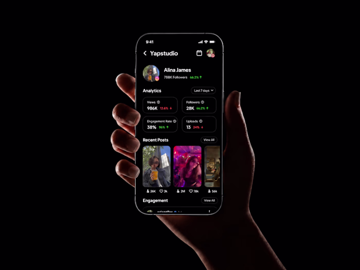
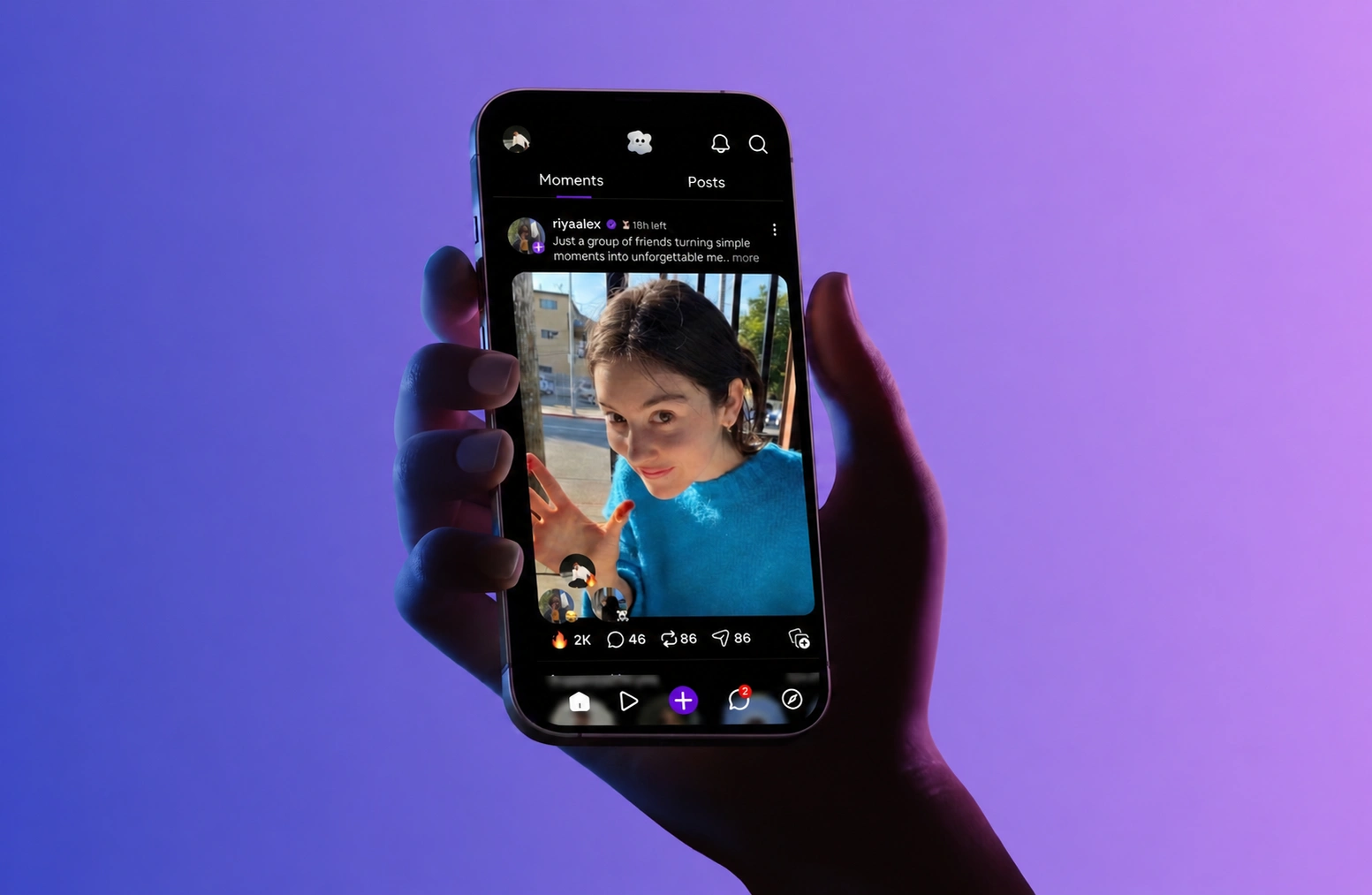
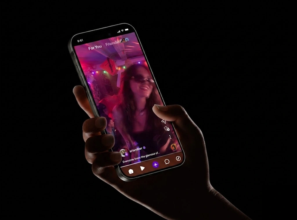
Moments Feed
Content on Yapster is full screen. No thumbnails. No cropped previews. You feel it before you think about it.
Two tabs separate what is temporary from what is permanent. Moments and Posts. Simple structure, powerful emotional difference.
YapChat
Group chats and personal conversations are separated visually. Every other app mixes them into one noisy list. This one decision makes the whole experience feel effortless.
The streak counter next to every conversation shows how many days you have been yapping with that person. It sounds small. Psychologically it is one of the most powerful things in the product. It keeps friendships alive without feeling like a reminder.
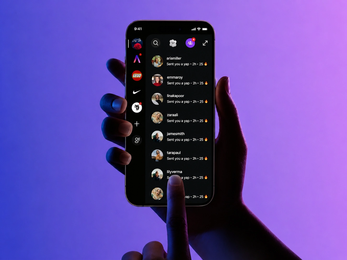
Yapchat
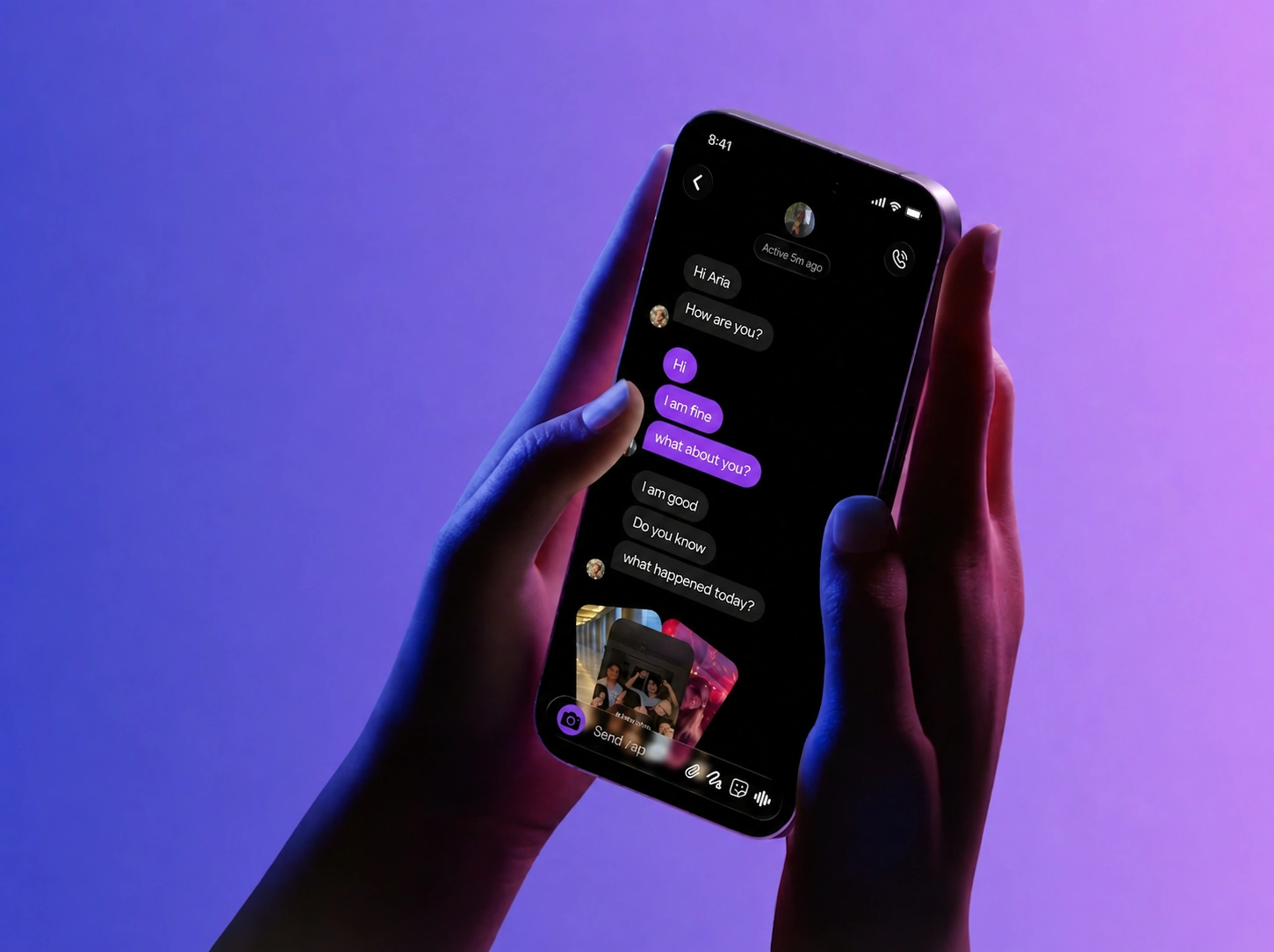
The Conversation
The biggest decision in the entire product.
When someone reads your message, their profile picture appears next to it. Not a double tick. Not a Seen label. A face.
That one change shifts the emotional experience completely. It goes from surveillance to presence. That is not just a design detail. It is a product philosophy.
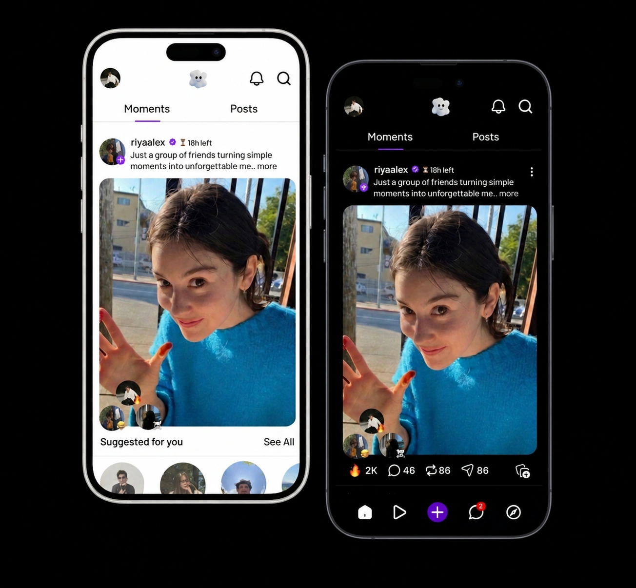
Why All Black
There is no light mode in Yapster. That was one of the first decisions I made and I never questioned it.
Black communicates premium and intentional before the user reads a single word. A Gen Z user opens the app and immediately feels it was built for them specifically, not adapted for them. That emotional response happens in the first two seconds and it is worth more than any onboarding screen.
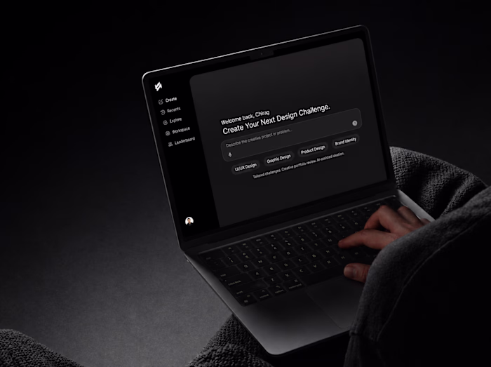
Design Process
I skipped wireframes entirely. When the vision is sharp, wireframes slow you down. I went straight into high fidelity in Figma and started making real decisions.
I redesigned every core screen five to six times. Not because the first version was broken, but because each version taught me something the previous one could not.
For inspiration I looked outside the industry entirely. Fashion, film, architecture, gaming. If you only study chat apps you will only ever build another chat app.
Results
500 early users. Zero paid marketing. Every single one came through word of mouth.
The feedback across the beta has been consistent. This finally feels like a platform made for us.
What I Learned
Before Yapster I was designing what I thought looked good.
With Yapster I was solving something I felt myself, confirmed with real people, and traced every single decision back to.
How a product works matters. How it feels matters more. But why it exists, that is what makes people stay.
Like this project
Posted May 10, 2026
Designed Yapster from zero. A content sharing platform for GenZ. Built the full UI solo — feed, moments, creator profiles, and the yapping experience.
Likes
0
Views
1
Timeline
Oct 7, 2025 - Ongoing