Design and Development of Yap Studio
Chirag Mahajan
YAP STUDIO
The all-in-one social media management tool built for creators.
The Problem
If you are a creator, your morning probably looks like this.
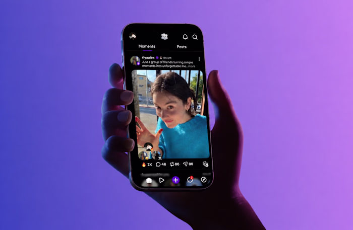
Open YouTube Studio. Check views. Switch to LinkedIn. Check engagement. Jump to Pinterest. Come back to YouTube to reply to comments. Somewhere in between you forget to post because you were too busy checking yesterday.
That is not a platform problem. That is a switching problem. And it kills your creative energy before the day even starts.
Every tool that existed was either too expensive, too bloated, or built for agencies managing ten clients. Nobody built something for a solo creator running their own presence. So I did.
Research
I did not need to interview strangers. I was the user.
Every pain point in Yap Studio came from something I personally experienced as a creator trying to manage multiple platforms alone. The switching. The missed comments. The analytics that tell you everything except what to actually do next.
I studied every major tool in the market before opening Figma. Buffer, Hootsuite, Later, native platform dashboards. What I found was consistent. All of them were built for volume, for agencies posting on behalf of brands. None of them were built for a creator who just wants to wake up, see their numbers, and get back to creating.
That gap was the entire brief.
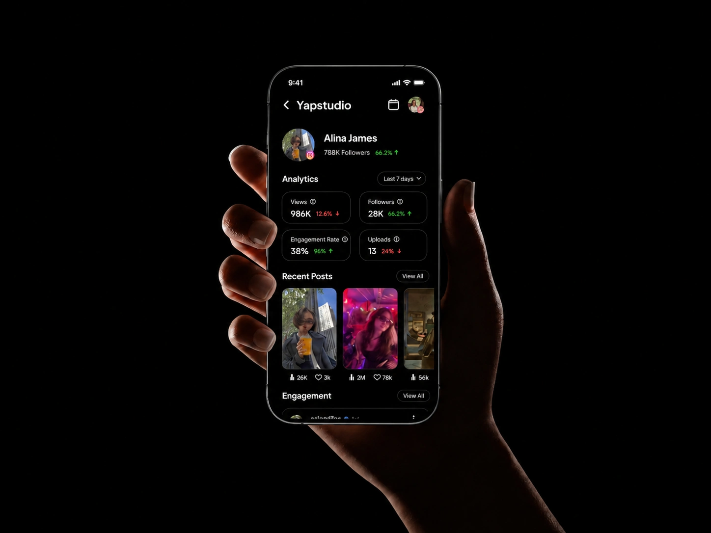
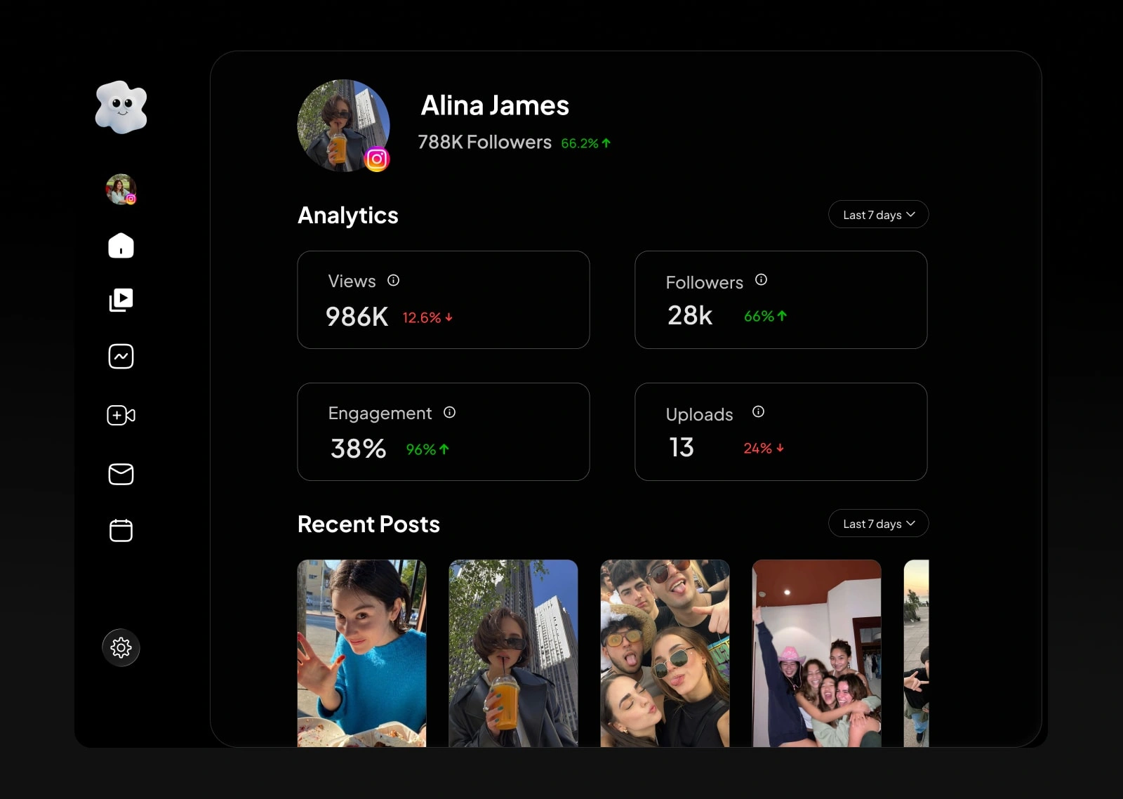
Dashboard
The first question I asked before designing this screen was simple. What is the one thing a creator wants to know the moment they open the app?
The answer was always the same. Am I growing?
So growth numbers became the hero of the dashboard. Nothing else competes for that first glance. No onboarding banners, no promotional cards, just your numbers front and center. The psychology behind this is straightforward. When the first thing you see makes you feel good about your progress, you engage more with everything else. I iterated on this layout until it felt less like a tool and more like a morning check-in with yourself.
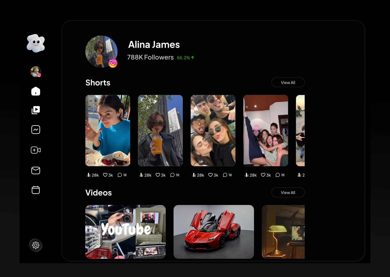
Content Overview
Every piece of content across all platforms, laid out in a visual grid. Shorts, videos, posts, carousels, all with engagement numbers sitting right below each one.
I looked at how creators already consume content before designing this. Instagram, Pinterest, YouTube. Always grids, never lists. So I brought that same visual language into Yap Studio.
The moment I saw my own content laid out in a grid with performance numbers below each piece, I instantly knew what was working and what was not. No reading required. That instant clarity was the validation I needed to keep this design exactly as it was.
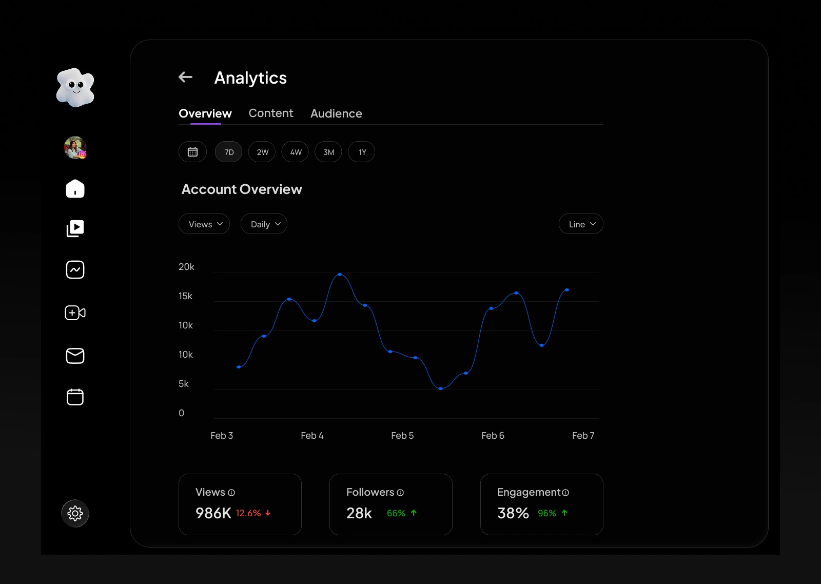
Analytics
A clean line graph. Three metrics. Views, followers, engagement. Time filters from 7 days to a full year.
I studied every analytics screen in the market before designing this one. All of them make the same mistake. They show you everything, which means they help you understand nothing.
I made the decision early to strip it down to three metrics because those are the only three that actually matter to a creator. Are more people watching. Are more people following. Are they engaging. I cut everything else. The result is a screen you read in under ten seconds and walk away knowing exactly where you stand.
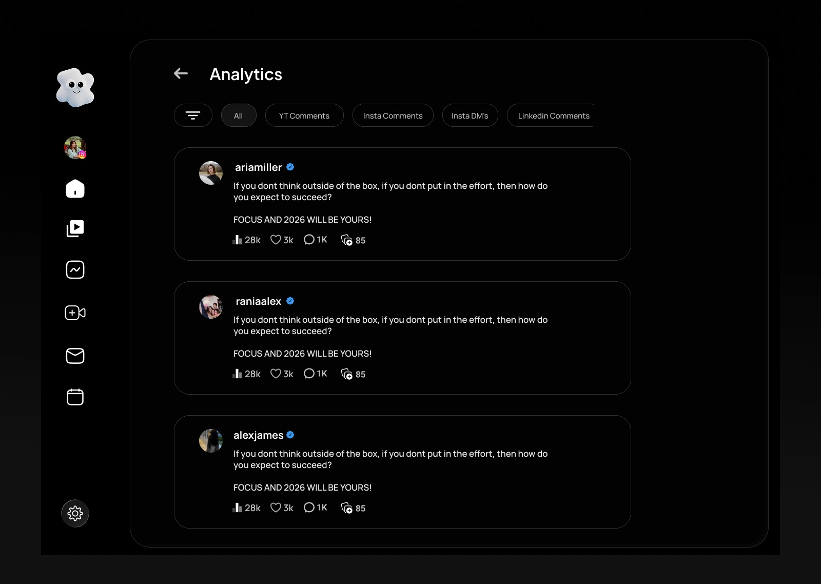
Engagement and Comments
Every comment and DM from every connected platform in one single feed. Filter by platform whenever you need to focus.
This was the screen I felt most personally about. As a creator I had missed real conversations just because they were buried inside a different app I forgot to check. This screen exists to fix that exact pain.
I explored a few different layouts in Figma but kept returning to a simple chronological feed because that is how creators already think about engagement. Newest first, nothing missed. The filter tabs at the top came directly from user conversations where creators told me they sometimes only want to focus on one platform at a time. So I gave them that control without making it complicated.
Process
This was my first desktop product. Everything before this was mobile.
Designing for a large screen with a sidebar, layered information, and multiple data states was a completely different challenge. I had to relearn spacing, hierarchy, and how much information a user can hold in one view before it becomes overwhelming.
I went straight into high fidelity in Figma without wireframes. The vision was clear enough that wireframing would have just added a step between thinking and deciding.
Results
Yap Studio is a fully designed product built from a problem I lived myself.
Every screen has a clear reason for existing. Every decision traces back to one question: what does a solo creator actually need right now, in this moment, to feel in control of their growth.
What I Learned
Before this I only designed for mobile. Yap Studio forced me to think at a completely different scale.
But the bigger lesson had nothing to do with screen size. It was this: the best products come from problems you have actually lived. I did not need months of research because I was the user. That made every design decision faster, clearer, and more honest.
Build for the problem. Not for the portfolio.
Yap Studio. Built for creators, by a creator.
Like this project
Posted May 10, 2026
Designed Yap Studio, a social media tool for solo creators to streamline content management.
Likes
0
Views
1
Timeline
Feb 5, 2026 - Ongoing