The Torch - Brand and Web design
Hosna Kachooee
Overview:
I had the exciting opportunity to collaborate with the Bergen Community College Student Newspaper team on a comprehensive rebranding and website redesign project. The objective was to modernize The Torch's visual identity, create a cohesive brand experience, and develop an intuitive online platform that resonates with the university's diverse student body.
Client Background:
Bergen Community College Student Newspaper, known as The Torch, is a vital source of information and engagement for the college community. The project was initiated to revitalize the brand and enhance the digital presence to better serve the dynamic interests and needs of the student population.
Key Goals:
Modernize Brand Identity: Develop a contemporary and cohesive visual identity that reflects the spirit of the university and appeals to the diverse interests of students.
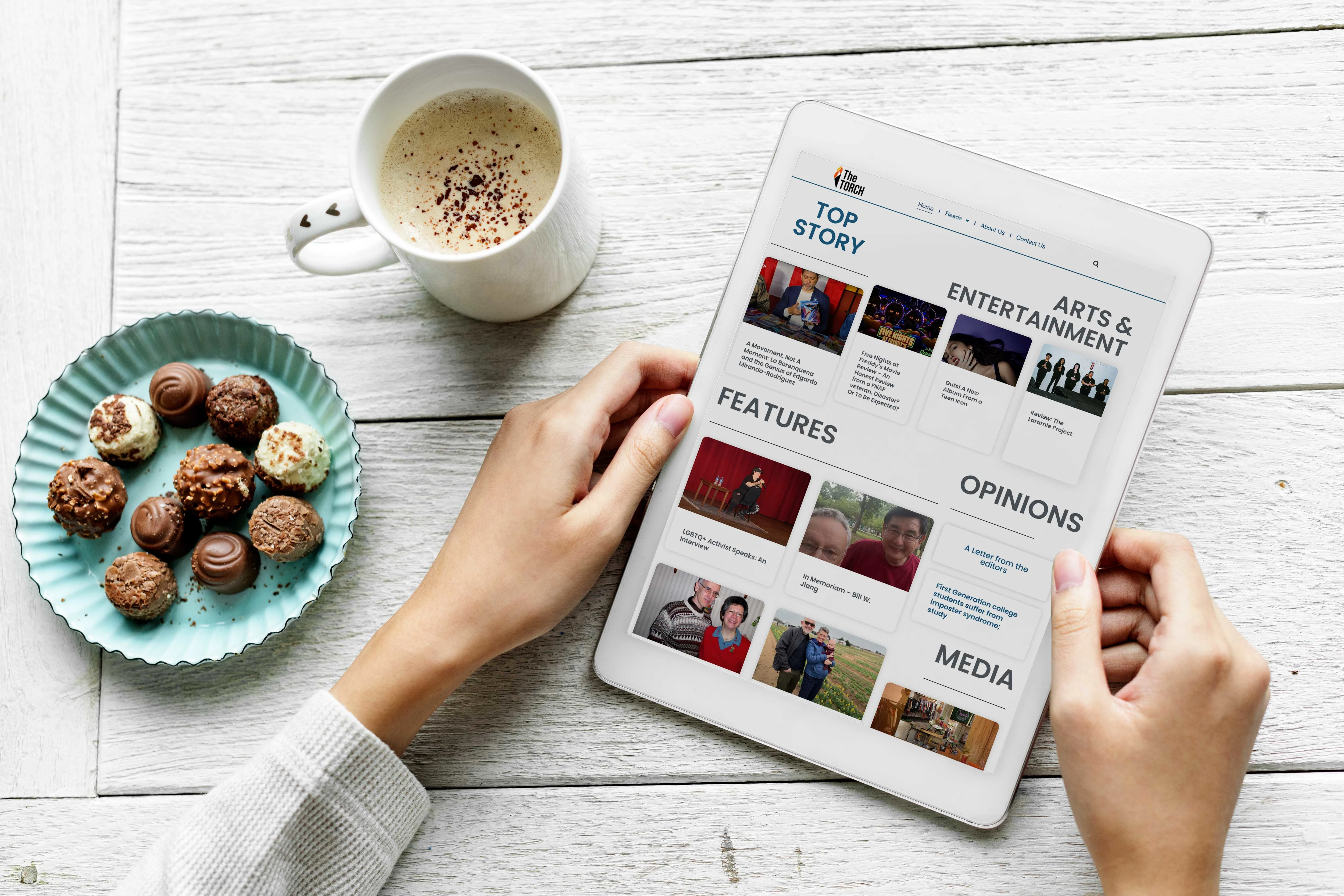
User-Centric Website Design: Redesign the website to prioritize user experience, making it easy for students to access news, articles, and relevant campus information.
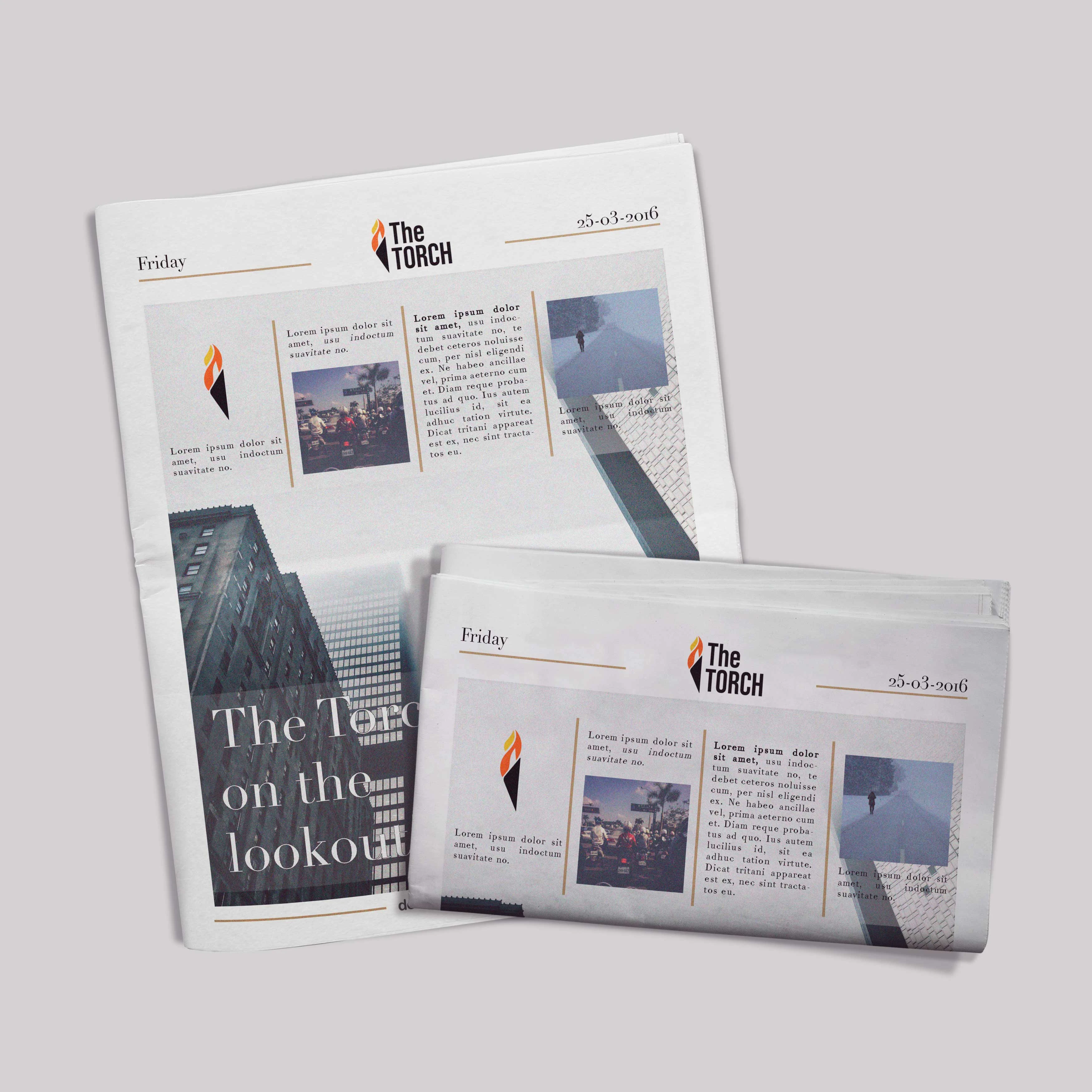
Newspaper layout Design: Design monthly issues for The Torch, and communicate with editors and photographers to get all needed content. Deliver layout file for print.
Enhanced Content Discovery: Implement intuitive navigation and organization of content to facilitate easy discovery of articles, events, and features.
Community Engagement: Create interactive elements and features that encourage student engagement, such as comments, polls, and social media integration.
Design Process:
Brand Discovery: Engaged with the student newspaper team to understand their vision, values, and the university culture. Conducted surveys and interviews to gather insights from the student community.
Visual Identity Creation: Developed a modern and versatile visual identity, including a refreshed logo, color palette, and typography. Ensured the design elements resonated with the vibrancy and diversity of the university community.
Wireframing and Prototyping: Created wireframes to outline the new website structure and user flow. Developed interactive prototypes to simulate user interactions and gather feedback from the student newspaper team and potential users.
Newspaper Print Design: Researched previous issues, and prepared a print layout on InDesign for printers to use after collecting content from the editor and photographers.
Community-Centric Features: Integrated interactive features such as comment sections, social media feeds, and polls to enhance community engagement. These features encourage student participation and create a sense of community around the newspaper.
Conclusion: This web and brand design project exemplifies my commitment to creating visually appealing and user-centric solutions. The rebranding of The Pulse not only revitalized its visual identity but also strengthened its connection with the [University Name] student community, positioning it as a vibrant and essential source of information and engagement on campus.
Like this project
Posted Nov 26, 2023
Redesigned their brand identity and website for a more engaging and modern look. Designed their newspaper layout for monthly prints.