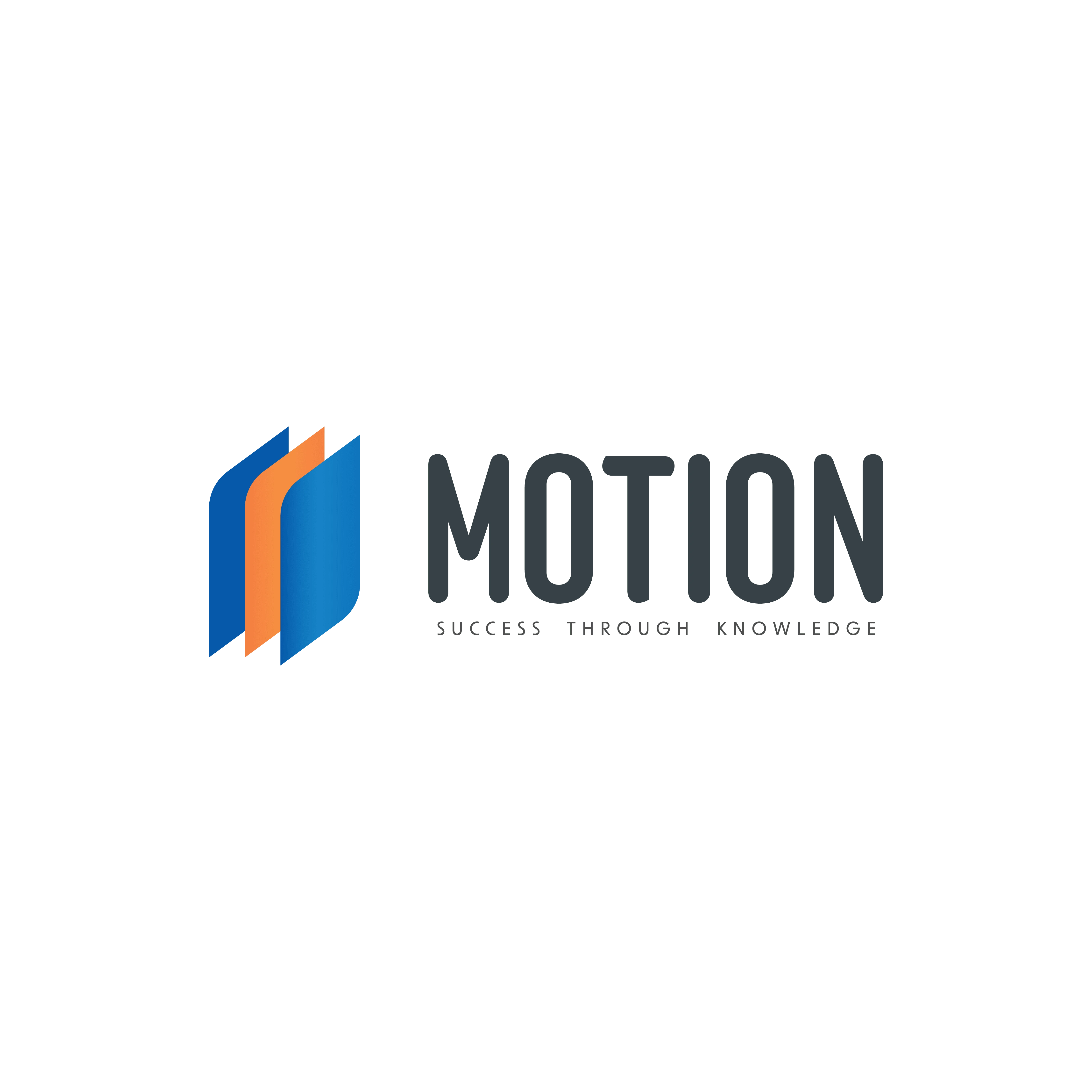
Motion Club - Logo Design
Hosna Kachooee
Overview:
I had the pleasure of collaborating with the Motion Club, a student organization dedicated to financial education and learning within the college community. The project involved creating a distinctive and versatile logo that captures the essence of finance, education, and community, reflecting the club's mission and values.
Client Background:
The Motion Club is a student-led initiative aimed at fostering financial literacy and creating a space for collaborative learning on financial topics. The organization needed a logo that would serve as a visual representation of its mission while resonating with the diverse student body.
Key Goals:
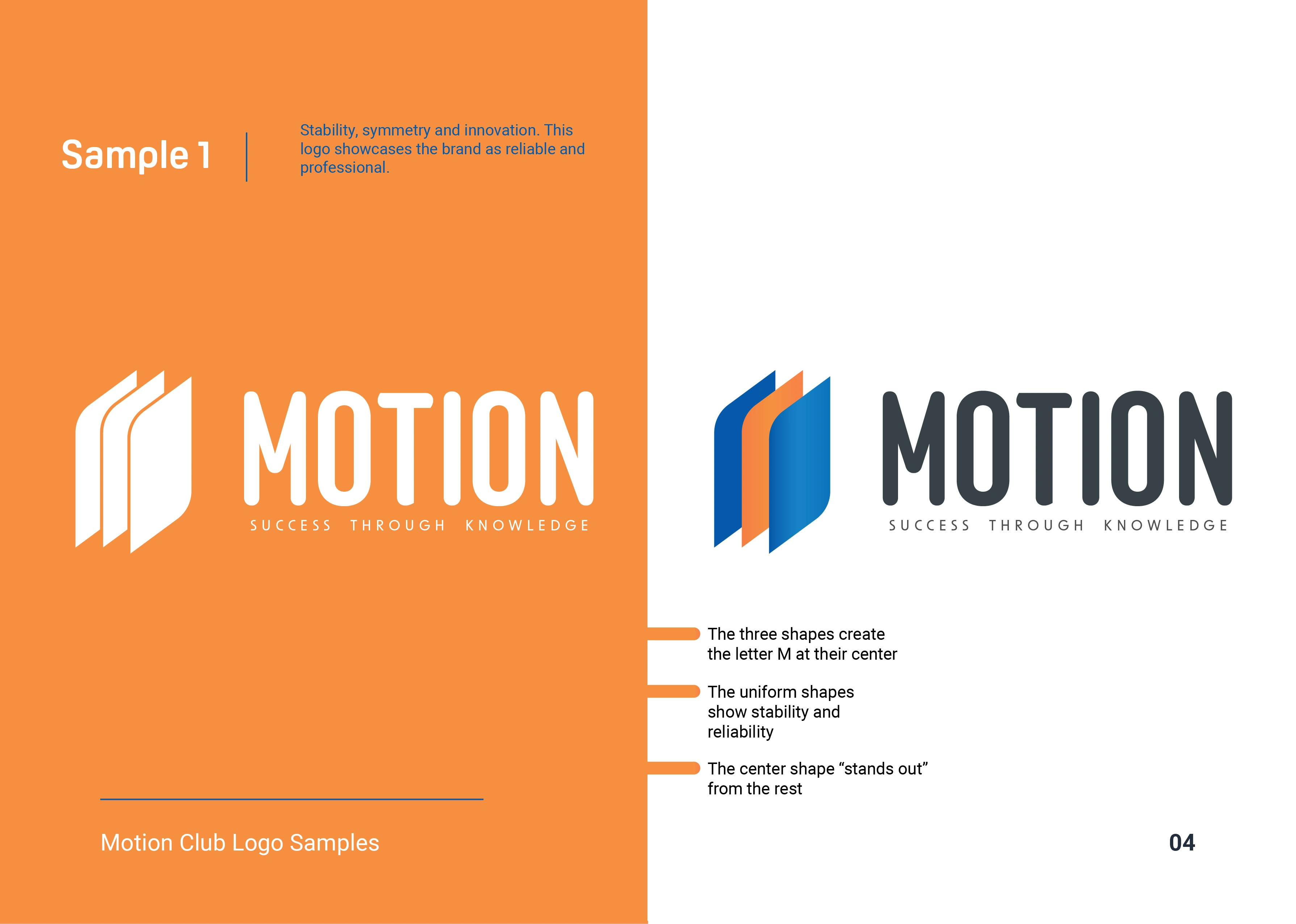
Distinct Identity: Develop a unique and memorable logo that sets Motion Club apart and establishes a distinct visual identity within the college community.
Symbolism of community and standing out: Incorporate elements that symbolize community and learning to communicate the dual focus of the club on financial education and collaborative learning.
Versatility: Design a versatile logo that can be used across various mediums, from digital platforms to print materials, while maintaining clarity and impact.
Inclusivity: Create a design that resonates with the diverse student body, promoting inclusivity and encouraging participation from students with varying levels of financial knowledge.
Design Process:
Research and Inspiration: Conducted research on financial symbols, educational icons, and design trends to gather inspiration and insights. Explored color palettes that convey professionalism, approachability, and a sense of community.
Conceptualization: Brainstormed and sketched various concepts, considering the combination of finance-related elements (such as currency symbols) and educational symbols (like books or graduation caps) to represent the dual nature of the club.
Feedback and Iteration: Presented initial concepts to the Motion Club team for feedback. Incorporated their input to refine and iterate on the designs, ensuring the final logo resonated with the organization's vision.
Color and Typography: Selected a color scheme that balanced professionalism and approachability. Chose typography that complemented the logo design, reflecting a modern and academic feel.
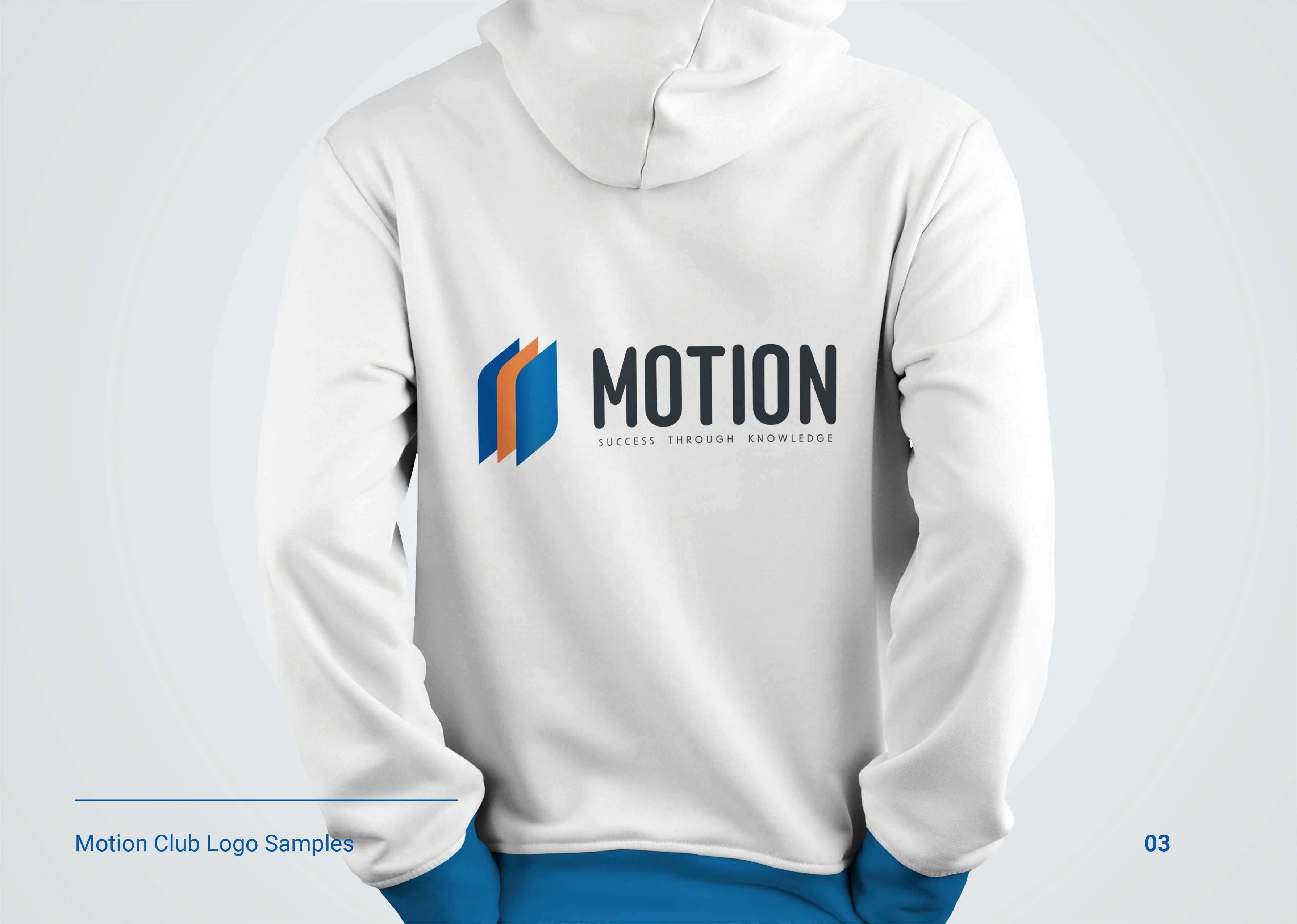
Finalization and Presentation: Presented the final logo design along with mock-ups to showcase its application on various materials and platforms. Ensured that the logo met the technical requirements for scalability and versatility.
Conclusion: This logo design project for the Motion Club exemplifies my ability to translate an organization's mission into a visually compelling and meaningful identity. The final logo serves as a powerful symbol that not only represents the dual focus of finance and learning but also fosters a sense of identity and community within the student organization.
Like this project
Posted Nov 26, 2023
Redesigned their logo for a more mission-aligned representation. Used elements such as innovation, letter M, community, and learning.
Likes
0
Views
5