EZ Wallet UX Design: A Journey of Innovation and Intuition
Section 1: UX Challenges and Solutions
Hey there, startup enthusiasts! Let's dive into the nitty-gritty of EZ Wallet's UX design. When we took on this project, we knew we had our work cut out for us. But hey, we love a good challenge!
Tasked Goals
Our mission, should we choose to accept it (and of course, we did!):
Create an app so intuitive, even your grandma could use it (no offense, grandma).
Make onboarding a breeze with creator videos guiding the way.
Design a dashboard that feels like home, even for crypto newbies.
Keep it simple, keep it clean, keep it user-friendly.
Boost those revenue streams without being sneaky about it.
Main Flows
We mapped out the main user journeys like a treasure hunt:
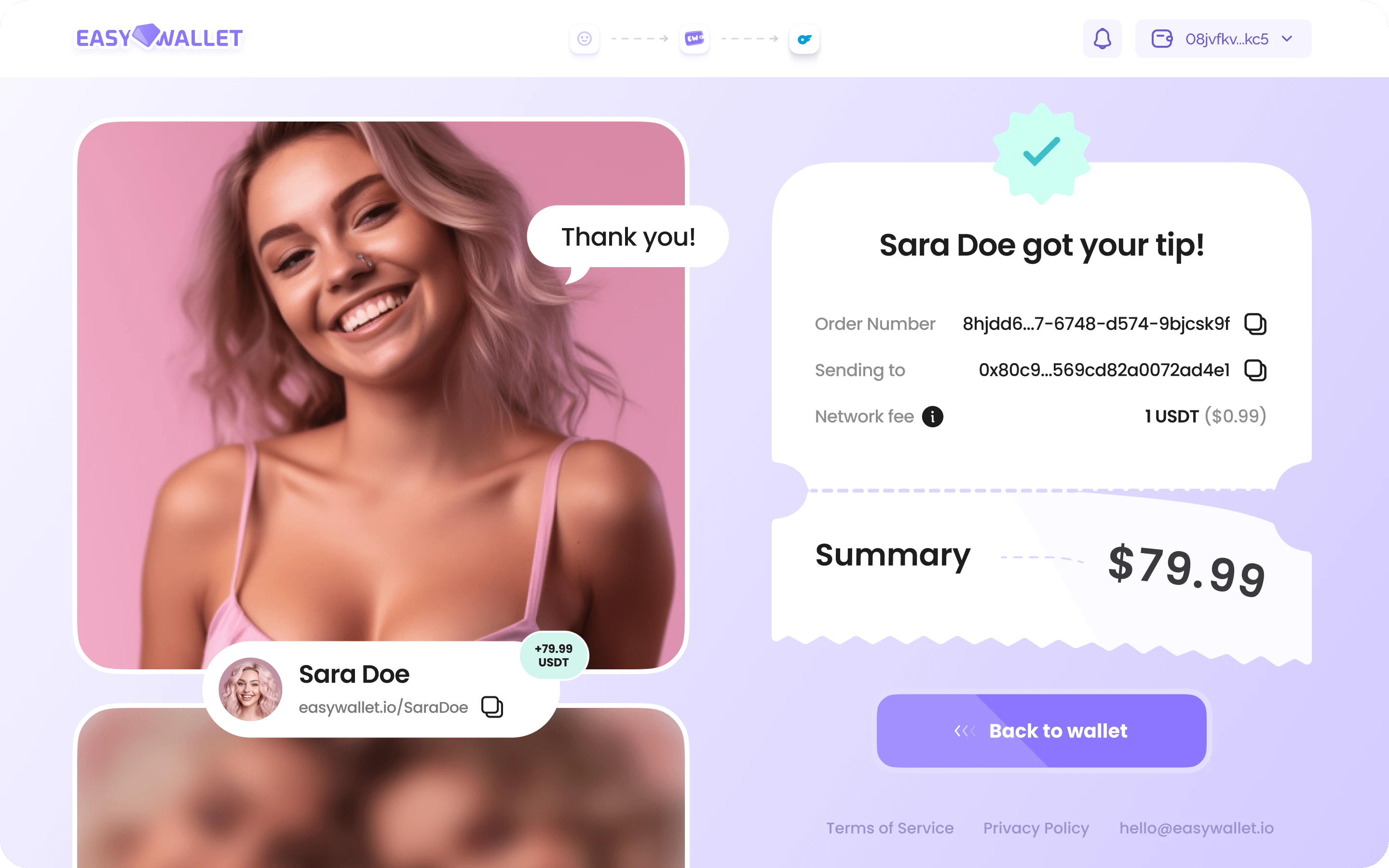
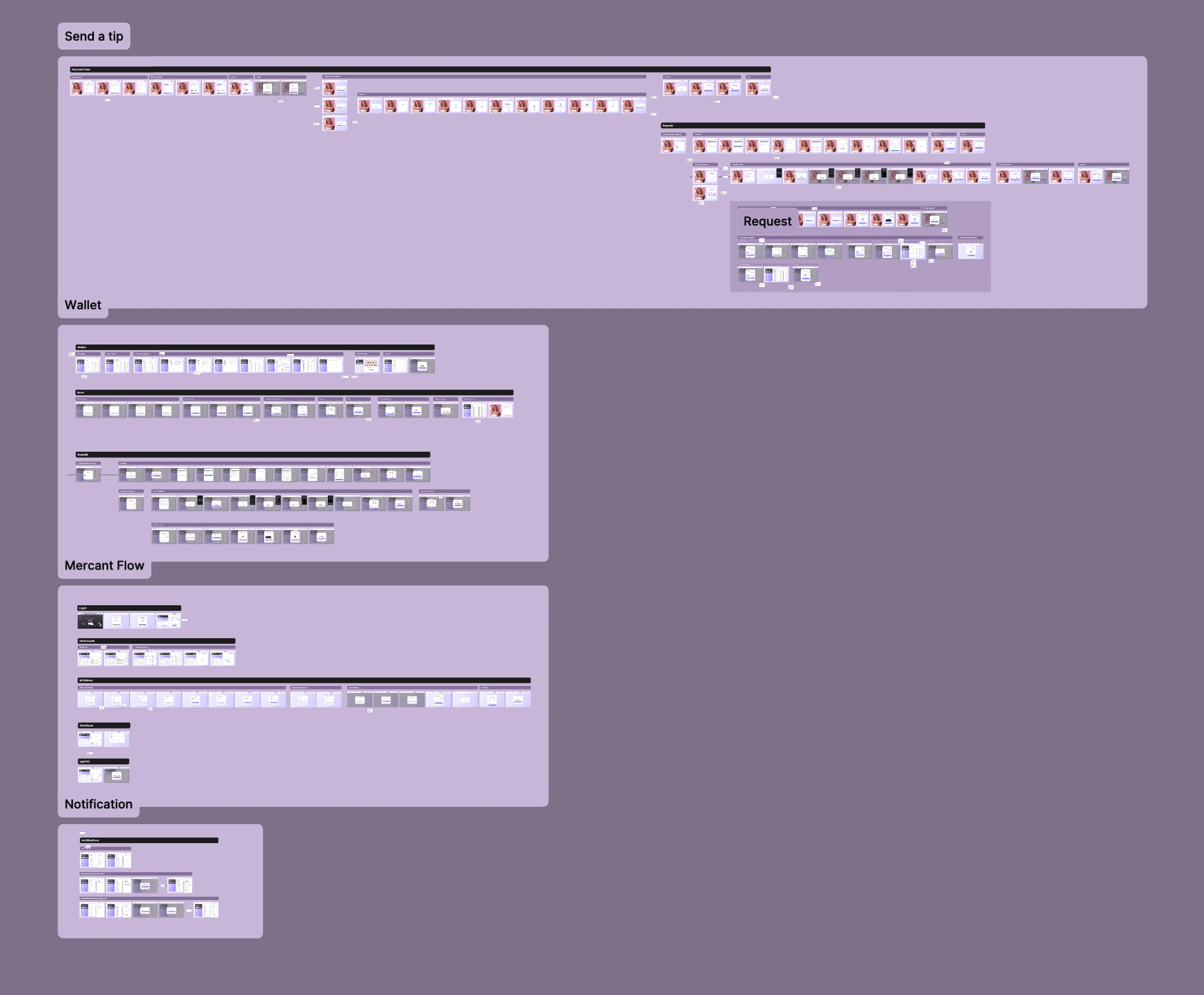
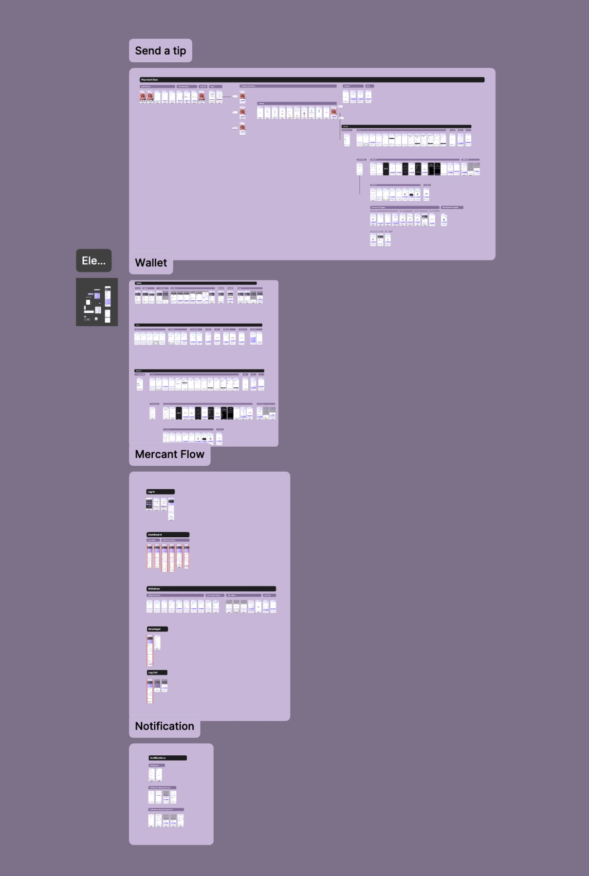
Tips: From entering amounts to confirming transfers, we've got it all covered.

2. User Wallet: Manage your funds, send, receive, and log out with ease.
3. Merchant's Wallet: Log in, check your dashboard, withdraw your earnings, and tinker with settings – it's all here!

These are developments that the client already had. We didn't draw and compose these logical flows.
Practical Solutions
Now, here's where the magic happens:
Preset 'chips' with suggested tip amounts – a little nudge goes a long way!
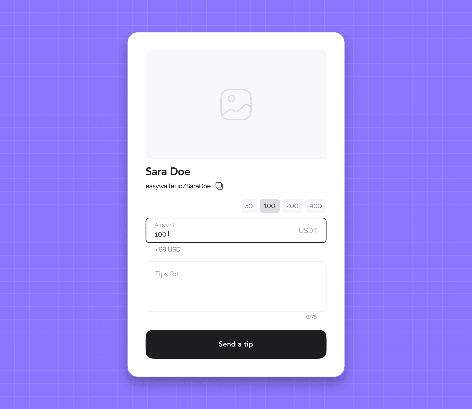
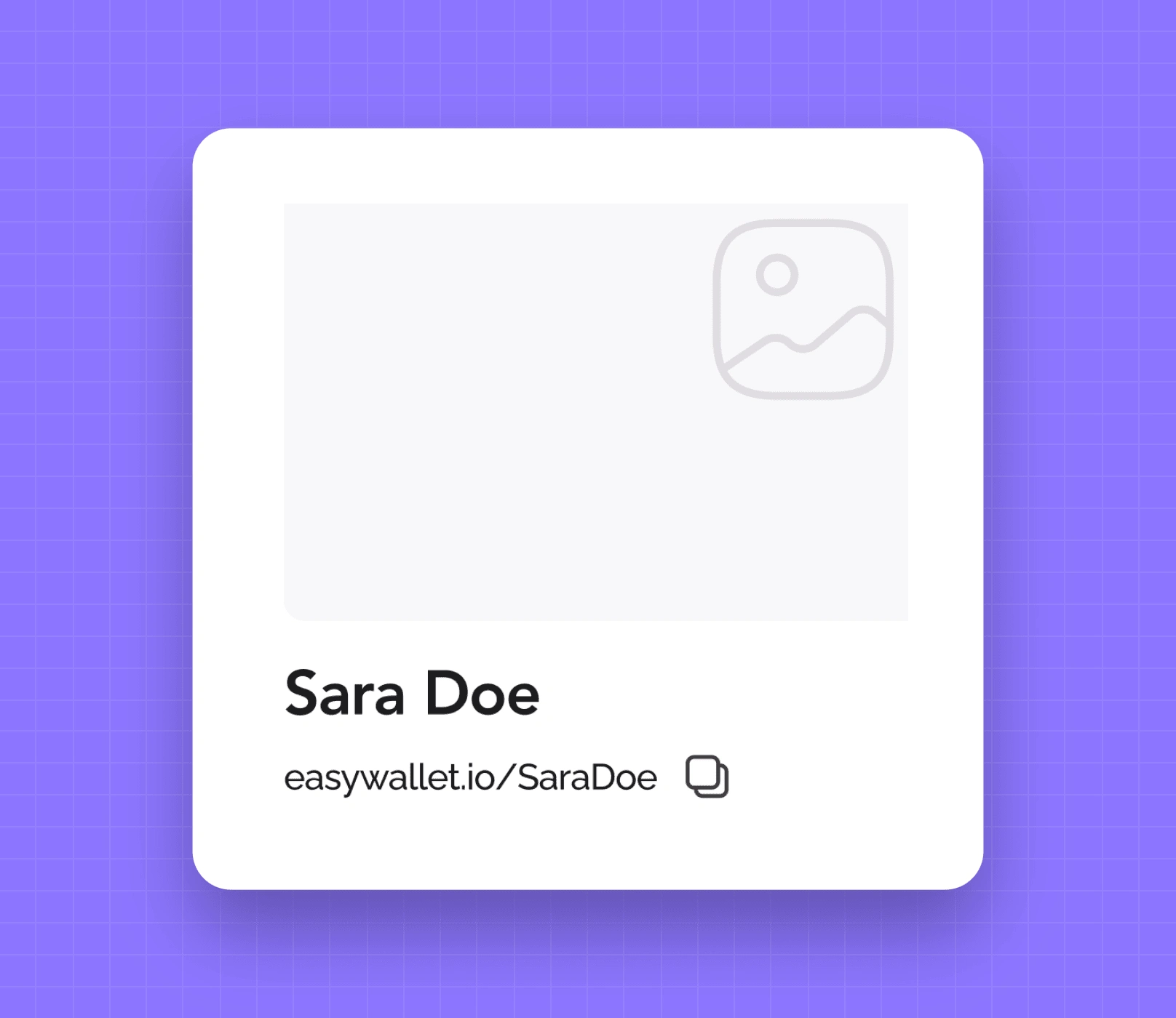
2. Cover photos for creators' tip pages – because first impressions matter.
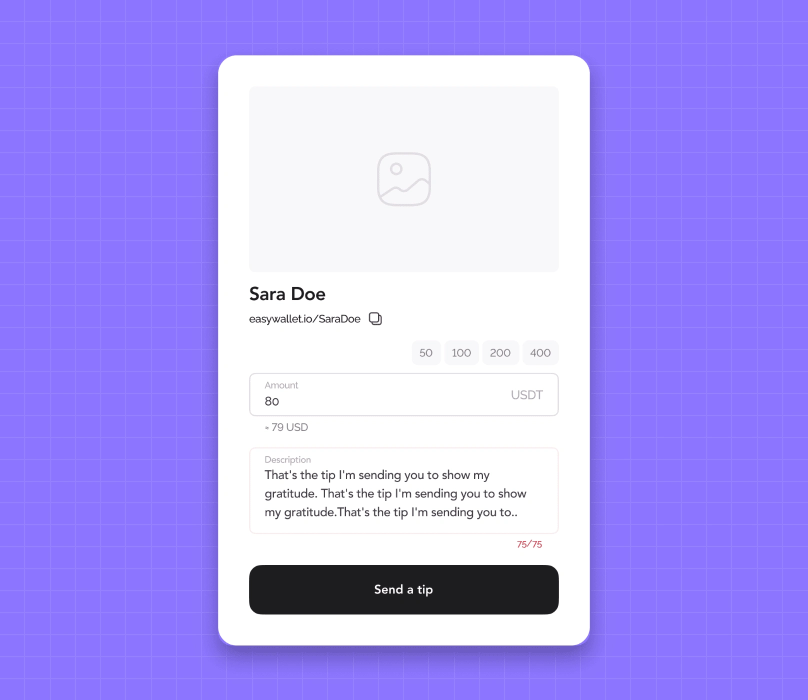
3. Personalized messages with tips – because who doesn't love a heartfelt note?
4. Simplified payment flow – three paths, zero confusion.
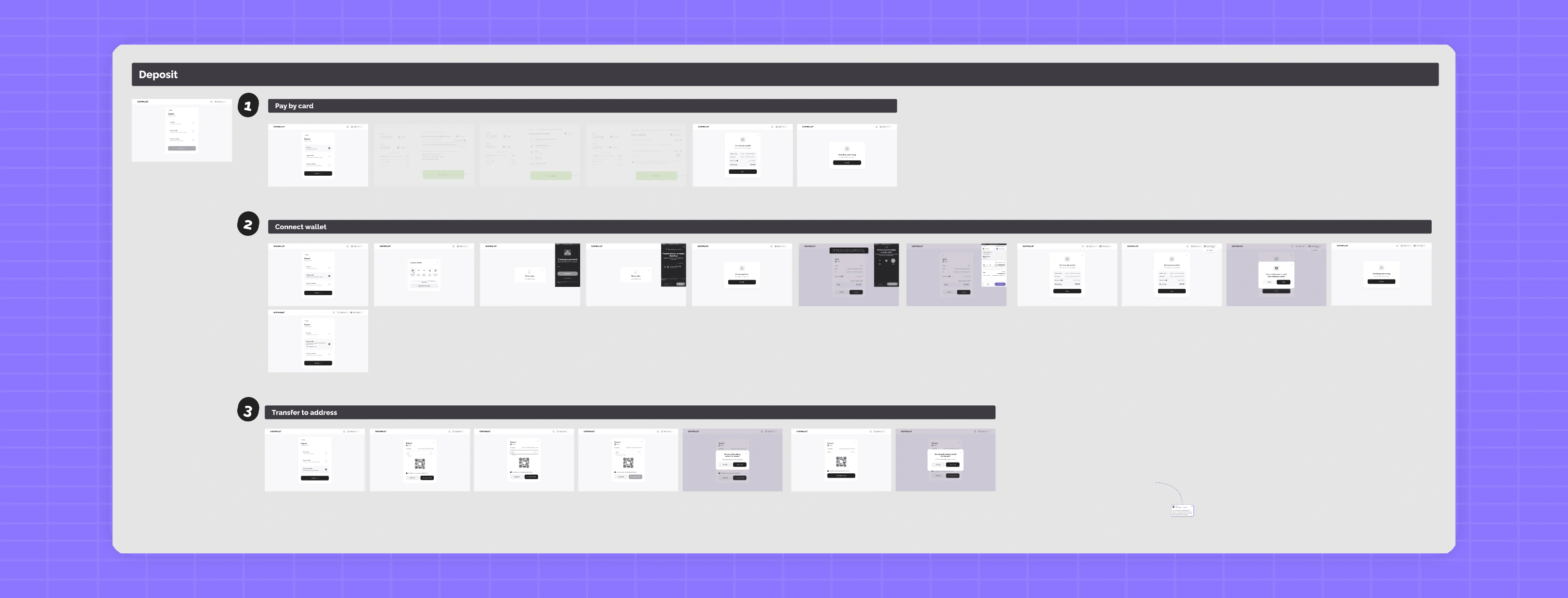
5. Clean layout – no clutter, no fuss, just the essentials.
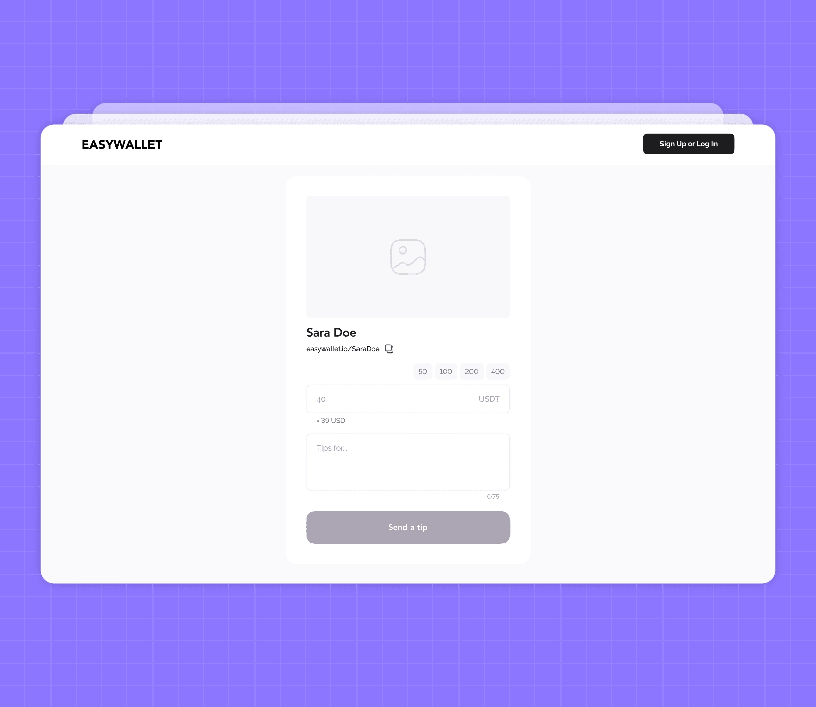
6. Familiar UX – like your favorite payment app, but better.
Cool UX Features
We couldn't resist adding some extra sauce:
Traffic quality metrics and donation stats for creators – because data is power!
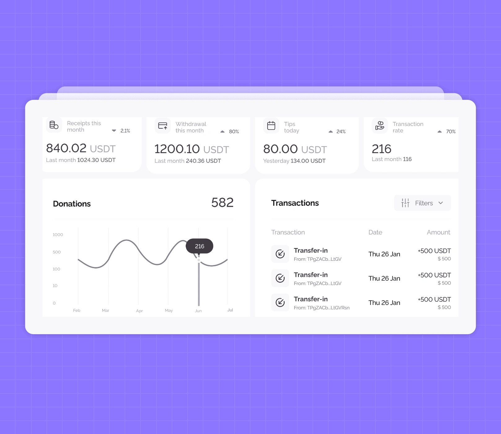
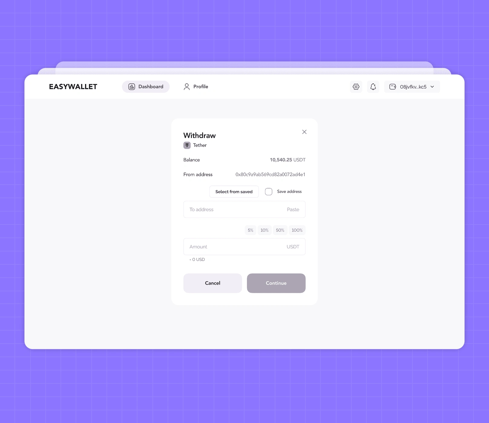
2. Prominent withdrawal feature – because who doesn't love seeing those earnings?
3. Dual connected wallets – seamless and flexible.
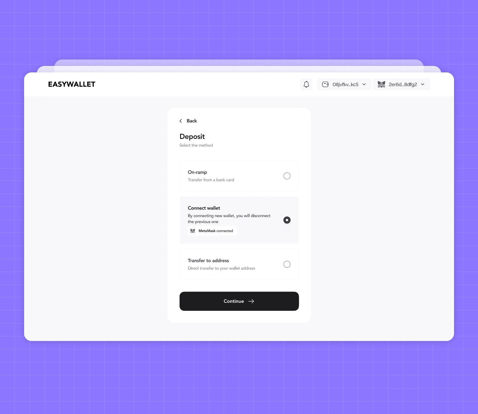
4. Dynamic 'Pay' button – low funds? No problem, just top up and pay!
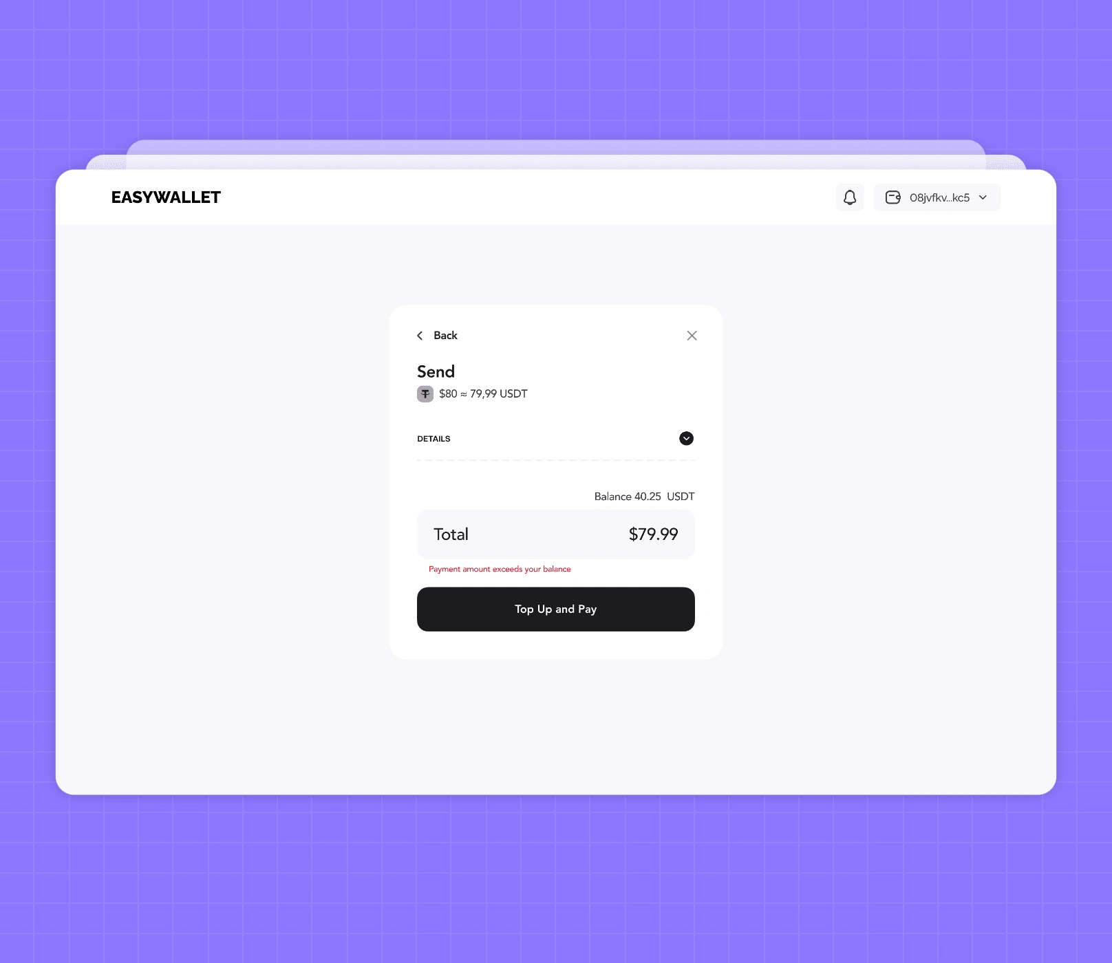
In this UX phase, we put on our thinking caps and got down to business. We balanced tech smarts with intuitive design, always keeping the end-user in mind. The result? An app that's not just functional, but also a joy to use. Stay tuned for the next chapter, where we'll bring this UX foundation to life with some jaw-dropping UI design!
Section 2: EZ Wallet UI Stage
Recap: UX Stage
Remember all that hard work we put into the UX? Well, it's time to take it to the next level! We've got the user paths mapped out, the success and error scenarios covered, and the UX concept locked down. Now, it's time to gather some design inspiration and make this baby shine!
Our UI Design Philosophy
At Unipaws, we don't just slap some colors on a UX prototype and call it a day. No sir! We believe in transforming layouts, elevating designs, and making user engagement our top priority. It's not just about making it work; it's about making it wow af!
UI Design Concept
Let's break it down!
First One
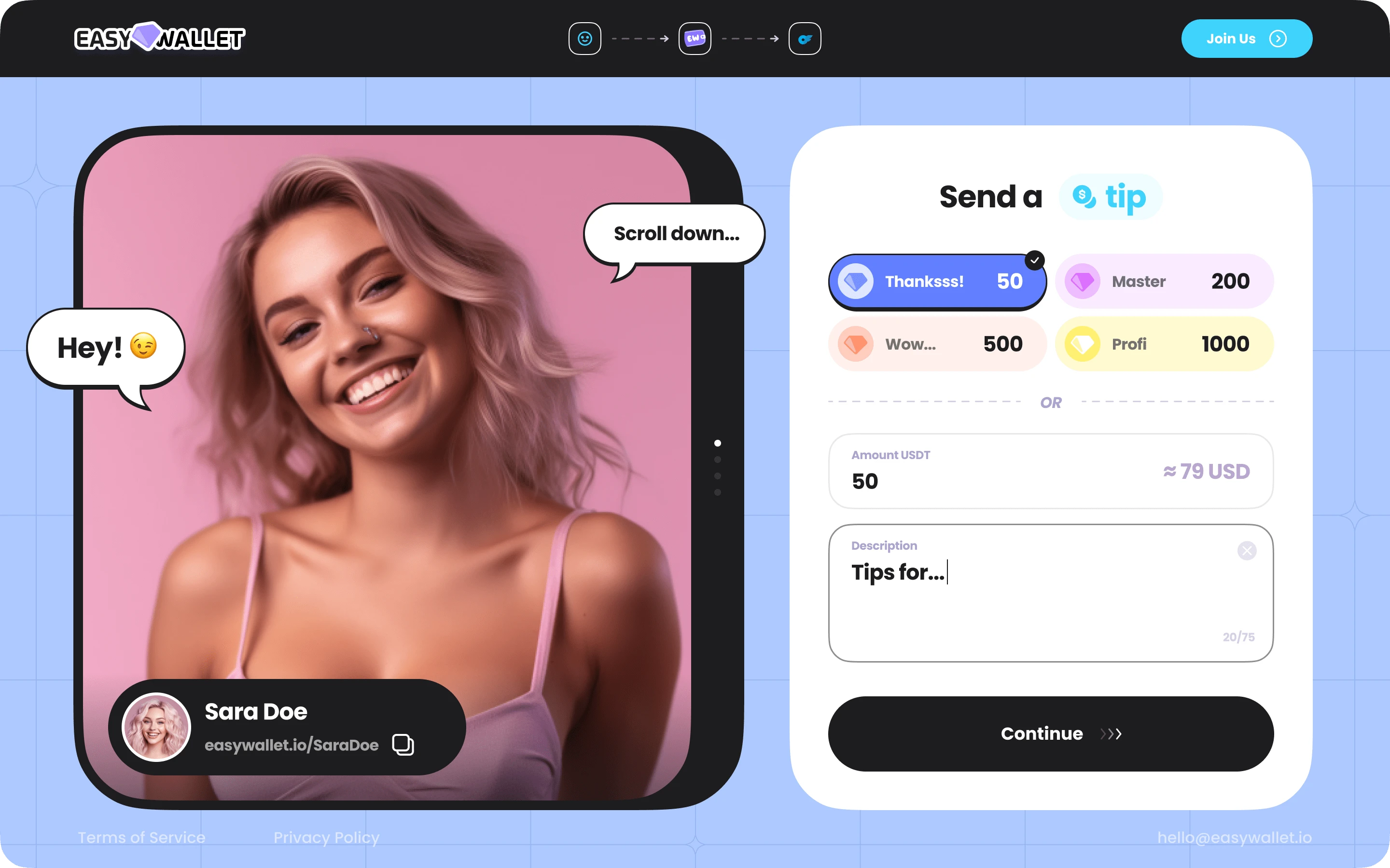
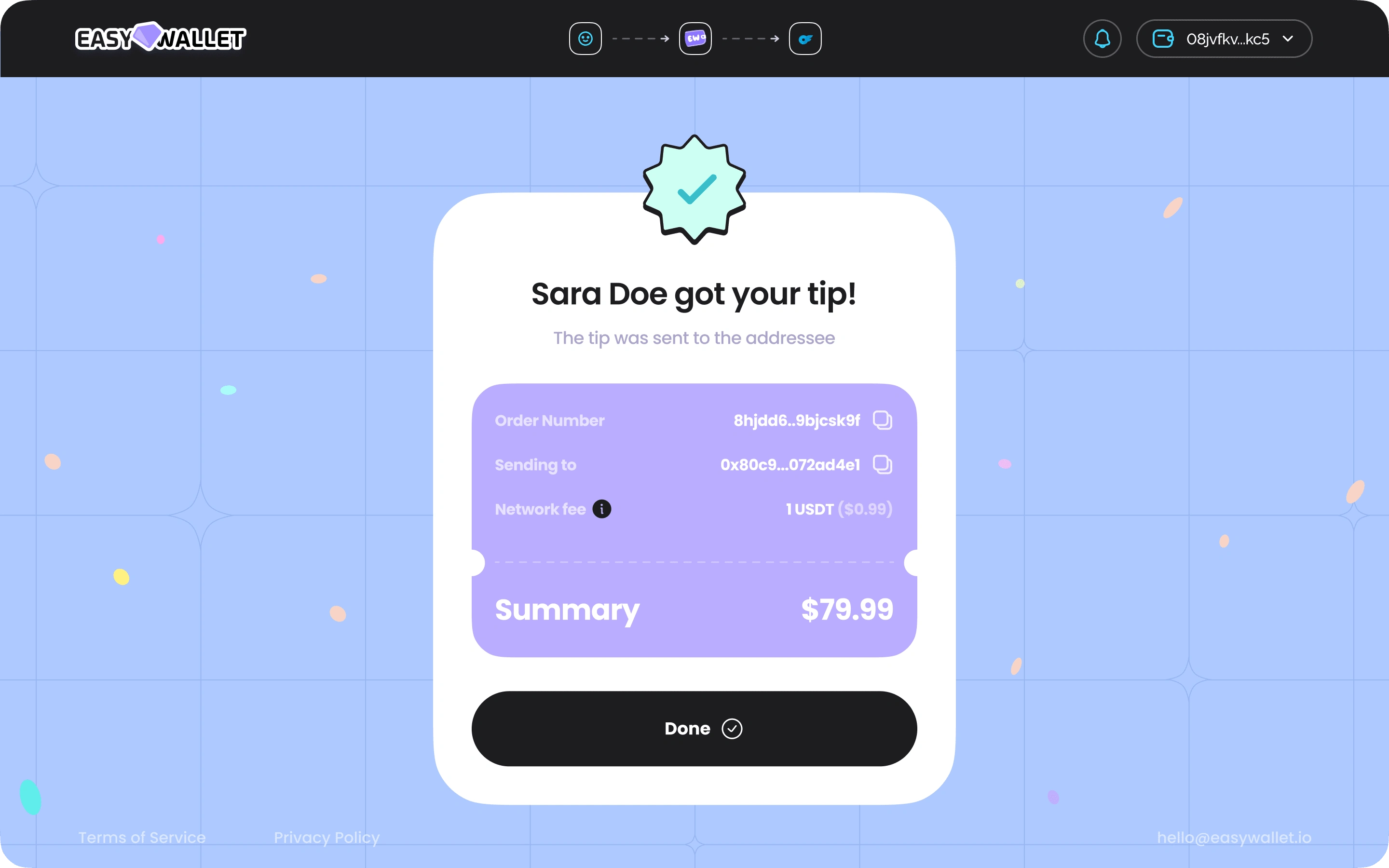
Second One
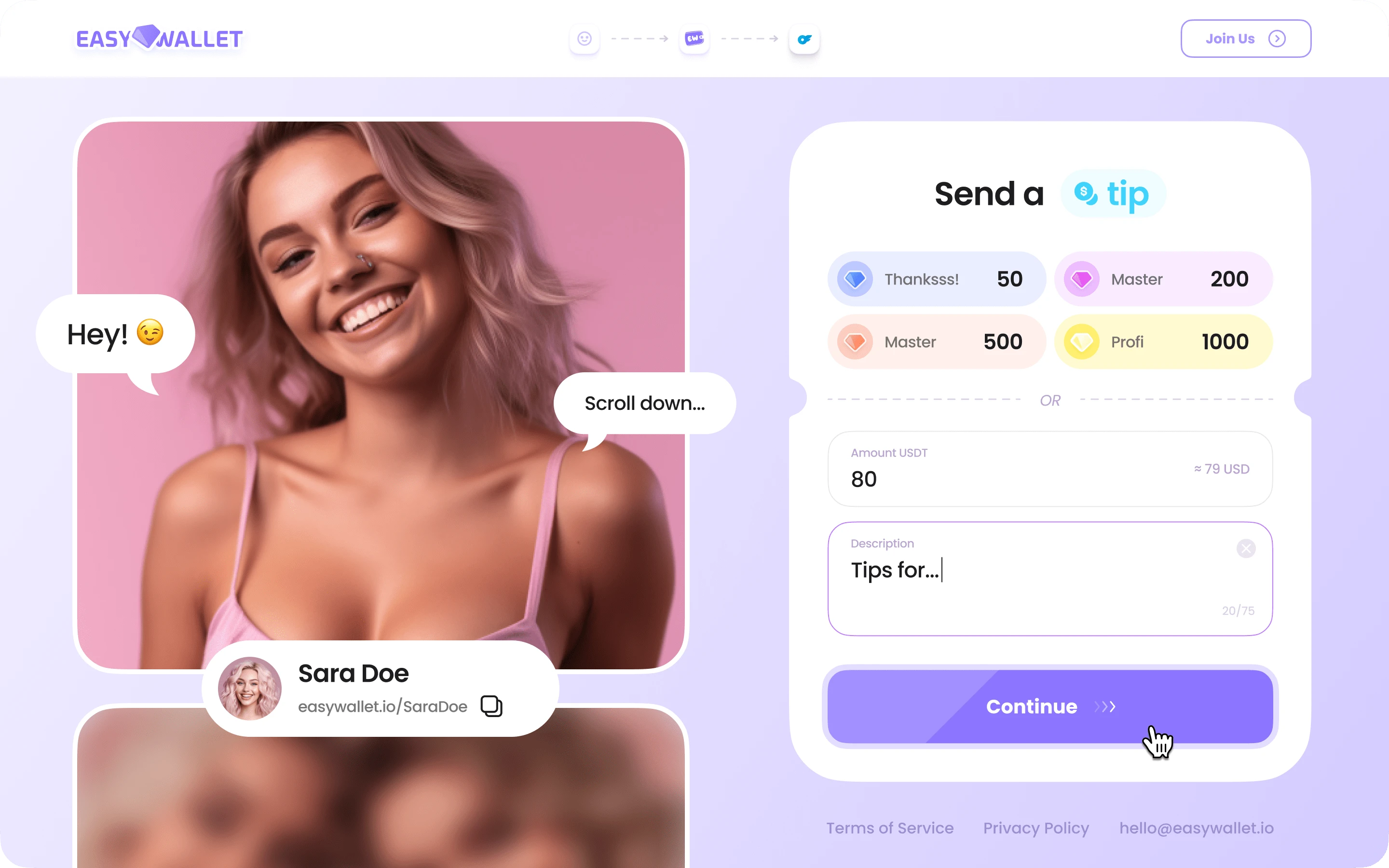
Design Foundations
We've got some key principles to guide our design journey:
Emotional Connection: Big, bold onboarding videos to create that personal touch.
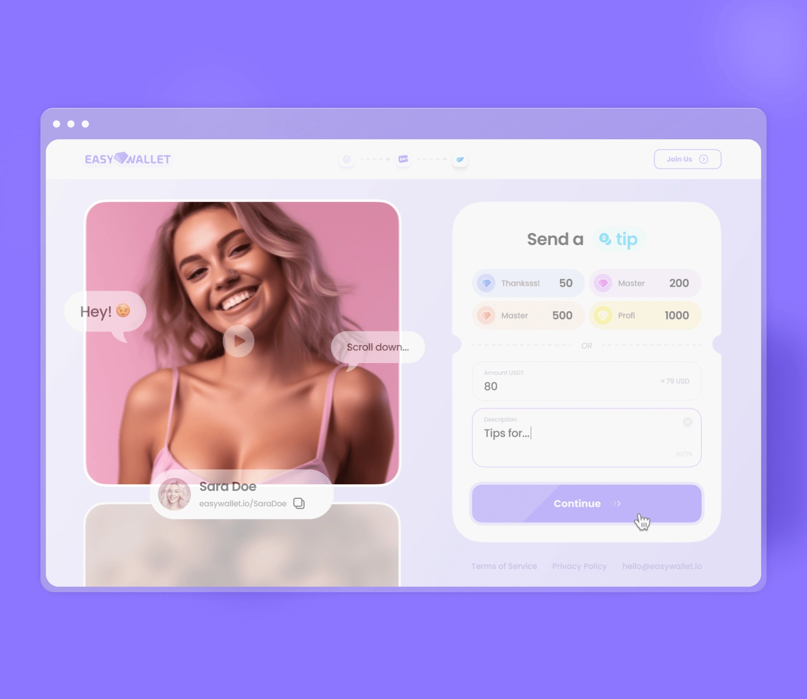
Simple Modules: Mix-and-match, flexible design for ultimate versatility.
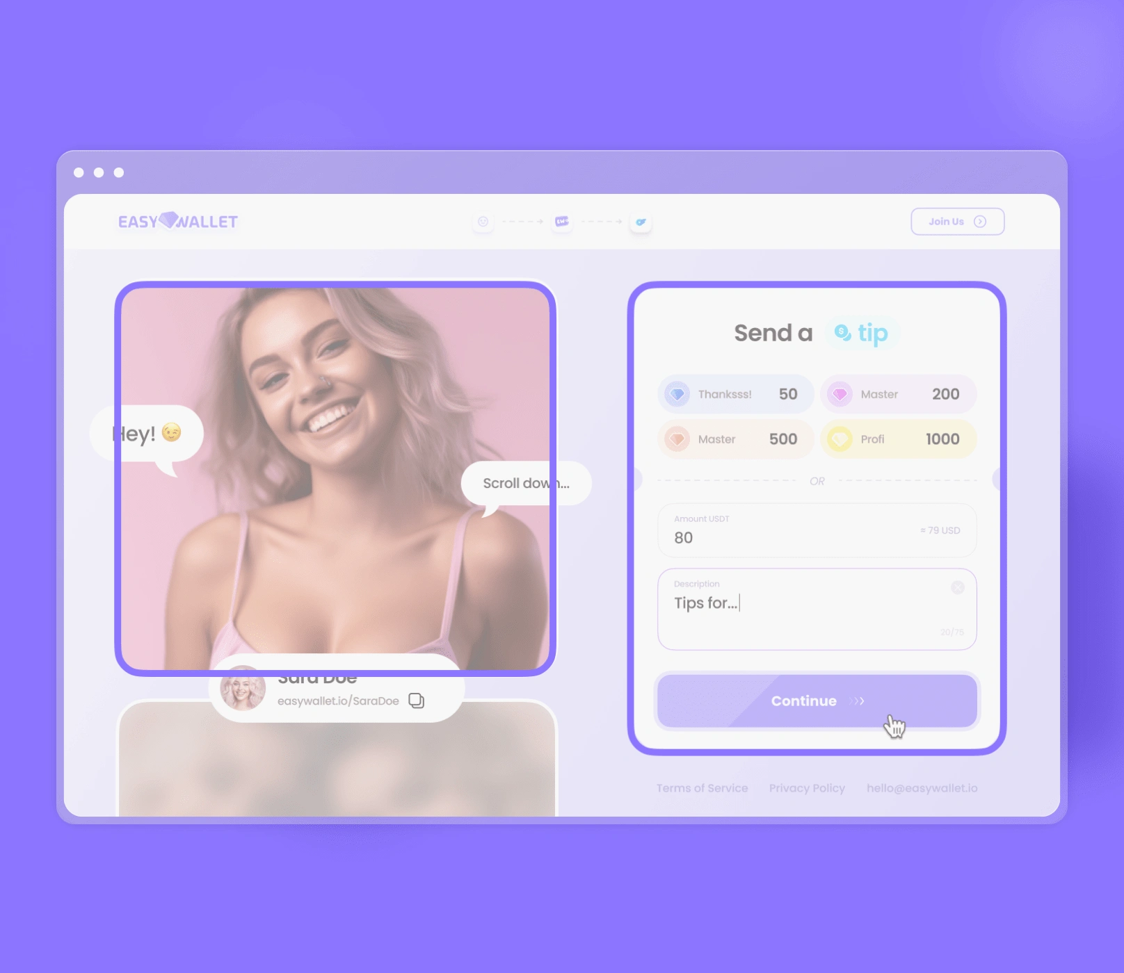
Interaction Emphasis: Making every message and tip a moment to remember.
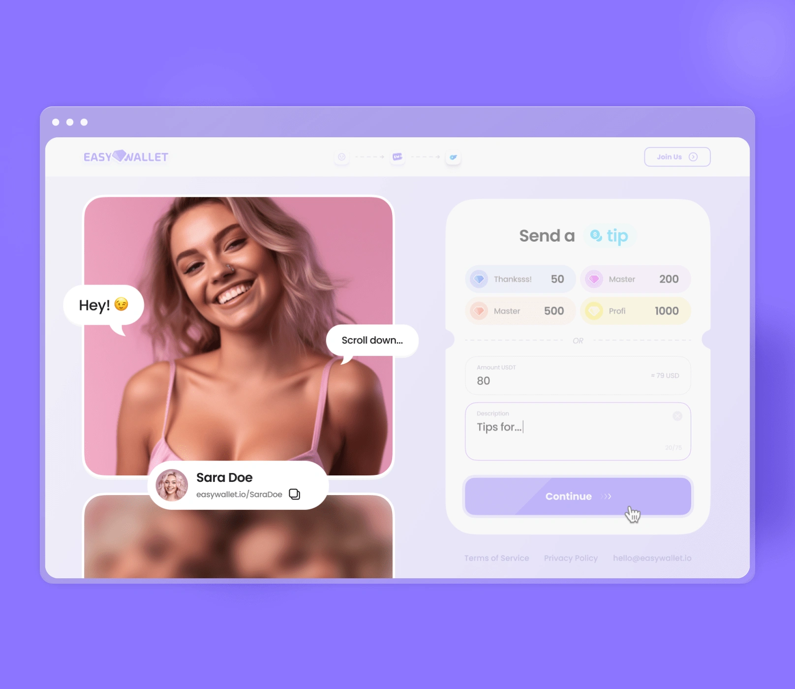
Intuitive Interface: So easy, a caveman could do it (no offense, cavemen).
Flexibility and Personalization: Because every user is unique.
Humanizing Digital: Bringing that human touch to the digital world.
Visual Style
We're going for a soft, friendly, and playful vibe. Think rounded forms, clean layouts, and a dash of decorative elements for that casual, inviting feel.
Color Scheme
Pastel colors are the name of the game, taking cues from OnlyFans without being too on-the-nose. Familiar colors, fresh context – it's all about building those associations!
Typography
Poppins is our typography soulmate:
Modern and geometric – check!
Readable and distinct – check!
Scalable across devices – check!
Versatile for headers and body text – check!
Professional and polished – check and check!
Interface Design
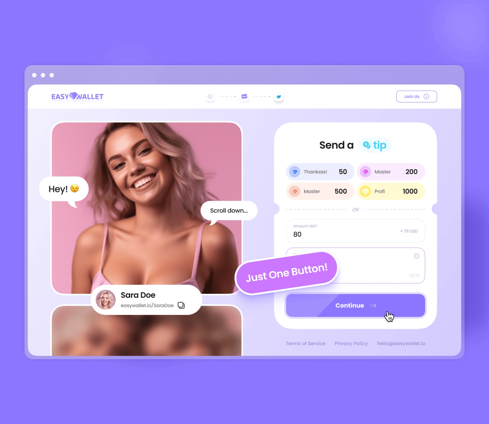
Those donation chips? They're not just amounts; they're vibrant, motivational modules. The header? Sleek and focused on the essentials. And that 'tip' word? Bright, iconic, and impossible to miss.
Cool Feature
Web3-auth grabs the user's avatar for a personalized touch, while basic video controls blend seamlessly into the overall composition.
Visual Hierarchy and Layout
Two parts, one flow:
Left side: Onboarding video for that emotional connection.
Right side: Donation form, designed to follow along with the video.
It's a layout that just makes sense, guiding users through the process with ease.
In the UI stage of EZ Wallet, we're not just designing an interface; we're crafting a story. A story of simplicity, engagement, and that fuzzy feeling you get when something just works. It's a journey we can't wait to take our users on!
Section 3: EZ Wallet Eco-System Design
UI Stage: The Heart of the Matter
We're diving deep into the core of EZ Wallet – the crypto wallet capabilities, the dashboard's elegance, and the smooth tipping mechanics that make our app tick.
A Wallet That Works
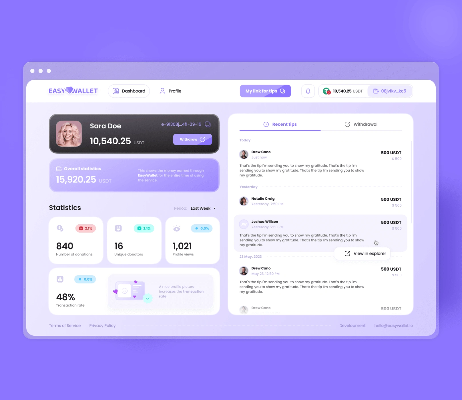
EZ Wallet isn't just a piggy bank for digital currency. It's a powerhouse for creators to manage, grow, and leverage their earnings from tips. It's about making cryptocurrency work for our users, not the other way around.
Dashboard Dreams
Numbers never looked so good! Our dashboard is where creators can see their growth, engagement, and earnings come to life with intuitive visuals and metrics that matter. It's not just data; it's a story of success.
Tipping Made Easy
Tipping on EZ Wallet is like sending a secret note, but with the power of a bank transfer. It's private, personal, and incredibly simple. No crypto know-how needed – our smart system handles the technicalities, so users can focus on the warm and fuzzies.
Seamless Integration
EZ Wallet isn't a standalone star; it's the glue that holds our app's ecosystem together. It makes transactions between users a breeze, leveraging the best of blockchain tech while keeping things familiar and user-friendly.
Why and How: The Method Behind the Magic
Why did we integrate the wallet so deeply? Simple: we believe in effortless interactions. How did we do it? By harnessing cutting-edge technology and user-centered design to make transacting a joy, not a chore.
In the grand scheme of the EZ Wallet ecosystem, every feature – from the wallet to the dashboard to the tipping mechanics – plays a vital role in amplifying the creator's journey. It's our love letter to the digital age, wrapped up in a secure, simple, and endlessly exciting package.
Desktop Design
Mobile Design
UI Kit

So there you have it, folks – a deep dive into the UX and UI magic that makes EZ Wallet tick. But we're not just here to brag; we're here to inspire! If you're a startup looking to make your mark in the world of digital transactions, take a page from our book:
Put your users first – always!
Keep it simple, intuitive, and engaging.
Leverage technology to enhance, not complicate.
Infuse every interaction with a human touch.
And most importantly, have fun with it!
At Unipaws, we pour our hearts into every project, and EZ Wallet is no exception. We can't wait to see how it revolutionizes the way creators and their supporters interact in the digital space.
So, if you're ready to embark on your own design journey, remember – innovation and intuition go hand in hand. Trust your gut, push the boundaries, and never settle for anything less than extraordinary.
And if you ever need a partner in crime, you know where to find us. Until next time, keep dreaming big and designing bold!
Like this project
Posted Jun 10, 2024
EZ Wallet UX/UI case study: user-friendly crypto tipping app with video onboarding, creator dashboards, & intuitive payments.
Likes
1
Views
46

