Multichain Web3 Projects Crypto Launchpad
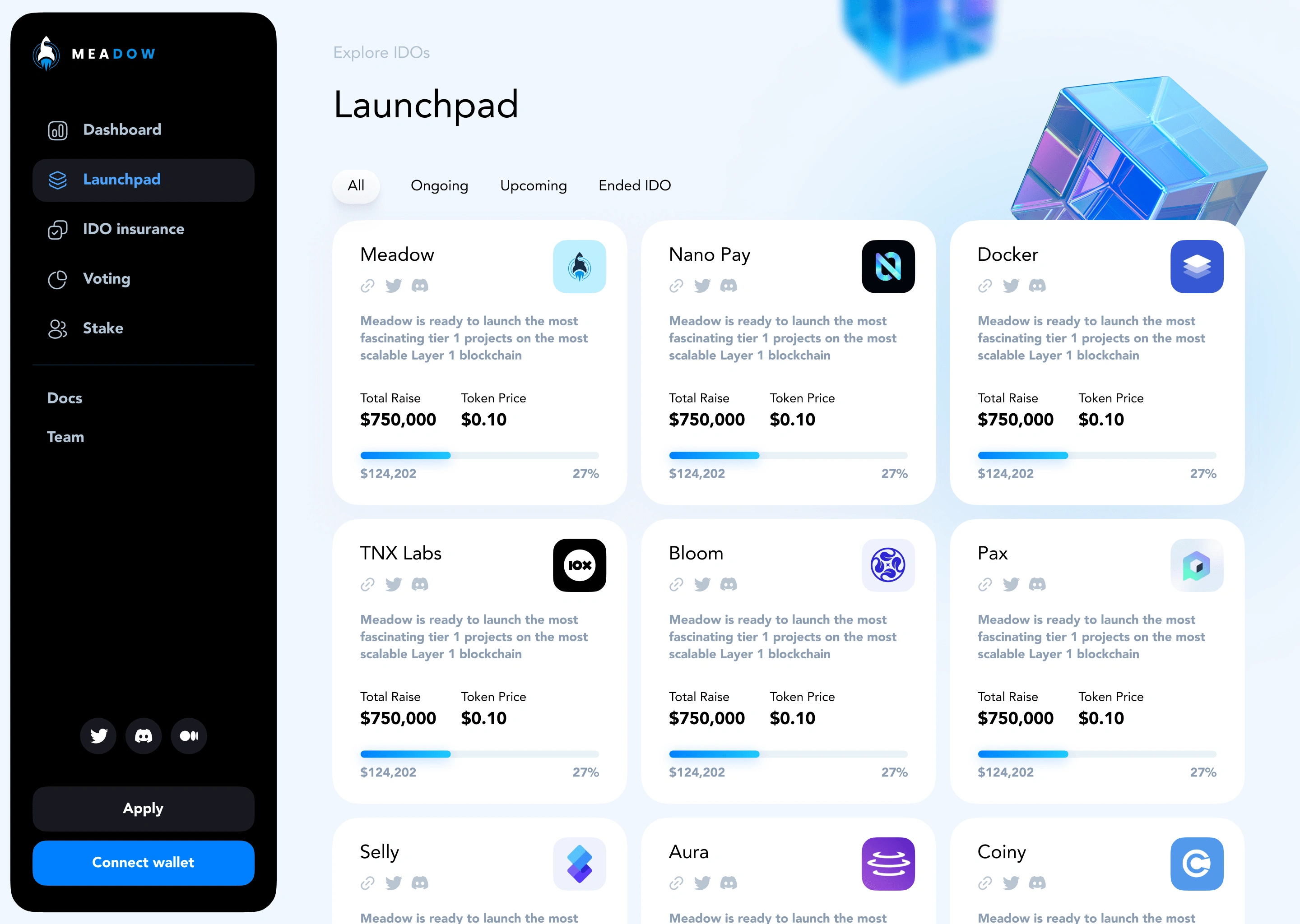
Meadow’s current Web3 launchpad demanded a refreshing redesign to make it more competitive in the dynamic world of crypto. Our role was to convert their platform into a lively, dynamic center that radiated a modern character. We have created a very fresh and welcoming Meadow, which is ready to thrive, through strategic design decisions.
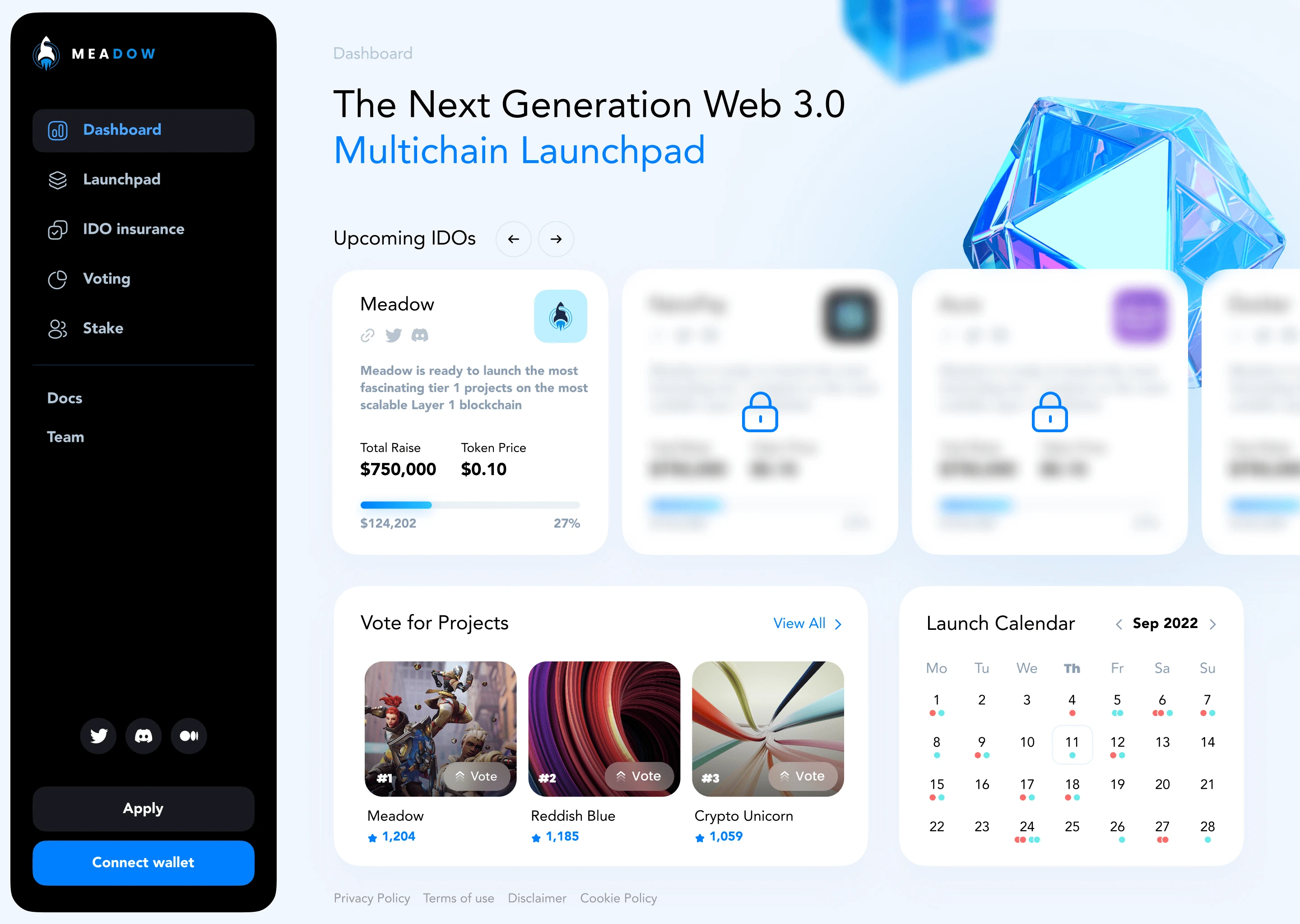
Blooming With Contemporary Flair
We created an updated design that strayed from typical crypto visuals. A very effective clean and airy interface against pops of bright color made Meadow a design style leader. Some playful illustrated elements added an artistic punch to this modern style. This delightful touches perfectly combined with clean, reduced layouts, designed for user-friendly modern, minimalism.
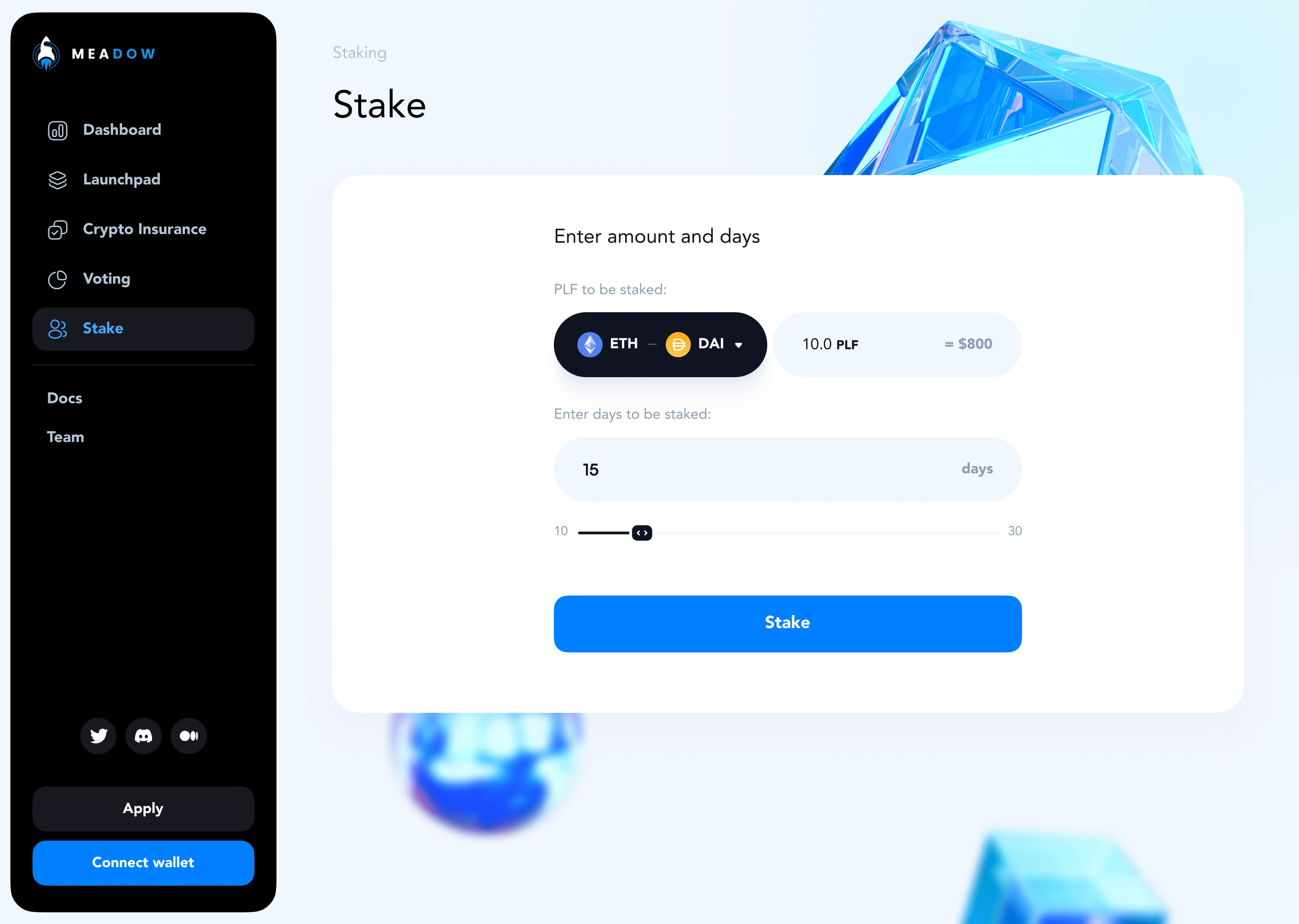
Project Pages In Focus
In the core launchpad functionality of Meadow, we put a major emphasis on making the individual project pages specifically fun and unique. More innovative modifications of the normal layout conventions made the standard become more interesting and the essence of each presented product was emphasized by the layout. Animated decorations added more to this environment of a creative power.
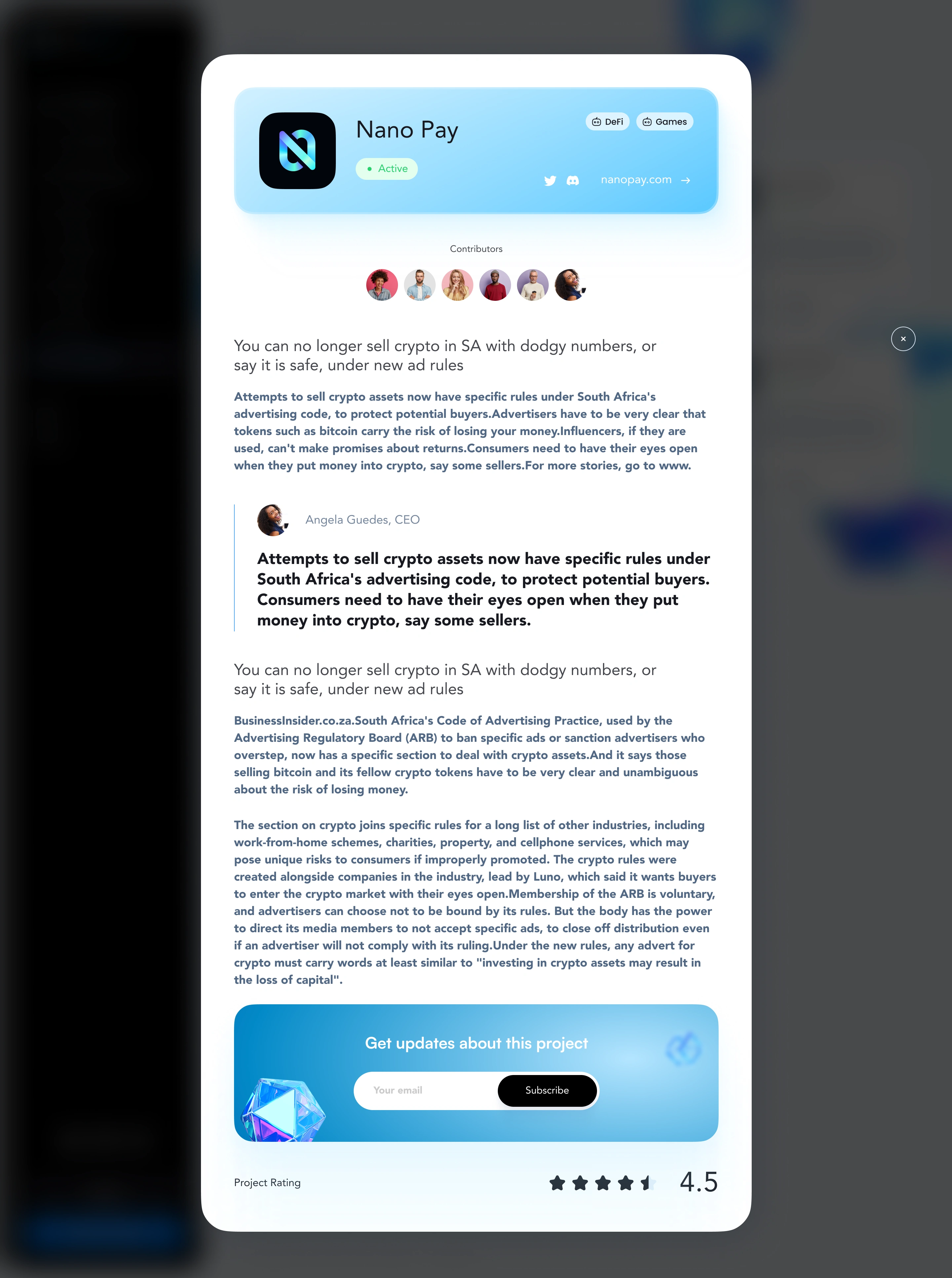
Nurturing Seamless Exploration
The fresh aesthetics were underpinned by a light-hearted structural redesign that focused on intuitive navigation and content discovery. We developed optimized layout maps that immediately oriented users and allowed for effortless browsing of projects.
Supportive microinteractions gave pleasure feedback and directed the visitors through a fascinating journey from start to finish.
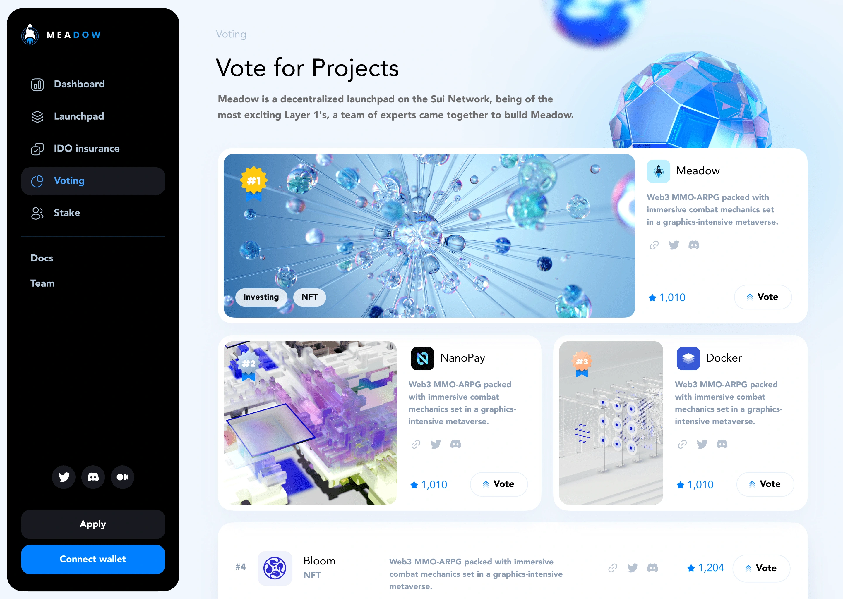
A Vibrant Community Ecosystem
The revived Meadow created a very friendly, clean environment that greeted the users with the first click. This led to a revitalized atmosphere that was characterized by increased community interactions, which were brought about by open discussion and lively opportunities. Upon launch, Meadow’s hyper fresh type has aligned with the remade UX judgments, freezing a lively environment, ready to thrive in the fertile Web3 landscape.
Like this project
Posted May 3, 2024
Meadow's redesign isn't just about looks. We built a vibrant community hub for Web3 projects. 🎉
Likes
0
Views
36

